Info Popup (pub.dev)
The simple way to show the user some information on your selected widget.
Features
- Info holder with dynamic size
- Fully editable content area

Getting started
Use this package as a Library
Usage
All you have to do is wrap it in the widget you want to show information with InfoPopupWidget. With InfoPopupController, you can customize it as you wish, and turn it off and on.
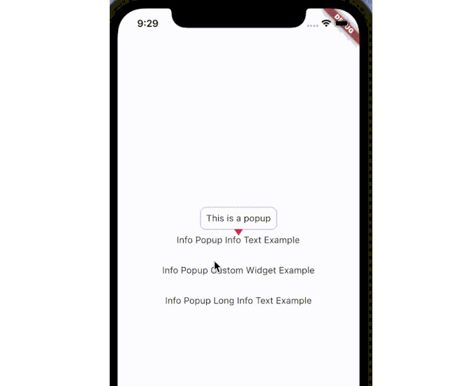
Normal Info Text Using
InfoPopupWidget(
  onControllerCreated: (InfoPopupController controller) {
    controller.show();
  },
  arrowTheme: const InfoPopupArrowTheme(
  arrowDirection: ArrowDirection.down, color: Colors.pink),
  infoText: 'This is a popup',
  child: const Text('Info Popup Info Text Example'),
),
Custom Popup Widget
InfoPopupWidget(
    onControllerCreated: (InfoPopupController controller) {
    controller.show();
  },
  arrowTheme: const InfoPopupArrowTheme(
    color: Colors.black87,
  ),
  infoWidget: Container(
    width: context.screenWidth * .8,
    height: 100,
    decoration: BoxDecoration(
      color: Colors.red,
      borderRadius: BorderRadius.circular(10),
    ),
    child: const Center(
      child: Text(
        'This is a custom widget',
        style: TextStyle(
          color: Colors.white,
        ),
      ),
    ),
  ),
  child: const Text('Info Popup Custom Widget Example'),
),