flutter_xlider
A material design slider and range slider with rtl support and lots of options and customizations for flutter.
Get Started
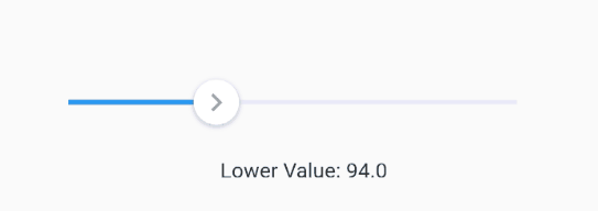
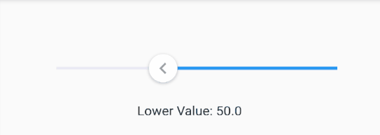
Single Slider
A single slider
FlutterSlider(
  values: [300],
  max: 500,
  min: 0,
  onDragging: (lowerValue, upperValue) {
    _lowerValue = lowerValue;
    _upperValue = upperValue;
    setState(() {});
  },
)
to make slider Right To Left use rtl: true
 FlutterSlider(
  ...
  rtl: true,
  ...
)
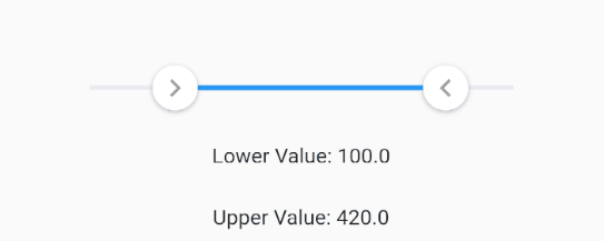
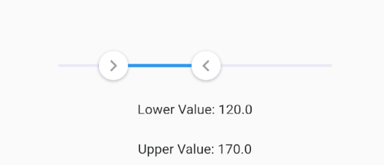
Range Slider
A simple example of slider
FlutterSlider(
  values: [30, 420],
  rangeSlider: true,
  max: 500,
  min: 0,
  onDragging: (lowerValue, upperValue) {
    _lowerValue = lowerValue;
    _upperValue = upperValue;
    setState(() {});
  },
)
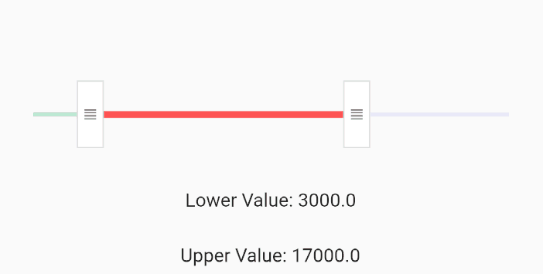
Handlers
You can customize handlers using handler and rightHandler properties.
width and height are required for custom handlers, so we use SizedBox as a wrapper
if you use rangeSlider then you should define rightHandler as well if you want to customize handlers
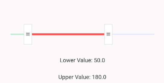
here there is a range slider with customized handlers and trackbars
FlutterSlider(
  ...
  handler: SizedBox(
    width: 20,
    height: 50,
    child: Container(
      child: Icon(
        Icons.view_headline,
        color: Colors.black54,
        size: 13,
      ),
      decoration: BoxDecoration(
          color: Colors.white,
          border: Border.all(color: Colors.black.withOpacity(0.12))),
    ),
  ),
  rightHandler: SizedBox(
    width: 20,
    height: 50,
    child: Container(
      child: Icon(
        Icons.view_headline,
        color: Colors.black54,
        size: 13,
      ),
      decoration: BoxDecoration(
          color: Colors.white,
          border: Border.all(color: Colors.black.withOpacity(0.12))),
    ),
  ),
  ...
)
Handler Scale Animation
You can control the scale animation type of your handlers, it's duration and it's scale size using handlerAnimation
handlerAnimation accepts a FlutterSliderHandlerAnimation class which has 4 properties as following
FlutterSlider(
  ...
    handlerAnimation: FlutterSliderHandlerAnimation(
      curve: Curves.elasticOut,
      reverseCurve: Curves.bounceIn,
      duration: Duration(milliseconds: 500),
      scale: 1.5
    ),
  ...
)
if you don't want scale animation, then just pass 1 to scale property
if you don't want reverseCurve, just ignore it. default is null
Trackbars
to customize track bars you can use FlutterSliderTrackBar. You can see the details here
FlutterSlider(
  ...
    trackBar: FlutterSliderTrackBar(
      activeTrackBarColor: Colors.redAccent,
      activeTrackBarHeight: 5,
      leftInactiveTrackBarColor: Colors.greenAccent.withOpacity(0.5),
    ),
  ...
)
Tooltips
in order to customize your tooltips, you can use FlutterSliderTooltip class. You can see all properties here
FlutterSlider(
  ...
  tooltip: FlutterSliderTooltip(
    textStyle: TextStyle(fontSize: 17, color: Colors.white),
    boxStyle: FlutterSliderTooltipBox(
      decoration: BoxDecoration(
        color: Colors.redAccent.withOpacity(0.7)
      )
    )
  ),
  ...
)
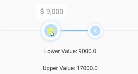
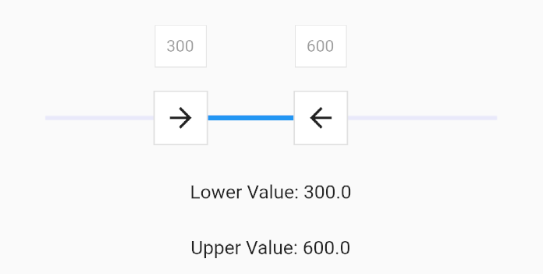
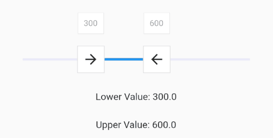
Tooltip Prefix
You can use leftPrefix, leftSuffix, rightPrefix, rightSuffix to add your desired widget around tooltip content.
FlutterSlider(
  ...
    tooltip: FlutterSliderTooltip(
      leftPrefix: Icon(Icons.attach_money, size: 19, color: Colors.black45,),
      rightSuffix: Icon(Icons.attach_money, size: 19, color: Colors.black45,),
    ),
  ...
)
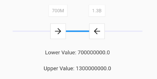
Tooltip Number Format
you can customize tooltip numbers by using NumberFormat class
here is an example
FlutterSlider(
  ...
    tooltip: FlutterSliderTooltip(
      numberFormat: intl.NumberFormat(),
      // numberFormat: intl.compact(),
    ),
  ...
)
you can find more about NumberFormat
Controls
Jump
by default slider handlers move fluently, if you set jump to true, handlers will jump between intervals
FlutterSlider(
  ...
  jump: true,
  ...
)
divisions
The number of discrete divisions
FlutterSlider(
  ...
  divisions: 25,
  ...
)
Ignore Steps
if your configurations requires that some steps are not available, you can use ignoreSteps property.
this property accepts a simple class to define from and to ranges.
FlutterSlider(
  ...
    ignoreSteps: [
      FlutterSliderIgnoreSteps(from: 8000, to: 12000),
      FlutterSliderIgnoreSteps(from: 18000, to: 22000),
    ],
  ...
)
Minimum Distance
when using range slider, the minimum distance between two handlers can be defined using minimumDistance option
FlutterSlider(
  ...
    minimumDistance: 300,
  ...
)
Maximum Distance
this is the opposite of minimum distance, when using range slider, the maximum distance between two handlers can be defined using maximumDistance option
FlutterSlider(
  ...
    maximumDistance: 300,
  ...
)
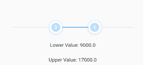
Always Show Tooltips
tooltips always displayed if this property is set to true. like above example
FlutterSlider(
  ...
  alwaysShowTooltip: true,
  ...
)
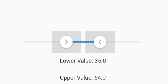
Touch Zone
You can control how big a handler's touch area could be. by default touch zone is 2
the range is between 1 to 5
FlutterSlider(
  ...
  touchZone: 2,
  ...
)
to see the touchable area for handlers you set displayTestTouchZone to true and test your slider
FlutterSlider(
  ...
  displayTestTouchZone: true,
  ...
)
disabled
to disable your slider, you can use disabled.
FlutterSlider(
  ...
  disabled: true,
  ...
)
rtl
makes the slider Right To Left
FlutterSlider(
  ...
  rtl: true,
  ...
)
Events
There are 3 events
onDragStarted: fires when drag starts
onDragCompleted fires when drag ends
onDragging keeps firing when dragging
all three of above functions returns two double values. Lower Value and Upper Value
FlutterSlider(
  ...
  onDragging: (lowerValue, upperValue) {
    _lowerValue = lowerValue;
    _upperValue = upperValue;
    setState(() {});
  },
  ...
)