ColorPicker
ColorPicker is a highly configurable color picker for Flutter. The ColorPicker can show anywhere from 1 to 6 different color picking tools that you can use to choose colors from.
The different color selection choices are:
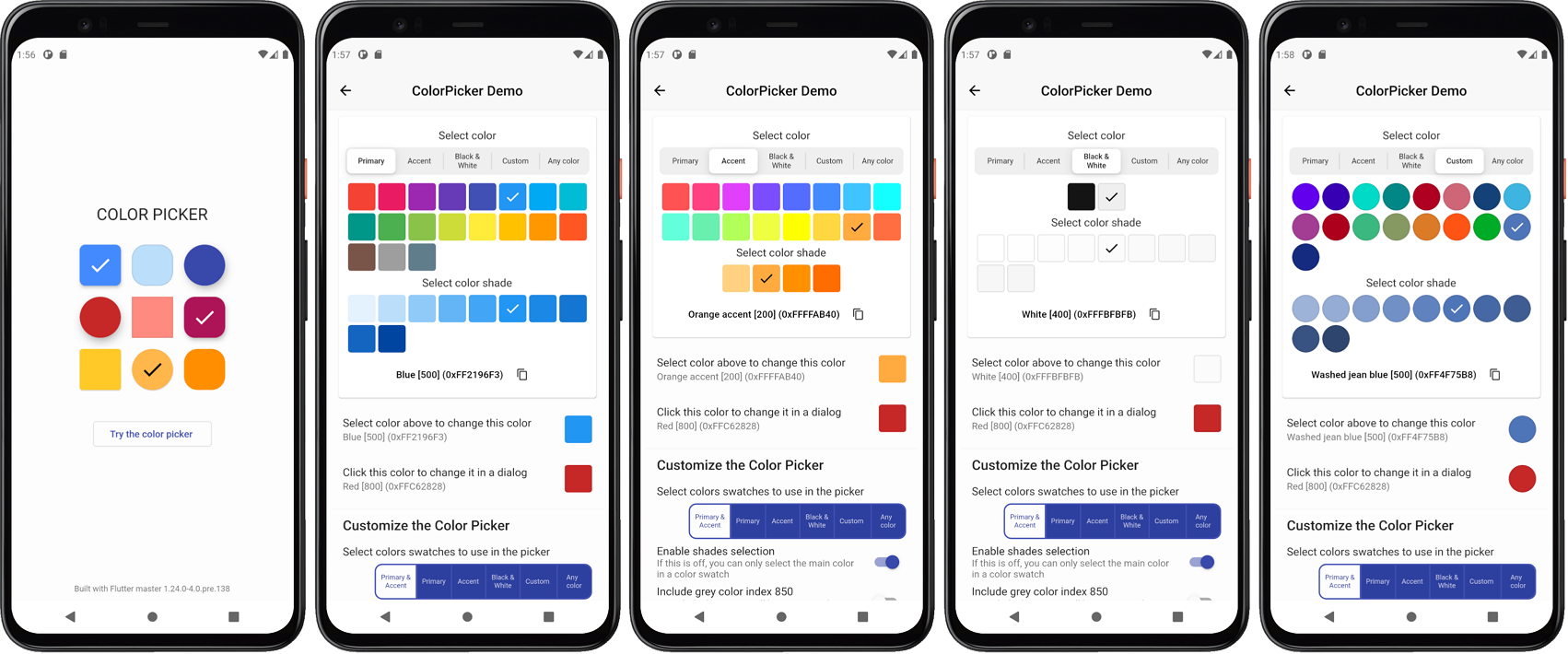
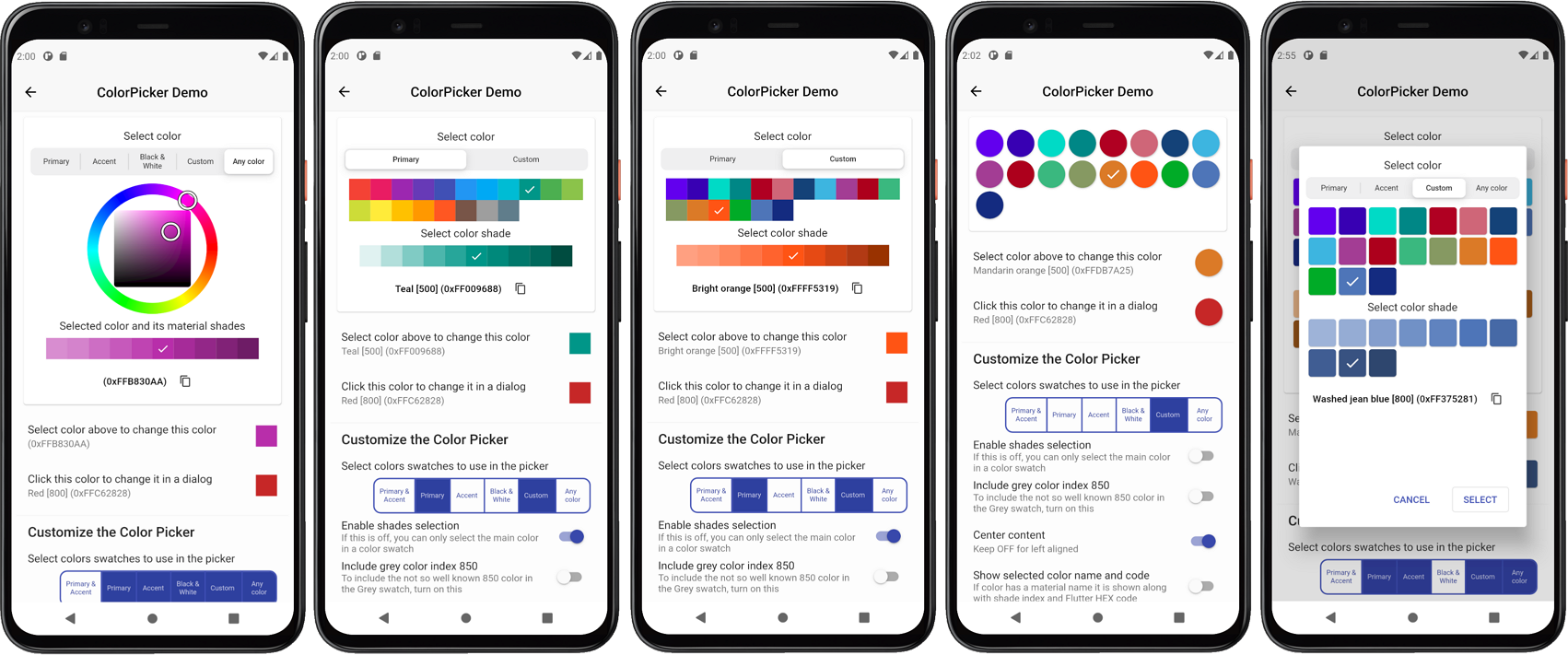
- Material primary colors and its shades.
ColorPickerSwatch.material - Material accent colors and its shades.
ColorPickerSwatch.accent - Material primary and accent colors and their shades in the same color picker.
ColorPickerSwatch.both - Black and White colors, including near black and near white shades.
ColorPickerSwatch.bw - Custom material like colors and their shades, that you define and name.
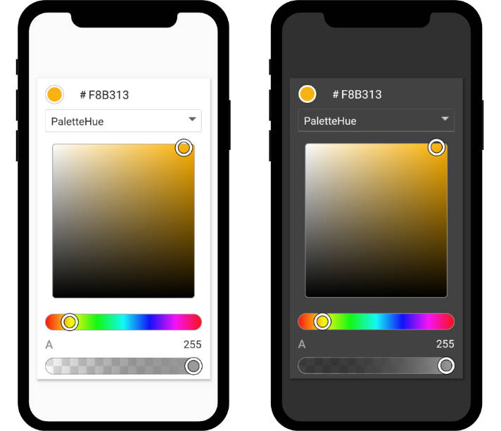
ColorPickerSwatch.custom - A HSV color wheel picker, that allows you to select any color. Material primary color like shades for the selected color are computed automatically.
ColorPickerSwatch.any
When you show more than one color swatch selection tool, a slider allows you to select which one to use. You can configure the color picker to include any of the above color swatches. Showing options 1 and 2, together with option 3 is not very useful, they are available as optional ways of showing the Material primary and accent colors.
You provide the picker with its heading and sub heading, usually a Text widgets with appropriate style. You also define if the Material shades can be selected or not and if the selected color names and values are shown in the picker. If the value is shown, the picker includes a button that allows you the copy the selected color code to the clipboard.
The shape, size and spacing of the color picker items can be modified. There is built in dialog that can be used to show the ColorPicker in a pre-made dialog, but you can also make your own dialog and just use the ColorPicker in your own custom dialog. The example below show some variations of the ColorPicker.
Getting Started
In the pubspec.yaml of your Flutter project, add the following dependency:
dependencies:
  ...
  color_picker:
In your library file add the following import:
import 'package:color_picker/color_picker.dart';
Example Application
To try a basic example of the ColorPicker on a device or simulator, clone the ColorPicker repository and run the example:
cd example/
flutter run --release
The result is a basic default picker and another picker that opens in a dialog, with a few more options.
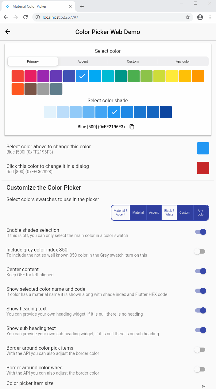
Live Web Example
You can also try a live web example of the ColorPicker here. With the web demo you can modify most of the ColorPicker's API values and use it as a tool to find settings and a style that you like and that fits your application.
The source code for the Web demo, which is just a slightly more elaborate example than the basic sample bundled with the package, is available here.
Introduction to the ColorPicker
Define a Color variable and give it a start value in a normal StatefulWidget.
class _ColorPickerPageState extends State<ColorPickerPage> {
  Color screenPickerColor;

@override
void initState() {
  super.initState();
  screenPickerColor = Colors.blue[500];
}
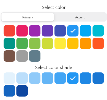
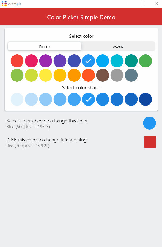
Add the ColorPicker in your build method, could for example be in a ListView or Column. Give it the starting color, a heading and subHeading, plus the required onColorChanged callback function. Use the color from the callback in a setState() to modify the screenPickerColor, to the selected color in the color picker.
ColorPicker(
  color: screenPickerColor,
  onColorChanged: (Color color) =>
    setState(() => screenPickerColor = color),
  heading: Text(
    'Select color',
    style: Theme.of(context).textTheme.subtitle1,
  ),
  subHeading: Text(
    'Select color shade',
    style: Theme.of(context).textTheme.subtitle1,
  ),
),
The result will look like this:
If you like, you can change the pick item style and size. Let's make it circular:
ColorPicker(
  size: 44,
  borderRadius: 22,

  color: screenPickerColor,
  onColorChanged: (Color color) =>
    setState(() => screenPickerColor = color),
 :
),
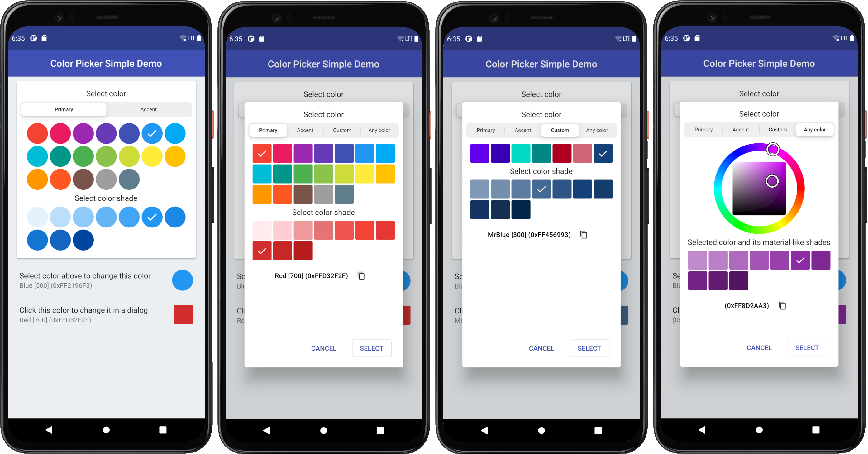
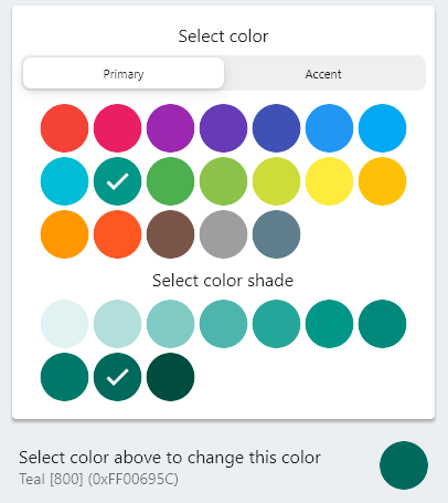
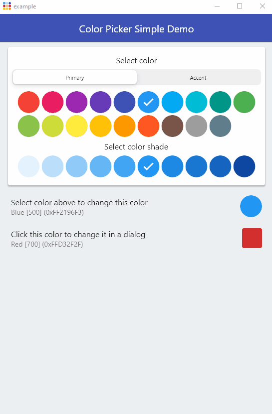
You can use same the ColorIndicator Widget that the ColorPicker uses internally as a color indicator. Here we use it in a ListTile as its trailing property to show the selected color. The ColorPicker also includes ColorTools that you can use to display names of the standard material colors and their shade index value. Optionally it can also return a Flutter style Hex color code. We use it in the ListTile subtitle property to describe the selected color.
ListTile(
  title: const Text('Select color above to change this color'),
  subtitle: Text(
    ColorTools.colorNameAndHexCode(screenPickerColor),
  ),
  trailing: ColorIndicator(
    height: 44,
    width: 44,
    borderRadius: 22,
    color: screenPickerColor,
  ),
),
This setup results in round color pick items and a separate indicator for the selected color:
ColorPicker as a Dialog
A common use case for a color picker is to show a color selection widget and allow the user to choose a new color in a dialog or cancel the color selection. The ColorPicker comes with a built in dialog that can be used for this. Alternatively you can just use the ColorPicker Widget to build your own dialog based on it.
For the dialog example we will show a few more of the built in picker options and also add some custom colors to the Custom colors section of the ColorPicker.
First we define custom colors and from the single color definitions we create primary and accent color swatches by using ColorTools.createPrimaryColor or alternatively ColorTools.createAccentColor for an accent color swatch of a defined color. We then add these color swatches to a ColorSwatch Map, that we map to our own custom names for the color swatches.
  // Define some custom colors.
  static const Color googlePrimary = Color(0xFF6200EE);
  static const Color googlePrimaryVariant = Color(0xFF3700B3);
  static const Color googleSecondary = Color(0xFF03DAC6);
  static const Color googleSecondaryVariant = Color(0xFF018786);
  static const Color googleError = Color(0xFFB00020);
  static const Color googleErrorDark = Color(0xFFCF6679);
  static const Color mrBlue = Color(0xFF174378);

  // Make a custom color swatch to name map from the above custom colors.
  final Map<ColorSwatch<Object>, String> colorsNameMap =
      <ColorSwatch<Object>, String>{
    ColorTools.createPrimaryColor(googlePrimary): 'G Purple',
    ColorTools.createPrimaryColor(googlePrimaryVariant): 'G Purple Variant',
    ColorTools.createAccentColor(googleSecondary): 'G Teal',
    ColorTools.createAccentColor(googleSecondaryVariant): 'G Teal Variant',
    ColorTools.createPrimaryColor(googleError): 'G Error',
    ColorTools.createPrimaryColor(googleErrorDark): 'G Error Dark',
    ColorTools.createPrimaryColor(mrBlue): 'MrBlue',
  };
We also create a Map from all the ColorPickerSwatch enum values to a boolean value, that defines which swatches we want to show in the ColorPicker. In the example below we includes material primary, accent and the above custom colors plus the HSV color wheel that allows us to select any color. We did not include the picker that combines the primary and accent colors in the same picker, nor do we show the black and white and its near black and near white shades picker.
  static final Map<ColorPickerSwatch, bool> swatchesAvailable =
      <ColorPickerSwatch, bool>{
    ColorPickerSwatch.both: false,
    ColorPickerSwatch.material: true,
    ColorPickerSwatch.accent: true,
    ColorPickerSwatch.bw: false,
    ColorPickerSwatch.custom: true,
    ColorPickerSwatch.any: true,
  };
We add a variable for a our dialog picked color dialogPickerColor and set a start value for it.
class _ColorPickerPageState extends State<ColorPickerPage> {
  Color screenPickerColor;
  Color dialogPickerColor;

@override
void initState() {
  super.initState();
  screenPickerColor = Colors.blue[500];
  dialogPickerColor = Colors.red[700];
}
We use another ListTile to display a ColorIndicator, that we style a bit differently in this case. We also use its onSelect callback to open a dialog with another ColorPicker. Before we open the dialog we store the current dialogPickerColor color that we intend to change with the dialog. This way we can restore this color value if the user cancels the dialog.
  ListTile(
    title: const Text('Click this color to change it in a dialog'),
    subtitle: Text(
      ColorTools.colorNameAndHexCode(
        dialogPickerColor,
        colorSwatchNameMap: colorsNameMap,
      ),
    ),
    trailing: ColorIndicator(
      height: 40,
      width: 40,
      borderRadius: 3,
      color: dialogPickerColor,
      onSelect: () async {
        final Color _colorBeforeDialog = dialogPickerColor;
        if (!(await colorPickerDialog())) {
          setState(() {
            dialogPickerColor = _colorBeforeDialog;
          });
        }
      },
    ),
  ),
The colorPickerDialog is an asynchronous boolean function, that returns true if the user closed the dialog picker with the Select button. If Cancel was selected or user dismissed the dialog by clicking outside of it, false is returned.
  Future<bool> colorPickerDialog() async {
    return ColorPicker(
      color: dialogPickerColor,
      onColorChanged: (Color color) =>
          setState(() => dialogPickerColor = color),
      showNameSelected: true,
      size: 40,
      borderRadius: 3,
      padding: 8,
      spacing: 3,
      runSpacing: 3,
      heading: Text(
        'Select color',
        style: Theme.of(context).textTheme.subtitle1,
      ),
      subHeading: Text(
        'Select color shade',
        style: Theme.of(context).textTheme.subtitle1,
      ),
      subWheelHeading: Text(
        'Selected color and its material like shades',
        style: Theme.of(context).textTheme.subtitle1,
      ),
      swatchAvailable: swatchesAvailable,
      colorSwatchNameMap: colorsNameMap,
    ).showPickerDialog(
      context,
      constraints:
          const BoxConstraints(minHeight: 475, minWidth: 480, maxWidth: 480),
    );
  }
The above example uses a few more styling properties, but most importantly it uses the showPickerDialog method to show the defined ColorPicker in a dialog. The dialog needs a context, so we pass it along to it.
We also define size constraints for the dialog. If you do not define size constraints, it will auto size to fit the dialog content. Using constraints allows the dialog to keep the same size when the content size changes slightly as you switch between the different picker types you enabled. It looks better if the dialog size does not change when you switch picker type with the selector. The color wheel picker in particular will often require a bit more space. The wheel size can be customized as well, it does however become more difficult to operate with touch and less accurate if it is made very small.
The end result of the above setup is a ListTile where the trailing color indicator widget can be clicked to open a dialog to select a new color for the trailing ColorIndicator color.
As the dialogPickerColor color is changed in the dialog, the ColorIndicator's color also changes interactively. If the selection is cancelled the ColorIndicator original color is restored.
As an extra exercise, try connecting the dialogPickerColor value the AppBar's backgroundColor property. Did you manage to do it? What happened?
:
appBar: AppBar(
  backgroundColor: dialogPickerColor,
  elevation: 1,
  centerTitle: true,
  title: const Text('Color Picker Simple Demo'),
),
As can be seen below, now the selected color in the dialog changes the AppBar's color as you select color in the dialog and cancelling it restores the app bar color as well, Pretty cool!
You can connect the color to theme colors and modify your application's theme color values interactively as well, but that goes beyond the scope of this example.
Digging deeper
The above introduction was a walk through of the bundled example, please see the example section for its complete source code.
There are more configuration options available for the ColorPicker. Use the API reference guide for additional information. You can also study the more complete live web example and its source code.