async_button_builder
A builder that adds loading, disabled, errored and completed states on top of buttons that perform asynchronous tasks. It can be used with most any button or even on top of a custom Material button. It includes fluid animation between states as well using AnimatedSize in combination with AnimatedSwitcher which gives possibility to define your own transitions.
Getting Started
Include the package:
async_button_builder: <latest_version>
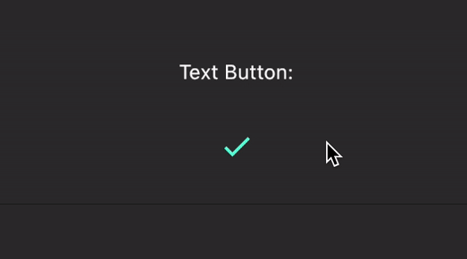
Wrap the builder around a button, passing the onPressed and child element to builder instead of the button directly. These two are the only required fields.
AsyncButtonBuilder(
  child: Text('Click Me'),
  onPressed: () async {
    await Future.delayed(Duration(seconds: 1));
  },
  builder: (context, child, callback, _) {
    return TextButton(
      child: child,
      onPressed: callback,
    );
  },
),

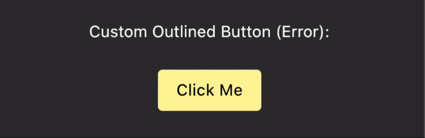
The fourth value in the builder allows you listen to the loading state. This can be used to conditionally style the button. This package depends freezed in order to create a sealed union to better handle the possible states.
AsyncButtonBuilder(
  child: Text('Click Me'),
  loadingWidget: Text('Loading...'),
  onPressed: () async {
    await Future.delayed(Duration(seconds: 1));

    throw 'shucks';
  },
  builder: (context, child, callback, buttonState) {
    final buttonColor = buttonState.when(
      idle: () => Colors.yellow[200],
      loading: () => Colors.grey,
      success: () => Colors.orangeAccent,
      error: () => Colors.orange,
    );

    return OutlinedButton(
      child: child,
      onPressed: callback,
      style: OutlinedButton.styleFrom(
        primary: Colors.black,
        backgroundColor: buttonColor,
      ),
    );
  },
),
You can also drive the state of the button yourself using the buttonState field:
AsyncButtonBuilder(
  buttonState: ButtonState.completing(),
  // ...
),
async_button_builder even works for custom buttons. You can define your own widgets for loading, error, and completion as well as define the transitions between them. This example is a little verbose but shows some of what's possible.
AsyncButtonBuilder(
  child: Padding(
    // Value keys are important as otherwise our custom transitions
    // will have no way to differentiate between children.
    key: ValueKey('foo'),
    padding: const EdgeInsets.symmetric(
      horizontal: 16.0,
      vertical: 8.0,
    ),
    child: Text(
      'Click Me',
      style: TextStyle(color: Colors.white),
    ),
  ),
  loadingWidget: Padding(
    key: ValueKey('bar'),
    padding: const EdgeInsets.all(8.0),
    child: SizedBox(
      height: 16.0,
      width: 16.0,
      child: CircularProgressIndicator(
        valueColor: AlwaysStoppedAnimation<Color>(Colors.white),
      ),
    ),
  ),
  successWidget: Padding(
    key: ValueKey('foobar'),
    padding: const EdgeInsets.all(4.0),
    child: Icon(
      Icons.check,
      color: Colors.purpleAccent,
    ),
  ),
  onPressed: () async {
    await Future.delayed(Duration(seconds: 2));
  },
  loadingSwitchInCurve: Curves.bounceInOut,
  loadingTransitionBuilder: (child, animation) {
    return SlideTransition(
      position: Tween<Offset>(
        begin: Offset(0, 1.0),
        end: Offset(0, 0),
      ).animate(animation),
      child: child,
    );
  },
  builder: (context, child, callback, state) {
    return Material(
      color: state.maybeWhen(
        success: () => Colors.purple[100],
        orElse: () => Colors.blue,
      ),
      // This prevents the loading indicator showing below the
      // button
      clipBehavior: Clip.hardEdge,
      shape: StadiumBorder(),
      child: InkWell(
        child: child,
        onTap: callback,
      ),
    );
  },
),