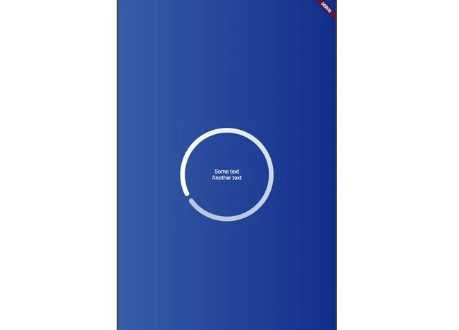
Gradient Progress Indicator
This package shows a circular progress indicator with gradient colors, and it is possible insert texts inside that.
Basic Usage
class MyApp extends StatelessWidget {
  // This widget is the root of your application.
  @override
  Widget build(BuildContext context) {
    return MaterialApp(
      title: 'Flutter Demo',
      theme: ThemeData(
        primarySwatch: Colors.blue,
      ),
      home: Scaffold(
        backgroundColor: Colors.blue,
        body: GradientProgressIndicator(
          radius: 120,
          duration: 3,
          strokeWidth: 12,
          gradientStops: const [
            0.2,
            0.8,
          ],
          gradientColors: const [
            Colors.white,
            Colors.grey,
          ],
          child: Column(
            mainAxisAlignment: MainAxisAlignment.center,
            children: [
              Text(
                'Some text',
                style: TextStyle(color: Colors.black, fontSize: 18),
              ),
              Text(
                'Another text',
                style: TextStyle(color: Colors.black, fontSize: 18),
              ),
            ],
          ),
        ),
      ),
    );
  }
}
GitHub
https://github.com/otonielduarte/gradient-progress-indicator