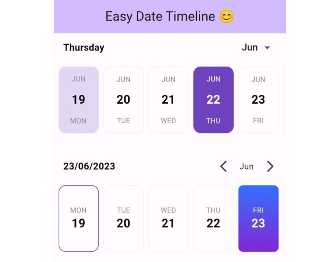
EasyDateTimeline
The “easy_date_timeline” package is a customizable Flutter library that displays a timeline of dates in a horizontal view.
How To Use
Import the following package in your dart file
import 'package:easy_date_timeline/easy_date_timeline.dart';
Usage
Use the EasyDateTimeLine Widget
   Column(
        mainAxisAlignment: MainAxisAlignment.center,
        children: [
          EasyDateTimeLine(
            initialDate: DateTime.now(),
            onDateChange: (selectedDate) {
              //[selectedDate] the new date selected.
            },
          ),
        ],
      ),
Features
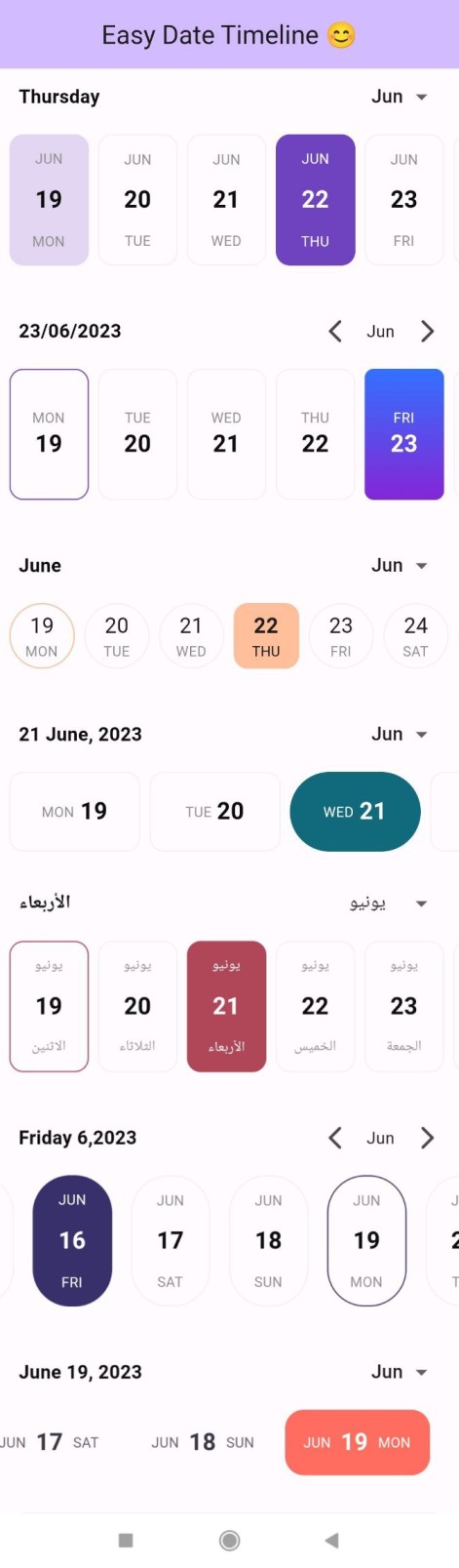
Dynamic Text Color: The “easy_date_timeline” package automatically adjusts the text color of the active day based on the active color. If the active color is a dark color, the text color will be light, and if the active color is a light color, the text color will be dark. This ensures that the text is always easy to read and contrasts well with the background color.Customizable Item Builder: The “easy_date_timeline” package provides an item builder that allows for full customization of the timeline items. With the item builder, developers can customize the appearance and behavior of each date item in the timeline, including the text, background color,etc..Locale Support: The “easy_date_timeline” package supports locale, allowing developers to display the timeline in different languages and formats based on the user’s device settings. This feature ensures that the package can be used in a variety of international contexts and provides a seamless user experience for users around the world.
Custom background
Use the dayProps that contains decoration
for both active and inactive day.
 Column(
        mainAxisAlignment: MainAxisAlignment.center,
        children: [
          EasyDateTimeLine(
            initialDate: DateTime.now(),
            onDateChange: (selectedDate) {
              //[selectedDate] the new date selected.
            },
            dayProps: const EasyDayProps(
              activeDayDecoration: BoxDecoration(
                borderRadius: BorderRadius.all(Radius.circular(8)),
                gradient: LinearGradient(
                  begin: Alignment.topCenter,
                  end: Alignment.bottomCenter,
                  colors: [
                    Color(0xff3371FF),
                    Color(0xff8426D6),
                  ],
                ),
              ),
            ),
          ),
        ],
      ),
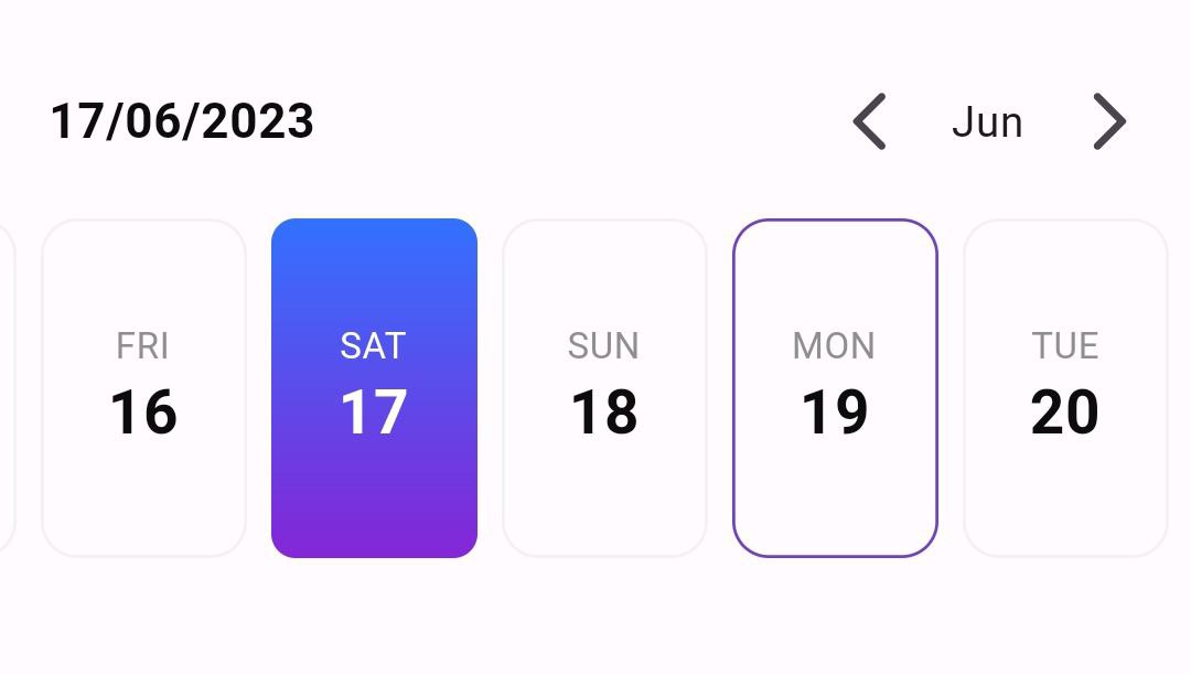
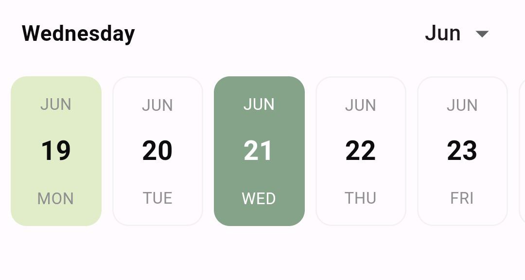
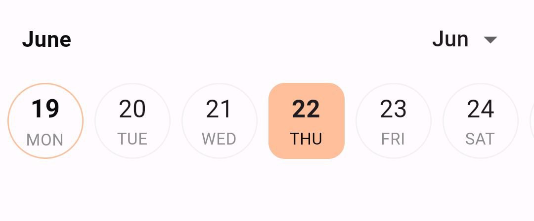
Change current day highlight color and style
in the dayProps you can set todayHighlightStyle to :
TodayHighlightStyle.withBackground: Set a background color for the current day.TodayHighlightStyle.withBorder: Set just a colored border for the current day.TodayHighlightStyle.none: Remove the highlight from the current day. by default the highlight color equal to primary color with opacity of 20%. to change the highlight color you can usetodayHighlightColorand set your own color.
 Column(
        mainAxisAlignment: MainAxisAlignment.center,
        children: [
          EasyDateTimeLine(
            initialDate: DateTime.now(),
            onDateChange: (selectedDate) {
              //[selectedDate] the new date selected.
            },
            activeColor: const Color(0xff85A389),
            dayProps: const EasyDayProps(
              todayHighlightStyle: TodayHighlightStyle.withBackground,
              todayHighlightColor: Color(0xffE1ECC8),
            ),
          ),
        ],
      ),
NOTE:
If you provide an
inactiveDecorationto the EasyDateTimeline widget, the current day highlight feature will be disabled. This is because the inactiveDecoration is used to style the dates that are not in the active date range, and applying the current day highlight to those dates may not be desirable. If you want to use the current day highlight feature, do not provide an inactiveDecoration to the widget.
Change day structure
In the dayProps change the dayStructure to:
DayStructure.dayNumDayStr: show the current day number then current day name.DayStructure.dayStrDayNum: show the current name then current day number.DayStructure.monthDayNumDayStr: show current month name then the current day number finally current day name.DayStructure.dayNumberOnly: show only current day number.DayStructure.dayNameOnly: show only current day name.DayStructure.dayStrDayNumMonth: show current day name then the current day number finally current moth name.
       Column(
        mainAxisAlignment: MainAxisAlignment.center,
        children: [
          EasyDateTimeLine(
            initialDate: DateTime.now(),
            onDateChange: (selectedDate) {
              //[selectedDate] the new date selected.
            },
            activeColor: const Color(0xffFFBF9B),
            dayProps: const EasyDayProps(
              dayStructure: DayStructure.dayNumDayStr,
              inactiveBorderRadius: 48.0,
              height: 56.0,
              width: 56.0,
              activeDayNumStyle: TextStyle(
                fontSize: 18.0,
                fontWeight: FontWeight.bold,
              ),
              inactiveDayNumStyle: TextStyle(
                fontSize: 18.0,
              ),
            ),
          )
        ],
      ),
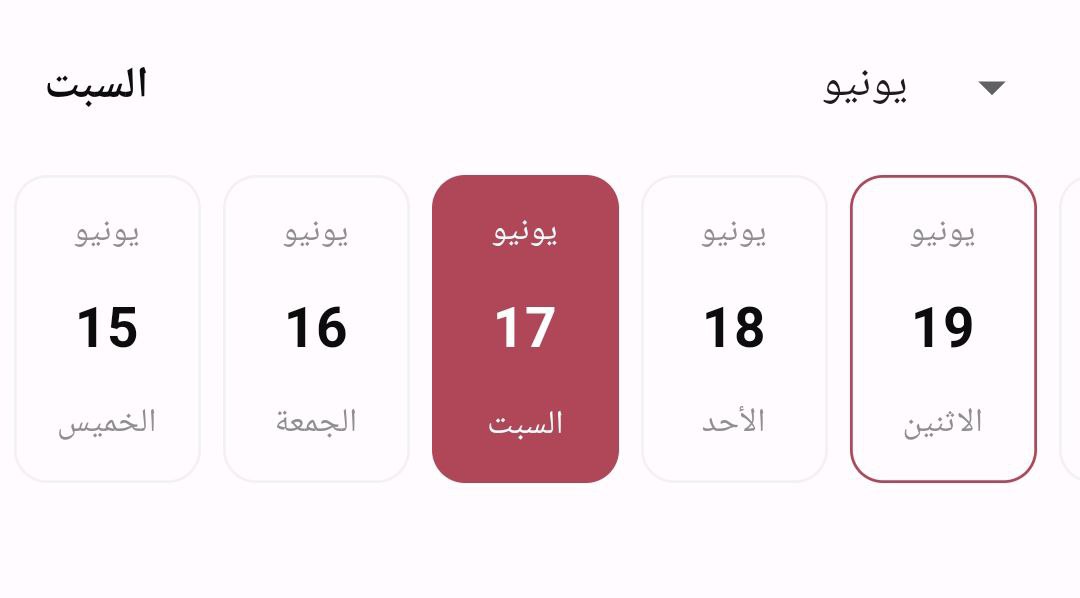
Locale support
With easy_date_timeline, you can display dates and timelines in your preferred language and format. Simply pass the locale parameter with the appropriate language code and region as a value. For example, if you want to display the dates in Arabic, you can set the locale parameter to “ar”. The package’s support for localization allows you to provide a better user experience for users around the world by displaying text and information in their preferred language and format.
       Column(
        mainAxisAlignment: MainAxisAlignment.center,
        children: [
          EasyDateTimeLine(
            initialDate: DateTime.now(),
            onDateChange: (selectedDate) {
              //[selectedDate] the new date selected.
            },
            activeColor: const Color(0xffB04759),
            locale:"ar",
          ),
        ],
      ),
Landscape view
With easy_date_timeline, you can display dates and timelines in landscape view just set
landScapeMode to true in dayProps.
       Column(
        mainAxisAlignment: MainAxisAlignment.center,
        children: [
                EasyDateTimeLine(
            initialDate: DateTime.now(),
            onDateChange: (selectedDate) {
              //[selectedDate] the new date selected.
            },
            activeColor: const Color(0xff116A7B),
            dayProps: const EasyDayProps(
              //set landScapeMode = true
              landScapeMode: true,
              activeBorderRadius: 48.0,
              dayStructure: DayStructure.dayStrDayNum,
            ),
            headerProps: const EasyHeaderProps(
              selectedDateFormat: SelectedDateFormat.fullDateDMonthAsStrY,
            ),
          ),
        ],
      ),
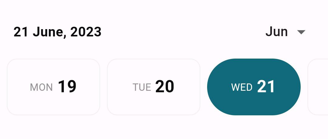
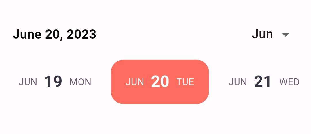
Change header appearance
In the headerProps change the monthPickerType to:
MonthPickerType.switcher: show the month and you can change month by clicking the arrow buttons.MonthPickerType.dropDown: show the month and you can change month from a dropdown menu. also in theheaderPropschange theselectedDateFormatto:SelectedDateFormat.fullDateDMY: show the data as:”11/06/2023″SelectedDateFormat.fullDateMDY: show the data as:”06/11/2023″SelectedDateFormat.fullDateDayAsStrMY: show the data as:”Sunday 6,2023″SelectedDateFormat.fullDateDMonthAsStrY: show the data as:”11 June,2023″SelectedDateFormat.fullDateMonthAsStrDY: show the data as:”June 11,2023″SelectedDateFormat.dayOnly: show only the selected day as:”Sunday”SelectedDateFormat.monthOnly: show only the selected month as:”June”
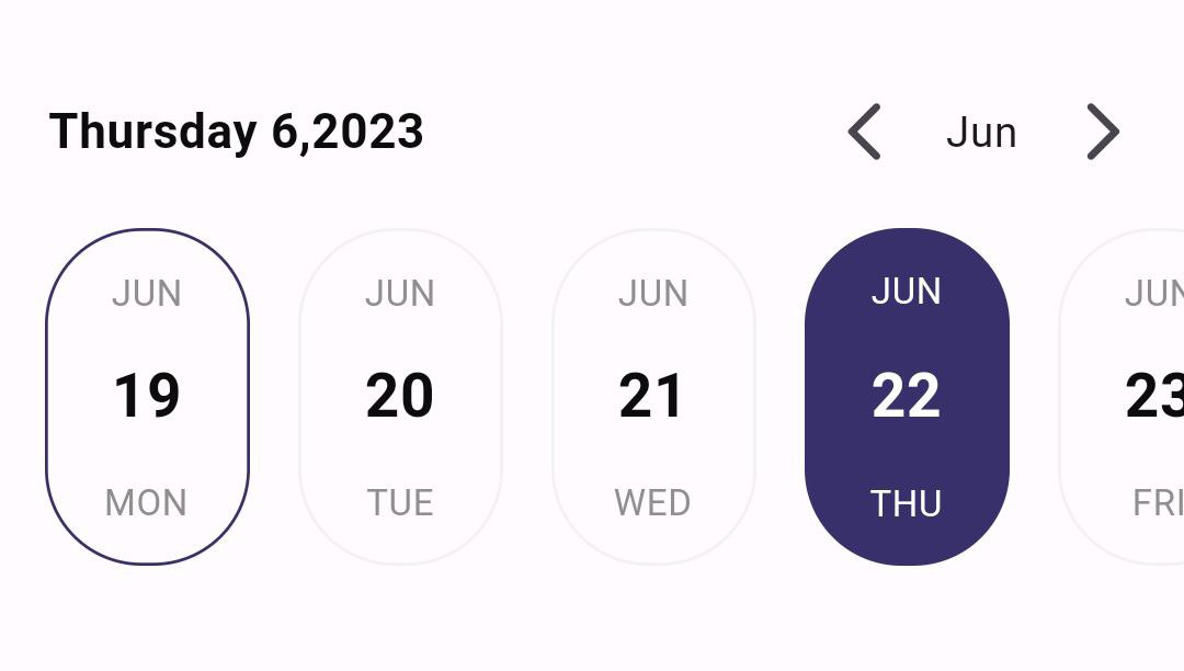
      Column(
        mainAxisAlignment: MainAxisAlignment.center,
        children: [
          EasyDateTimeLine(
            initialDate: DateTime.now(),
            onDateChange: (selectedDate) {
              //[selectedDate] the new date selected.
            },
            activeColor: const Color(0xff37306B),
            headerProps: const EasyHeaderProps(
              monthPickerType: MonthPickerType.switcher,
              selectedDateFormat: SelectedDateFormat.fullDateDMY,
            ),
            dayProps: const EasyDayProps(
              activeBorderRadius: 32.0,
              inactiveBorderRadius: 32.0,
            ),
            timeLineProps: const TimeLineProps(
              hPadding: 16.0, // padding from left and right
              separatorPadding: 16.0, // padding between days
            ),
          ),
        ],
      ),
Customize day appearance
You can use the itemBuilder to customize the appearance of the day widget.
The itemBuilder provides the following:
BuildContext context.String dayNumber: the day number ex: “11”.String dayName: the day name ex: “Sunday”.String monthName: the month name ex: “June”.DateTime fullDate: the full date of the day for fully customization.bool isSelected: whether the day is selected or not.
Column(
        mainAxisAlignment: MainAxisAlignment.center,
        children: [
          EasyDateTimeLine(
            initialDate: DateTime.now(),
            onDateChange: (selectedDate) {
              //[selectedDate] the new date selected.
            },
            dayProps: const EasyDayProps(
              height: 56.0,
              //you must provide the width in this case
              width: 124.0,
              activeBorderRadius: 16.0,
            ),
            itemBuilder:
                (context, dayNumber, dayName, monthName, fullDate, isSelected) {
              return Container(
                //the same width that provided previously.
                width: 124.0,
                padding: const EdgeInsets.symmetric(horizontal: 8.0),
                decoration: BoxDecoration(
                  color: isSelected ? const Color(0xffFF6D60) : null,
                  borderRadius: BorderRadius.circular(16.0),
                ),
                child: Row(
                  mainAxisAlignment: MainAxisAlignment.center,
                  children: [
                    Text(
                      monthName,
                      style: TextStyle(
                        fontSize: 12,
                        color:
                            isSelected ? Colors.white : const Color(0xff6D5D6E),
                      ),
                    ),
                    const SizedBox(
                      width: 8.0,
                    ),
                    Text(
                      dayNumber,
                      style: TextStyle(
                        fontSize: 20,
                        fontWeight: FontWeight.bold,
                        color:
                            isSelected ? Colors.white : const Color(0xff393646),
                      ),
                    ),
                    const SizedBox(
                      width: 8.0,
                    ),
                    Text(
                      dayName,
                      style: TextStyle(
                        fontSize: 12,
                        color:
                            isSelected ? Colors.white : const Color(0xff6D5D6E),
                      ),
                    ),
                  ],
                ),
              );
            },
          )
        ],
      ),
Constructor:
  EasyDateTimeLine({
    super.key,
    required this.initialDate,
    this.activeColor,
    this.headerProps,
    this.timeLineProps,
    this.dayProps,
    this.onDateChange,
    this.itemBuilder,
    this.locale = "en_US",
  });