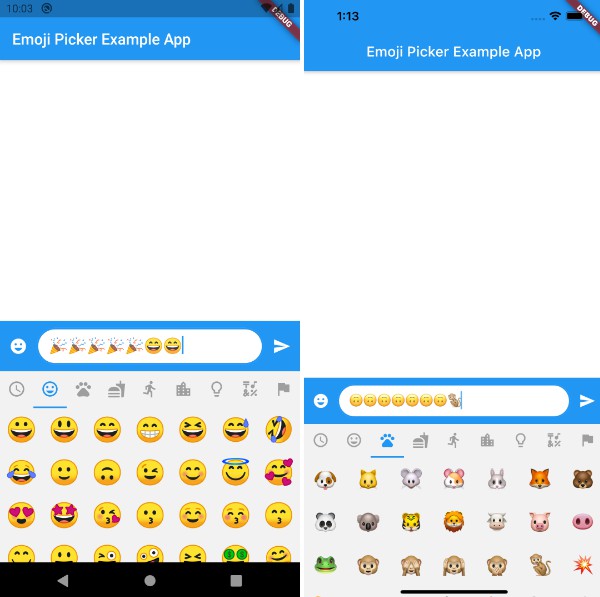
emoji_picker_flutter
Yet another Emoji Picker for Flutter.
Key features
- Lightweight Package
- Faster Loading
- Null-safety
- Completely customizable
- Material Design and Cupertino mode
- Emojis that cannot be displayed are filtered out (Android Only)
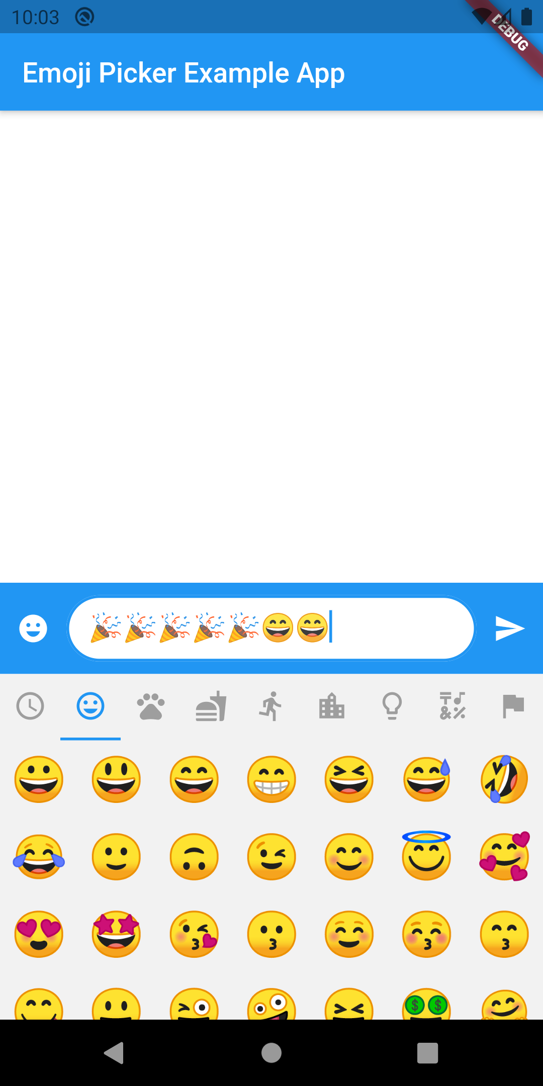
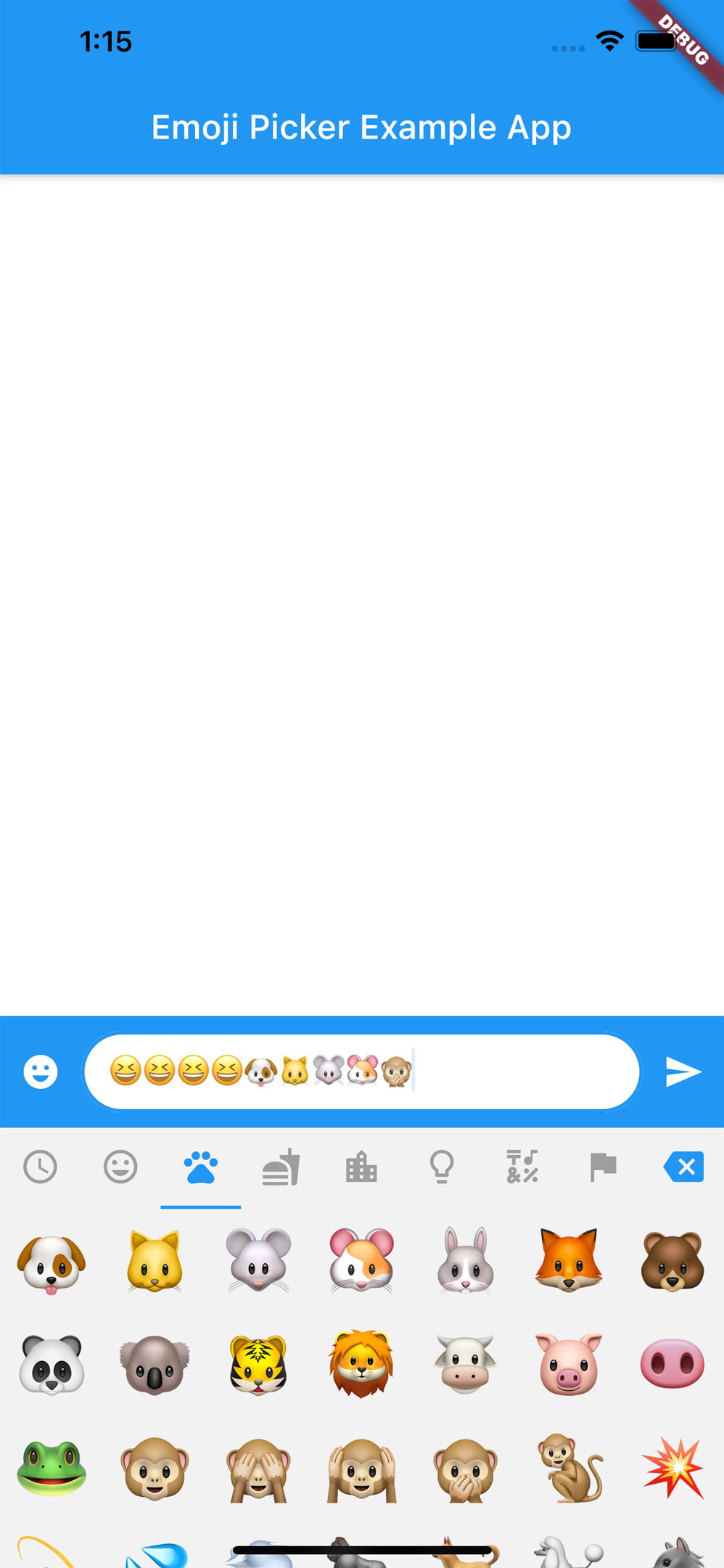
- Optional recently used emoji tab
Getting Started
EmojiPicker(
    onEmojiSelected: (category, emoji) {
        // Do something when emoji is tapped
    },
    config: Config(
        columns: 7,
        emojiSizeMax: 32.0,
        verticalSpacing: 0,
        horizontalSpacing: 0,
        initCategory: Category.RECENT,
        bgColor: Color(0xFFF2F2F2),
        indicatorColor: Colors.blue,
        iconColor: Colors.grey,
        iconColorSelected: Colors.blue,
        progressIndicatorColor: Colors.blue,
        showRecentsTab: true,
        recentsLimit: 28,
        noRecentsText: "No Recents",
        noRecentsStyle:
            const TextStyle(fontSize: 20, color: Colors.black26),
        categoryIcons: const CategoryIcons(),
        buttonMode: ButtonMode.MATERIAL
    ),
)
See the demo for more detailed sample project.
Config
| property | description | default |
|---|---|---|
| columns | Number of emojis per row | 7 |
| emojiSizeMax | Width and height the emoji will be maximal displayed | 32.0 |
| verticalSpacing | Verical spacing between emojis | ToastGravity.BOTTOM |
| horizontalSpacing | Horizontal spacing between emojis | 0 |
| initCategory | The initial Category that will be selected | Category.RECENT |
| bgColor | The background color of the Widget | Color(0xFFF2F2F2) |
| indicatorColor | The color of the category indicator | Colors.blue |
| iconColor | The color of the category icons | Colors.grey |
| iconColorSelected | The color of the category icon when selected | Colors.blue |
| progressIndicatorColor | The color of the loading indicator during initalization | Colors.blue |
| showRecentsTab | Show extra tab with recently used emoji | true |
| recentsLimit | Limit of recently used emoji that will be saved | 28 |
| noRecentsText | The text to be displayed if no recent emojis to display | "No Recents" |
| noRecentsStyle | The text style for [noRecentsText] | TextStyle(fontSize: 20, color: Colors.black26) |
| categoryIcons | Determines the icon to display for each Category. You can change icons by setting them in the constructor. | CategoryIcons() |
| buttonMode | Choose between Material and Cupertino button style | ButtonMode.MATERIAL |
Custom view
The appearance is completely customizable by setting customWidget property. If properties in Config are not enough you can inherit from EmojiPickerBuilder (recommended but not necessary) to make further adjustments.
class CustomView extends EmojiPickerBuilder {
    CustomView(Config config, EmojiViewState state) : super(config, state);

    @override
    _CustomViewState createState() => _CustomViewState();
}

class _CustomViewState extends State<CustomView> {
    @override
    Widget build(BuildContext context) {
        // TODO: implement build
        // Access widget.config and widget.state
        return Container();
    }
}

EmojiPicker(
    onEmojiSelected: (category, emoji) { /* ...*/ },
    config: Config( /* ...*/ ),
    customWidget: (config, state) => CustomView(config, state),
)