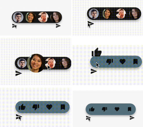
Quick Interact
Quick Interact is a Flutter package inspired by the Instagram quick send feature. It provides a simple and intuitive API to create interactive widgets with ease, allowing you to show quick interactions for any widget with various configurations.


Features
- Display quick interactions for any widget
- Customize the interaction with various configurations
- Easy to use and integrate into any Flutter project
Installation
To use this package, add quick_interact as a dependency in your pubspec.yaml file.
dependencies:
  quick_interact: ^latest_version
Or you can install it from the command line:
bash
flutter pub add quick_interact
Usage
Here is a basic example of using Quick Interact:
Widget iconQuickReaction({required QuickInteractConfig config}) {
  return Center(
    child: QuickInteractions(
      quickInteractionWidgets: const [
        Icon(Icons.thumb_up),
        Icon(Icons.thumb_down),
        Icon(Icons.favorite),
        Icon(Icons.bookmark),
      ],
      onQuickInteractCompleted: (index) {
        print('Quick interaction selected: $index');
      },
      config: config,
      child: const Icon(Icons.send),
    ),
  );
}
Example User Avatar Usage
Widget userAvatarQuickReaction({required QuickInteractConfig config}) {
  return Center(
    child: QuickInteractions(
      quickInteractionWidgets: const [
        CircleAvatar(
          radius: 15,
          backgroundImage:
          NetworkImage('https://randomuser.me/api/portraits/men/1.jpg'),
        ),
        CircleAvatar(
          radius: 15,
          backgroundImage:
          NetworkImage('https://randomuser.me/api/portraits/women/2.jpg'),
        ),
        CircleAvatar(
          radius: 15,
          backgroundImage:
          NetworkImage('https://randomuser.me/api/portraits/men/3.jpg'),
        ),
        CircleAvatar(
          radius: 15,
          backgroundImage:
          NetworkImage('https://randomuser.me/api/portraits/women/4.jpg'),
        ),
      ],
      onQuickInteractCompleted: (index) {
        print('Quick interaction selected: $index');
      },
      animate: true,
      config: QuickInteractConfig(),
      showToolTipDelay: const Duration(milliseconds: 300),
      child: const Icon(Icons.send),
    ),
  );
}
API
QuickInteractions
QuickInteractions is a widget that provides quick interaction functionality. It uses long press gesture to trigger a set of quick interaction widgets.
Attributes:
quickInteractionWidgets: The list of widgets for quick interactions.config: The configuration model for QuickInteractBuilder and QuickInteract classes.onQuickInteractCompleted: The callback function when a quick interaction is completed.child: The child widget.onTap: The callback function when the widget is tapped.toolTip: The tooltip widget.disable: A flag to disable the quick interactions.animate: A flag to enable animation for the quick interactions.showToolTipDelay: The delay before showing the tooltip.
QuickInteractConfig
QuickInteractConfig is a configuration model for QuickInteractBuilder and QuickInteract classes. It allows you to
customize the behavior and appearance of the quick interaction widgets.
Parameters
-
widgetSize: Size of the quick interaction widgets container. Default is 35. -
widgetPadding: Padding between quick interaction widgets. Default is 4. -
transitionAnimationEndOffset: Offset animations end value. Default is Offset(0, -1). -
scaleAnimationEndScale: Scale animations end value. Default is 1.5. -
cursorAnimationDuration: Duration of the cursor animation. Default is Duration(milliseconds: 300). -
containerColor: Color of the quick interaction container. No default value. -
containerHeight: Height of the quick interaction container. Default is 40. -
containerBorderRadius: Border radius of the quick interaction container. Default is BorderRadius.all( Radius.circular(30)). -
containerAnimationDuration: Duration of the container animation. Default is Duration(milliseconds: 300). -
containerAnimationCurve: Curve of the container animation. Default is Curves.linearToEaseOut. -
widgetAnimationCurve: Curve of the widget animation. Default is Curves.linearToEaseOut. -
elevation: Elevation of the quick interaction container. Default is 5. Named Constructors -
QuickInteractConfig(): Creates a new instance ofQuickInteractConfigwith default values. -
QuickInteractConfig.onlyTransition(): Creates a new instance ofQuickInteractConfigwith only transition offset -2. The default elevation is set to 5. -
QuickInteractConfig.onlyScale(): Creates a new instance ofQuickInteractConfigwith only scale 2. The default elevation is set to 5.
Examples
You can find more examples and different usages in the example main.dart.
Upcoming Features
- Displaying quick interaction in a safe area
- Providing a builder constructor to change state when active with boolean
- For more information, please refer to the API documentation.