Flutter Material Pickers
A flutter package containing commonly used material design picker dialogs. Some are new, some wrap existing or built in pickers with a common dialog and access function.
It includes:
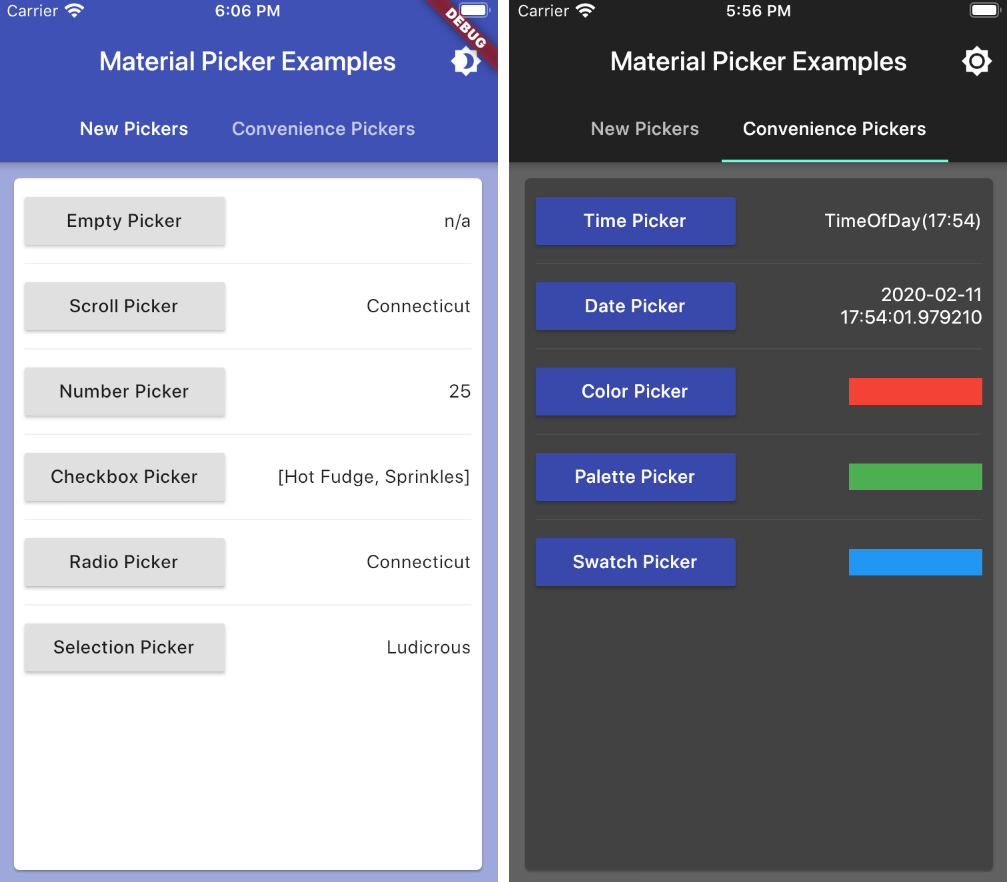
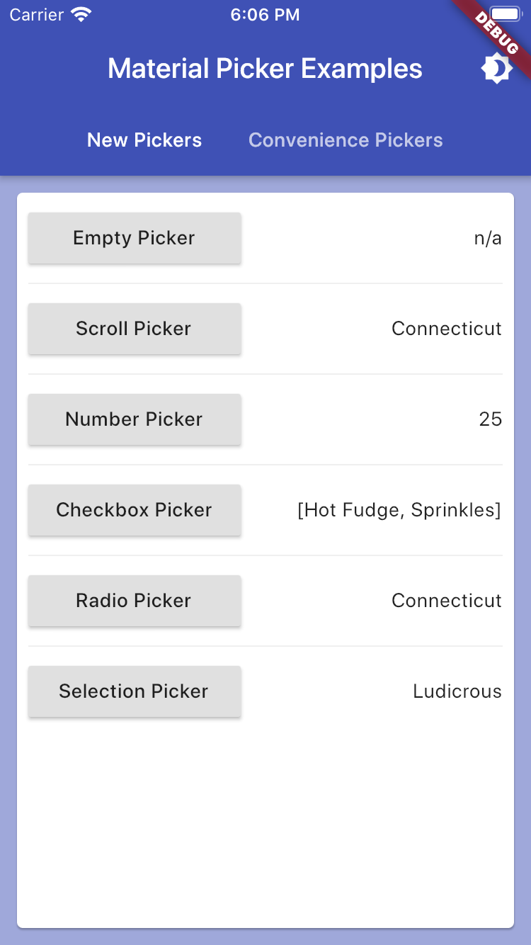
- New Pickers
- showMaterialScrollPicker:
- Allows selection of a string via a slot machine carousel
- showMaterialNumberPicker:
- Allows selection of a number via a slot machine carousel
- showMaterialRadioPicker:
- Allows selection of a single from a radio list
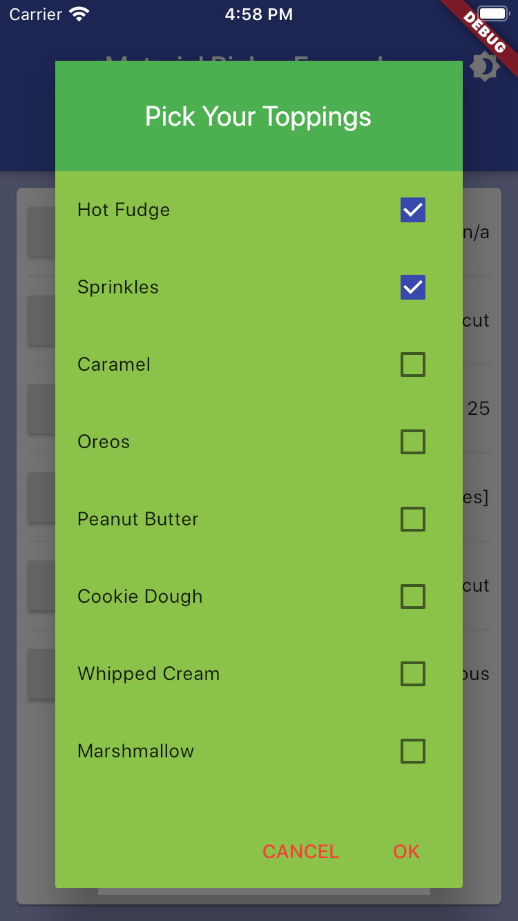
- showMaterialCheckboxPicker:
- Allows selection of many values from a checkbox list
- showMaterialSelectionPicker:
- Allows selection of a single value via an icon label list
- showMaterialScrollPicker:
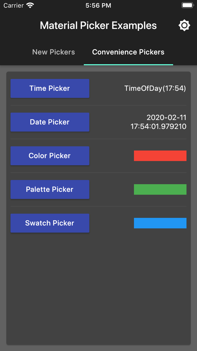
- Convenience Pickers
- showMaterialDatePicker:
- Allows selection of a date (uses the core date picker)
- showMaterialTimePicker:
- Allows selection of a time (uses the core time picker)
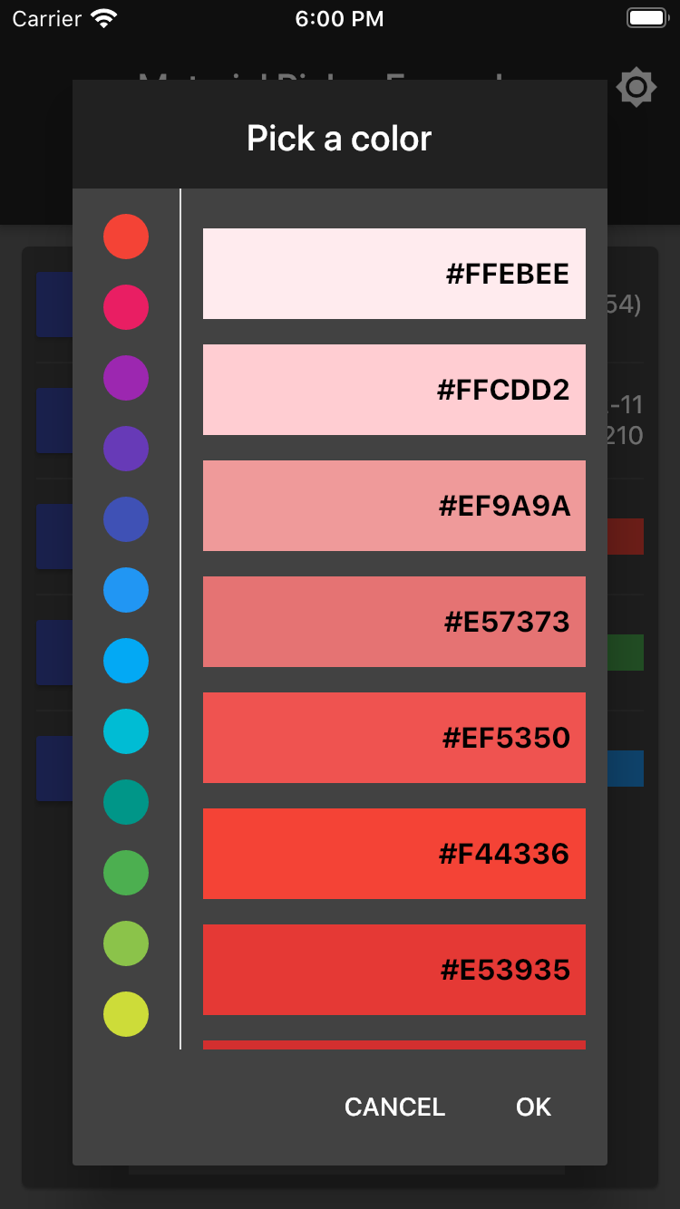
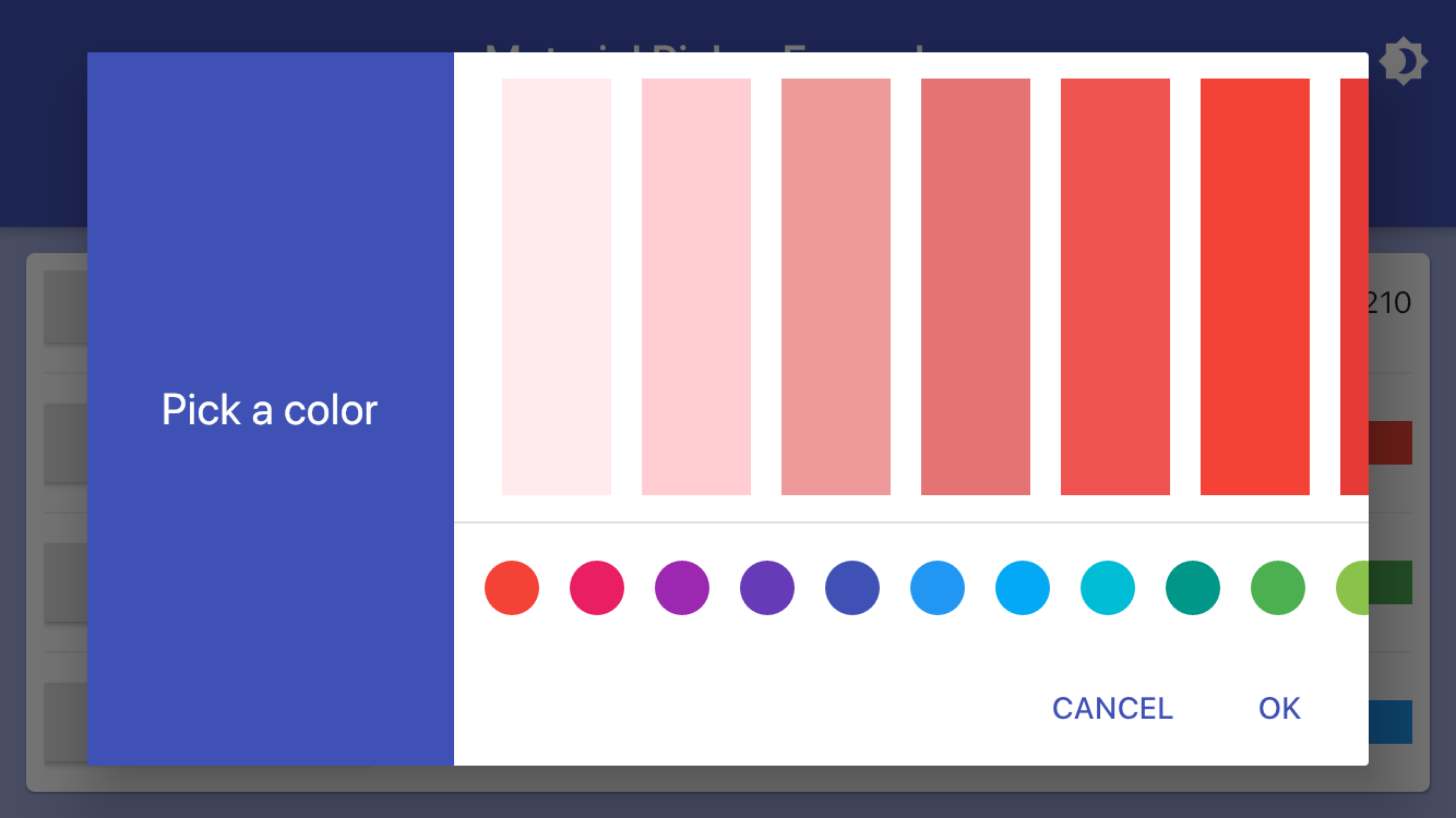
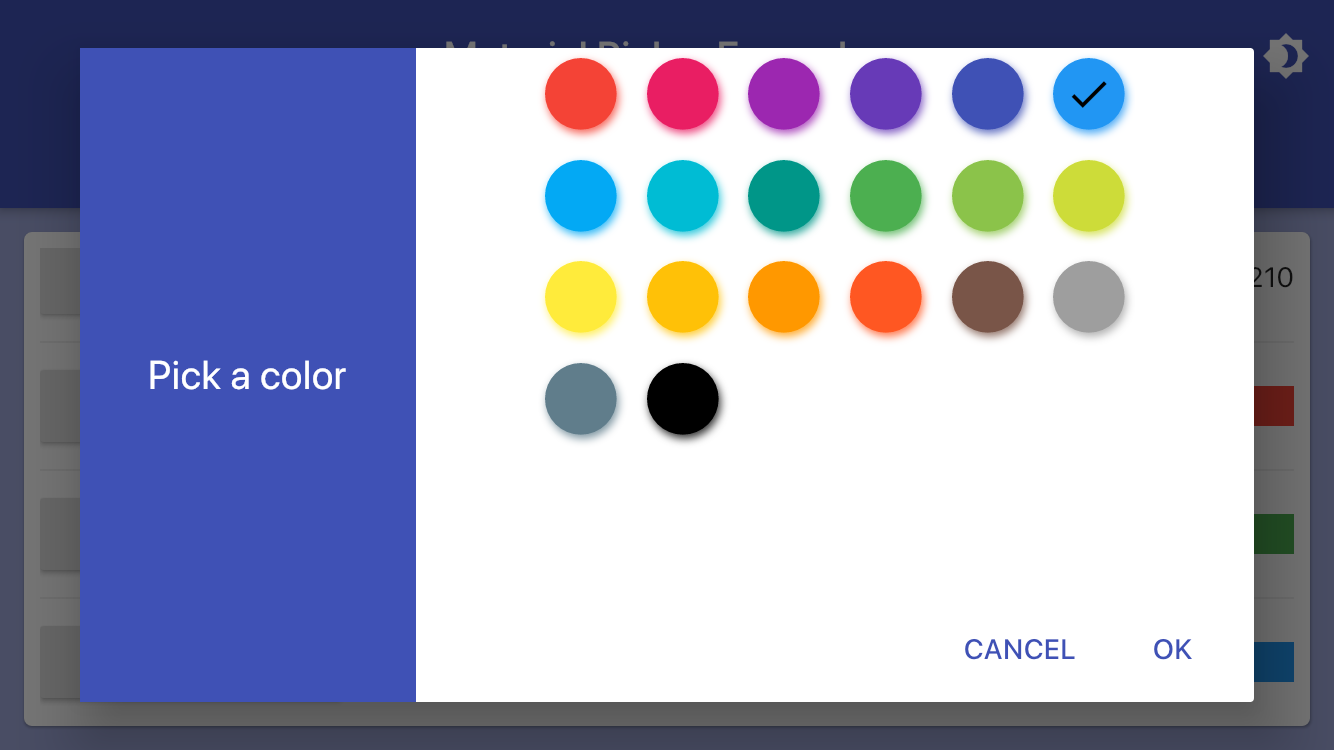
- showMaterialColorPicker:
- Allows RGB selection of a color (uses the ColorPicker of flutter_colorpicker)
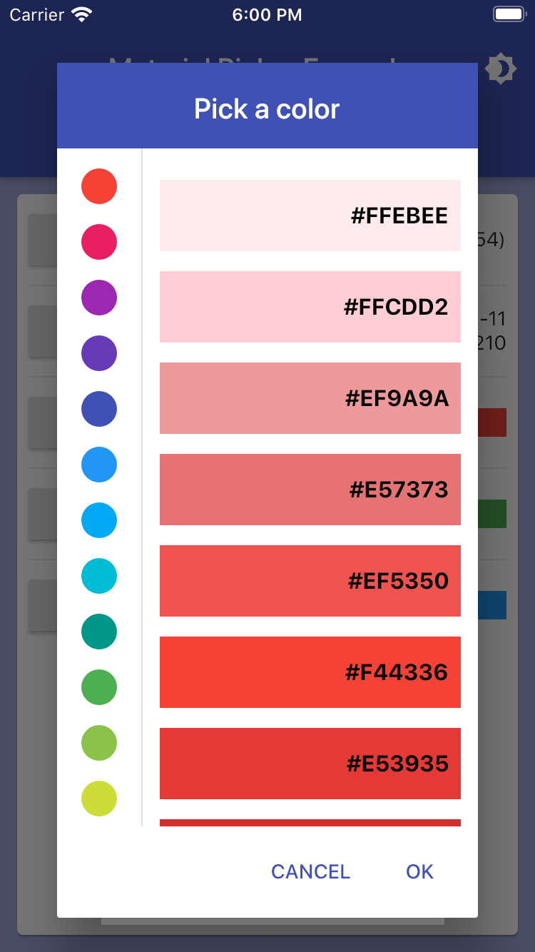
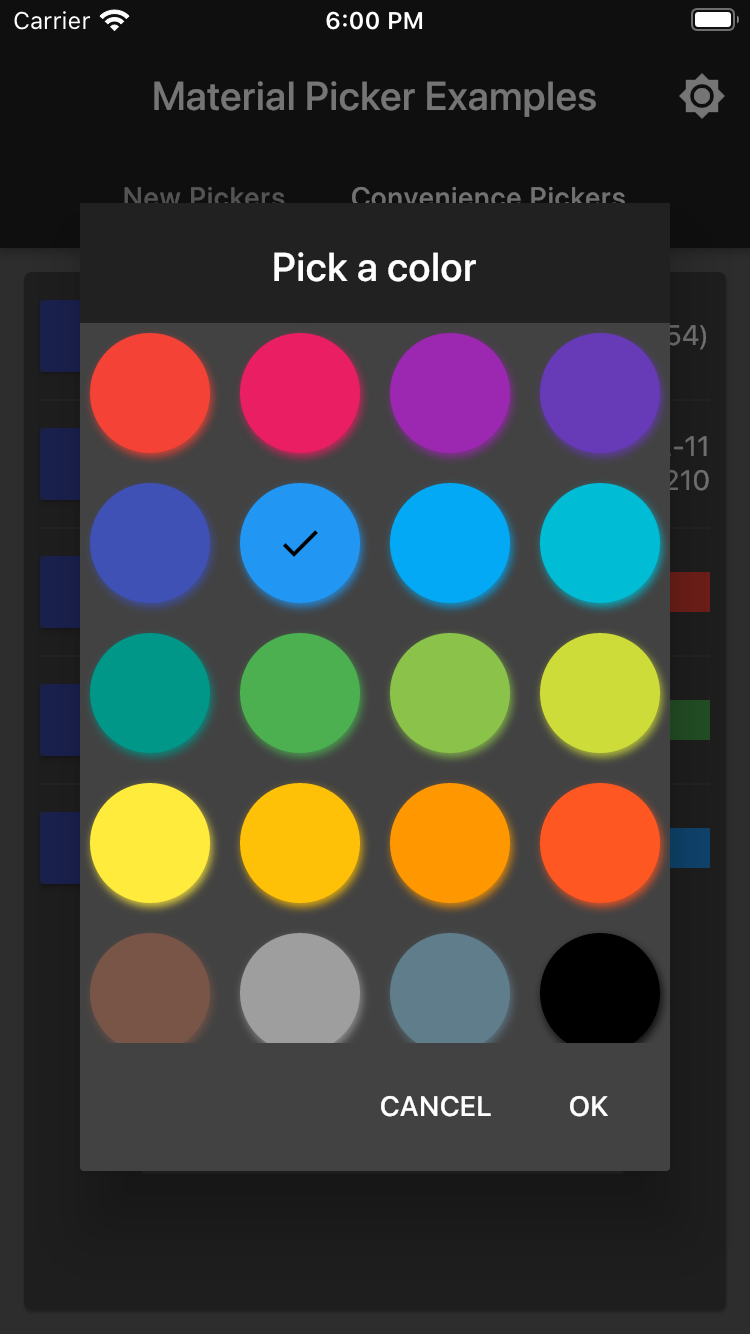
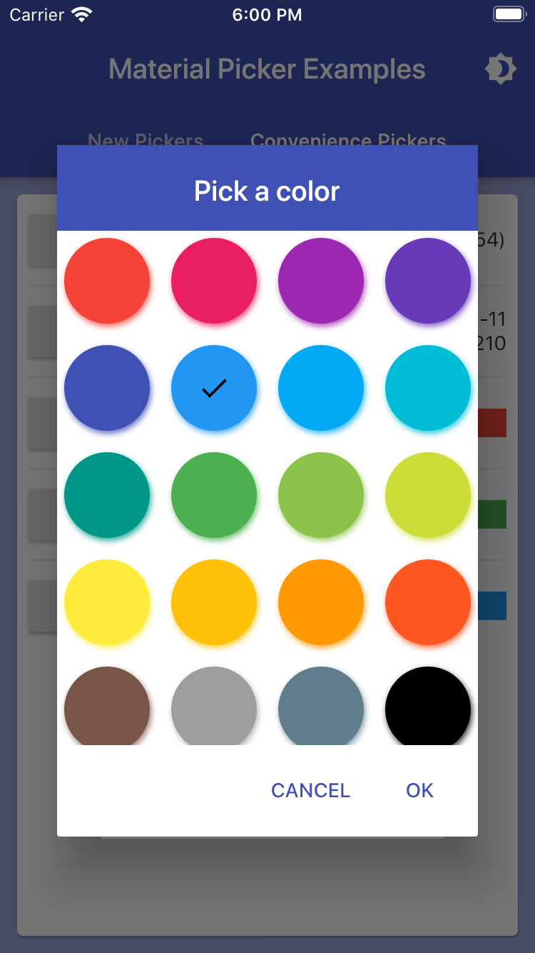
- showMaterialPalettePicker:
- Allows Material palette selection of a color (uses the MaterialPicker of flutter_colorpicker)
- showMaterialSwatchPicker:
- Allows selection of a color from swatches (uses the BlockPicker of flutter_colorpicker)
- showMaterialDatePicker:
- Dialog
- showMaterialResponsiveDialog:
- Extends Dialog by making it responsive to screen orientation changes
- showMaterialResponsiveDialog:
All helpers implement an onChange handler to return picked option(s).
Example Usage
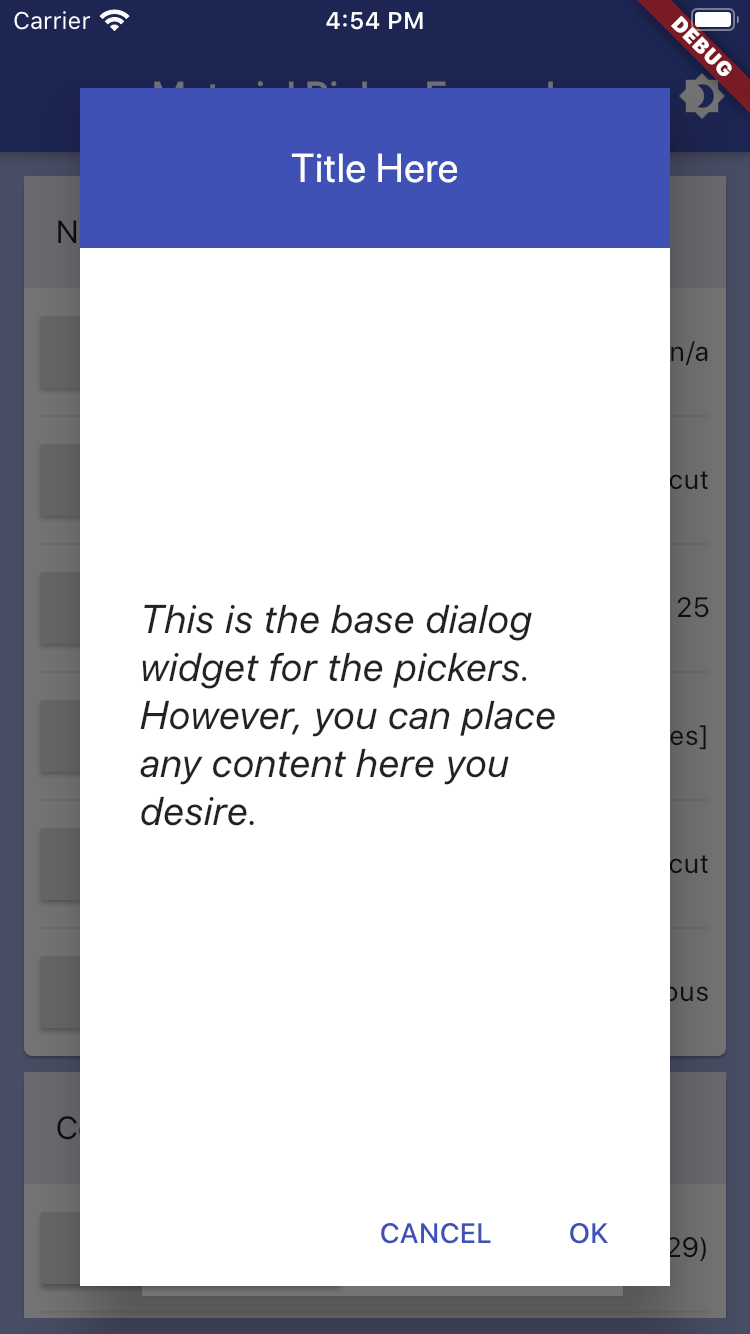
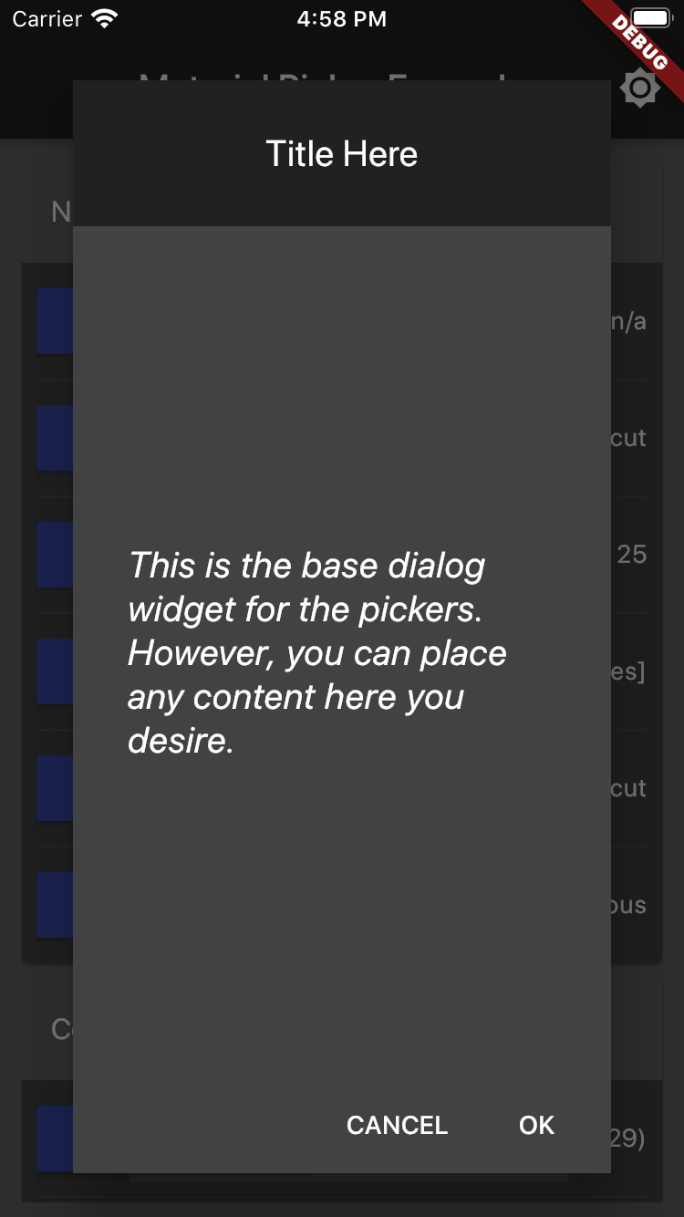
Empty Dialog Example
Although not a picker, per se, the showMaterialEmptyPicker helper displays the universal material design dialog wrapper that the pickers appear in. Using this directly, however, allows any content to be injected into the content area by passing in a custon Widget as the child. This code shows the basic structure of all the helpers:
showMaterialResponsiveDialog(
    context: context,
    child: Center(
        child: Container(
            padding: EdgeInsets.all(30.0),
            child: Text("Any content here."),
            style: TextStyle(
                fontSize: 20.0,
                fontStyle: FontStyle.italic,
            ),
        ),
    ),
);
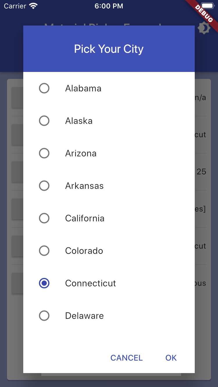
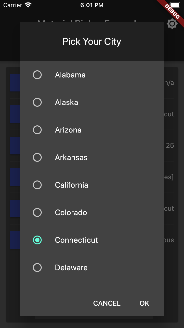
Scroll Picker Example
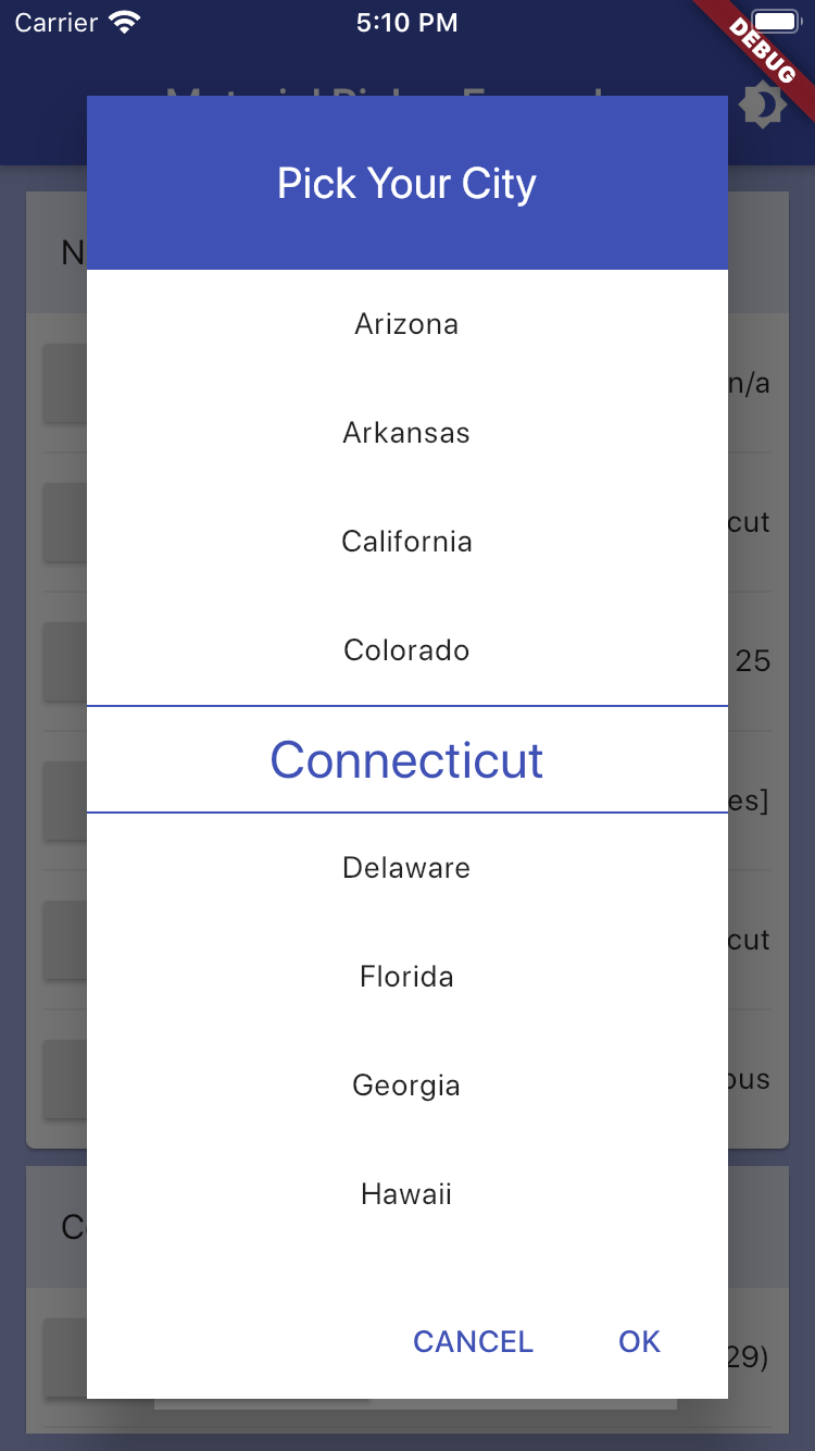
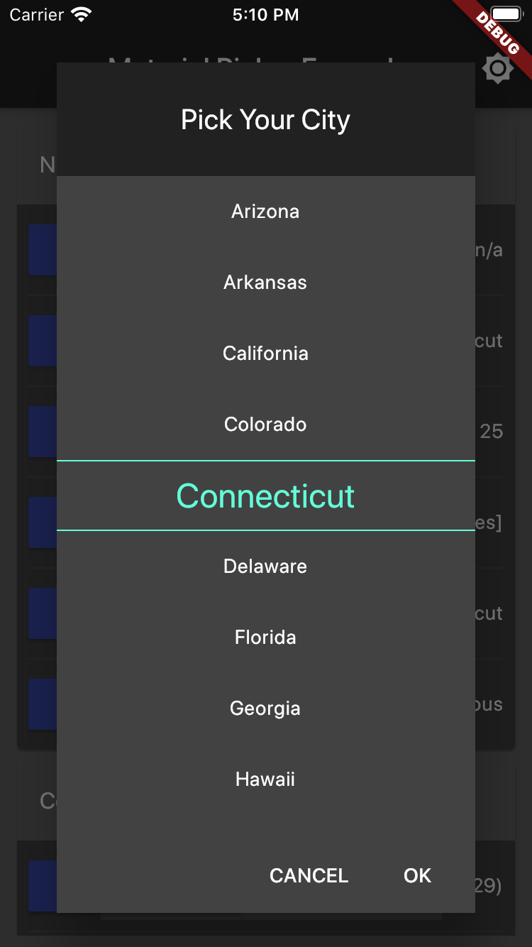

var selectedUsState = "Connecticut";

List<String> usStates = <String>[
  'Alabama',
  'Alaska',
  'Arizona',
  'Arkansas',
  'California',
  'Colorado',
  'Connecticut',
  ...
];

showMaterialScrollPicker(
    context: context,
    title: "Pick Your City",
    items: usStates,
    selectedItem: selectedUsState,
    onChanged: (value) => setState(() => selectedUsState = value),
);
Number Picker Example
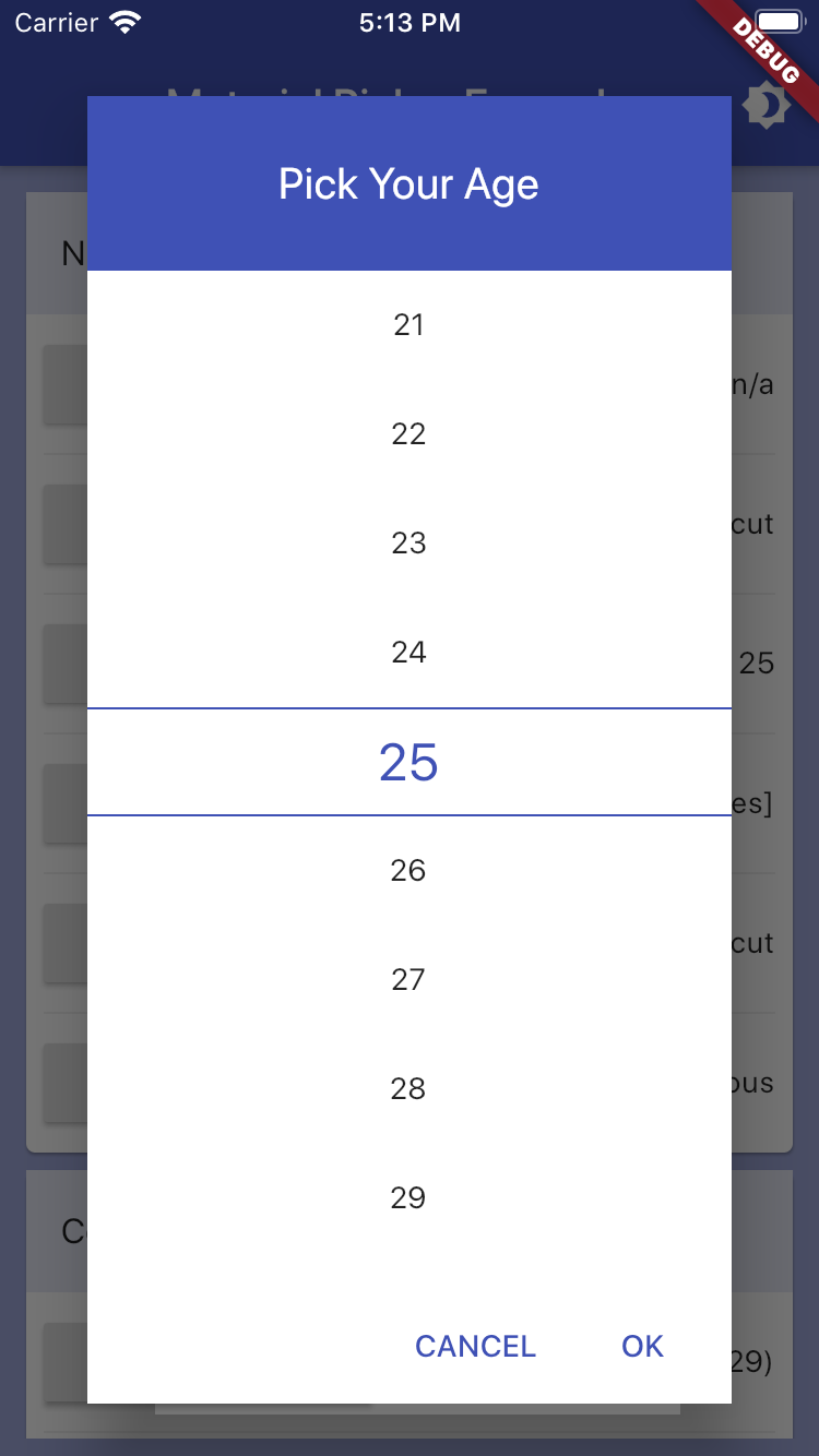
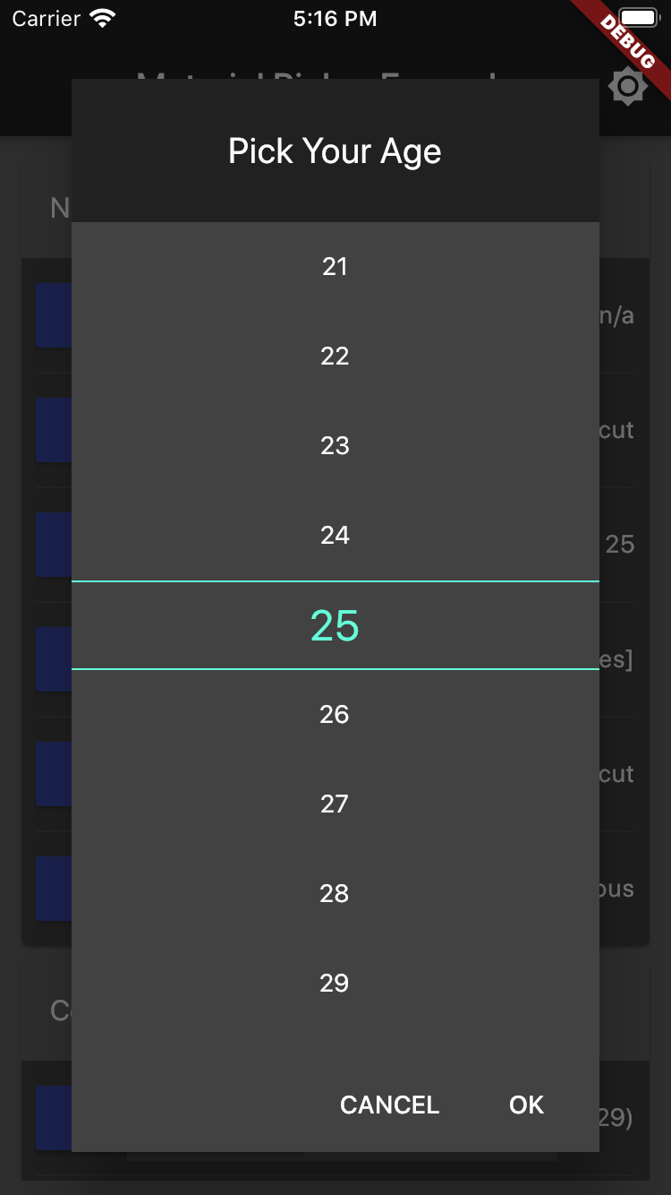
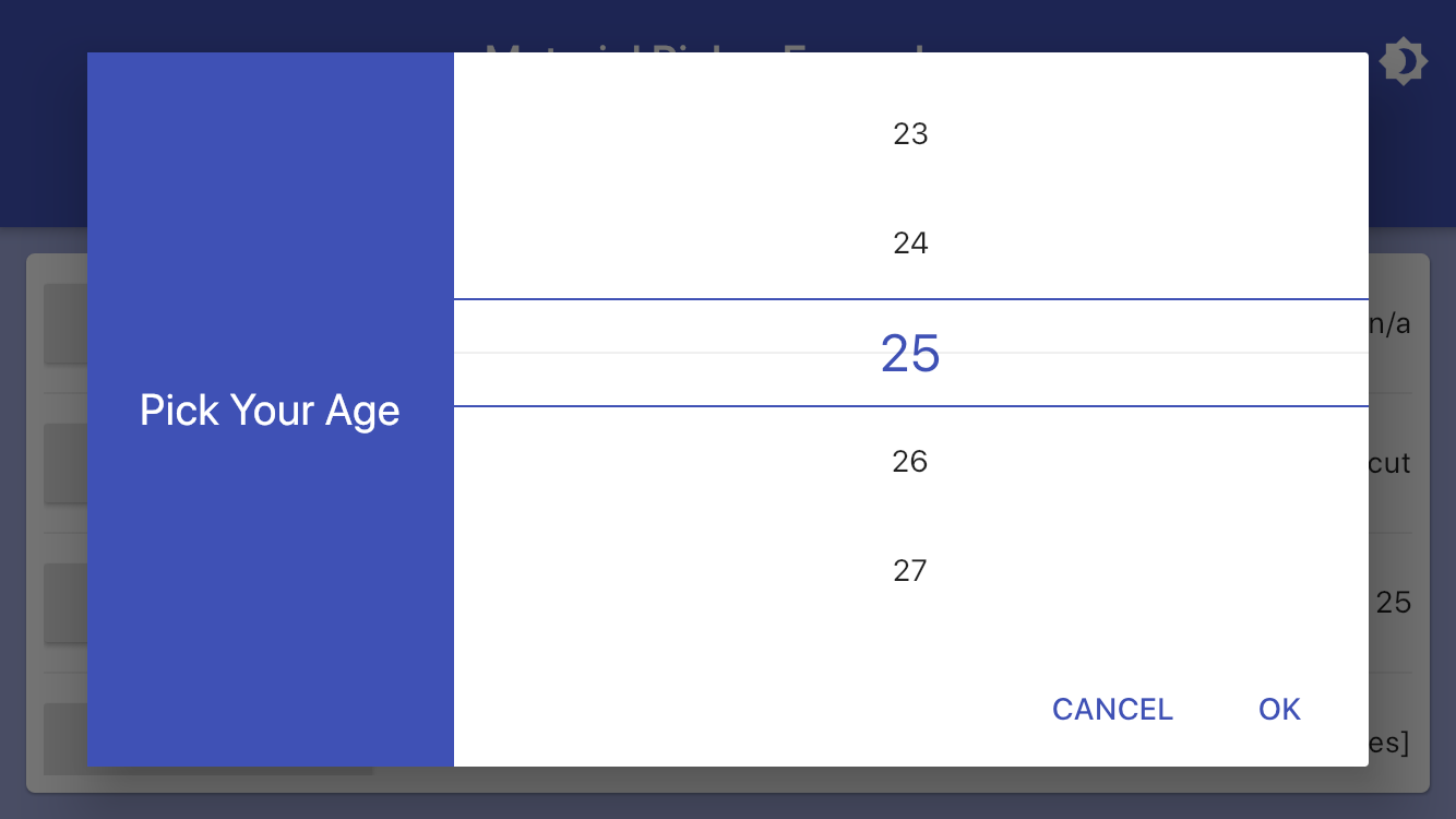
var age = 25;

showMaterialNumberPicker(
  context: context,
  title: "Pick Your Age",
  maxNumber: 100,
  minNumber: 14,
  selectedNumber: age,
  onChanged: (value) => setState(() => age = value),
);
Checkbox Picker Example
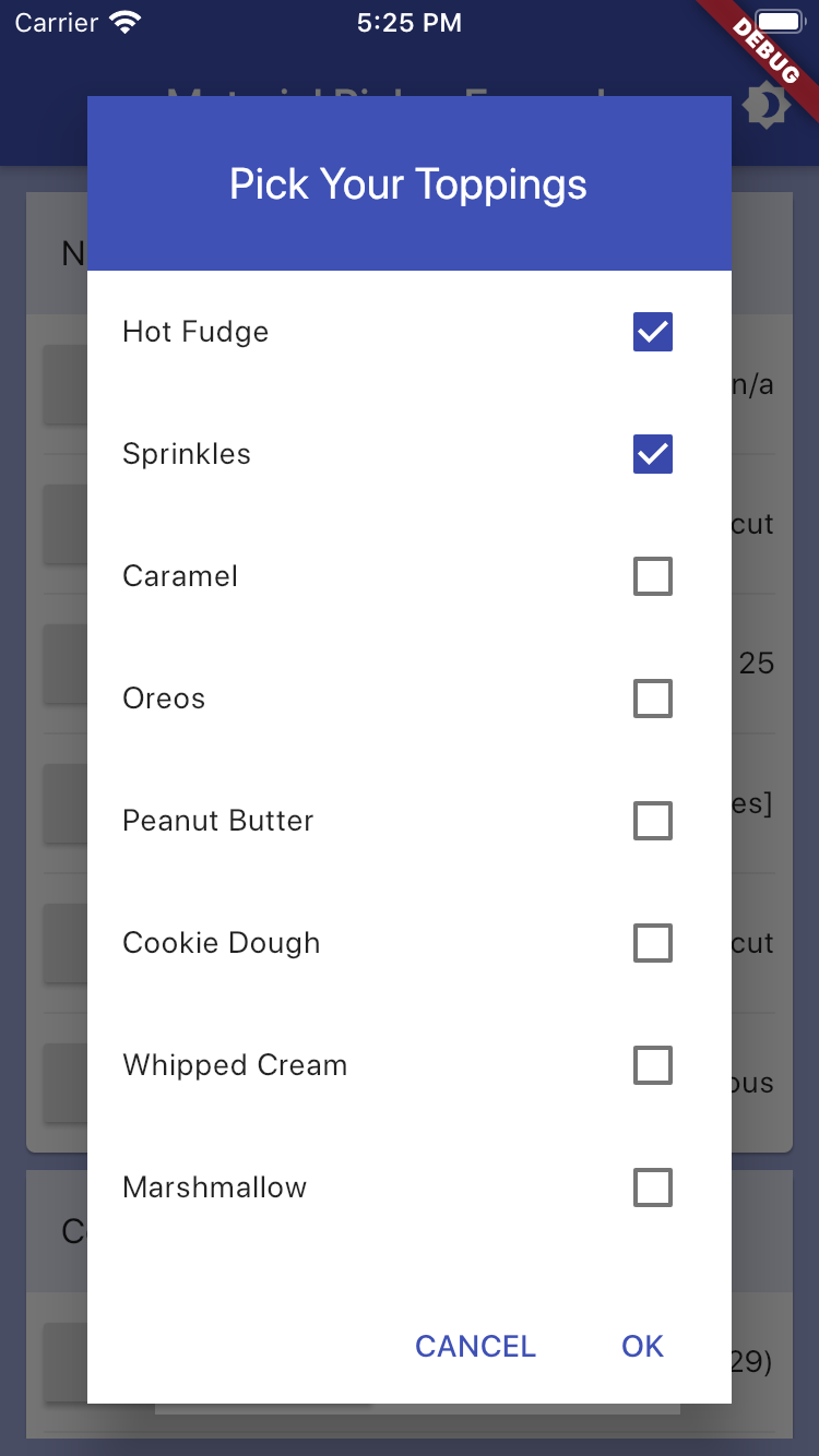
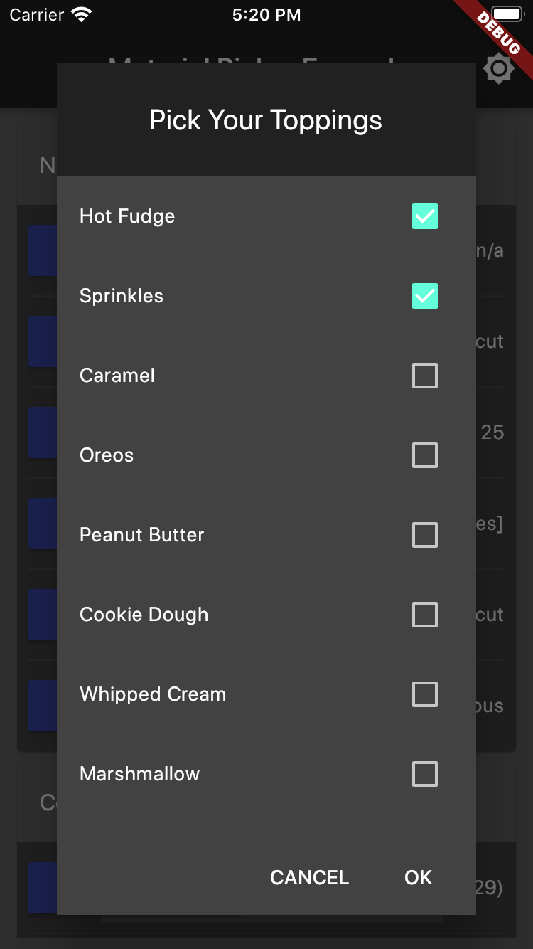
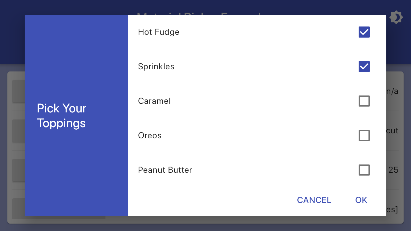
List<String> iceCreamToppings = <String>[
  'Hot Fudge',
  'Sprinkles',
  'Caramel',
  'Oreos',
  ...
];
List<String> selectedIceCreamToppings = <String>[
  'Hot Fudge',
  'Sprinkles',
];

showMaterialCheckboxPicker(
  context: context,
  title: "Pick Your Toppings",
  items: iceCreamToppings,
  selectedItems: selectedIceCreamToppings,
  onChanged: (value) => setState(() => selectedIceCreamToppings = value),
);
Radio Picker Example
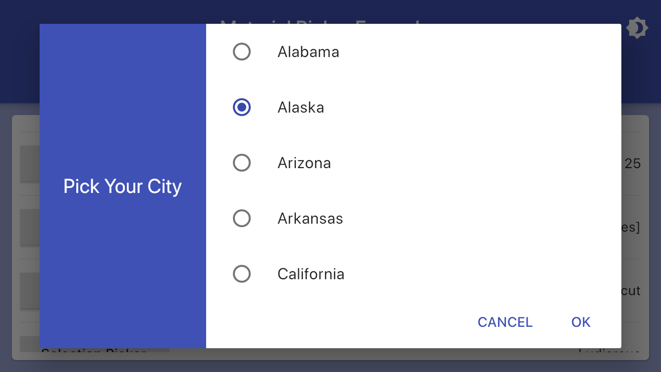
var selectedUsState = "Connecticut";

List<String> usStates = <String>[
  'Alabama',
  'Alaska',
  'Arizona',
  'Arkansas',
  'California',
  'Colorado',
  'Connecticut',
  ...
];

showMaterialRadioPicker(
  context: context,
  title: "Pick Your City",
  items: model.usStates,
  selectedItem: selectedUsState,
  onChanged: (value) => setState(() => selectedUsState = value),
);
Selection Picker Example
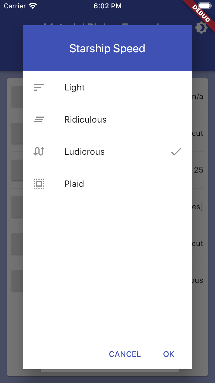
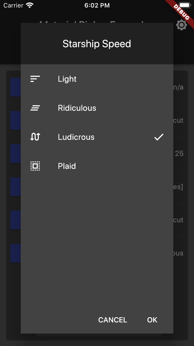
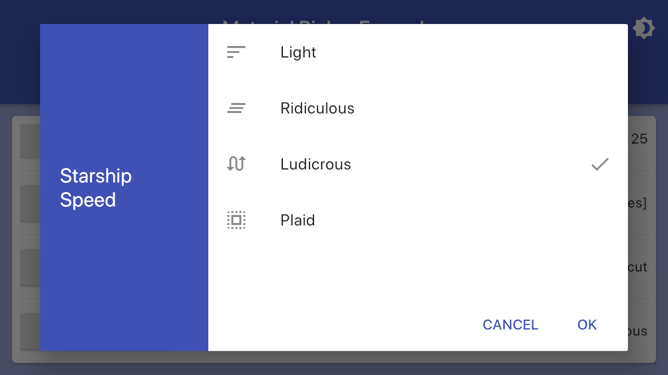
String speed = 'Ludicrous';

List<String> speedOptions = <String>[
  'Light',
  'Ridiculous',
  'Ludicrous',
  'Plaid',
];

List<Icon> speedIcons = <Icon>[
  Icon(Icons.sort),
  Icon(Icons.clear_all),
  Icon(Icons.swap_calls),
  Icon(Icons.select_all),
];

showMaterialSelectionPicker(
  context: context,
  title: "Starship Speed",
  items: speedOptions,
  selectedItem: speed,
  icons: speedIcons,
  onChanged: (value) => setState(() => speed = value),
);
Time Picker Example
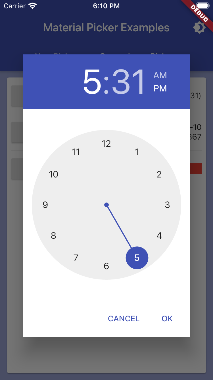
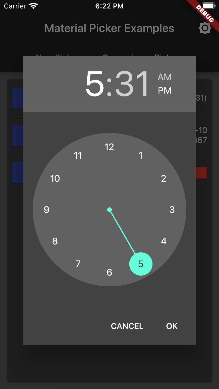
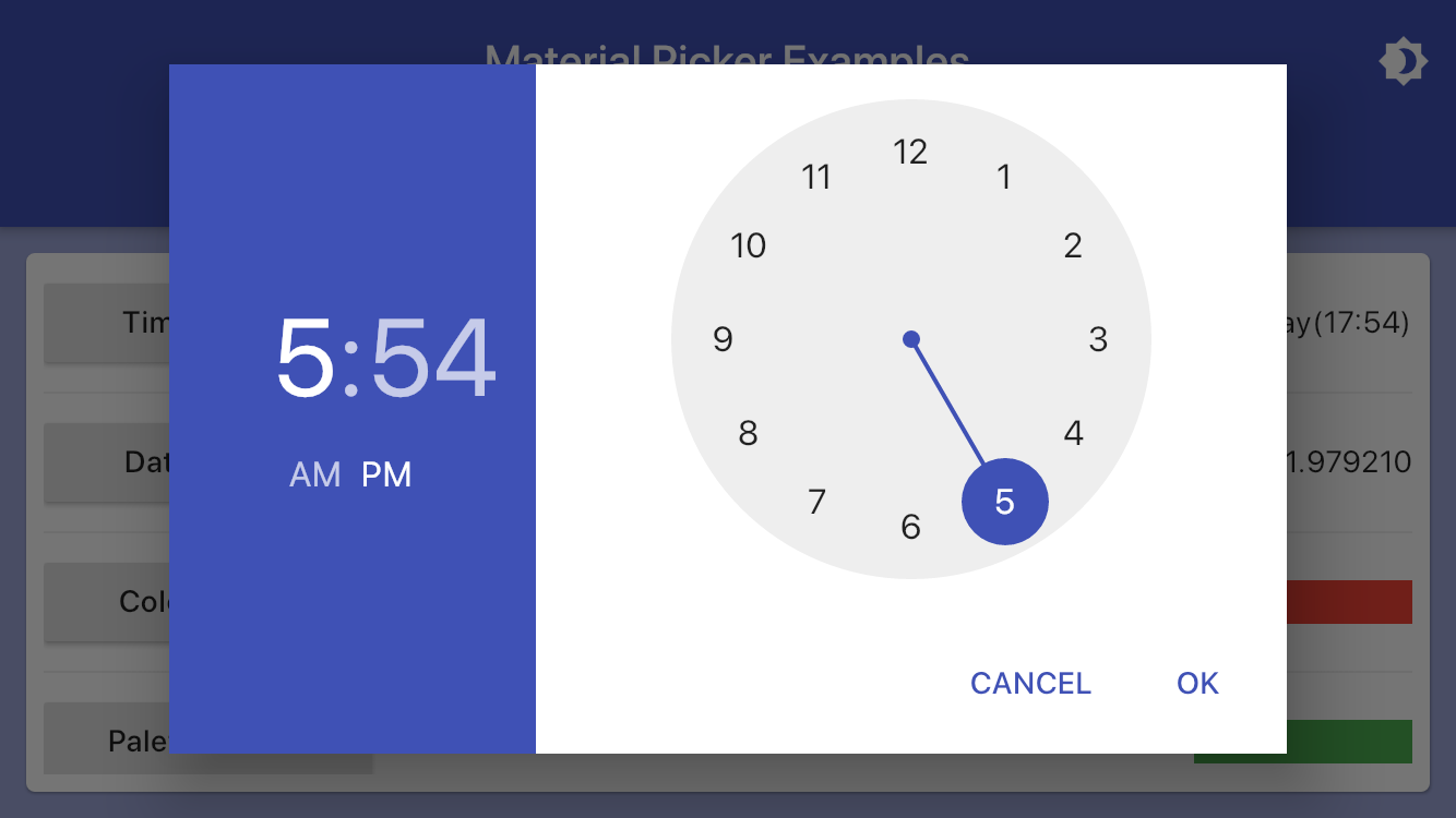
var time = TimeOfDay.now();

showMaterialTimePicker(
  context: context,
  selectedTime: time,
  onChanged: (value) => setState(() => time = value),
);
Date Picker Example
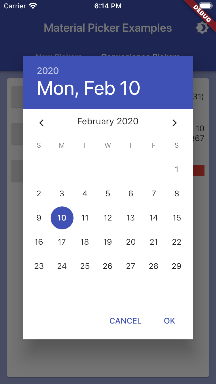
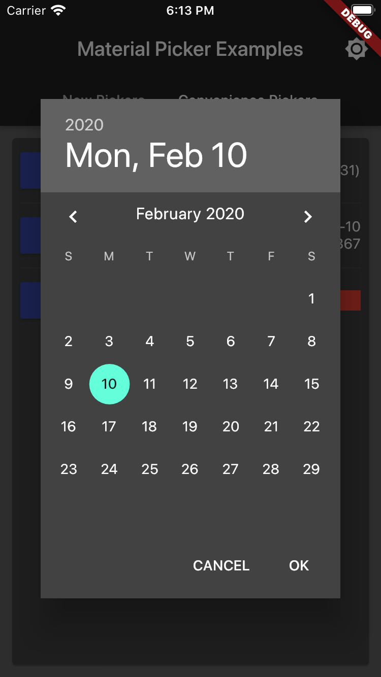
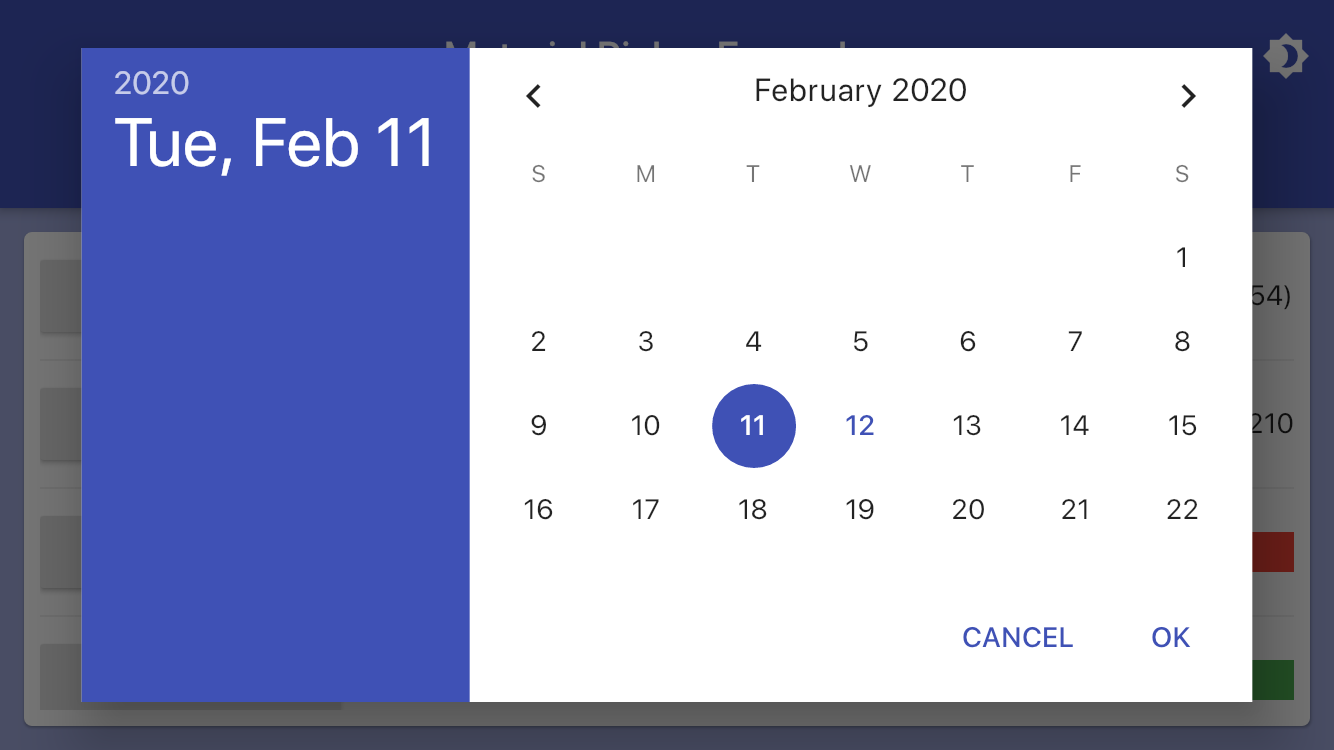
var date = DateTime.now();

showMaterialDatePicker(
  context: context,
  selectedDate: date,
  onChanged: (value) => setState(() => date = value),
);
Color Picker Example
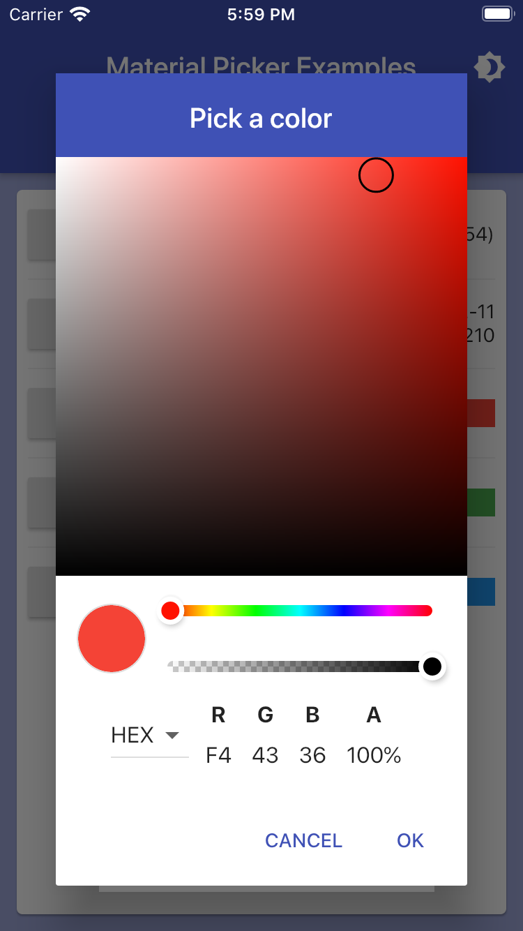
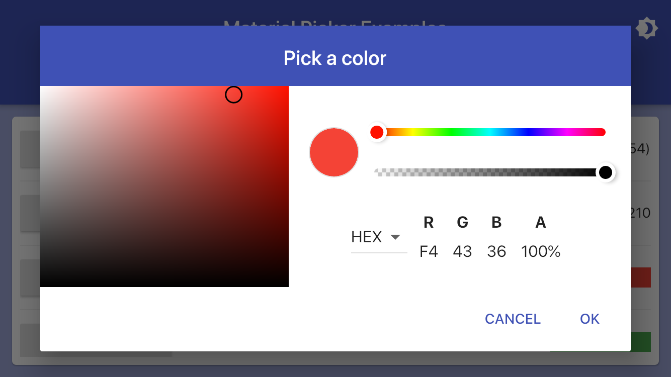
Color color = Colors.red;

showMaterialColorPicker(
  context: context,
  selectedColor: color,
  onChanged: (value) => setState(() => color = value),
);
Palette Picker Example
Color palette = Colors.green;

showMaterialPalettePicker(
  context: context,
  selectedColor: palette,
  onChanged: (value) => setState(() => palette = value),
);
Swatch Picker Example
Color swatch = Colors.blue;

showMaterialSwatchPicker(
  context: context,
  selectedColor: swatch,
  onChanged: (value) => setState(() => swatch = value),
);
Theming
It is highly recommended you use Flutter's built in theme styling with primarySwatch to automatically style all controls across your entire application.
ThemeData(
  primarySwatch: Colors.indigo,
)
If you desire to override the color for a given control, here is how to customize the theme:
var theme = ThemeData();
theme = theme.copyWith(
  primaryColor: Colors.green, // background color of the header area
  accentColor: Colors.black, // color of selected controls and button bar text
  dialogBackgroundColor: Colors.green[300], // background color of the entire dialog
  primaryTextTheme: theme.primaryTextTheme.copyWith(
    title: theme.primaryTextTheme.title.copyWith(
      color: Colors.lightGreen[50], // text color of the header area
    ),
  ),
  textTheme: theme.textTheme.copyWith(
    body1: theme.textTheme.body1.copyWith(
      color: Colors.green[900], // text color of dialog text
    ),
    button: theme.textTheme.button.copyWith(
      color: Colors.lightGreen[50], // text color of the action bar buttons
    ),
  ),
);
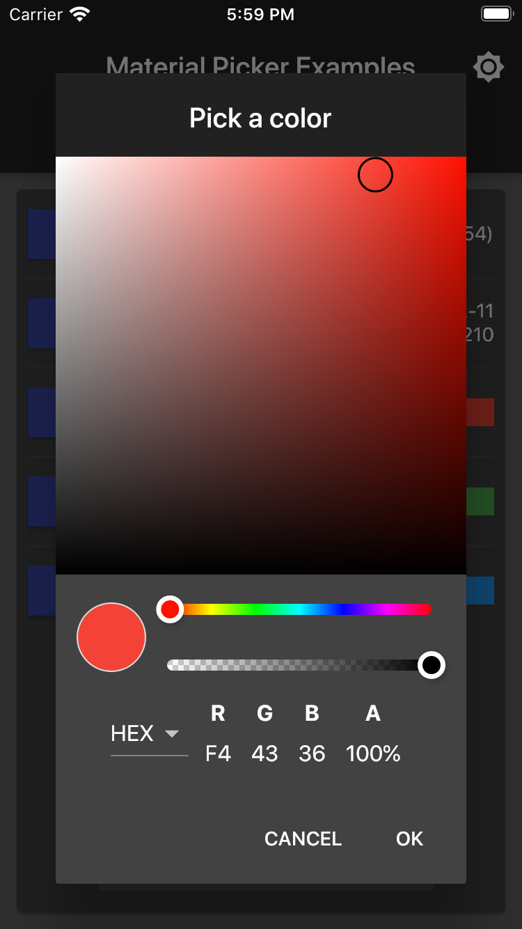
The example app demonstrates switching between light and dark themes globally.
However, if for some reason you want to change colors in an individual dialog, several parameters are exposed to allow this:
showMaterialResponsiveDialog(
    context: context,
    headerColor: Colors.green, // background color of the header area
    headerTextColor: Colors.white, // text fcolor of the header
    backgroundColor: Colors.lightGreen, // background color of the entire dialog
    buttonTextColor: Colors.red, // text color of the action bar buttons
    child: Text("Custom dialog colors"),
);
Dependencies
This widget set relies on these external third-party components:
Changelog
Please see the Changelog page to know what's recently changed.
Authors
- Jeff Jorczak [email protected]