Card Settings
A flutter package for building card based settings forms. This includes a library of pre-built form field widgets. The style is a bit like a cross between the cupertino settings screen and material design; The idea is it should be usable and intutive on both iOS and Android.
This package consists of a CardSettings layout wrapper and a series of form field options including:
- Text Fields
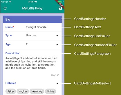
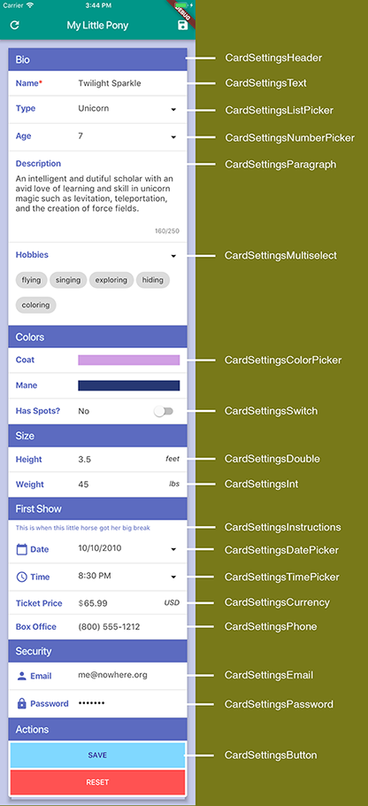
- CardSettingsText - Basic text field
- CardSettingsParagraph - Multiline text field with a counter
- CardSettingsEmail - A text field pre-configured for email input
- CardSettingsPassword - A text field pre-configured for passwords
- CardSettingsPhone - A masked phone entry field (US style currently)
- Numeric Fields
- CardSettingsDouble - Field for double precision numbers
- CardSettingsInt - Field for integer numbers
- CardSettingsCurrency - Field for currency entry
- CardSettingsSwitch - Field for boolean state
- Pickers
- CardSettingsListPicker - Picker list of arbitrary options
- CardSettingsNumberPicker - Picker list of numbers in a given range
- CardSettingsColorPicker - RGB Color Picker
- CardSettingsDatePicker - Material Design Date Picker
- CardSettingsTimePicker - Material Design Time Picker
- Selection
- CardSettingsMultiselect - Select from a list of available options
- Informational Sections
- CardSettingsHeader - A control to put a header between form sections
- CardSettingsInstructions - Informational read-only text
- Actions
- CardSettingsButton - Actions buttons for the form
All fields support validate, onChange, onSaved, autovalidate, and visible.
The package also includes these additonal items:
- CardSettingsField - The base layout widget. You can use this to build custom fields
- Converters - a set of utility functions to assist in converting data into and out of the fields
Simple Example
All fields in this package are compatible with the standard Flutter Form widget. Simply wrap the CardSettings control in a form and use it as you normally would with the form functionality.
  String title = "Spheria";
  String author = "Cody Leet";
  String url = "http://www.codyleet.com/spheria"

  final GlobalKey<FormState> _formKey = GlobalKey<FormState>();

  @override
  Widget build(BuildContext context) {
      body: Form(
        key: _formKey,
        child: CardSettings(
          children: <Widget>[
            CardSettingsHeader(label: 'Favorite Book'),
            CardSettingsText(
              label: 'Title',
              initialValue: title,
              validator: (value) {
                if (value == null || value.isEmpty) return 'Title is required.';
              },
              onSaved: (value) => title = value,
            ),
            CardSettingsText(
              label: 'URL',
              initialValue: url,
              validator: (value) {
                if (!value.startsWith('http:')) return 'Must be a valid website.';
              },
              onSaved: (value) => url = value,
            ),
          ],
        ),
      ),
    );
  }
See the full demo example here.
Theming
The widgets support the material design theme. This example shows what global theme values to set to determine how the various elements appear.
class MyApp extends StatelessWidget {

  @override
  Widget build(BuildContext context) {
    return new MaterialApp(
      title: 'Card Settings Example',
      home: new HomePage(),
      theme: ThemeData(
        accentColor: Colors.indigo[400], // used for card headers
        cardColor: Colors.white, // used for field backgrounds
        backgroundColor: Colors.indigo[100], // color outside the card
        primaryColor: Colors.teal, // color of page header
        buttonColor: Colors.lightBlueAccent[100], // background color of buttons
        textTheme: TextTheme(
          button: TextStyle(color: Colors.deepPurple[900]), // style of button text
          subhead: TextStyle(color: Colors.deepOrange[900]), // style of input text
        ),
      ),
    );
  }
}
Or if you want to apply a different theme to the CardSettings hierarchy only, you can wrap it in a Theme widget like so:
  Theme(
    data: Theme.of(context).copyWith(
      primaryTextTheme: TextTheme(
        title: TextStyle(color: Colors.lightBlue[50]), // style for headers
      ),
      inputDecorationTheme: InputDecorationTheme(
        labelStyle: TextStyle(color: Colors.deepPurple), // style for labels
      ),
    ),
    child: CardSettings(
      ...
    ),
  )
Global Properties
The CardSettings widget implements a few global settings that all child fields can inherit. Currently it supports only label customization.
Labels
You can control how the labels are rendered with four properties:
  CardSettings(
    labelAlign: TextAlign.right, // change the label alignment
    labelSuffix: ':', // add an optional tag after the label
    labelPadding: 10.0, // control the spacing between the label and the content
    contentAlign: TextAlign.left, // alignment of the entry widgets
    icon: Icon(Icons.person), // puts and option icon to the left of the label
    requiredIndicator: Text('*', style: TextStyle(color: Colors.red)), // puts an optional indicator to the right of the label
  )
The labelAlign and contentAlign properties are also available on each field, so you can override the global setting for individual fields.
  CardSettingsText(
    label: 'Last Name',
    labelAlign: TextAlign.left,
    contentAlign: TextAlign.right,
  )
Dynamic Visibility
Each field implements a visible property that you can use to control the visibility based on the value of other fields. In this example, the switch field controls the visibility of the text field:
  bool _ateOut = false;

  CardSettingsSwitch(
    label: 'Ate out?',
    initialValue: _ateOut,
    onChanged: (value) => setState(() => _ateOut = value),
  ),

  CardSettingsText(
    label: 'Restaurant',
    visible: _ateOut,
  ),
Masking
The CardSettingsText widget has an inputMask property that forces entered text to conform to a given pattern. This is built upon the flutter_masked_text
package and as such masks are formatted with the following characters:
- 0: accept numbers
- A: accept letters
- @: accept numbers and letters
- *: accept any character
So for example, phone number would be '(000) 000-0000'.
Note: CardSettingsPhone is a convenience widget that is pre-configured to use this pattern.
Caution: flutter_masked_text is a controller and as such, you will not be able to use an inputMask and a custom controller at the same time. This might be rectified in the future.
Orientation
This suite allows for orientation switching. To configure this, build different layouts depending on the orientation provided by MediaQuery.
You might want to have different fields in each layout, or a different field order. So that Flutter doesn't get confused tracking state under this circumstance, you must provide a unique state key for each individual field, using the same key in each layout.
@override
Widget build(BuildContext context) {

  final GlobalKey<FormState> _emailKey = GlobalKey<FormState>();
  var orientation = MediaQuery.of(context).orientation;

  return Form
    key: _formKey,(
    child: (orientation == Orientation.portraitUp)
        ? CardSettings(children: <Widget>[
              // Portrait layout here
              CardSettingsEmail(key: _emailKey)
            ])
        : CardSettings(children: <Widget>[
              // Landscape layout here
              CardSettingsEmail(key: _emailKey)
            ]);
    },
  );
}
You may have multiple fields on the same row in landscape orientation. This normally requires the use of container widgets to provide the layout inside the row. Instead, you can use the CardFieldLayout helper widget to streamline this. It will by default make it's children equally spaced, but you can provide an array of flex values to control the relative sizes.
// equally spaced example
CardSettings(
  children: <Widget>[
    CardFieldLayout(children: <Widget>[
      CardSettingsEmail(),
      CardSettingsPassword(),
    ]),
  ],
);
// relative width example
CardSettings(
  children: <Widget>[
    CardFieldLayout_FractionallySpaced(
      children: <Widget>[
        CardSettingsEmail(),
        CardSettingsPassword(),
      ],
      flexValues: [2, 1], // 66% and 33% widths
    ),
  ],
);
Custom Fields
The CardSettingsField is the basis of all other fields and can be used to build unique fields outside of this library. Its purpose is to govern layout with consistent decorations. The best way to make a custom field is to inherit from FormField<T>, which will manage the state of your field. The cleanest example of this is the CardSettingsSwitch widget. All you have to do is provide your custom widgets in the content property.