progress_button
A Material Flutter Button that supports progress and error visuals.
Getting Started
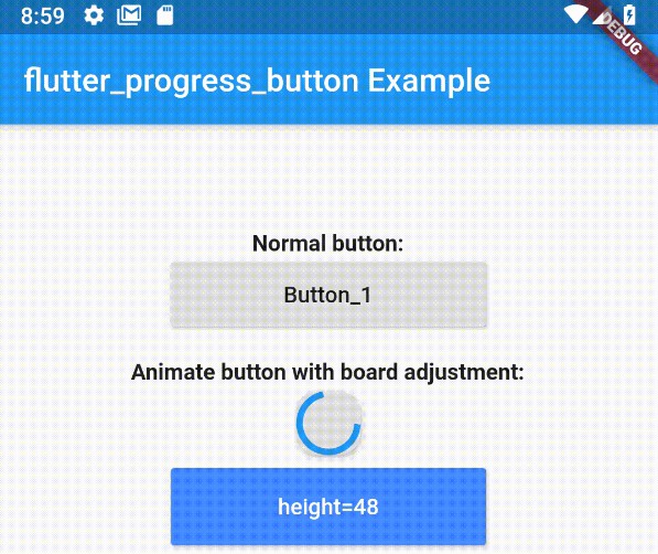
ProgressButton is designed to be easy to use and customizable. Without going into much detail, you can see a demo and example code below. What more do you need from a single class package??
- First, add dependency to your pubspec.yaml
dependencies:
  progress_button: ^0.0.1
- Second, add progress button to your widget tree
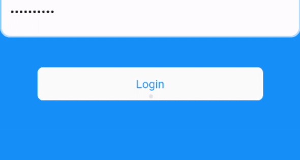
val progressButton = ProgressButton(
    onPressed: VoidCallback,
    text: "Login",
    buttonState: ButtonState.normal,
    pBackgroundColor: Theme.of(context).primaryColor,
    pTextColor: Theme.of(context).primaryTextTheme.button.color,
    pProgressColor: Theme.of(context).primaryColor,
);
Of course you can change the buttonState anytime you want by using StreamBuilders and such. ProgressButton reacts accordingly to changes.