Flutter DropdownTextfield
A DropdownTextfield is a material design TextField. The DropDownButton is a widget that we can use to select one unique value or multivalue from a set of values.
Key Features
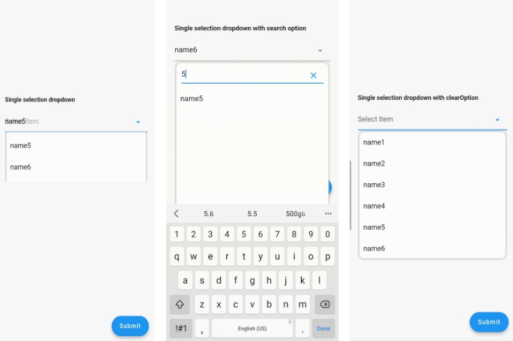
- Searchable dropdown
- Single & multi selection
- Material dropdown
- Easy customizable UI
- Easy implementation into statelessWidget
- ToolTip dialogue for multi selection dropdown item.
Example:
| Single dropdown | Single dropdown with search option | Single dropdown with clear option |
 |
 |
 |
| Multiple dropdown | Multiple dropdown with all selected item |
 |
 |
controller
single and multiple dropdown controller It must be type of SingleValueDropDownController or MultiValueDropDownController.
dropdownRadius
define the radius of dropdown List ,default value is 12
initialValue
initial value ,if it is null or not exist in dropDownList then it will not display value.
dropDownList
dropDownList,List of dropdown values List
onChanged
it will listen and return value when item selected from dropdown list for single Selection Dropdown it will return single DropDownValueModel object, and for multi Selection Dropdown ,it will return list of DropDownValueModel object,
textFieldDecoration
override default textfield decoration
dropDownIconProperty
customize dropdown icon size and color
isEnabled
isEnabled=false to disable textfield,default value true
enableSearch
enableSearch=true to enable search option in dropdown,as of now this feature enabled only for single selection dropdown
displayCompleteItem
set displayCompleteItem=true, if you want show complete list of selected item in textfield else it will display like “number_of_item item selected”
dropDownItemCount
Maximum number of dropdown item to display,default value is 6
searchKeyboardType
override default search keyboard type,only applicable if enableSearch=true,
searchAutofocus
searchAutofocus=true to autofocus search textfield,only applicable if enableSearch=true, default value is false
searchShowCursor
searchShowCursor=false to hide cursor from search textfield,only applicable if enableSearch=true,
clearOption
clearOption=false to hide clear suffix icon button from textfield.
clearIconProperty
customize Clear icon size and color
listSpace
space between textfield and list ,default value is 0
listPadding
dropdown List item padding
submitButtonText
multi dropdown submit button text
submitButtonColor
multi dropdown submit button color
submitButtonTextStyle
multi dropdown submit button text style
listTextStyle
dropdown list item text style
checkBoxProperty
customize multiple checkbox property
dropdownColor
customize the dropdown overlay color