Draggable Home
A draggable Flutter widget that makes implementing a Sliding up and fully-stretchable much easier! Based on the Scaffold and Sliver.
Usage
Make sure to check out examples for more details.
Installation
Add the following line to pubspec.yaml:
dependencies:
  draggable_home: ^1.0.0
Basic setup
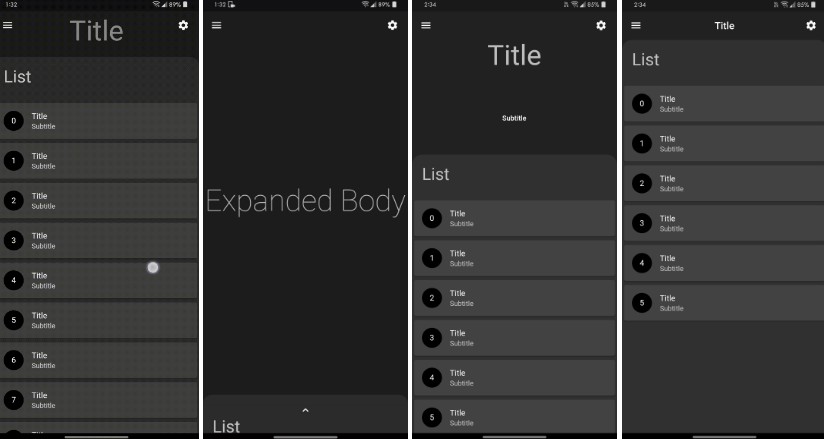
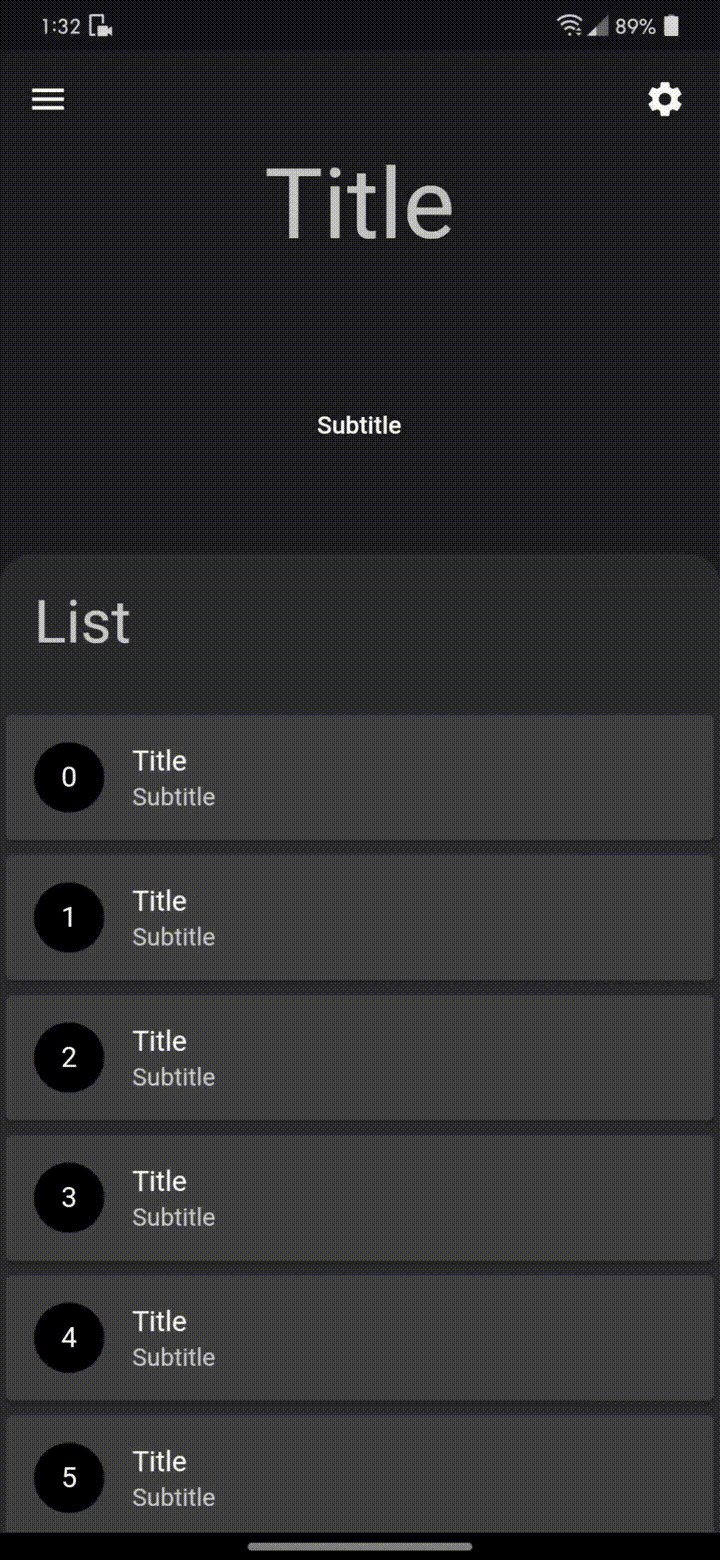
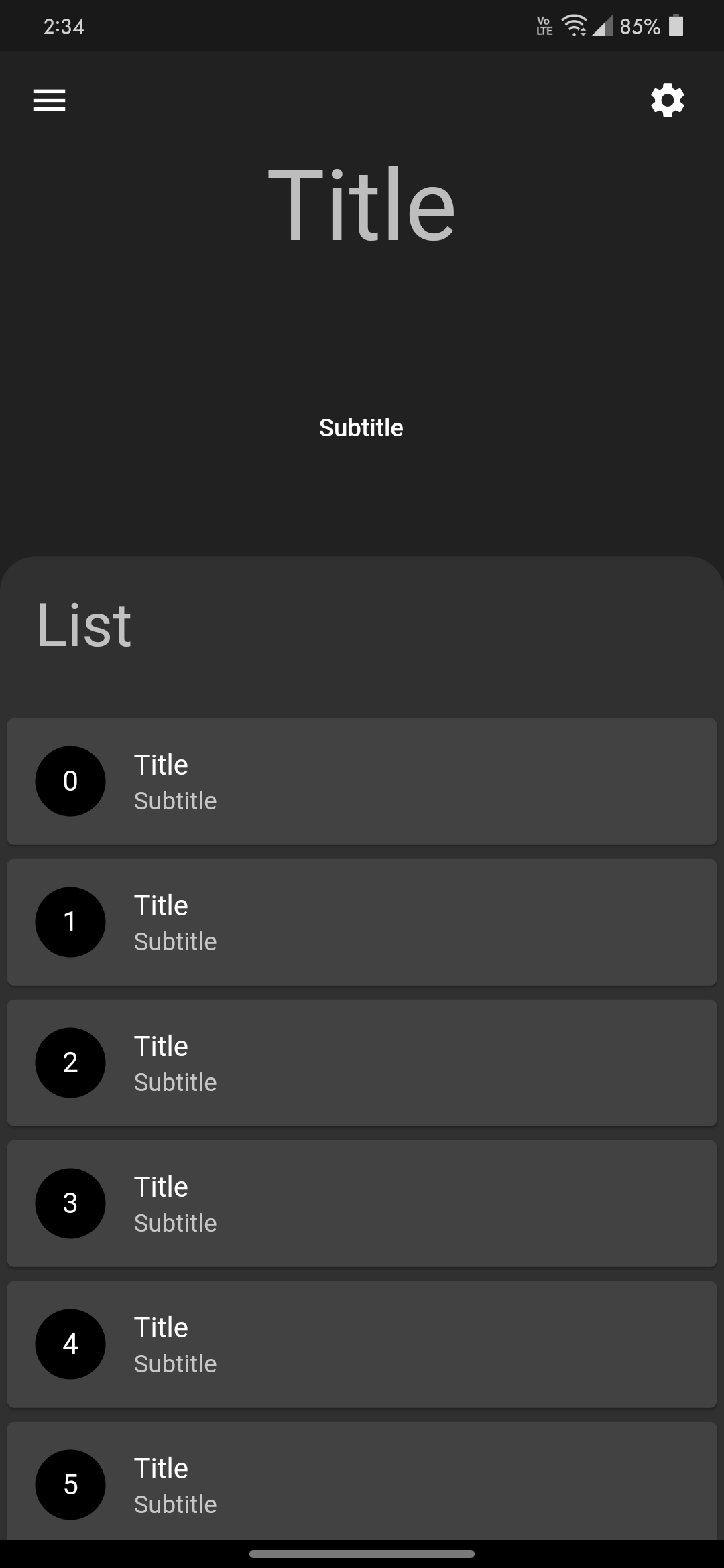
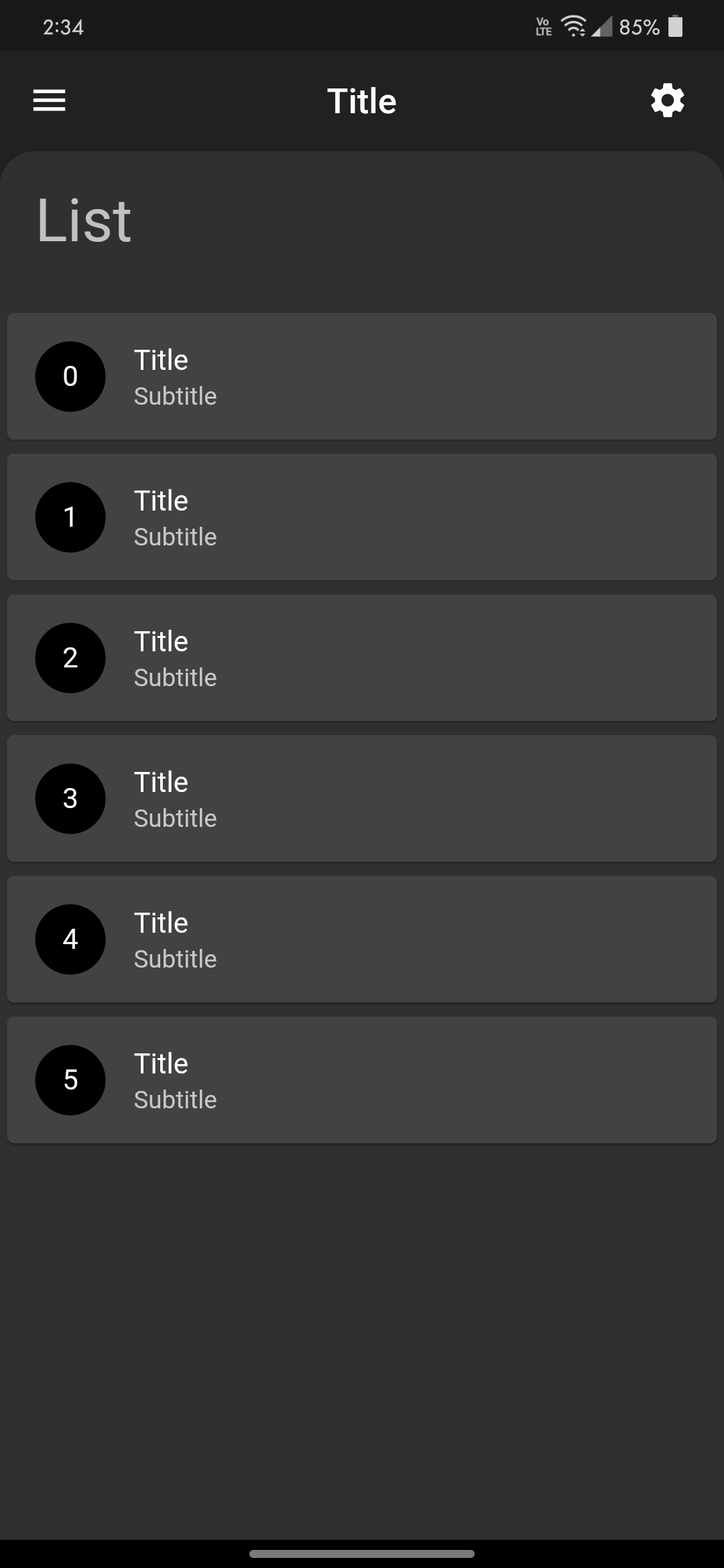
DraggableHome requires you to provide title, headerWidget and body:
titlewidget is basically for title in AppBar. For no title in appbar, simply put an empty Contnainer.headerWidgetis the expanded widget just above body when not fully expanded.bodyis in the form of Column which requires list of widget or a widget. Do not add any verically scrollable widge or you may just disable the scroll.
physics: const NeverScrollableScrollPhysics()
Sample code
DraggableHome(
  title: Text("Ttitle"),
  headerWidget: headerWidget(),
  body: [
    Container(...),
    (...),
  ]
);
Arguments
There are several options that allow for more control:
| Properties | Description |
|---|---|
leading |
A widget to display before the toolbar's title. |
action |
A list of Widgets to display in a row after the title widget. |
drawer |
Drawers are typically used with the Scaffold.drawer property. |
centerTitle |
Allows toggling of title from the center. By default title is in the center. |
headerExpandedHeight |
Height of the header widget. The height is a double between 0.0 and 1.0. The default value of height is 0.35 and should be less than stretchMaxHeight |
headerWidget |
A widget to display Header above body. |
backgroundColor |
The color of the Material widget that underlies the entire DraggableHome body. |
curvedBodyRadius |
Creates a border top left and top right radius of body, Default radius of the body is 20.0. For no radius simply set value to 0. |
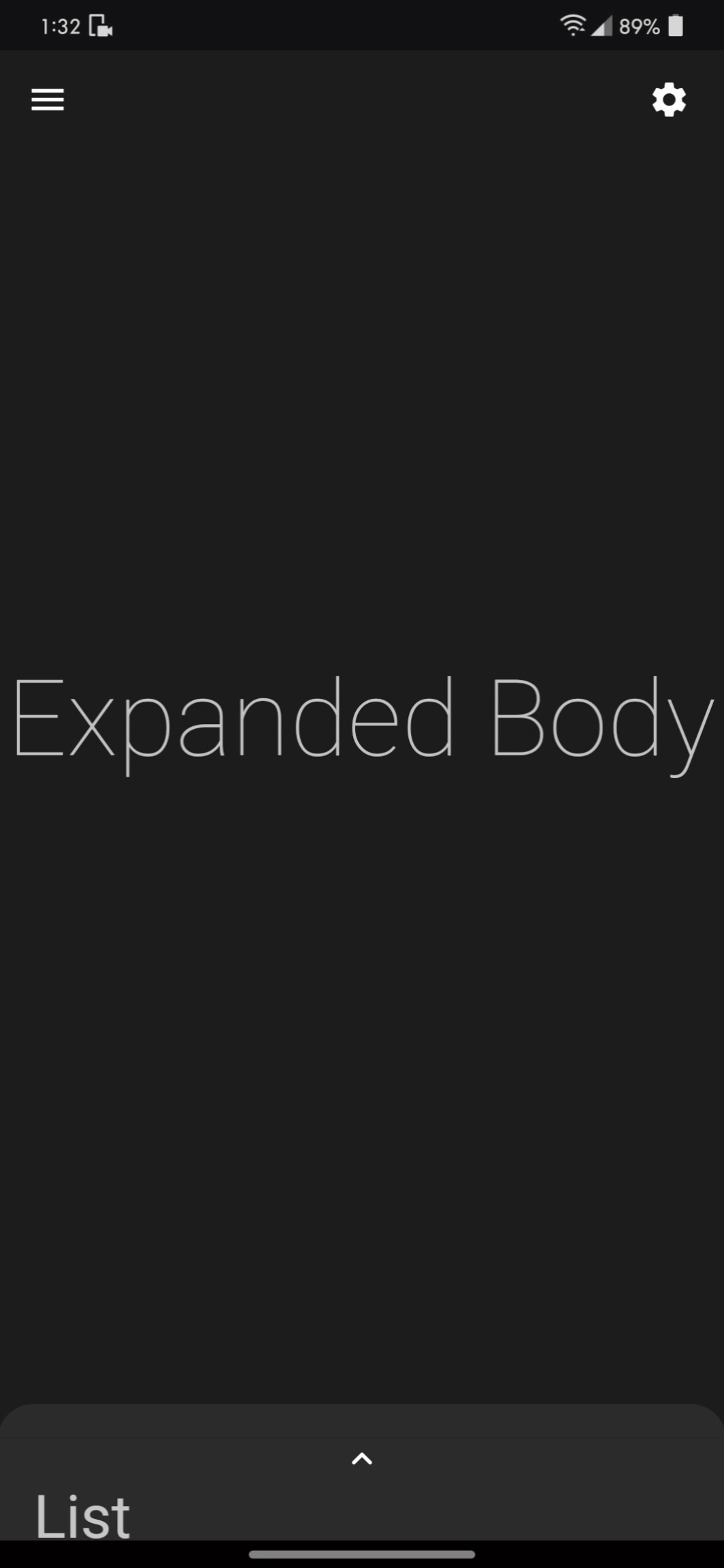
fullyStretchable |
Allows toggling of fully expand draggability of the DraggableHome. Set this to true to allow the user to fully expand the header. |
stretchTriggerOffset |
The offset of overscroll required to fully expand the header. |
expandedBody |
A widget to display when fully expanded as header or expandedBody above body. |
stretchMaxHeight |
Height of the expandedBody widget. The height is a double between 0.0 and 0.95. The default value of height is 0.9 and should be greater than headerExpandedHeight |
floatingActionButton |
A floating action button is a circular icon button that hovers over content to promote a primary action in the application. |
floatingActionButtonLocation |
An object that defines a position for the FloatingActionButton based on the Scaffold's ScaffoldPrelayoutGeometry. |
floatingActionButtonAnimator |
Provider of animations to move the FloatingActionButton between FloatingActionButtonLocations. |
Sample code for ListView.builder
DraggableHome(
  title: Text("Ttitle"),
  headerWidget: headerWidget(),
  body: [
    Container(...),

    // shrinkWrap true required for ListView.builder()
    // disable the scroll for any verically scrollable widget
    ListView.builder(
      physics: NeverScrollableScrollPhysics(),
      shrinkWrap: true,
      itemCount: list.length,
      itemBuilder: (context, index) => Card(
        child: ListTile(
          title: Text("$index"),
        ),
      ),
    ),

    (...),
  ]
);