Avatar Brick
Avatar Brick is a custom avatar can automatically display your abbreviation name when no avatar is available.

Let’s get started
Import the package in your project:
import 'package:avatar_brick/avatar_brick.dart';
1. Avatar with an image

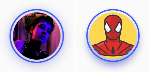
To pass an image to an AvatarBrick, you can either pass an image to the image variable or use
specific image formats (AvatarBrick.network, AvatarBrick.asset, AvatarBrick.file
, AvatarBrick.memory). Try the following simple example:
Widget simpleAvatarBrick() =>
    AvatarBrick.network(
      src: "https://images.healthshots.com/healthshots/en/uploads/2020/12/08182549/positive-person.jpg",
    );
Note: If you pass an image to the image variable, it should be have a fit variable
of BoxFit.cover, a height variable of double.maxFinite and a weight variable
of double.maxFinite.
Widget simpleAvatarBrick() =>
    AvatarBrick(
        image: Image.network(
          "https://images.healthshots.com/healthshots/en/uploads/2020/12/08182549/positive-person.jpg",
          fit: BoxFit.cover,
          height: double.maxFinite,
          width: double.maxFinite,
        )
    );
2. Avatar with a “name”

If you want to create an avatar can automatically display your abbreviation name. DON’T pass
image variable or pass null value. Then pass your name in the name variable like following
example:
Widget nameAvatarBrick() =>
    AvatarBrick(
      image: null,
      name: "Jennie Garth",
    );
3. Loading Avatar
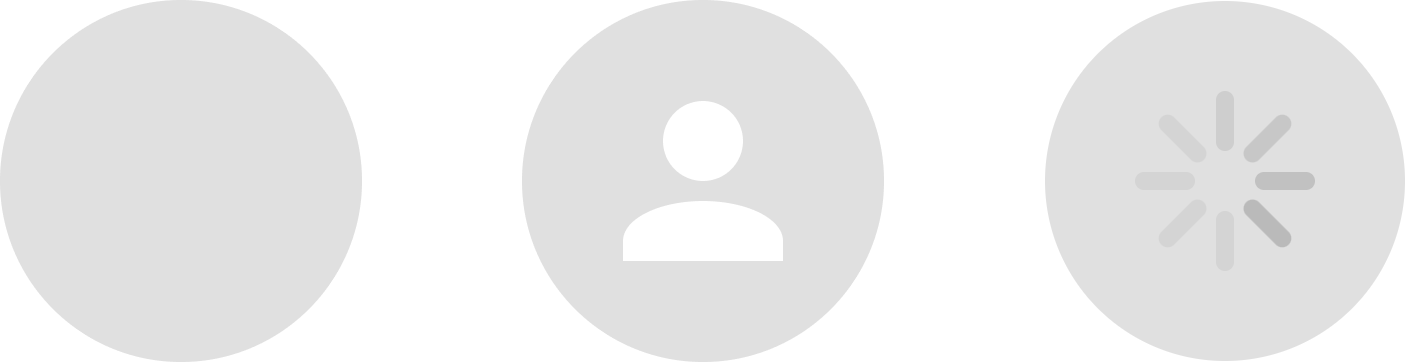
If you want to create a loading avatar.DON’T pass any variable or pass the true value to
the isLoading variable like the following example:
Widget simpleAvatarBrick() => AvatarBrick(isLoading: true);

Widget nullAvatarBrick() => AvatarBrick();
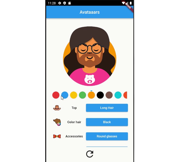
Customization
You can customize the size of the avatar by passing the variable size. Try the following example:
Widget resizeAvatarBrick() =>
    AvatarBrick.network(
      size: const Size(16, 16),
      src: "https://www.waldenu.edu/media/5504/seo-2332-bs-glad-dark-skinned-woman-with-a-393146831-1200x675",
    );

You can customize the color of the background, border, abbreviation name. Try the following example:
Widget colorAvatarBrick() =>
    AvatarBrick(
      name: "Jennie Garth",
      backgroundColor: Colors.white,
      nameTextColor: Colors.teal,
      border: Border.all(width: 4, color: Colors.teal),
    );

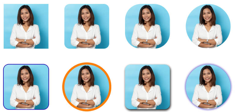
You can customize the radius, border, shadow,… of the image. Try the following example:
Widget otherAvatarBrick() =>
    AvatarBrick.network(
      radius: 24,
      boxShadows: const [
        BoxShadow(
            color: Colors.black54,
            blurRadius: 8,
            offset: Offset(2, 4))
      ],
      border: Border.all(width: 2, color: Colors.orange),
      src: "https://media.istockphoto.com/id/1166423321/photo/portrait-business-woman-asian-on-blue-background.webp?b=1&s=170667a&w=0&k=20&c=k4ByeqnhyGUnT4wJm4baVX2mlT46iRSr65i2FwcldAk=",
    );

Thank you for using my package!
See more of my packages here
Contact me: [email protected] | linkedin | github