Anydrawer
The anydrawer package allows you to easily show a customizable drawer from any horizontal side of the screen in your Flutter applications. Unlike the default scaffold drawer that can only be shown from the scaffold itself, this package provides the flexibility to display drawers from various parts of your app’s UI. The package includes a showDrawer function that facilitates the process of displaying the drawer, and you can also customize the drawer’s appearance and behavior using the DrawerConfig class.
Installation
To use the anydrawer package in your Flutter project, follow these steps:
-
Add the dependency to your
pubspec.yamlfile:dependencies: anydrawer: ^1.0.1 # Replace with the latest version
-
Run
flutter pub getto fetch the package.
Usage
-
Import the required packages:
import 'package:anydrawer/anydrawer.dart';
-
Utilize the
showDrawerfunction to display a customized drawer:showDrawer( context, builder: (context) { return const Center( child: Text('Left Drawer'), ); }, config: const DrawerConfig( side: DrawerSide.left, closeOnClickOutside: true, ), onOpen: () { // Optional callback when the drawer is opened }, onClose: () { // Optional callback when the drawer is closed }, controller: drawerController, // Optional controller to programmatically close the drawer );
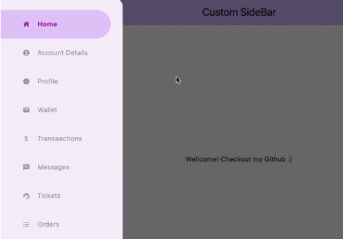
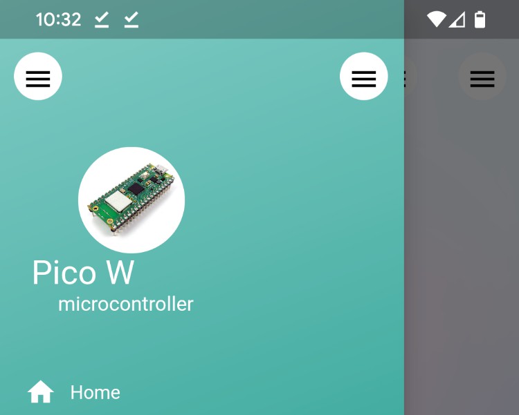
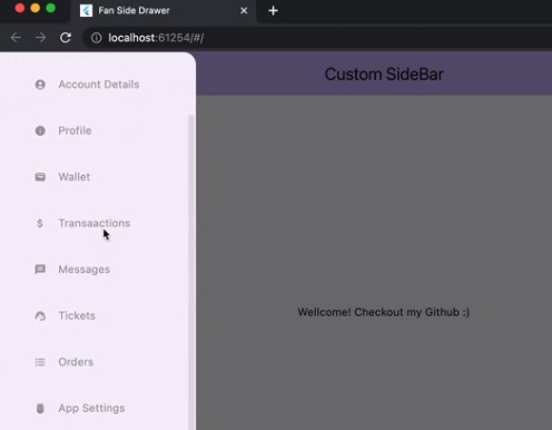
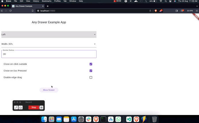
Screenshots
[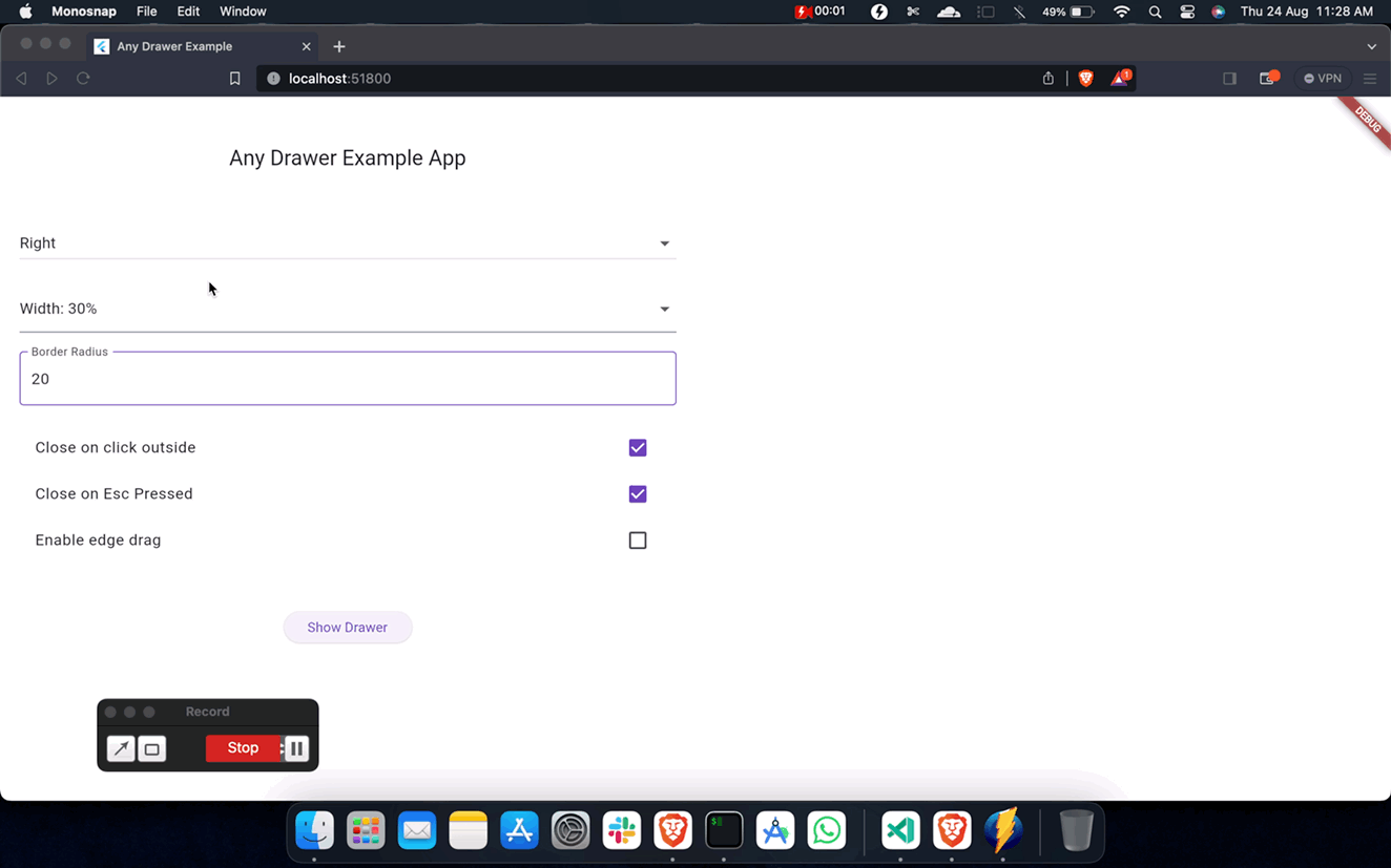 ]
]
[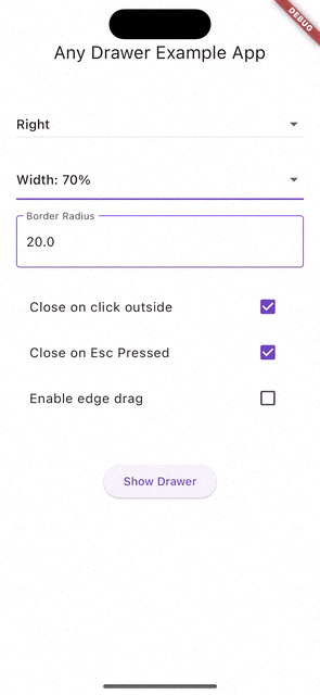 ]
]
Parameters
The showDrawer function takes the following parameters:
context: The build context of the widget that is calling the function.builder: A builder function that returns the widget tree to be displayed inside the drawer.config: A DrawerConfig object that allows you to customize the behavior and appearance of the drawer.onOpen: An optional callback that is called when the drawer is opened.onClose: An optional callback that is called when the drawer is closed.controller: A AnyDrawerController object that can be used to programmatically close the drawer.
Note: The controller should be disposed of when it is no longer needed. This can be done by calling the dispose method of the controller. It is not automatically disposed of when the drawer is closed.
DrawerConfig has the following properties:
widthPercentage: Set the width of the drawer as a percentage of the screen width.maxDragExtent: Set the maximum extent to which the drawer can be dragged open.side: Specify the side from which the drawer should appear (DrawerSide.leftorDrawerSide.right).closeOnClickOutside: Determine whether the drawer should close when clicking outside of it.closeOnEscapeKey: Determine whether the drawer should close when the Escape key is pressed.dragEnabled: Allow users to drag the drawer to open and close it.backdropOpacity: Set the opacity of the backdrop that appears behind the drawer.borderRadius: Adjust the corner radius of the drawer.
This information provides an overview of the showDrawer function and the customizable properties of the DrawerConfig object, allowing you to create and control drawers in your Flutter application with ease.
Animation and Interaction
The package includes smooth animations and interactive gestures for opening and closing the drawer:
- Drag the drawer to open or close it (can be disabled using
dragEnabled). - The drawer smoothly slides in and out from the specified side with customizable animations.
Contributing
Pull requests are welcome. For major changes, please open an issue first to discuss what you would like to change.
TODO
- Fix issue with drawer not closing when backbutton is pressed on mobile devices.
License
This project is licensed under the MIT License.