flutter_intro
A better way for new feature introduction and step-by-step users guide for your Flutter project.
Usage
To use this package, add flutter_intro as a dependency in your pubspec.yaml file.
Init
import 'package:flutter_intro/flutter_intro.dart';
Intro intro = Intro(
/// The total number of guide pages, must be passed
stepCount: 4,
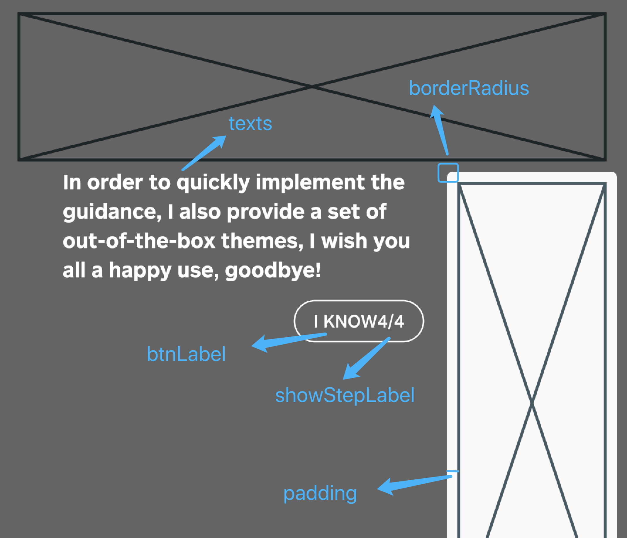
/// The padding of the highlighted area and the widget
padding: EdgeInsets.all(8),
/// Border radius of the highlighted area
borderRadius: BorderRadius.all(Radius.circular(4)),
/// Use the default useDefaultTheme provided by the library to quickly build a guide page
/// Need to customize the style and content of the guide page, implement the widgetBuilder method yourself
widgetBuilder: StepWidgetBuilder.useDefaultTheme(
/// Prompt text
texts: [
'Hello, I\'m Flutter Intro.',
'I can help you quickly implement the Step By Step guide in the Flutter project.',
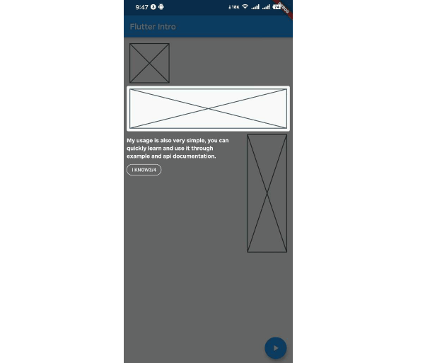
'My usage is also very simple, you can quickly learn and use it through example and api documentation.',
'In order to quickly implement the guidance, I also provide a set of out-of-the-box themes, I wish you all a happy use, goodbye!',
],
/// Button label
btnLabel: 'I KNOW',
/// Whether to display the current step after the button
showStepLabel: true,
),
);
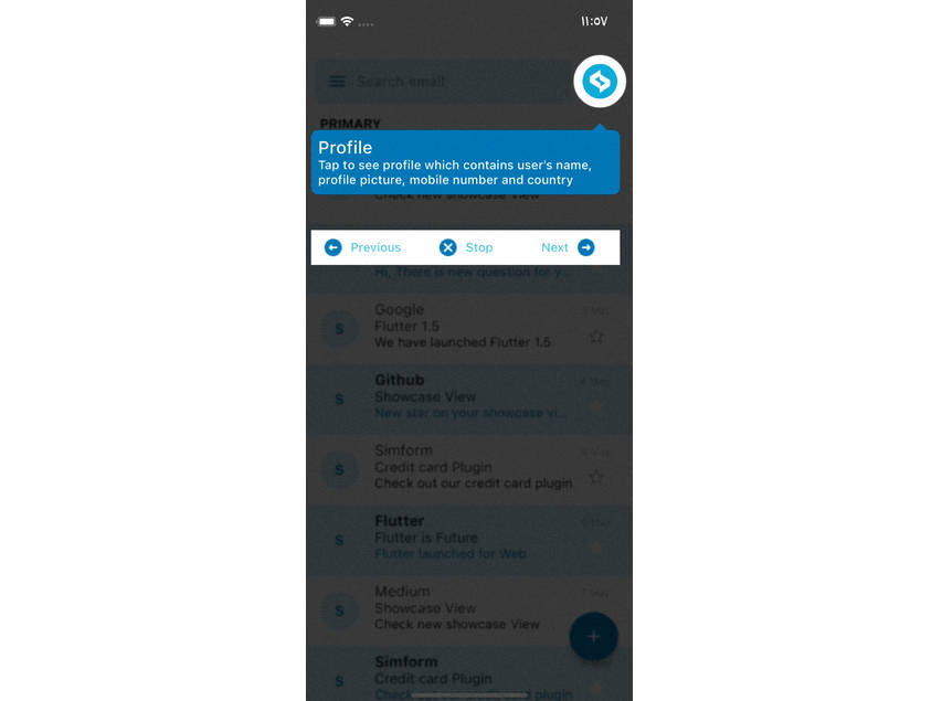
Bind globalKey to widgets that need to be guided
The intro object in the first step contains the keys property, and keys is a globalKey array of length stepCount. Just bind the globalKey in the array to the corresponding component.
Placeholder(
  /// The first guide page is the first item in the binding keys
  key: intro.keys[0]
)
Run
That's it!
intro.start(context);
Custom widgetBuilder method
If you need to completely customize the style and content of the guide page, you need to implement the widgetBuilder method yourself.
final Widget Function(StepWidgetParams params) widgetBuilder;
This method will be called internally by flutter_intro when the intro page appears,
and will pass some data on the current page in the form of parameters StepWidgetParams,
and finally render the component returned by this method on the screen.
class StepWidgetParams {
  /// Return to the previous guide page method, or null if there is none
  final VoidCallback onPrev;

  /// Enter the next guide page method, or null if there is no
  final VoidCallback onNext;

  /// End all guide page methods
  final VoidCallback onFinish;

  /// Which guide page is currently displayed, starting from 0
  final int currentStepIndex;

  /// Total number of guide pages
  final int stepCount;

  /// The width and height of the screen
  final Size screenSize;

  /// The width and height of the highlighted component
  final Size size;

  /// The coordinates of the upper left corner of the highlighted component
  final Offset offset;
}
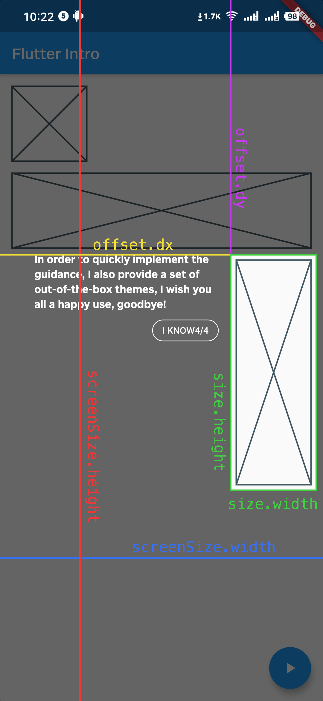
StepWidgetParams provides all the parameters needed to generate the guide page.
The theme provided by default is also based on this parameter to generate the guide page.
Q&A
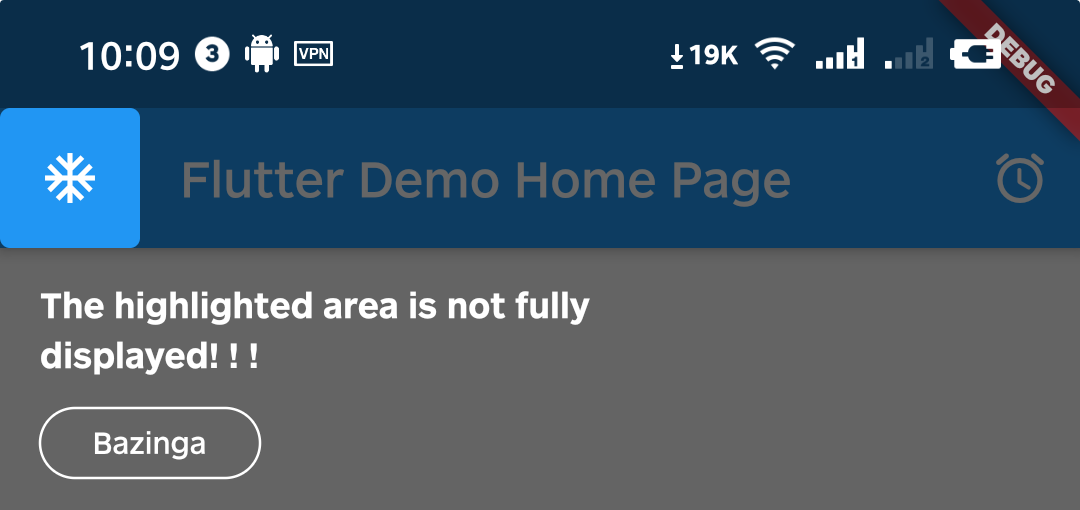
Q1. What if the highlighted area is not displayed completely?
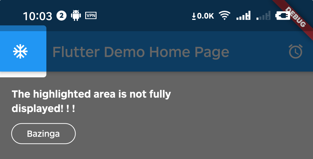
A1. That's because Intro provides 8px padding by default.
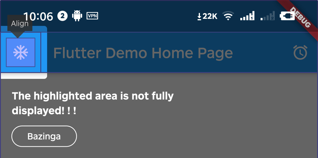
We can change it by setting the value of padding.
intro = Intro(
  ...,
  /// Set it to zero
  padding: EdgeInsets.zero,
);
Q2. Can I set different configurations for each step?
A2. Above version 0.4.x, you can set single or multiple step settings(padding & borderRadius) through setStepConfig and setStepsConfig.
intro.setStepConfig(
  1,
  padding: EdgeInsets.symmetric(
    vertical: -5,
    horizontal: -8,
  ),
);
intro.setStepsConfig(
  [0, 1],
  borderRadius: BorderRadius.all(
    Radius.circular(
      16,
    ),
  ),
);
Q3. Can I make the highlight area smaller?
A3. You can do it by setting padding to a negative number.
intro.setStepConfig(
  1,
  padding: EdgeInsets.symmetric(
    vertical: -10,
    horizontal: -8,
  ),
);
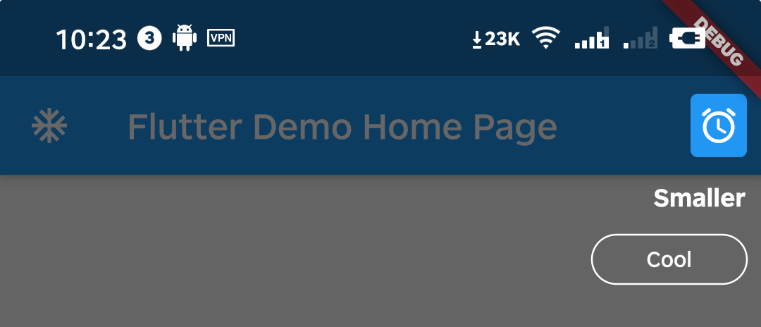
Example
class _MyHomePageState extends State<MyHomePage> {
  Intro intro;

  _MyHomePageState() {
    /// init Intro
    intro = Intro(
      stepCount: 4,

      /// use defaultTheme, or you can implement widgetBuilder function yourself
      widgetBuilder: StepWidgetBuilder.useDefaultTheme(
        texts: [
          'Hello, I\'m Flutter Intro.',
          'I can help you quickly implement the Step By Step guide in the Flutter project.',
          'My usage is also very simple, you can quickly learn and use it through example and api documentation.',
          'In order to quickly implement the guidance, I also provide a set of out-of-the-box themes, I wish you all a happy use, goodbye!',
        ],
        btnLabel: 'I KNOW',
        showStepLabel: true,
      ),
    );
  }

  @override
  void initState() {
    super.initState();
    Timer(Duration(microseconds: 0), () {
      /// start the intro
      intro.start(context);
    });
  }

  Widget build(BuildContext context) {
    return Scaffold(
      appBar: AppBar(
        title: Text(widget.title),
      ),
      body: SizedBox.expand(
        child: Container(
          padding: EdgeInsets.all(16),
          child: Column(
            crossAxisAlignment: CrossAxisAlignment.start,
            children: [
              SizedBox(
                width: 100,
                child: Placeholder(
                  /// 2nd guide
                  key: intro.keys[1],
                  fallbackHeight: 100,
                ),
              ),
              SizedBox(
                height: 16,
              ),
              Placeholder(
                /// 3rd guide
                key: intro.keys[2],
                fallbackHeight: 100,
              ),
              SizedBox(
                height: 16,
              ),
              Row(
                mainAxisAlignment: MainAxisAlignment.end,
                children: [
                  SizedBox(
                    width: 100,
                    child: Placeholder(
                      /// 4th guide
                      key: intro.keys[3],
                      fallbackHeight: 300,
                    ),
                  ),
                ],
              ),
            ],
          ),
        ),
      ),
      floatingActionButton: FloatingActionButton(
        /// 1st guide
        key: intro.keys[0],
        child: Icon(
          Icons.play_arrow,
        ),
        onPressed: () {
          intro.start(context);
        },
      ),
    );
  }
}