FlutterStepIndicator (0.0.2)
FlutterStepIndicator is a versatile Flutter widget designed for creating step indicators to visualize multi-step processes. It offers extensive customization options and features to enhance the user experience.
Features
-
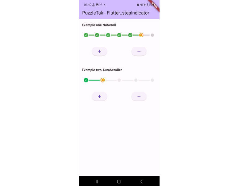
Step Display: Easily visualize a list of steps or stages in an appealing format.
-
Current Step Highlight: Highlight the current step for easy progress tracking.
-
Customization: Customize the appearance of active and inactive steps, including color choices.
-
Custom Checkmarks: Option to use custom widgets, such as checkmarks, for success indicators.
-
Animations: Configure animation durations for smooth step transitions and custom animations.
-
Personalization: Tailor step colors, sizes, and shapes to match your app’s design.
-
Step Change Notifications: Implement custom actions on step changes using the
onChangecallback. -
Selectability and Validation: Control step selectability to guide user interactions.
FlutterStepIndicator is suitable for various applications, including registration flows, user tutorials, and task progress tracking.
Demo new


Installation ☺
To use the FlutterStepIndicator package, add the following dependency to your pubspec.yaml
file:

dependencies:
flutter_stepindicator: ^0.0.2
Then, run flutter pub get to fetch the package.
Usage
Import the package in your Dart file:
import 'package:flutter_step_indicator/flutter_step_indicator.dart';
Create a FlutterStepIndicator widget and provide the necessary parameters:
FlutterStepIndicator(
height: 20, // Set the height of the step indicator.
disableAutoScroll: false, // Enable or disable automatic scrolling.
list: yourStepList, // Provide a list of steps or stages to display.
onChange: (int index) {
// Define a callback function that triggers when the active step changes.
// You can perform actions based on the selected step here.
},
page: yourCurrentStep, // Specify the current step or page.
positiveCheck: yourCustomCheckmarkWidget, // Optionally, use a custom checkmark widget.
positiveColor: yourColor, // Customize the color of positive (active) steps.
negativeColor: yourColor, // Customize the color of negative (disabled) steps.
progressColor: yourColor, // Customize the color of the progress indicator.
durationScroller: yourDuration, // Set the duration for scrolling animations.
durationCheckBulb: yourDuration, // Set the duration for checkmark bulb animations.
division: yourDivision, // Specify the number of divisions for rendering steps.
),
Used this example
      FlutterStepIndicator(
                height: 20,
                disableAutoScroll: false,
                list: list,
                onChange: (i){},
                page: page,),
            ),
#Parameters
height: The height of the step indicator. disableAutoScroll: A boolean flag to enable or disable automatic scrolling. list: A list of steps or stages to be displayed. onChange: A callback function invoked when the active step changes. page: The current step or page in the process. positiveCheck: An optional custom widget for displaying checkmarks. positiveColor: Customize the color of positive (active) steps. negativeColor: Customize the color of negative (disabled) steps. progressColor: Customize the color of the progress indicator. durationScroller: Set the duration for scrolling animations. durationCheckBulb: Set the duration for checkmark bulb animations. division: The number of divisions for rendering steps.
Feel free to modify and expand upon this example and description in your GitHub README to provide more context and usage instructions for your FlutterStepIndicator class.
Tags
- Flutter
- Step Indicator
- Widget
Example
For a complete example of using the NavigationView package, refer to the example provided.
License
This package is released under the MIT License. See the LICENSE file for more details.
Credits
NavigationView is developed and maintained by puzzleTak.