
Yet another rating bar for Flutter. But this time supported any value, not just full or half, fully customizable as well. Tap and drag gestures are all supported.
Features
- Support any fraction value
- Make use of Flutters Wrap widget, that mean you can achieve any layout that Wrap supported.
- Customizable rating widget, the degree of customizable is really high, each widget don’t have to be the same size, don’t even have to use the same indication color.
- Hit test correctly, render object of each child widget is used for hitTest, so the hitTest result is as correct as it can be.
Getting started
First import the widget
import 'package:flutter_pannable_rating_bar/flutter_pannable_rating_bar.dart';
Usage
The widget itself is completely Stateless, that mean you can manipulate any value that the callback provided and use it as the value for PannableRatingBar.
Just setState with the value provided in onChanged call back, and it will be correctly distributed for each rate widget respectively.

@override
Widget build(BuildContext context) {
  return Scaffold(
    appBar: AppBar(),
    body: Center(
      child: Padding(
        padding: const EdgeInsets.symmetric(horizontal: 16.0),
        child: PannableRatingBar(
          rate: value,
          alignment: WrapAlignment.center,
          spacing: 20,
          items: List.generate(
              5,
                  (index) =>
              const RatingWidget(
                selectedColor: Colors.yellow,
                unSelectedColor: Colors.grey,
                child: Icon(
                  Icons.star,
                  size: 48,
                ),
              )),
          runAlignment: WrapAlignment.center,
          onChanged: (value) {
            setState(() {
              this.value = value;
            });
          },
        ),
      ),
    ),
  );
}
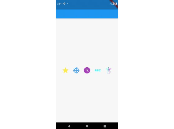
Use your own widget as the rating widget. They don’t have to be the same size, color, or anything, fully customizable.

@override
Widget build(BuildContext context) {
  return Scaffold(
    appBar: AppBar(),
    body: Center(
      child: Padding(
        padding: const EdgeInsets.symmetric(horizontal: 16.0),
        child: PannableRatingBar(
          rate: value,
          alignment: WrapAlignment.center,
          spacing: 20,
          items: const [
            RatingWidget(
              selectedColor: Colors.yellow,
              unSelectedColor: Colors.grey,
              child: Icon(
                Icons.star,
                size: 48,
              ),
            ),
            RatingWidget(
              selectedColor: Colors.blue,
              unSelectedColor: Colors.red,
              child: Icon(
                Icons.ac_unit,
                size: 48,
              ),
            ),
            RatingWidget(
              selectedColor: Colors.purple,
              unSelectedColor: Colors.amber,
              child: Icon(
                Icons.access_time_filled,
                size: 48,
              ),
            ),
            RatingWidget(
              selectedColor: Colors.cyanAccent,
              unSelectedColor: Colors.grey,
              child: Icon(
                Icons.abc,
                size: 48,
              ),
            ),
            RatingWidget(
              selectedColor: Colors.tealAccent,
              unSelectedColor: Colors.purple,
              child: Icon(
                Icons.accessibility_new_sharp,
                size: 48,
              ),
            ),
          ],
          runAlignment: WrapAlignment.center,
          onChanged: (value) {
            setState(() {
              this.value = value;
            });
          },
        ),
      ),
    ),
  );
}
The layout algorithm is of the Flutter built-in Wrap widget, so any layout that can be achieved with wrap, can be achieved with this widget.

@override
Widget build(BuildContext context) {
  return Scaffold(
    appBar: AppBar(),
    body: Center(
      child: Padding(
        padding: const EdgeInsets.all(16.0),
        child: PannableRatingBar.builder(
          rate: value,
          alignment: WrapAlignment.center,
          spacing: 20,
          runSpacing: 10,
          itemCount: 20,
          direction: Axis.vertical,
          itemBuilder: (context, index) {
            return const RatingWidget(
              selectedColor: Colors.yellow,
              unSelectedColor: Colors.grey,
              child: Icon(
                Icons.star,
                size: 48,
              ),
            );
          },
          onChanged: (value) {
            setState(() {
              this.value = value;
            });
          },
        ),
      ),
    ),
  );
}
Additional information
Have any idea to improve it? Just raise an issue in the repo!