This plugin helps to design and develop beautiful responsive flutter apps.
Lightweight, Responsive Spacing
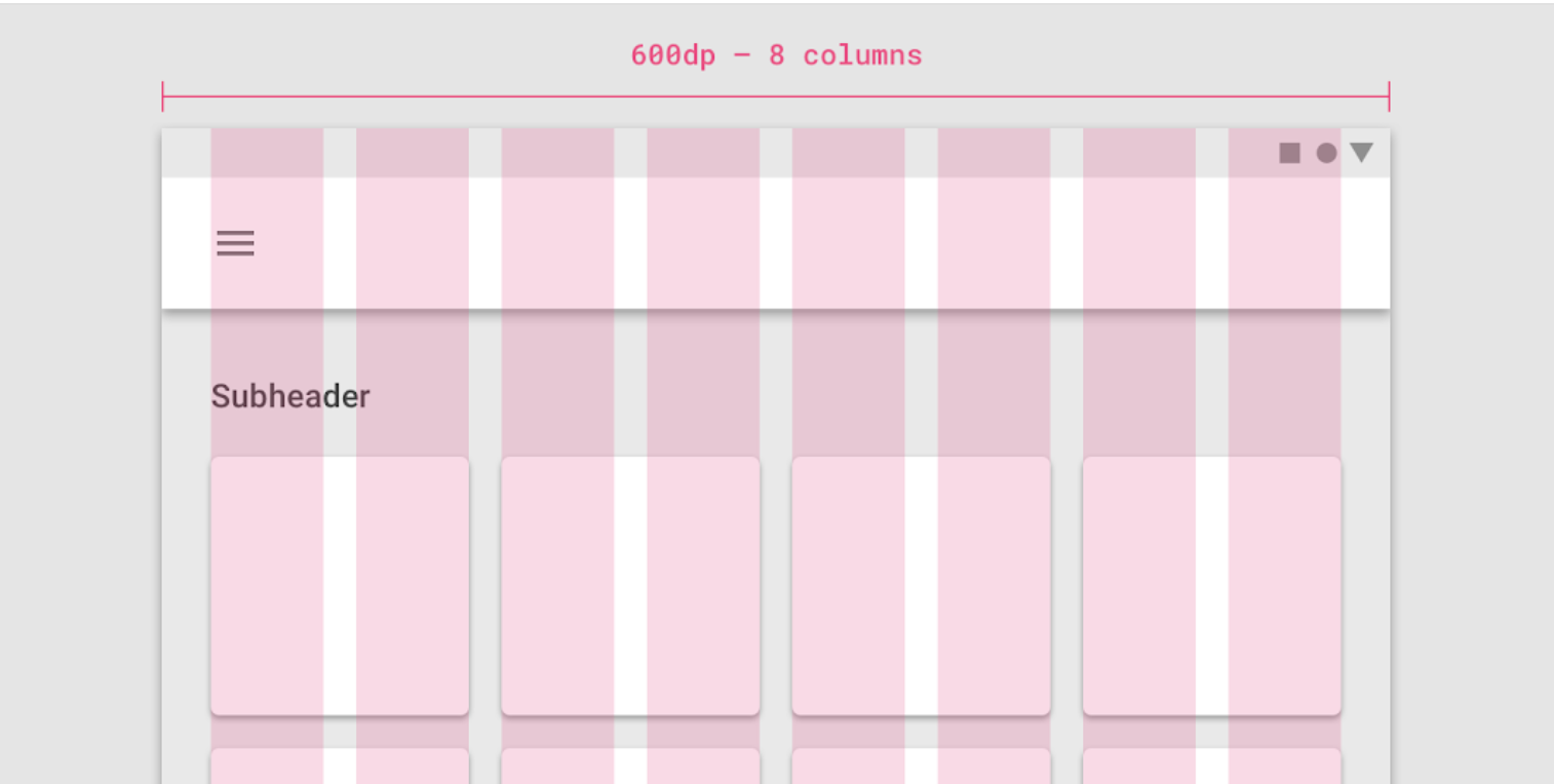
All design principles have roughly the same elements. For example, Material Design has a responsive 12 column system that works with margin, gutter & body.
We have developed this plugin so that you can easily create your own responsive app.
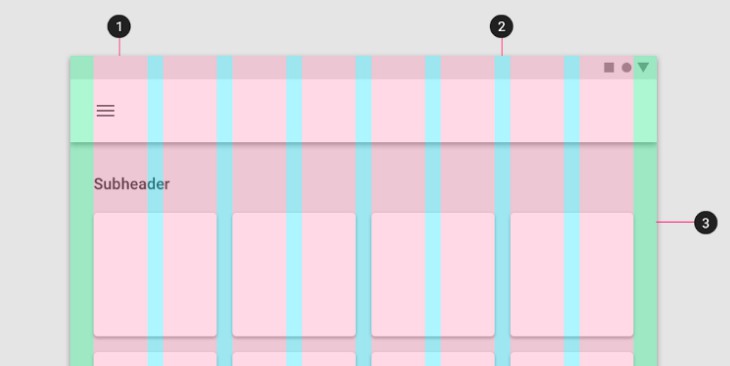
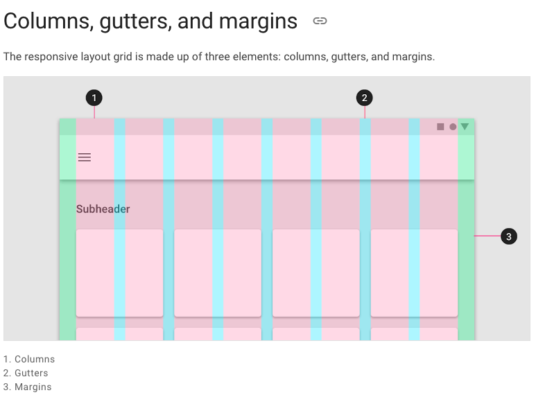
Columns, Gutters & Margins
The responsive layout grid is made up of three elements: columns, gutters, and margins. Read everything about Columns, Gutters & Margins on the material guidelines responsive layout page.
default Sizes
The Material Breakpoints are used for all default values.
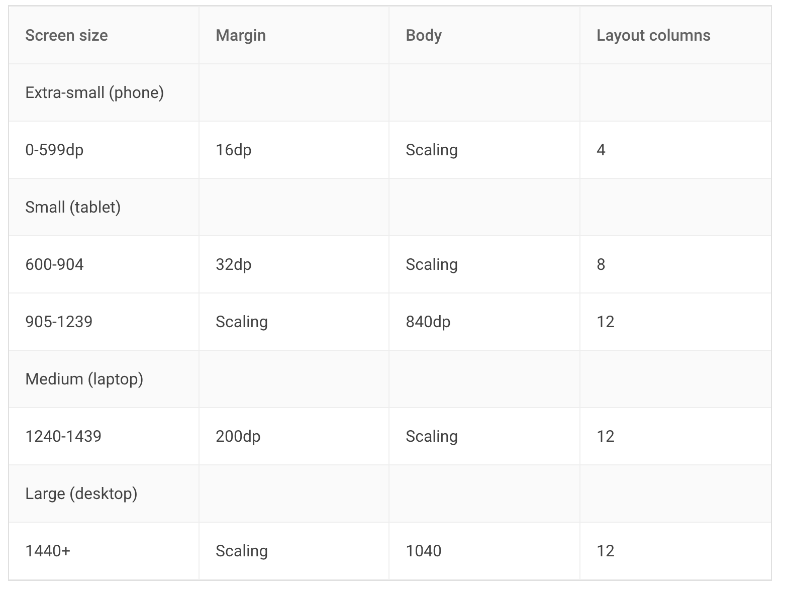
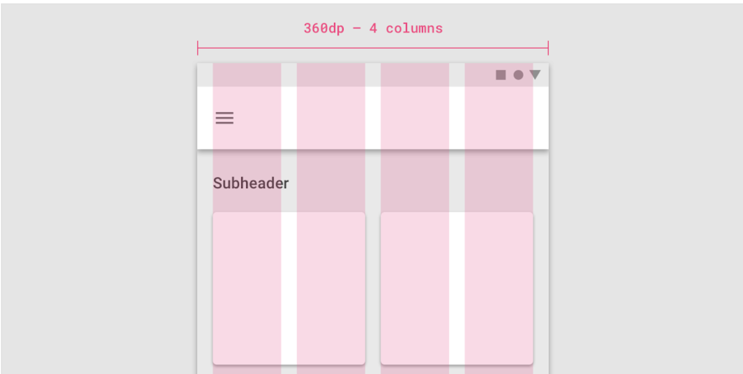
As an example, the 360 size display has 4 columns, a margin of 16, padding of 8 & gutters of 8.
The responsive values are saved to the ResponsiveData class:
class ResponsiveData {
  final ScaledSize margin;
  final ScaledSize padding;
  final ScaledSize gutter;
  final ScaledSize body;
  final LayoutColumns layoutColumns;
}
Usage
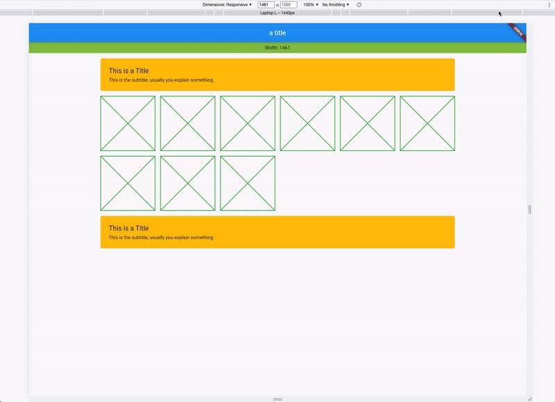
Instead of using a Scaffold, use the ResponsiveScaffold:
ResponsiveScaffold(
  appBar: AppBar(
    title: const Text("The Title"),
  ),
  body: YourWidget()
);
And in your Widget, access the Spacing class with Spacing.of(context) which returns an object of ResponsiveData. The object has all necessary spacings.
ResponsiveData responsiveData = Spacing.of(context);
For example with a Card:
Card(
  /// Spacing outside the card
  margin: Spacing.of(context).margin.horizontalEdgeInsets,
  child: Padding(
  /// Spacing inside the card
    padding: Spacing.of(context).padding.allEdgeInsets,
    child: Column(
      crossAxisAlignment: CrossAxisAlignment.start,
      children: [
        Text("This is a Title"),
        Text("This is the subtitle, usually you explain something")
      ],
    ),
  ),
)