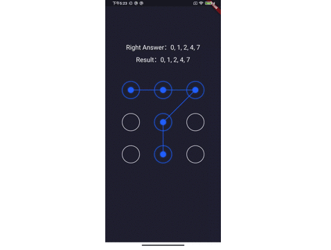
Flutter Screen Lock
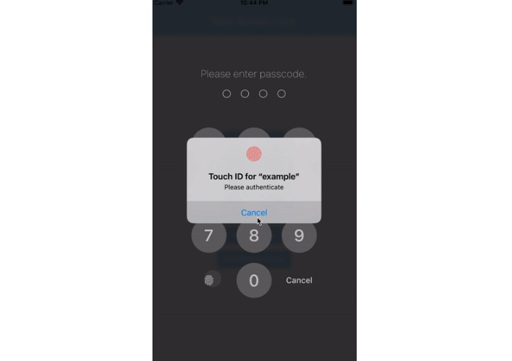
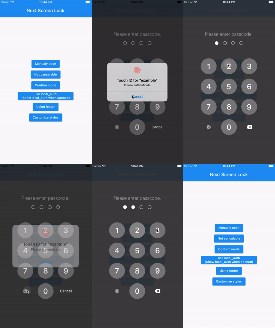
This Flutter plugin provides an feature for screen lock. Enter your passcode to unlock the screen. You can also use biometric authentication as an option.
⚠Attention
A detailed API description will be provided later.
Only tentatively necessary information is provided.
Features
- By the length of the character count
- You can change
CancelandDeletewidget - Optimizes the UI for device size and orientation
- You can disable cancellation
- You can use biometrics (local_auth plugin)
- Biometrics can be displayed on first launch
- Unlocked callback
- You can specify a mismatch event.
- Limit the maximum number of retries
Usage
You can easily lock the screen with the following code.
To unlock, enter correctString.
Simple
If you give the same input as correctString, it will automatically close the screen.
import 'package:flutter_screen_lock/functions.dart';

screenLock(
  context: context,
  correctString: '1234',
);
Change digits
Provides a screen lock that cannot be canceled.
import 'package:flutter_screen_lock/functions.dart';

screenLock(
  context: context,
  correctString: '1234',
  canCancel: false,
);
Confirmation screen
You can display the confirmation screen and get the first input with didConfirmed if the first and second inputs match.
import 'package:flutter_screen_lock/functions.dart';

screenLock(
  context: context,
  correctString: '',
  confirmation: true,
  didConfirmed: (matchedText) {
    print(matchedText);
  },
);
Control the confirmation state
import 'package:flutter_screen_lock/functions.dart';
import 'package:flutter_screen_lock/input_controller.dart';

final inputController = InputController();

screenLock(
  context: context,
  correctString: '',
  confirmation: true,
  inputController: inputController,
);

// Release the confirmation state at any event.
inputController.unsetConfirmed();
Use local_auth
Add the local_auth package to pubspec.yml.
https://pub.dev/packages/local_auth
It includes an example that calls biometrics as soon as screenLock is displayed in didOpened.
import 'package:flutter_screen_lock/functions.dart';
import 'package:local_auth/local_auth.dart';
import 'package:flutter/material.dart';

/// Method extraction to call by initial display and custom buttons.
Future<void> localAuth(BuildContext context) async {
  final localAuth = LocalAuthentication();
  final didAuthenticate = await localAuth.authenticateWithBiometrics(
      localizedReason: 'Please authenticate');
  if (didAuthenticate) {
    Navigator.pop(context);
  }
}

screenLock(
  context: context,
  correctString: '1234',
  customizedButtonChild: Icon(
    Icons.fingerprint,
  ),
  customizedButtonTap: () async {
    await localAuth(context);
  },
  didOpened: () async {
    await localAuth(context);
  },
);
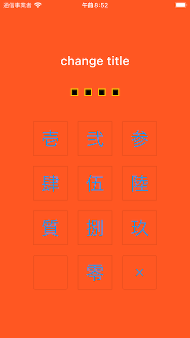
Full customize
import 'package:flutter/material.dart';
import 'package:flutter_screen_lock/configurations/input_button_config.dart';
import 'package:flutter_screen_lock/configurations/screen_lock_config.dart';
import 'package:flutter_screen_lock/configurations/secret_config.dart';
import 'package:flutter_screen_lock/configurations/secrets_config.dart';
import 'package:flutter_screen_lock/functions.dart';
import 'package:flutter_screen_lock/screen_lock.dart';

screenLock(
  context: context,
  title: Text('change title'),
  confirmTitle: Text('change confirm title'),
  correctString: '1234',
  confirmation: true,
  screenLockConfig: ScreenLockConfig(
    backgroundColor: Colors.deepOrange,
  ),
  secretsConfig: SecretsConfig(
    spacing: 15, // or spacingRatio
    padding: const EdgeInsets.all(40),
    secretConfig: SecretConfig(
      borderColor: Colors.amber,
      borderSize: 2.0,
      disabledColor: Colors.black,
      enabledColor: Colors.amber,
      height: 15,
      width: 15,
      build: (context, {config, enabled}) {
        return SizedBox(
          child: Container(
            decoration: BoxDecoration(
              shape: BoxShape.rectangle,
              color: enabled
                  ? config.enabledColor
                  : config.disabledColor,
              border: Border.all(
                width: config.borderSize,
                color: config.borderColor,
              ),
            ),
            padding: EdgeInsets.all(10),
            width: config.width,
            height: config.height,
          ),
          width: config.width,
          height: config.height,
        );
      },
    ),
  ),
  inputButtonConfig: InputButtonConfig(
    textStyle:
        InputButtonConfig.getDefaultTextStyle(context).copyWith(
      color: Colors.orange,
      fontWeight: FontWeight.bold,
    ),
    buttonStyle: OutlinedButton.styleFrom(
      shape: RoundedRectangleBorder(),
      backgroundColor: Colors.deepOrange,
    ),
  ),
  cancelButton: const Icon(Icons.close),
  deleteButton: const Icon(Icons.delete),
);
API References
screenLock / ScreenLock API
| Property | Type | Default | Description |
|---|---|---|---|
| context | BuildContext | (Required) [screenLock] only | |
| correctString | String | (Required) Input correct String If [confirmation] is true, it will be ignored, so set it to any string or empty. |
|
| screenLockConfig | ScreenLockConfig | ScreenLockConfig() | Refer to the API of ScreenLockConfig |
| secretsConfig | SecretsConfig | SecretsConfig() | Refer to the API of SecretsConfig |
| inputButtonConfig | InputButtonConfig | InputButtonConfig() | Refer to the API of InputButtonConfig |
| canCancel | bool | true | true is show cancel button. (Default: true) |
| confirmation | bool | Make sure the first and second inputs are the same. | |
| digits | int | Set the maximum number of characters to enter when [confirmation] is true. |
|
| maxRetries | int | 0 | 0 is unlimited. For example, if it is set to 1, didMaxRetries will be called on the first failure. |
| didUnlocked | void Function() | Called if the value matches the correctString. | |
| didError | void Function(int retries) | Called if the value does not match the correctString. | |
| didMaxRetries | void Function(int retries) | Events that have reached the maximum number of attempts. | |
| didOpened | void Function() | For example, when you want to perform biometric authentication. [screenLock] only | |
| didConfirmed | void Function(String matchedText) | Called when the first and second inputs match during confirmation. It is possible to receive the matched text as an argument. |
|
| customizedButtonTap | Future<void> Function() | Tapped for left side lower button. | |
| customizedButtonChild | Widget | Child for bottom left side button. | |
| footer | Widget | Add a Widget to the footer. | |
| cancelButton | Widget | Change the child widget for the cancel button. | |
| deleteButton | Widget | Change the child widget for the delete button. | |
| title | Widget | HeadingTitle(text: 'Please enter passcode.') | Change the title widget. |
| confirmTitle | Widget | HeadingTitle(text: 'Please enter confirm passcode.') | Change the confirm title widget. |
| inputController | InputController | Control the confirmation state change on the outside. |
ScreenLockConfig API
| Property | Type | Default | Description |
|---|---|---|---|
| backgroundColor | Color | Specifies the background color of the screen. By default, themeData will be set. | |
| themeData | ThemeData | ScreenLockConfig.defaultThemeData |
SecretsConfig API
| Property | Type | Default | Description |
|---|---|---|---|
| spacing | double | Absolute space between secret widgets. If specified together with spacingRatio, this will take precedence. |
|
| spacingRatio | double | 0.05 | Space ratio between secret widgets. |
| padding | EdgeInsetsGeometry | EdgeInsets.only(top: 20, bottom: 50) | padding of Secrets Widget. |
| secretConfig | SecretConfig | SecretConfig() | Refer to the API of SecretConfig |
SecretConfig API
| Property | Type | Default | Description |
|---|---|---|---|
| width | double | 16 | Widget width. |
| height | double | 16 | Widget height. |
| borderSize | double | 1.0 | border size. |
| borderColor | Color | Color(0xFFFFFFFF) | border color. |
| enabledColor | Color | Color(0xFFFFFFFF) | Fill color when input is active. |
| disabledColor | Color | Color(0xFFFFFFFF) | Fill color for unentered. |
InputButtonConfig API
| Property | Type | Default | Description |
|---|---|---|---|
| height | double | MediaQuery.of(context).size.height * 0.6 * 0.16 |
Button height. |
| width | double | MediaQuery.of(context).size.width * 0.22 |
Button width. |
| autoSize | bool | true | Automatically adjust the size of the square to fit the orientation of the device. |
| inputStrings | List<String> | ['0','1','2','3','4','5','6','7','8','9'] | A string to be matched against correctString. |
| displayStrings | List<String> | ['0','1','2','3','4','5','6','7','8','9'] | The string to be displayed on the screen. |
| style | ButtonStyle | It is recommended that you use [OutlinedButton.styleFrom()] to change it. | |
| textStyle | TextStyle | Changes the text style of the button. |
Apps I use
TimeKey
