flutter_calendar_widget
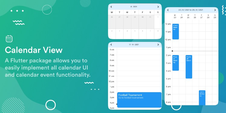
The flutter_calendar_widget is highly customizable calendar widget.
Not only can you change the style, but you can also change the widget in the calendar, so you can customize it freely if you want.
Features
- Supports multiple date selections such as single, range, multiple, etc
- Can register events in the calendar
- Advanced customizable; all widgets in the calendar can be changed.
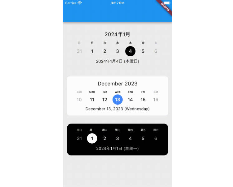
- Multilingual translation support.
- Calendar size changes dynamically depending on content.
- Can add calendar navigation header.
- Can change the icon in the navigation header.
- Calendar style can be changed.
- All text in the calendar can be changed.
Installation
flutter pub add flutter_calendar_widget
Usage
Make sure to check out examples and API docs for more details.
Selection Mode
Depending on the selection mode, you can specify the following three selection methods.
1. CalendarSelectionMode.single for selecting one date.
Allows to select a single date, selecting a new date will remove the selection for previous date and updates selection to the new selected date.
Preview
Example
FlutterCalendar(
    selectionMode: CalendarSelectionMode.single,
    onDayPressed: (DateTime date) {
        print(date);
    }
)
2. CalendarSelectionMode.multiple for selection of multiple dates.
Allows multiple date selection, selecting a new date will not remove the selection for previous dates, allows to select as many dates as possible.
Preview
Example
FlutterCalendar(
    selectionMode: CalendarSelectionMode.multiple,
    onMultipleDates: (List<DateTime> dates) {
        for (var date in dates) {
            print(date);
        }
    },
)
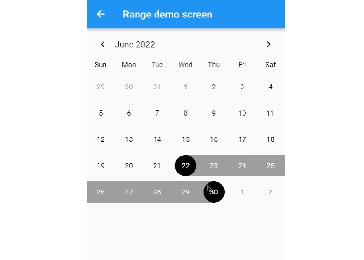
3. CalendarSelectionMode.range Allows to select a single range of dates.
Preview
Example
FlutterCalendar(
    selectionMode: CalendarSelectionMode.range,
    onRageDate: (CalendarDateRange dateRange) {
        print(
            'start: ${dateRange.start}, end: ${dateRange.end}',
        );
    },
)
How to change style
There are two main ways to style that calendar widget.
1. To change the style of text.
You can change the text style by injecting a CalendarTextStyle instance.
Example
FlutterCalendar(
    selectionMode: CalendarSelectionMode.single,
    textStyle: const CalendarTextStyle(
        dayFontSize: 16,
        dayTextColor: Colors.blue,
    ),
)
2. To change the style except for text.
Styles other than text styles can be changed by injecting an instance of CalendarStyle.
Example
FlutterCalendar(
    selectionMode: CalendarSelectionMode.single,
    style: const CalendarStyle(
        markerColor: Colors.green,
    ),
)
How to change widgets
All widgets in the calendar can be changed. All widgets are built in the inheritance of the CalendarBuilder abstract class, and you can make changes to the required widgets via method override.
Preview
Example
import 'package:flutter/material.dart';
import 'package:flutter_calendar_widget/flutter_calendar_widget.dart';

class CustomCalenderBuilder extends CalendarBuilder {
  @override
  Widget buildRangeDay(DateTime dateTime) {
    return Container();
  }

  @override
  Widget buildRangeDayLine(BoxConstraints constraints) {
    return SizedBox(
      child: Container(
        alignment: Alignment.center,
        color: Colors.greenAccent,
        child: const Text(
          '?',
          style: TextStyle(
            color: Colors.black,
          ),
        ),
      ),
    );
  }

  @override
  Widget buildRangeStartLine(BoxConstraints constraints) {
    return Align(
      alignment: Alignment.centerRight,
      child: Container(
        width: constraints.maxWidth / 2,
        decoration: BoxDecoration(
          border: Border.all(width: 0, color: Colors.greenAccent),
          color: Colors.greenAccent,
        ),
      ),
    );
  }

  @override
  Widget buildRangeEndLine(BoxConstraints constraints) {
    return Align(
      alignment: Alignment.centerLeft,
      child: Container(
        width: constraints.maxWidth / 2,
        decoration: BoxDecoration(
          border: Border.all(width: 0, color: Colors.greenAccent),
          color: Colors.greenAccent,
        ),
      ),
    );
  }
}

class CustomDemoScreen extends StatelessWidget {
  const CustomDemoScreen({Key? key}) : super(key: key);

  @override
  Widget build(BuildContext context) {
    return Scaffold(
      appBar: AppBar(
        title: const Text('Custom demo screen'),
      ),
      body: SafeArea(
        child: FlutterCalendar(
          selectionMode: CalendarSelectionMode.range,
          calendarBuilder: CustomCalenderBuilder(),

        ),
      ),
    );
  }
}
How to register events
You can create an event and register it in the calendar.
Preview
Usages
Create an EventList to register events. If you put the type in General, you can distinguish the type during the onDayPressed callback.
Example
EventList<Event> events = EventList(
    events: {
        DateTime(2022, 6, 7): [
            const Event('Event 1),
            const Event('Event 2),
        ]
    }
);

...

FlutterCalendar(
    selectionMode: CalendarSelectionMode.single,
    focusedDate: DateTime.now(),
    events: events,
    onDayPressed: (DateTime day) {
        Event event = events.get(day);
        print(event);
    },
),
See also: event_demo_screen
How to set localization
The project is being localized using the intl package.
The default is the language value set on the device. You can refer to the value that can be entered in locale here.
Example
FlutterCalendar(
    locale: 'en',
)
Contributors ✨
Please make sure to read the Contributing Guide before making a pull request. Thank you to all the people who helped to maintain and upgrade this project!
Thanks goes to these wonderful people (emoji key):
