Responsive Sizer
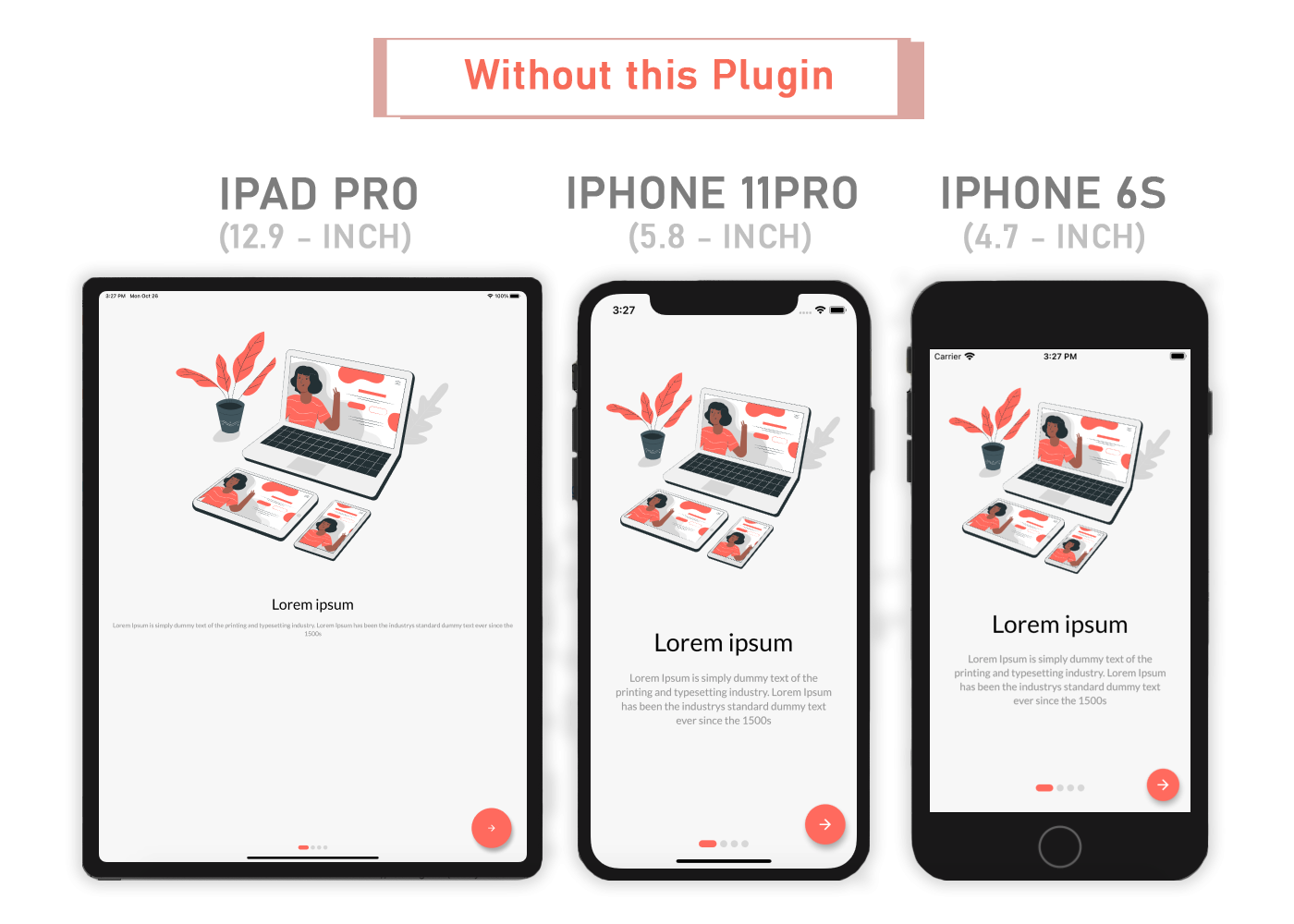
Responsive Sizer helps implement a responsive layout by providing helper widgets and extensions. Responsive_sizer has a lot of improvements over the unmaintained sizer package:
- Sizer's maintainer copy-pasted the entire code of this package from ^2.0.1 and didn't maintain the package ever since :(
- Ever since ^2.0.1, responsive_sizer has many improvements that includes the current breaking changes

Installation
Add responsive_sizer to pubspec.yaml
dependencies:
  responsive_sizer: 3.0.4+4
Breaking Changes
- The package will now use the current width and height regardless of the orientation instead of only using the width and height of portrait mode See Issue#6
- Changed
.spto calculate the value using device's pixel density ratio instead of calculating the value based on the device's width
Parameters
Adaptive.h()- Returns a calculated height based on the device (Does the same thing as .h)Adaptive.w()- Returns a calculated width based on the device (Does the same thing as .w)Adaptive.sp()- Returns a calculated sp based on the device (Does the same thing as .sp).h- Returns a calculated height based on the device (Does the same thing as Adaptive.h).w- Returns a calculated width based on the device (Does the same thing as Adaptive.w).sp- Returns a calculated sp based on the device (Does the same thing as Adaptive.sp)Device.boxConstraints- Returns the Device's BoxConstraintsDevice.orientation- Returns the Screen Orientation (portrait or landscape)Device.screenType- Returns the Screen Type (mobile or tablet)Device.aspectRatio- Returns the Device's aspect ratioDevice.pixelRatio- Returns the Device's pixel ratio
Usage
Import the Package
import 'package:responsive_sizer/responsive_sizer.dart';
Wrap MaterialApp with ResponsiveSizer widget
 ResponsiveSizer(
      builder: (context, orientation, screenType) {
        return MaterialApp();
      }
 )
Widget Size
Container(
  width: Adaptive.w(20),    // This will take 20% of the screen's width
  height: 30.5.h     // This will take 30.5% of the screen's height
)
Font size
Text(
  'Responsive Sizer',
  style: TextStyle(fontSize: 15.sp),
)
Orientation
If you want to support both portrait and landscape orientations
Device.orientation == Orientation.portrait
  ? Container(   // Widget for Portrait
      width: 100.w,
      height: 20.5.h,
   )
  : Container(   // Widget for Landscape
      width: 100.w,
      height: 12.5.h,
   )
ScreenType
If you want the same layout to look different in tablet and mobile, use the Device.screenType method:
Device.screenType == ScreenType.tablet
  ? Container(   // Widget for Tablet
      width: 100.w,
      height: 20.5.h,
   )
  : Container(   // Widget for Mobile
      width: 100.w,
      height: 12.5.h,
   )
Take Note
You need to import responsive_sizer package in order to access number.h, number.w, and number.sp
Auto import in VSCode and Android Studio doesn't work for dart extension methods. Typing 10.h would not bring up auto import suggestion for this package
One workaround is to type Device so that the auto import suggestion would show up:
import 'package:responsive_sizer/responsive_sizer.dart';


