Input Form Field plugin for Flutter
This input form is a wrapper around default TextFormField widget. It is supported by all platforms flutter supports.
Feature:
- Label text doesn’t overlap with Border
- Fill color support
- Obscure support by default (if you want to avoid boilerplate)
- All platform support
- Theme support
Installing
Install the latest version from pub
Usage
Now in your Dart code, you can use:
import 'package:input_form_field/input_form_field.dart';
Example
Default TextFormField, label text overlaps with border. But here, label text is always below the border.
InputFormField(
    textEditingController: _controller,
    labelText: "Label Text",
    hintText: "Hint Text",
)
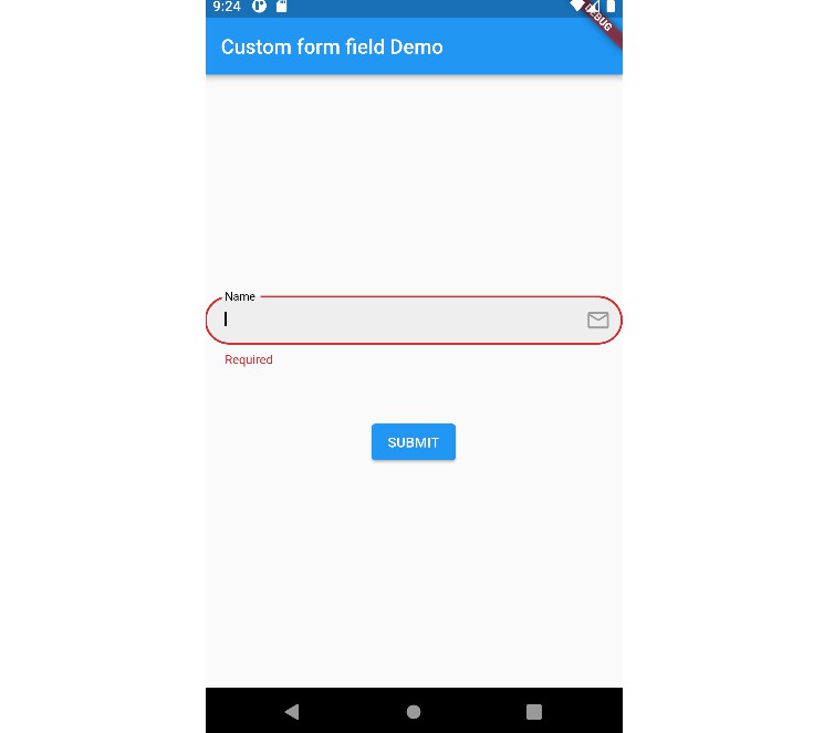
Validation error text positon normally can’t be changed. But here, the error text position can be moved vertically and horizontally
InputFormField(
    textEditingController: _controller,
    labelText: "Label Text",
    hintText: "Hint Text",
    floatingLabelBehavior: FloatingLabelBehavior.always,
    borderRadius: BorderRadius.circular(10),
    errorPadding: EdgeInsets.only(left: 10, top: 10),
    validator: (v) {
      if(v != null && v.isEmpty) {
        return "Required";
      }
    },
),
Added support for default password handler. By setting isPasswordField to true, one can handle password visibility with less boilerplatec code.
To handle it manually, please use obscureText and suffix
InputFormField(
    textEditingController: _controller,
    labelText: "Password",
    hintText: "*****",
    isPasswordField: true,
),
Want to contribute:
Leave a star if this was helpful Github Repository