FSuper
FSuper can help developers build complex views quickly and comfortably.
It supports rich text, rounded corners, borders, pictures, small red dots, and set up to two sub-components at the same time, and control their relative positions.
✨ Features
-
Rich corner effect
-
Exquisite border decoration
-
Naturally supports wonderful rich text
-
Gradient effect
-
More sense of space Shadow
-
Not simple Red Point
-
Flexible and powerful relative layout
Guide
⚙️ Parameters
? Basic parameters
| Param | Type | Necessary | Default | desc |
|---|---|---|---|---|
| width | double | false | null | width |
| height | double | false | null | height. can not be double.infinity |
| maxWidth | double | false | null | maxWidth. If width> maxWidth, width is overridden. If there is no width, the maximum expanded width is maxWidth |
| maxHeight | double | false | null | maxHeight. If height> maxHeight, height is overridden. If there is no height, the maximum extension width is maxHeight |
| backgroundColor | Color | false | null | background color |
| backgroundImage | ImageProvider | false | null | Background illustration. Overrides backgroundColor and gradient |
| gradient | Gradient | false | null | Gradient. Will be overwriting backgroundColor |
| padding | EdgeInsetsGeometry | false | null | Text and margins on each side. This is very useful to reserve space for children in FSuper |
| margin | EdgeInsets | false | null | FSuper margins in parent container |
| corner | Corner | false | null | Corner size |
| cornerStyle | CornerStyle | false | CornerStyle.round | Corner style. Rounded by default, set CornerStyle.bevel to bevel |
| text | String | false | null | Text content |
| textColor | Color | false | null | Font color |
| textSize | double | false | null | Font size |
| textStyle | FontStyle | false | null | Font style |
| textWeight | FontWeight | false | null | Font style |
| fontHeight | double | false | null | Height of a line of text = textSize * fontHeight |
| textAlign | TextAlign | false | TextAlign.center | Text alignment |
| spans | List<TextSpan> |
false | null | Rich text. After receiving text, the text configuration will be inherited by default. Can be set individually via TextStyle |
| onClick | GestureTapCallback | false | null | Set FSuper click listener |
Child Widget Parameters
| Param | Type | Necessary | Default | desc |
|---|---|---|---|---|
| child1 | Widget | false | null | child widget 1 |
| child1Alignment | Alignment | false | null | Relative position of child widget 1 in FSuper |
| child1Margin | EdgeInsets | false | null | child widget 1 relative position based offset |
| onChild1Click | GestureTapCallback | false | null | Click listener of child widget 1 |
| child2 | Widget | false | null | child widget 2 |
| child2Alignment | Alignment | false | null | Relative position of child widget 2 in FSuper |
| child2Margin | EdgeInsets | false | null | child widget 2 relative position based offset |
| onChi2d1Click | GestureTapCallback | false | null | Click listener of child widget 2 |
? Red Point Parameters
| Param | Type | Necessary | Default | desc |
|---|---|---|---|---|
| redPoint | bool | false | false | Whether to show the Red Point |
| redPointColor | Color | false | Colors.redAccent | The Red Point color |
| redPointSize | double | false | 20 | The Red Point size |
| redPointText | String | false | null | text on Red Point |
| redPointTextColor | Color | false | null | Text color on Red Point |
| redPointTextSize | double | false | null | Text font size on Red Point |
| redPointOffset | Offset | false | null | The Red Point shifts to the upper right. The Red Point of Offset (0,0) is in the upper right corner of FSuper. By default, the Red Point is shifted to the upper right by 1/4 |
? Stroke Parameters
| Param | Type | Necessary | Default | desc |
|---|---|---|---|---|
| strokeWidth | double | false | null | Border width. > 0 border will be displayed |
| strokeColor | Color | false | null | 边框颜色 |
Shadow Parameters
| Param | Type | Necessary | Default | desc |
|---|---|---|---|---|
| shadowColor | Color | false | null | Shadow color |
| shadowOffset | Offset | false | null | Shadow offset |
| shadowBlur | double | false | null | The larger the value, the larger the shadow |
? Demo
? Basic Demo
FSuper(
  margin: EdgeInsets.fromLTRB(12, 0, 12, 0),
  width: double.infinity,
  text: "This is FSuper!",
  backgroundColor: Color(0xffffc900),
),


FSuper(
  text: "En.. ",
  spans: [
    TextSpan(
        text: "FWidget",
        style: TextStyle(
          color: Color(0xffffc900),
          backgroundColor: Colors.black38,
          fontSize: 20,
        )),
  ...
  ],
),
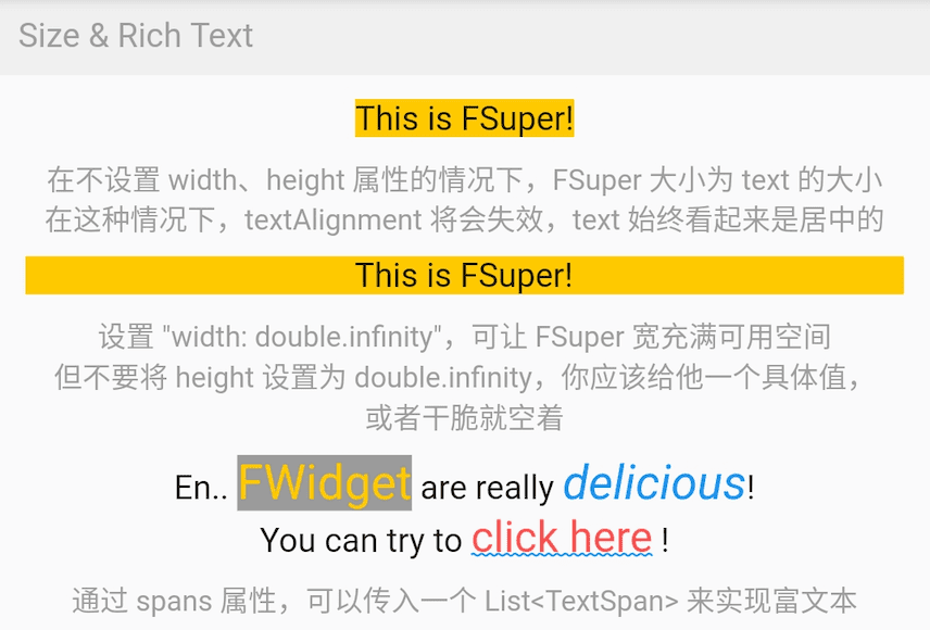
FSuper The first part of the text is set through the text property, and related text style properties can be set. If you want to achieve rich text effects, you can pass a TextSpan array via the spans property.
Of course, by default, the properties you have not set for TextSpan will automatically inherit the text style configuration of FSuper.
By default, FSuper is able to adapt the text content size.
But you can still specify a specific size through the width,height properties. If you want the parent container to be full of components, you can set their value to double.infinity.
⚠️ You should never set the size of FSuper to double.infinity in an infinite parent container, because it really does not know how big it should be!
In addition, FSuper also provides maxWidth andmaxHeight to assist in layout, which is useful in the case of an uncertain component size. Your components will never exceed their limits.
Corner & Stroke Demo
FSuper(
  width: 130,
  padding: EdgeInsets.only(top: 16, bottom: 16)
  text: 'Corner FSuper',
  backgroundColor: Color(0xffFF7043),
  corner: Corner.all(12),
  cornerStyle: CornerStyle.bevel,
),

FSuper(
  text: '音乐类型:流行音乐',
  textColor: Color(0xffc2bfc2),
  padding: EdgeInsets.all(2),
  corner: Corner.all(3),
  strokeColor: Color(0xffc2bfc2),
  strokeWidth: 1,
),
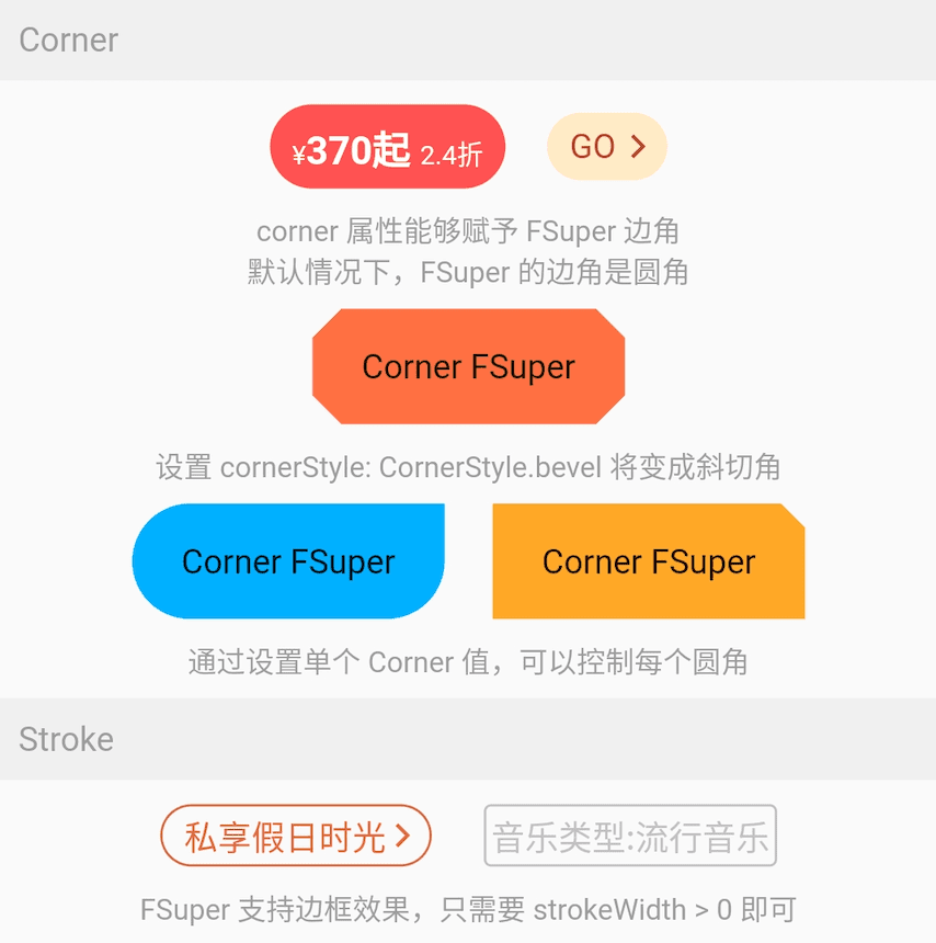
Using FSuper to declare a corner and border component is very simple.
Corners can be declared just by the corner property. A Corner object will describe the corners of the component. You can control each corner individually.
FSuper supports two types of corners:
-
CornerStyle.round:Rounded corners. This is what we need most of the time.
-
CornerStyle.bevel:bevel corners.
If you want a border, you only need to make StrokeWidth> 0 of FSuper. In addition, the strokeColor property allows you to describe the color of the border.
Gradient & Shadow Demo
FSuper(
  width: 280,
  height: 45,
  text: 'Search Flight',
  textAlignment: Alignment.center,
  textSize: 16,
  textColor: Color(0xff333333),
  corner: Corner.all(23),
  gradient: LinearGradient(colors: [
    Color(0xfffed83a),
    Color(0xfffcad2c),
  ]),
),
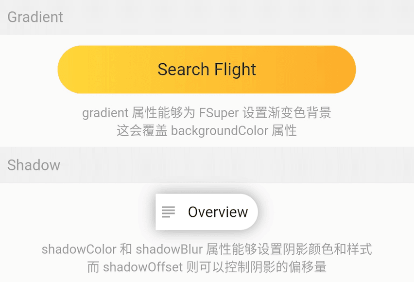
The gradient property allows you to declare a gradient background for FSuper using a gradient object.
The gradient background will override the solid background color set by backgroundColor.
⚠️ Background priority:backgroundImage > gradient > backgroundColor.
FSuper(
  text: 'Overview',
  backgroundColor: Colors.white,
  padding: EdgeInsets.fromLTRB(6.0 + 18.0 + 6.0, 9, 9, 9),
  corner: Corner(rightTopCorner: 20, rightBottomCorner: 20),
  child1: Icon(
    Icons.subject,
    size: 18,
    color: Color(0xffa6a4a7),
  ),
  child1Alignment: Alignment.centerLeft,
  child1Margin: EdgeInsets.only(left: 3),
  shadowColor: Colors.black38,
  shadowBlur: 10,
  onClick: () {
    _showDialog(context, "Disco");
  },
),
If you are considering adding shadow effects to your components, using FSuper is a great choice.
? Red Point Demo
FSuper(
  width: 60,
  height: 60,
  backgroundColor: Color(0xffeeeeee),
  corner: Corner.all(6),
  redPoint: true,
  redPointSize: 20,
  redPointText: "红包",
),
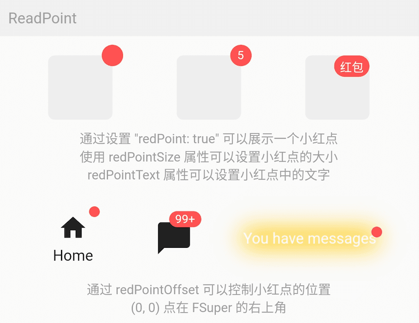
Using FSuper can be very simple to achieve the common Red Point effect. Just configure redPoint: true.
In addition, you can add arbitrary text content to the Red Point (it is really convenient) and set its position.
⚠️ The (0,0) position of the Red Point is in the upper right corner of FSuper.
One-stop service to meet all your needs.
Child Widget
FSuper(
    width: double.infinity,
    padding: EdgeInsets.fromLTRB(
        (16.0 + 25.0 + 12), 8, (0.0 + 8.0), 8),
    margin: EdgeInsets.fromLTRB(10, 10, 10, 0),
    corner: Corner.all(6),
    backgroundColor: Color(0xfffff0e7),
    strokeColor: Color(0xfffee0cd),
    strokeWidth: 1,
    text: '警告提示的文案',
    textColor: Color(0xff7e7c7a),
    textAlignment: Alignment.centerLeft,
    textAlign: TextAlign.left,
    spans: [
      ...
    ],
    child1: Transform.rotate(
      angle: pi,
      child: Icon(
        Icons.info,
        size: 25,
        color: Color(0xfffd6721),
      ),
    ),
    child1Alignment: Alignment.centerLeft,
    child1Margin: EdgeInsets.fromLTRB(16, 0, 0, 0),
    child2: Icon(
      Icons.close,
      size: 15,
      color: Colors.black38,
    ),
    child2Alignment: Alignment.topRight,
    child2Margin: EdgeInsets.fromLTRB(0, 8, 12, 0),
    onChild2Click: () {
      _showDialog(context, "关闭警告⚠️");
    },
  ),
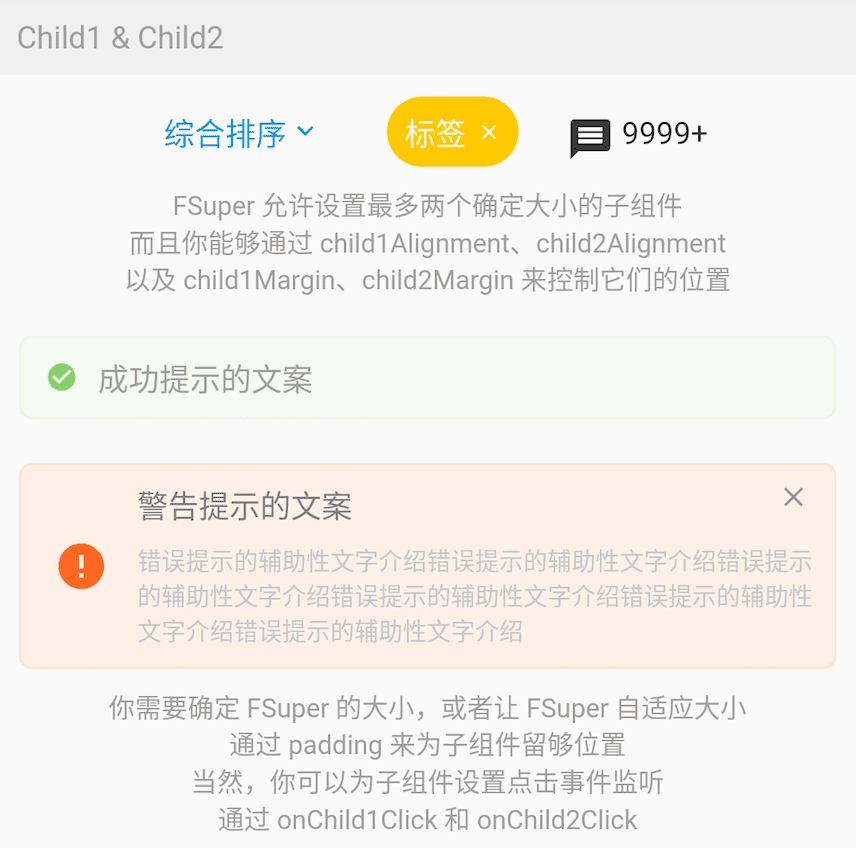
In FSuper, two child components can be declared by child1, child2. You can specify their location and declare a click event.
This will greatly increase development speed in some common and complex layouts. Especially in the scenario where the size of one component is small and uncertain, and the other component determines the position based on its size, FSuper handles everything.
The effects of these components in the picture only need one FSuper component to complete.
More Demo
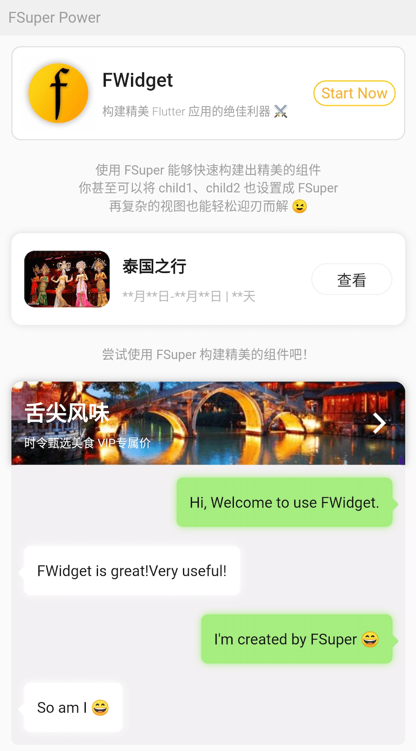
Do not be surprised, the effects in the figure are all achieved with FSuper.
The design of the sub-components makes FSuper a qualitative leap in flexibility, and most of the complex views are capable.
For example, the chat bubble in the picture does not need to use the background picture, just use FSuper to achieve it. This makes such components extremely flexible and easy to modify.
FSuper(
  maxWidth: 220,
  textAlign: TextAlign.left,
  text: "I'm created by FSuper ?",
  padding: EdgeInsets.only(
      left: 12, right: 12, top: 15, bottom: 15),
  backgroundColor: Color(0xffa5ed7e),
  corner: Corner.all(6),
  child1: Transform.rotate(
    angle: pi / 4,
    child: FSuper(
      width: 10,
      height: 10,
      backgroundColor: Color(0xffa5ed7e),
      corner: Corner.all(1.5),
    ),
  ),
  child1Alignment: Alignment.topRight,
  child1Margin: EdgeInsets.only(right: -4, top: 20),
  shadowColor: Color(0xffa5ed7e),
  shadowBlur: 5,
),
? How to use?
Add dependency in project pubspec.yaml file:
pub dependency
dependencies:
  fsuper: ^<version number>
⚠️ Attention, please go to pub to get the latest version number of FSuper
git dependencies
dependencies:
  fsuper:
    git:
      url: '[email protected]:Fliggy-Android-Team/fsuper.git'
      ref: '<Branch number or tag number>'
⚠️ Attention,Please refer to the official project of FSuper for the branch number or tag.