Animated Login


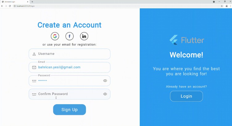
Animated Login for Flutter is a ready-made login/signup screen with soft and pleasant animations.
It is fully responsible to be able to use on both web and mobile apps. You can welcome your users with this beautiful animated screen that gives functionality for both login and sign up.
Web View Example Video
Mobile View Example Video
Installation
You can follow the instructions for installation here
Reference
| Property |
Type |
Description |
| onSignup |
SignupCallback |
Signup callback that will be called after signup button pressed. |
| onLogin |
LoginCallback |
Login callback that will be called after login button pressed. |
| socialLogins |
List<SocialLogin> |
List of social login options that will be provided. |
| loginTexts |
LoginTexts |
Determines all of the texts on the screen. |
| loginTheme |
LoginTheme |
Determines all of the theme related variables on the screen. |
| onForgotPassword |
ForgotPasswordCallback |
Callback that will be called after on tap of forgot password text. Commonly it navigates user to a screen to reset the password. |
| animationCurve |
Curve |
Custom animation curve that will be used for animations. |
| formWidthRatio |
double |
Ratio of width of the form to the width of the screen. |
| animationDuration |
Duration |
The duration of the animations. |
| formKey |
GlobalKey<FormState> |
The optional custom form key, if not provided will be created locally. |
| formElementsSpacing |
double |
The spacing between the elements of form. |
| socialLoginsSpacing |
double |
The spacing between the social login options. |
| checkError |
bool |
Indicates whether the login screen should handle errors, show the error messages returned from the callbacks in a dialog. |
| showForgotPassword |
bool |
Indicates whether the forgot password option will be enabled. |
| showChangeActionTitle |
bool |
Indicates whether the change action title should be displayed. |
| showPasswordVisibility |
bool |
Indicates whether the user can show the password text without obscuring. |
| nameController |
TextEditingController |
Optional TextEditingController for name input field. |
| emailController |
TextEditingController |
Optional TextEditingController for email input field. |
| passwordController |
TextEditingController |
Optional TextEditingController for password input field. |
| confirmPasswordController |
TextEditingController |
Optional TextEditingController for confirm password input field. |
| actionButtonStyle |
ButtonStyle |
Custom button style for action button (login/signup). |
| changeActionButtonStyle |
ButtonStyle |
Custom button style for change action button that will switch auth mode. |
| welcomePadding |
EdgeInsets |
Padding of the welcome part widget. |
| formPadding |
EdgeInsets |
Padding of the form part widget. |
| backgroundImage |
String |
Full asset image path for background of the welcome part. |
| logo |
String |
Full asset image path for the logo. |
| logoSize |
Size |
Size of the logo in the welcome part. |
| signUpMode |
SignUpModes |
Enum to determine which text form fields should be displayed in addition to the email and password fields: Name / Confirm Password / Both. |
LoginTexts
| Property |
Type |
Description |
| welcome |
String |
Welcome title in signUp mode for the informing part. |
| welcomeDescription |
String |
Welcome description in signUp mode for the informing part. |
| signUp |
String |
Action button text for sign up mode. |
| signUpFormTitle |
String |
Form title for sign up mode. |
| signUpUseEmail |
String |
Use email CTA for sign up mode. |
| welcomeBack |
String |
Welcome title in login mode for the informing part. |
| welcomeBackDescription |
String |
Welcome description in login mode for the informing part. |
| login |
String |
Action button text for login mode. |
| loginFormTitle |
String |
Form title for login mode. |
| loginUseEmail |
String |
Use email CTA for login mode. |
| forgotPassword |
String |
Forgot password text for login mode. |
| notHaveAnAccount |
String |
Text above the sign up button to direct users who don’t have an account. |
| alreadyHaveAnAccount |
String |
Text above the login button to direct users who already have an account. |
| nameHint |
String |
Hint text for name [TextFormField] |
| emailHint |
String |
Hint text for email [TextFormField] |
| passwordHint |
String |
Hint text for password [TextFormField] |
| confirmPasswordHint |
String |
Hint text for confirm password [TextFormField] |
| passwordMatchingError |
String |
The error text for not matching password and confirm password inputs. |
| dialogButtonText |
String |
The button text of error dialog. |
LoginTheme
| Property |
Type |
Description |
| formTitleStyle |
TextStyle |
Text style for the title of form part. |
| welcomeTitleStyle |
TextStyle |
Text style for the title of welcome part. |
| welcomeDescriptionStyle |
TextStyle |
Text style for the description of welcome part. |
| changeActionStyle |
TextStyle |
Text style for the change action CTA of welcome part. |
| useEmailStyle |
TextStyle |
Text style for the use email text of form part. |
| forgotPasswordStyle |
TextStyle |
Text style for the forgot password CTA of form part. |
| hintTextStyle |
TextStyle |
Text style for hint texts in the text form fields. |
| errorTextStyle |
TextStyle |
Text style for error texts in the text form fields. |
| textFormStyle |
TextStyle |
Text style for input texts in the text form fields. |
| actionTextStyle |
TextStyle |
Text style for action button text in the form part. |
| changeActionTextStyle |
TextStyle |
Text style for change action button text in the welcome part. |
| textFormFieldDeco |
InputDecoration |
Input decoration for the text form fields. |
| nameIcon |
Widget |
Prefix widget for name text form field. |
| emailIcon |
Widget |
Prefix widget for email text form field. |
| passwordIcon |
Widget |
Prefix widget for password text form field. |
| formFieldElevation |
double |
Elevation for text form fields. |
| formFieldBackgroundColor |
Color |
Background color for text form fields. |
| formFieldShadowColor |
Color |
Shadow color for text form fields. |
| formFieldBorderRadius |
BorderRadius |
Border radius for text form fields. |
| formFieldSize |
Size |
Size of text form fields. |
| formFieldHoverColor |
Color |
Hover color for text form fields. |
| backgroundColor |
Color |
Background color of the login screen. |
| errorBorderColor |
Color |
Error border color for text form fields. |
| focusedErrorBorderColor |
Color |
Focused error border color for text form fields. |
| focusedBorderColor |
Color |
Focused border color for text form fields. |
| enabledBorderColor |
Color |
Enabled border color for text form fields. |
| enabledBorder |
InputBorder |
Enabled border for text form fields. |
| errorBorder |
InputBorder |
Error border for text form fields. |
| focusedErrorBorder |
InputBorder |
Focused error border for text form fields. |
| focusedBorder |
InputBorder |
Focused border for text form fields. |
| showFormFieldErrors |
bool |
Indicates whether the error messages should be displayed below the text form fields. |
| showLabelTexts |
bool |
Indicates whether the labels should be displayed above the text form fields. |
| socialLoginHoverColor |
Color |
Hover color for social login widgets. |
| socialLoginBorder |
BorderSide |
Border for social login widgets. |
SocialLogin
| Property |
Type |
Description |
| iconPath |
String |
Full asset path of the social platform logo. |
| callback |
SocialLoginCallback |
The callback will be called on click to logo of the social platform. |
LoginData
| Property |
Type |
Description |
| email |
String |
Email text the user entered to the email [TextFormField] |
| password |
String |
Password text the user entered to the password [TextFormField] |
SignUpData
| Property |
Type |
Description |
| name |
String |
Name text the user entered to the name [TextFormField] |
| email |
String |
Email text the user entered to the email [TextFormField] |
| password |
String |
Password text the user entered to the password [TextFormField] |
| confirmPassword |
String |
Confirm password text the user entered to the confirm password [TextFormField] |
SignUpModes
| Enum |
Description |
| name |
Only displays name text form field, not displays confirm password. |
| confirmPassword |
Only displays confirm password form field, not name. |
| both |
Displays both name and confirm password text form fields. |
Sign up modes to determine which text form fields should be displayed.
Complete Example
You can see the complete example in the example folder with the example project. The video recordings for the example project are shown above via gifs.
Basic example
import 'package:flutter/material.dart';
import 'package:animated_login/animated_login.dart';
class LoginScreen extends StatelessWidget {
  const LoginScreen({Key? key}) : super(key: key);

  /// Simulates the multilanguage, you will implement your own logic.
  /// According to the current language, you can display a text message
  /// with the help of [LoginTexts] class.
  final String langCode = 'en';

  @override
  Widget build(BuildContext context) {
    return AnimatedLogin(
      onLogin: onLogin,
      onSignup: onSignup,
      onForgotPassword: onForgotPassword,
      formWidthRatio: 60,
      logo: 'images/logo.gif',
      // backgroundImage: 'images/background_image.jpg',
      signUpMode: SignUpModes.both,
      loginTheme: _loginTheme,
      loginTexts: _loginTexts,
    );
  }

  /// You can adjust the colors, text styles, button styles, borders
  /// according to your design preferences.
  /// You can also set some additional display options such as [showLabelTexts].
  LoginTheme get _loginTheme => LoginTheme(
        // showLabelTexts: false,
        backgroundColor: Colors.blue, // const Color(0xFF6666FF),
        formFieldBackgroundColor: Colors.white,
        changeActionTextStyle: const TextStyle(color: Colors.white),
      );

  LoginTexts get _loginTexts => LoginTexts(
        nameHint: _username,
        login: _login,
        signUp: _signup,
      );

  /// You can adjust the texts in the screen according to the current language
  /// With the help of [LoginTexts], you can create a multilanguage scren.
  String get _username => langCode == 'tr' ? 'Kullanıcı Adı' : 'Username';
  String get _login => langCode == 'tr' ? 'Giriş Yap' : 'Login';
  String get _signup => langCode == 'tr' ? 'Kayıt Ol' : 'Sign Up';

  /// Login action that will be performed on click to action button in login mode.
  Future<String?> onLogin(LoginData loginData) async {
    await Future.delayed(const Duration(seconds: 2));
    print('Successfully logged in.');
    return null;
  }

  /// Sign up action that will be performed on click to action button in sign up mode.
  Future<String?> onSignup(SignUpData loginData) async {
    await Future.delayed(const Duration(seconds: 2));
    print('Successfully signed up.');
    return null;
  }

  /// Action that will be performed on click to "Forgot Password?" text/CTA.
  /// Probably you will navigate user to a page to create a new password after the verification.
  Future<String?> onForgotPassword(String email) async {
    await Future.delayed(const Duration(seconds: 2));
    print('Successfully navigated.');
    return null;
  }
}
Basic example with social login options and data checks
import 'package:flutter/material.dart';
import 'package:animated_login/animated_login.dart';

class LoginScreen extends StatelessWidget {
  const LoginScreen({Key? key}) : super(key: key);

  /// Simulates the multilanguage, you will implement your own logic.
  /// According to the current language, you can display a text message
  /// with the help of [LoginTexts] class.
  final String langCode = 'en';

  @override
  Widget build(BuildContext context) {
    return AnimatedLogin(
      onLogin: onLogin,
      onSignup: onSignup,
      onForgotPassword: onForgotPassword,
      formWidthRatio: 60,
      logo: 'images/logo.gif',
      // backgroundImage: 'images/background_image.jpg',
      signUpMode: SignUpModes.both,
      socialLogins: _socialLogins,
      loginTheme: _loginTheme,
      loginTexts: _loginTexts,
    );
  }

  /// You can adjust the colors, text styles, button styles, borders
  /// according to your design preferences.
  /// You can also set some additional display options such as [showLabelTexts].
  LoginTheme get _loginTheme => LoginTheme(
        // showLabelTexts: false,
        backgroundColor: Colors.blue, // const Color(0xFF6666FF),
        formFieldBackgroundColor: Colors.white,
        changeActionTextStyle: const TextStyle(color: Colors.white),
      );

  LoginTexts get _loginTexts => LoginTexts(
        nameHint: _username,
        login: _login,
        signUp: _signup,
      );

  /// You can adjust the texts in the screen according to the current language
  /// With the help of [LoginTexts], you can create a multilanguage scren.
  String get _username => langCode == 'tr' ? 'Kullanıcı Adı' : 'Username';
  String get _login => langCode == 'tr' ? 'Giriş Yap' : 'Login';
  String get _signup => langCode == 'tr' ? 'Kayıt Ol' : 'Sign Up';

  /// Social login options, you should provide callback function and icon path.
  /// Icon paths should be the full path in the assets
  /// Don't forget to also add the icon folder to the "pubspec.yaml" file.
  List<SocialLogin> get _socialLogins => <SocialLogin>[
        SocialLogin(
            callback: () async => socialLogin('Google'),
            iconPath: 'images/google.png'),
        SocialLogin(
            callback: () async => socialLogin('Facebook'),
            iconPath: 'images/facebook.png'),
        SocialLogin(
            callback: () async => socialLogin('Linkedin'),
            iconPath: 'images/linkedin.png'),
      ];

  /// Login action that will be performed on click to action button in login mode.
  Future<String?> onLogin(LoginData loginData) async {
    await Future.delayed(const Duration(seconds: 2));
    print("""
    Successfully logged in.\n
    Email: ${loginData.email}\n
    Password: ${loginData.password}""");
    return null;
  }

  /// Sign up action that will be performed on click to action button in sign up mode.
  Future<String?> onSignup(SignUpData signupData) async {
    await Future.delayed(const Duration(seconds: 2));
    print("""
    Successfully signed up.\n
    Username: ${signupData.name}\n
    Email: ${signupData.email}\n
    Password: ${signupData.password}\n
    Confirm Password: ${signupData.confirmPassword}""");
    return null;
  }

  /// Action that will be performed on click to "Forgot Password?" text/CTA.
  /// Probably you will navigate user to a page to create a new password after the verification.
  Future<String?> onForgotPassword(String email) async {
    await Future.delayed(const Duration(seconds: 2));
    print('Successfully navigated. Email is $email');
    return null;
  }

  /// Social login callback example.
  Future<String?> socialLogin(String type) async {
    await Future.delayed(const Duration(seconds: 2));
    print('Successfully logged in with $type.');
    return null;
  }
}
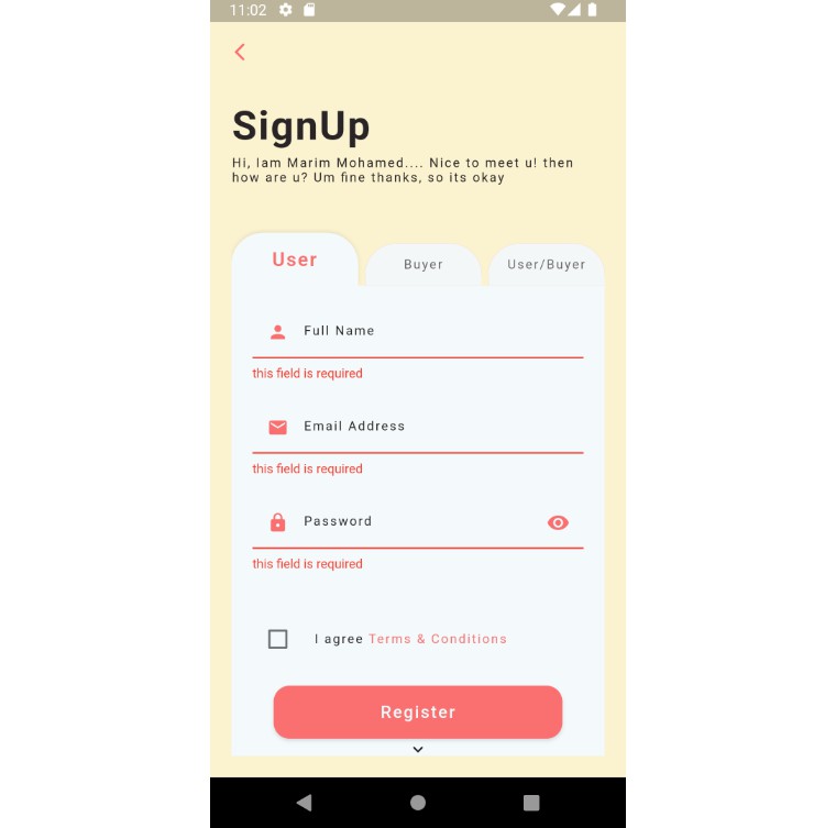
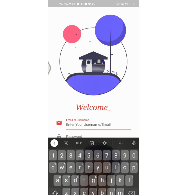
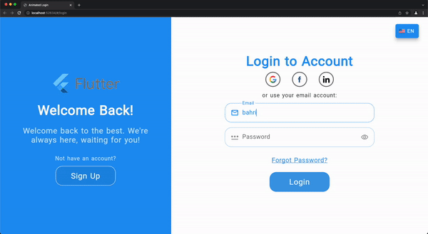
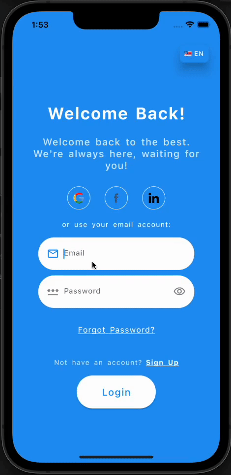
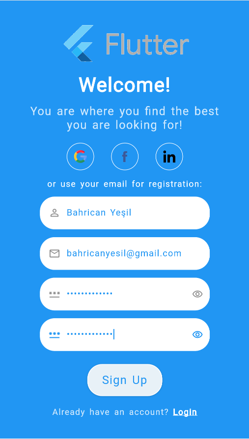
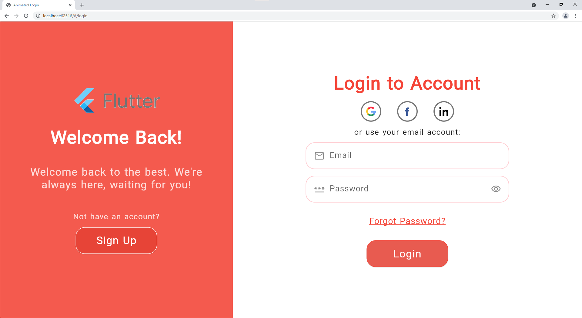
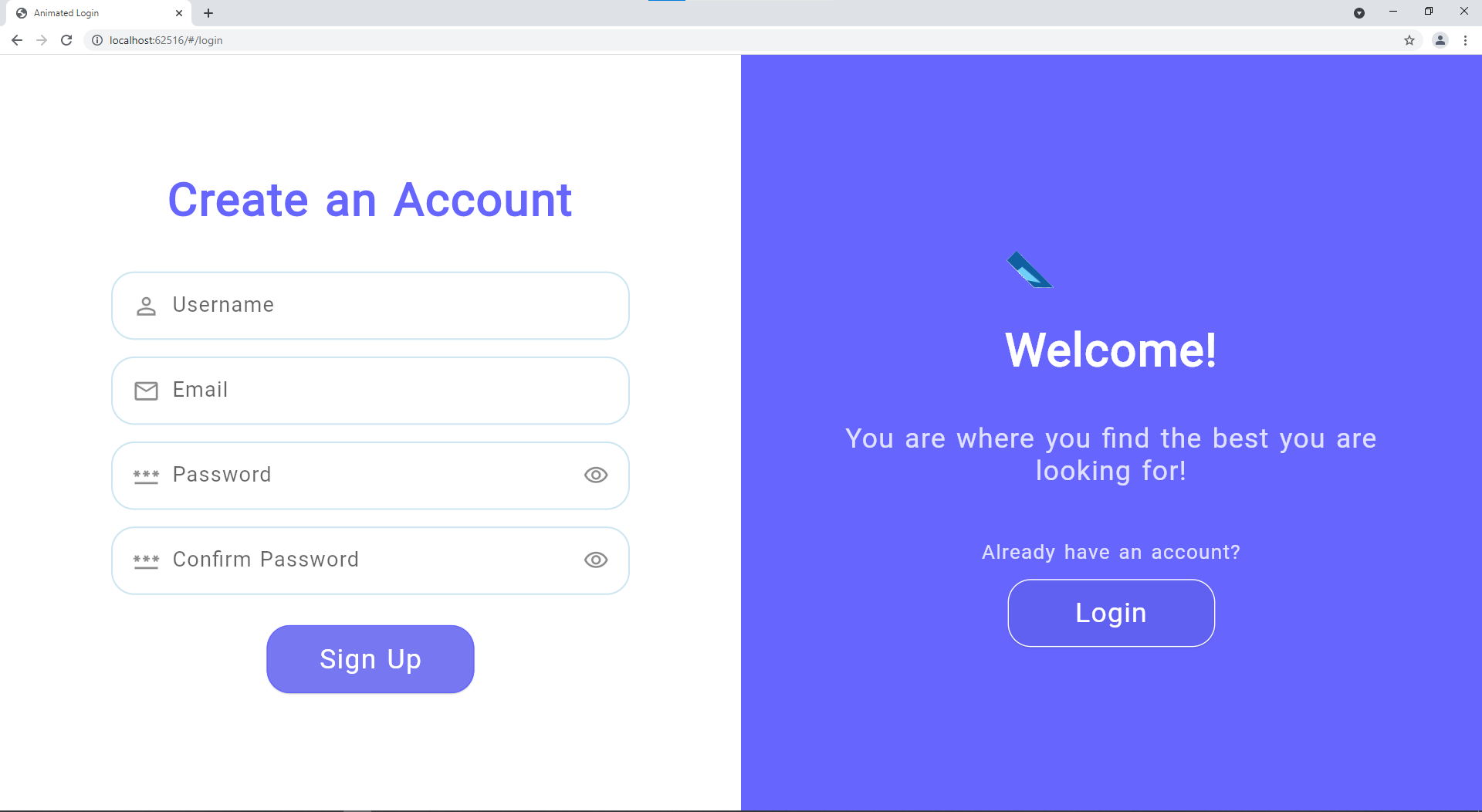
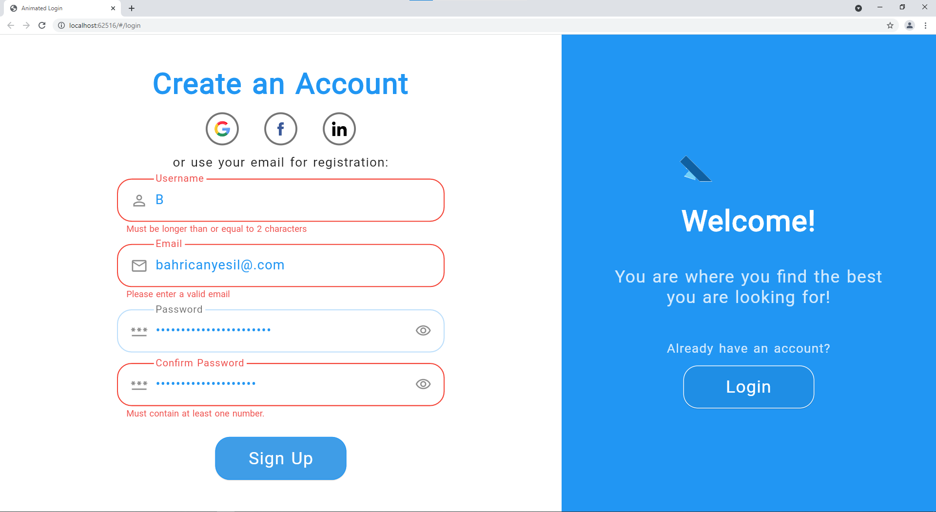
More Screenshots
| Web Login |
Mobile Login |
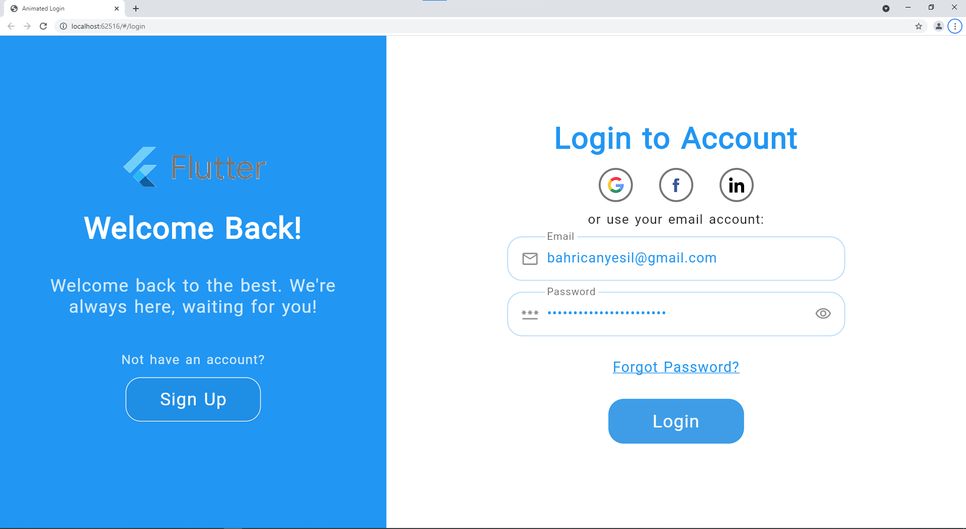 |
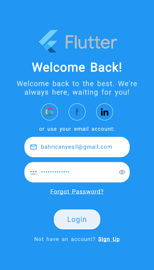 |
| Web Sign Up |
Mobile Sign Up |
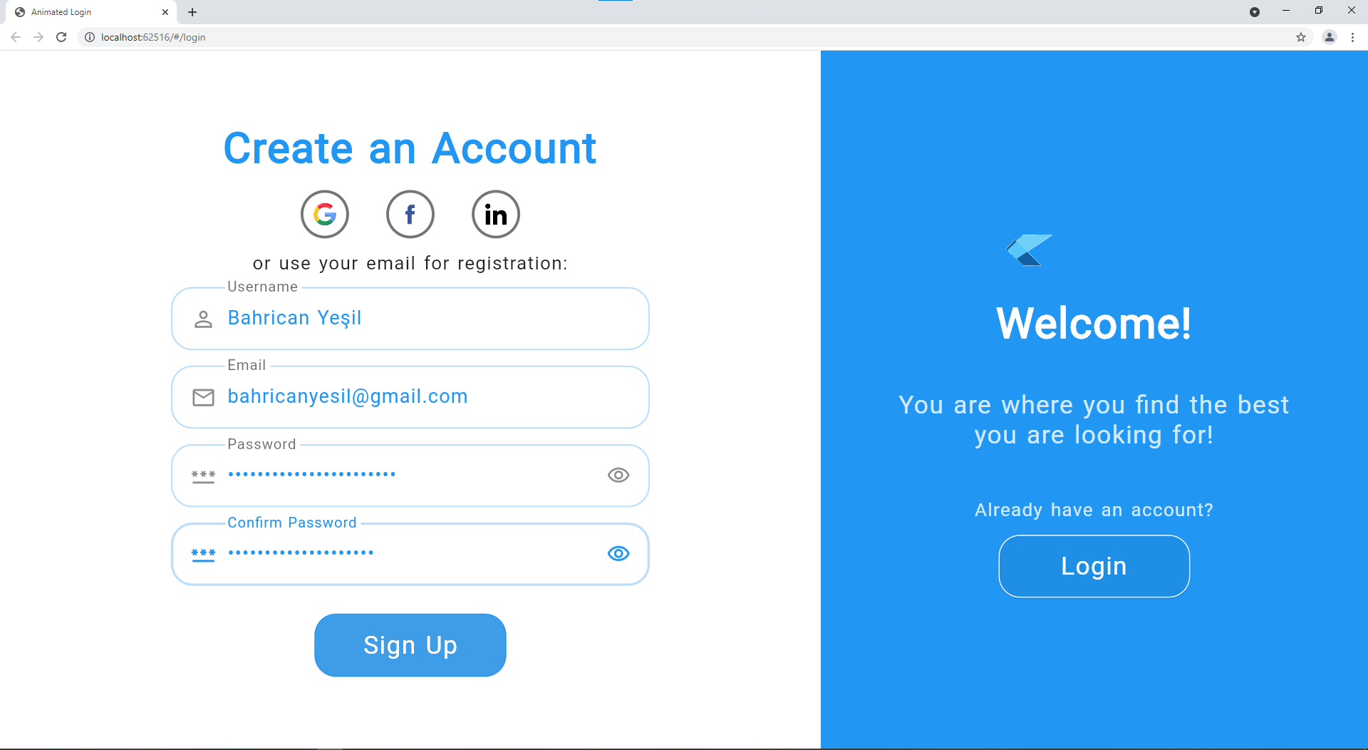 |
 |
| Color Change |
Without Social Logins |
 |
 |
| Error Example |
 |
Contributing
Contributions are so important for both me and those who want to use this package. I will be very appreciative if you allocate time to push forward the package.
All help is welcomed but if you have questions, bug reports, issues, feature requests, pull requests, etc, please first refer to the Contributing Guide.
If you like and benefit from this package, please give us a star on GitHub and like on pub.dev to help!
License
GitHub
View Github
