animator
Enables you to create stunning flutter animations, faster, efficient and with less code.
Partly inspired by the amazing Animate.css package by Dan Eden. Please note, although it's inspired by Animate.css, this still is a Flutter package, meaning it will be available for all flutter-supported platforms.
- LightSpeedIn
- LightSpeedOut
Getting Started
Note: To see all of the animated widgets in action be sure to run the app in the demo_app package, or view them on the Animate.css page.
Put the dependency inside your pubspec.yml and run packages get.
Using one of the Animate.css style widgets:
import 'package:flutter/widgets.dart';
import 'package:animator/animator.dart';

class TestAnimatedWidget extends StatelessWidget {
  @override
  Widget build(BuildContext context) {
    return RubberBand(
      child: Text(
        'Rubber',
        style: TextStyle(fontSize: 20),
      ),
    );
  }
}
Using a GlobalKey to enable play/stop/reverse animations from code:
import 'package:flutter/widgets.dart';
import 'package:animator/animator.dart';

class TestAnimatedWidget extends StatefulWidget {
  @override
  _TestAnimatedWidgetState createState() => _TestAnimatedWidgetState();
}
class _TestAnimatedWidgetState extends State<TestAnimatedWidget> {
  //Register a key in your state:
  GlobalKey<AnimatorWidgetState> _key = GlobalKey<AnimatorWidgetState>();

  @override
  Widget build(BuildContext context) {
    return Column(
      children: <Widget>[
        Expanded(
            //Render the widget using the _key
            child: RubberBand(
              key: _key,
              child: Text(
                'Rubber',
                style: TextStyle(fontSize: 60),
              ),
            ),
        ),
        Padding(
            padding: EdgeInsets.fromLTRB(10, 10, 10, 30),
            child: IconButton(
              icon: Icon(
                Icons.play_arrow,
                color: Colors.green,
              ),
              //Use _key.currentState to forward/stop/reverse
              onPressed: () => _key.currentState.forward(),
            ),
        ),
      ],
    );
  }
}
Create your own:
Below is the code (with extra comments) from the actual FadeInDown animated widget.
It should give you a clear insight on how to animate with the Animator using the AnimatorWidget.
import 'package:flutter/widgets.dart';

import '../../flutter_animator.dart';

///Firstly, we create an _AnimationDefinition_.
///This is the actual animation part, which gets driven by the _AnimatorWidget_.
class FadeInDownAnimation extends AnimationDefinition {
  FadeInDownAnimation({
  ///[AnimationPreferences] allows us to use the animation with different parameters for:
  ///offset, duration, autoPlay and an animationStatusListener.
    AnimationPreferences preferences = const AnimationPreferences(),
  }) : super(
          preferences: preferences,
          ///If you want to use the size of the widget, you need to define it here. (needsScreenSize is also available)
          needsWidgetSize: true,
          ///The opacity to use on the first render when using screenSize or widgetSize.
          ///In some cases 'flickering' may appear when this isn't set to 1.0 or 0.0 respectively.
          preRenderOpacity: 0.0,
        );

  ///Use the build function to actually render the animated values.
  ///Performance-wise it's better to use a FadeTransition for opacity animation.
  ///Use AnimatedBuilder to update te animation and it's values.
  @override
  Widget build(BuildContext context, Animator animator, Widget child) {
    return FadeTransition(
      ///Use animator.get([KEY]) to get to the Animation object.
      opacity: animator.get("opacity"),
      child: AnimatedBuilder(
        ///[Animator] exposes the AnimationController via animator.controller.
        animation: animator.controller,
        child: child,
        builder: (BuildContext context, Widget child) => Transform.translate(
          child: child,
          ///Use animator.get([KEY]).value to get the animated value.
          offset: Offset(0.0, animator.get("translateY").value),
        ),
      ),
    );
  }

  ///Inside the getDefinition method we return the actual animation.
  @override
  Map<String, TweenList> getDefinition({Size screenSize, Size widgetSize}) {
    return {
      ///Define a [KEY] and a list of Animated values from 0 to 100 percent.
      ///Please not that you can also define an animation curve inside the [TweenPercentage] class:
      ///TweenPercentage(percent: 0, value: 0.0, curve: Curves.ease),
      "opacity": TweenList<double>(
        [
          TweenPercentage(percent: 0, value: 0.0),
          TweenPercentage(percent: 100, value: 1.0),
        ],
      ),
      "translateY": TweenList<double>(
        [
          TweenPercentage(percent: 0, value: -widgetSize.height),
          TweenPercentage(percent: 100, value: 0.0),
        ],
      ),
    };
  }
}

///To use the AnimationDefinition we just created we could do the following:
///For a single animation:
/// AnimatorWidget(child: [child], definition: FadeInDownAnimation());
///
///For In & Out Animations:
///  InOutAnimation(child: [child), inDefinition: FadeInDownAnimation(), outDefinition: ...);
///
Available default animations:
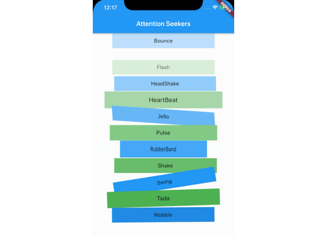
Attention Seekers
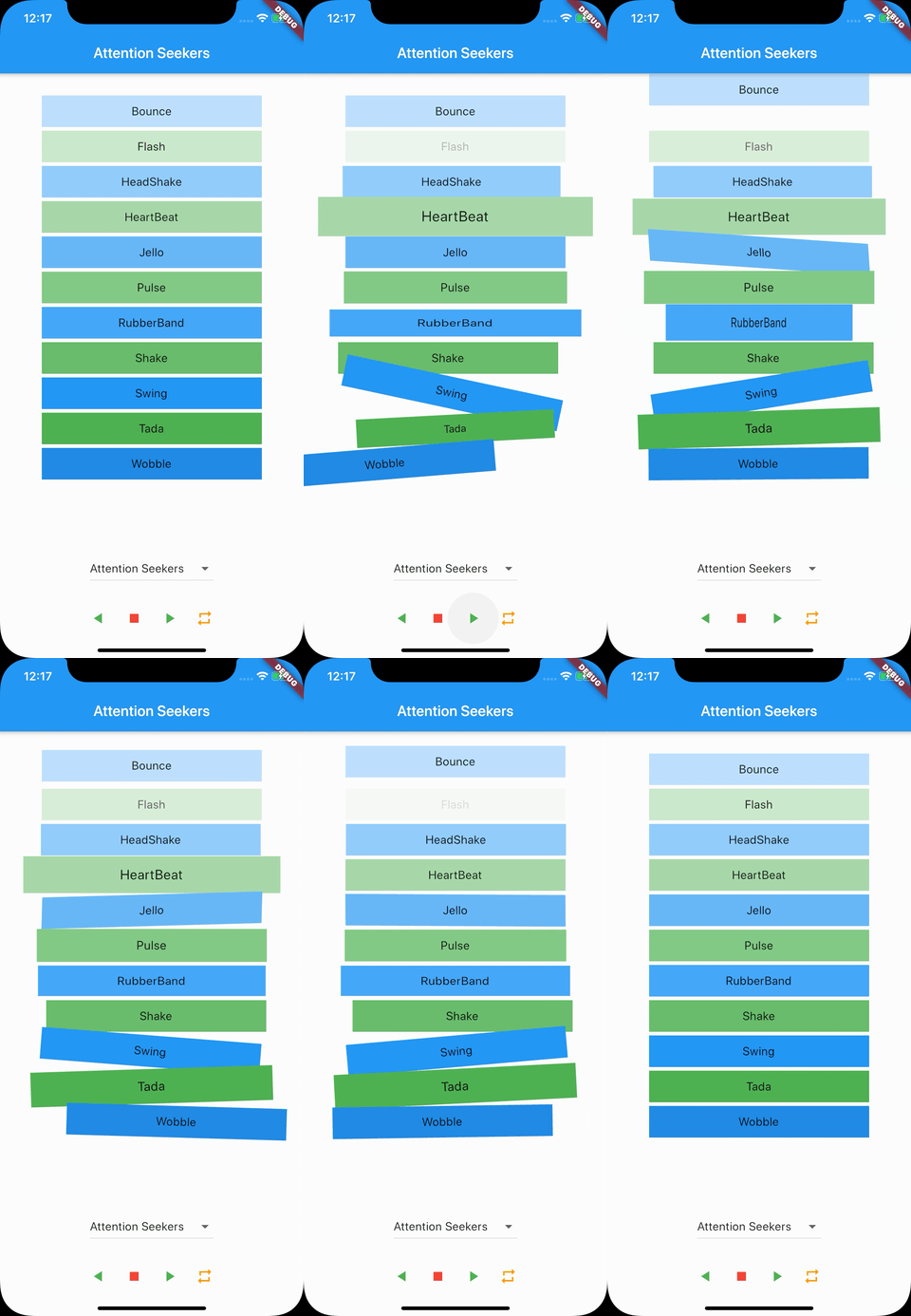
- Bounce
- Flash
- HeadShake
- HeartBeat
- Jello
- Pulse
- RubberBand
- Shake
- Swing
- Tada
- Wobble
Bouncing Entrances
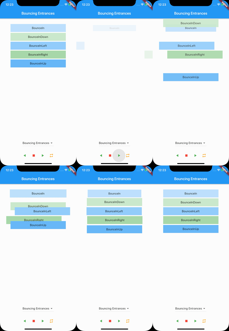
- BounceIn
- BounceInDown
- BounceInLeft
- BounceInRight
- BounceInUp
Bouncing Exits
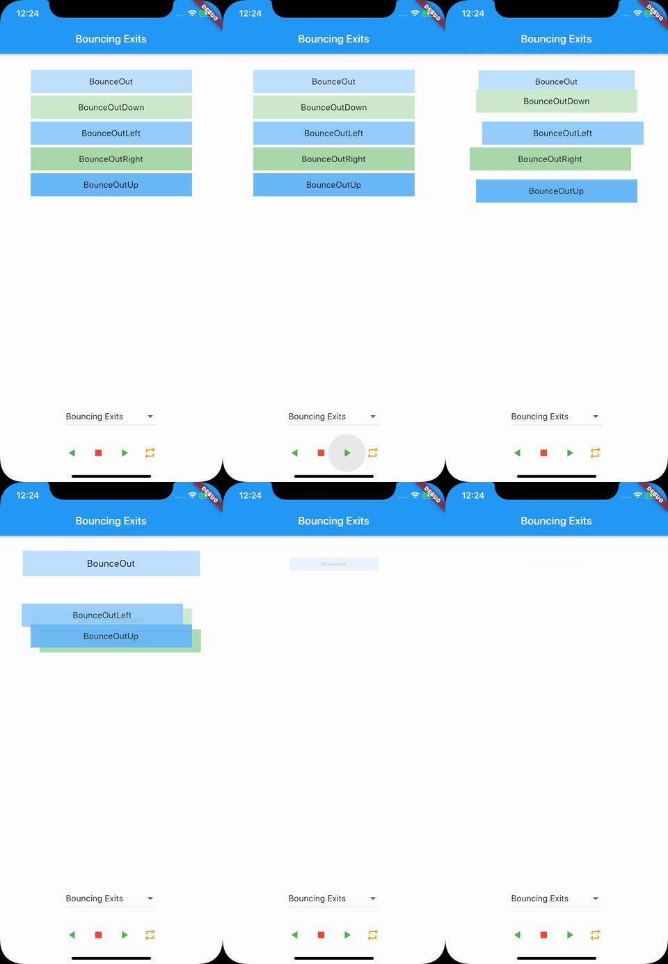
- BounceOut
- BounceOutDown
- BounceOutLeft
- BounceOutRight
- BounceOutUp
Fading Entrances

- FadeIn
- FadeInDown
- FadeInDownBig
- FadeInLeft
- FadeInLeftBig
- FadeInRight
- FadeInRightBig
- FadeInUp
- FadeInUpBig
Fading Exits
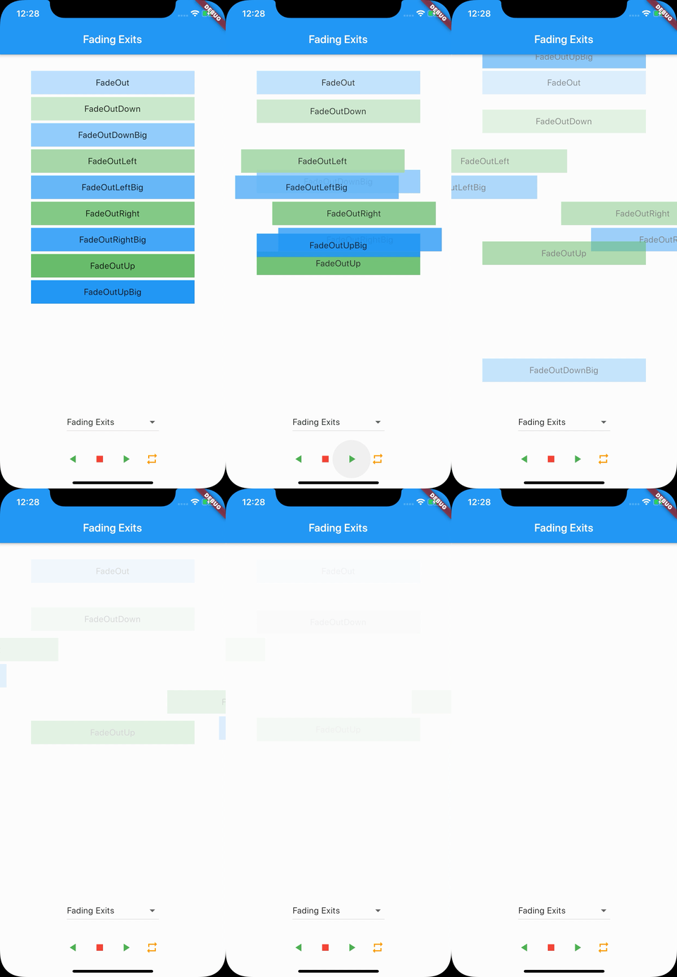
- FadeOut
- FadeOutDown
- FadeOutDownBig
- FadeOutLeft
- FadeOutLeftBig
- FadeOutRight
- FadeOutRightBig
- FadeOutUp
- FadeOutUpBig
Flippers
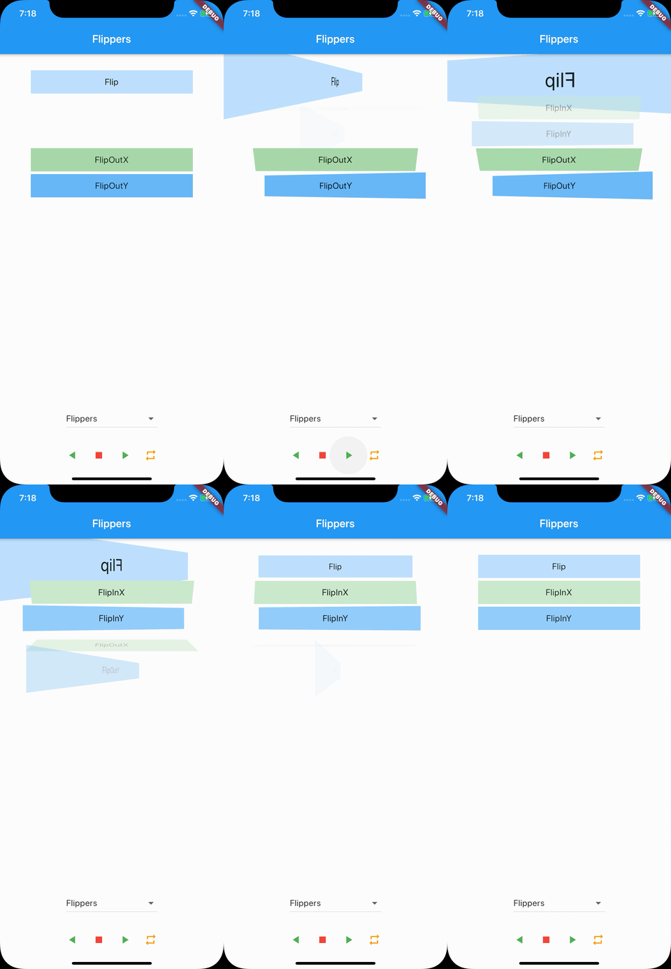
- Flip
- FlipInX
- FlipInY
- FlipOutX
- FlipOutY
Lightspeed
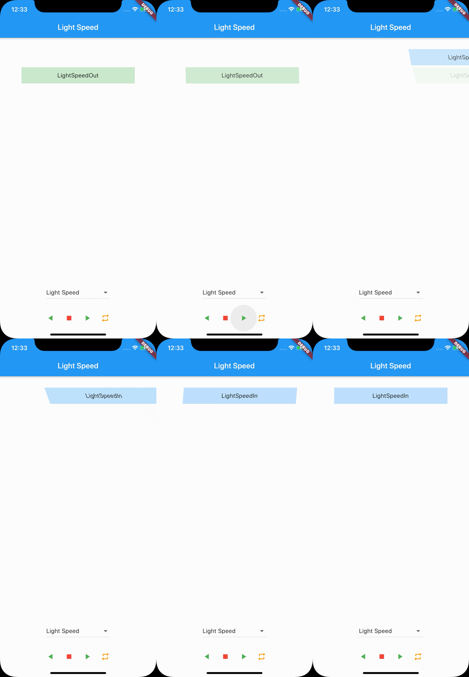
- LightSpeedIn
- LightSpeedOut
Rotating Entrances
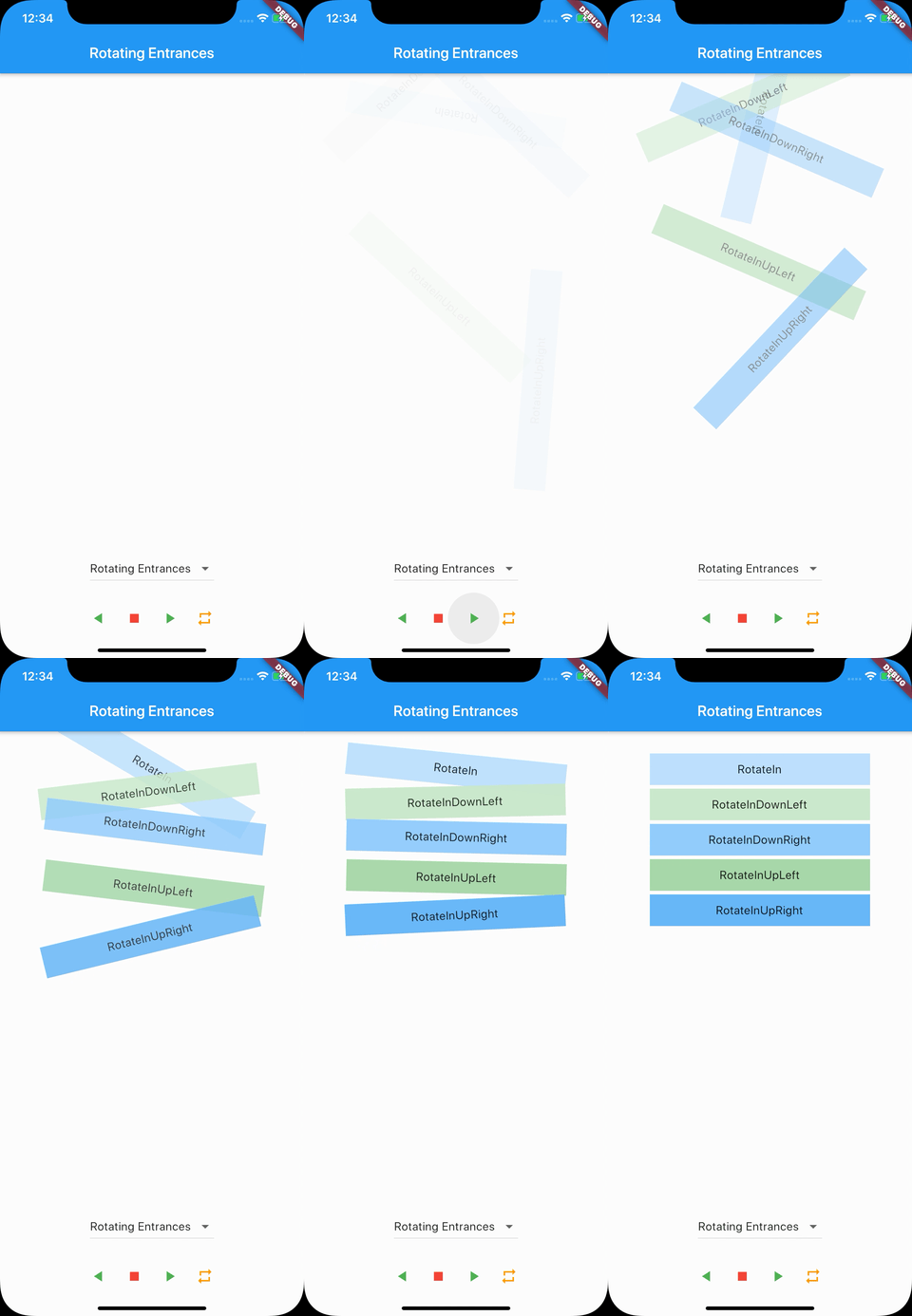
- RotateIn
- RotateInDownLeft
- RotateInDownRight
- RotateInUpLeft
- RotateInUpRight
Rotating Exits
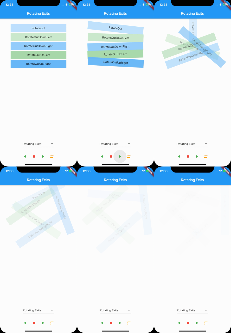
- RotateOut
- RotateOutDownLeft
- RotateOutDownRight
- RotateOutUpLeft
- RotateOutUpRight
Sliding Entrances
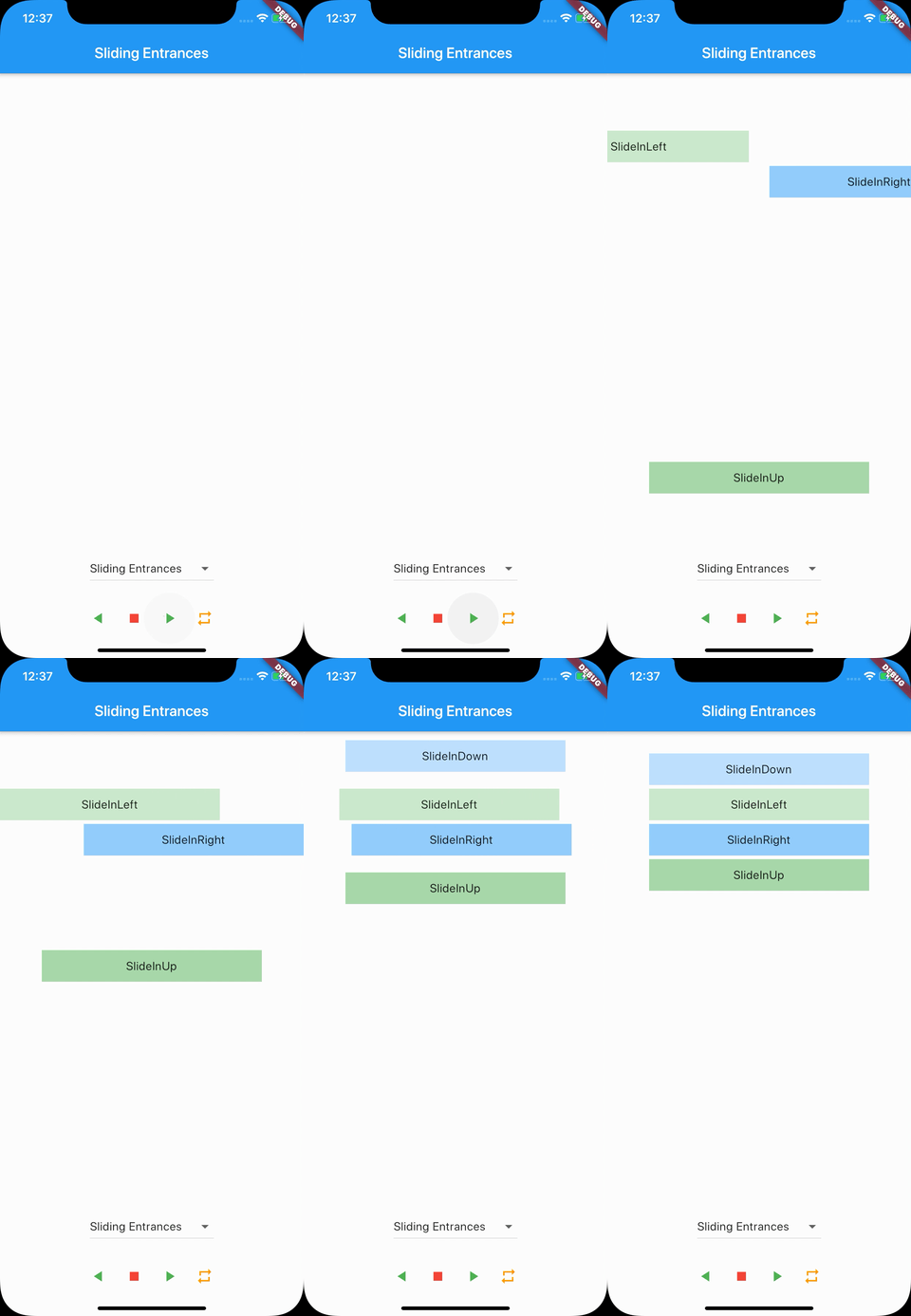
- SlideInDown
- SlideInLeft
- SlideInRight
- SlideInUp
Sliding Exits
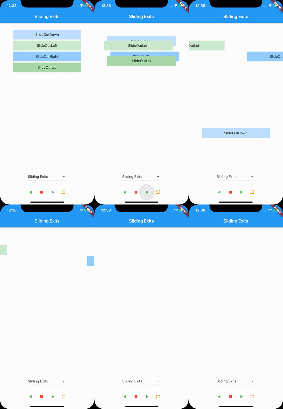
- SlideOutDown
- SlideOutLeft
- SlideOutRight
- SlideOutUp
Specials
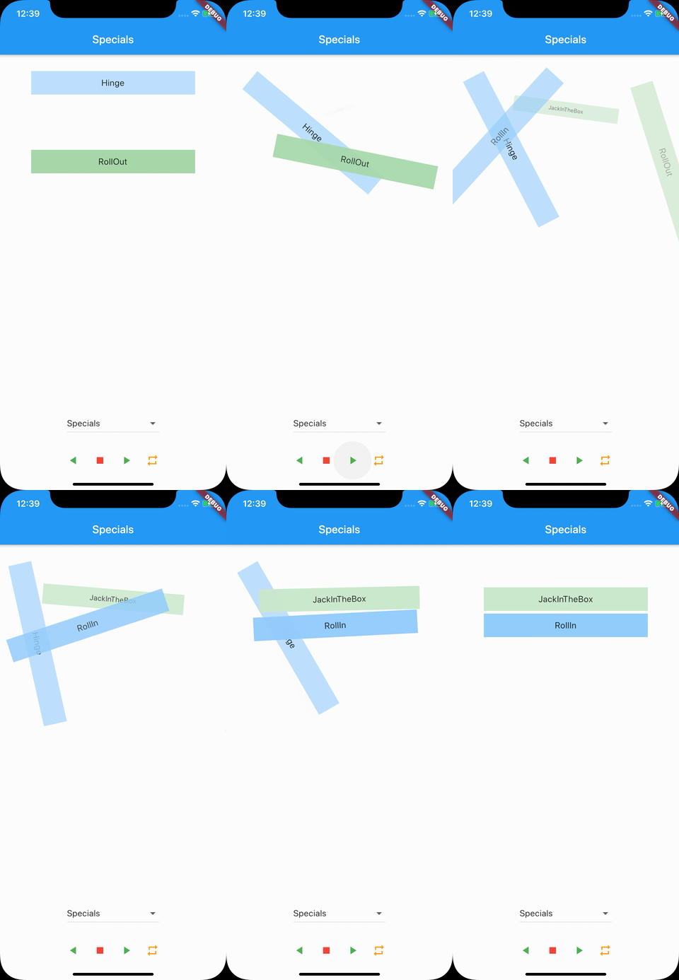
- Hinge
- JackInTheBox
- RollIn
- RollOut
Zooming Entrances
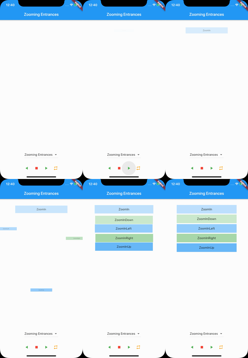
- ZoomIn
- ZoomInDown
- ZoomInLeft
- ZoomInRight
- ZoomInUp
Zooming Exits
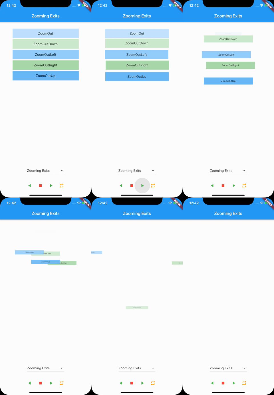
- ZoomOut
- ZoomOutDown
- ZoomOutLeft
- ZoomOutRight
- ZoomOutUp
