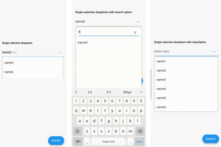
Flex DropDown | Custom DropDown 
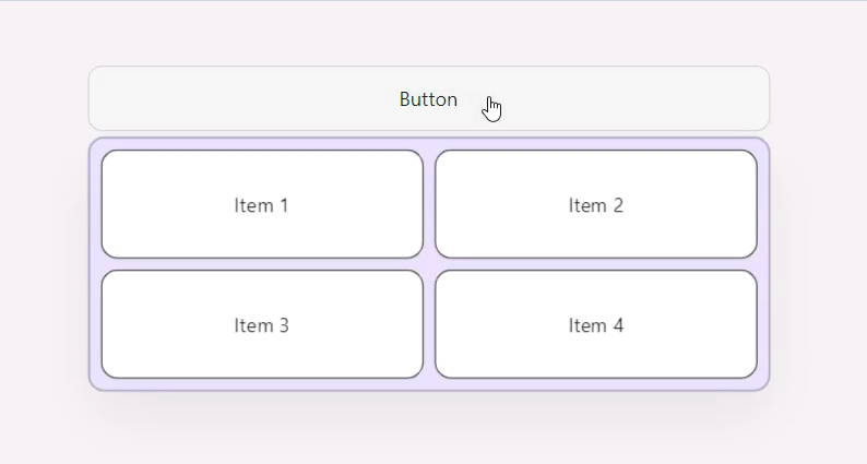
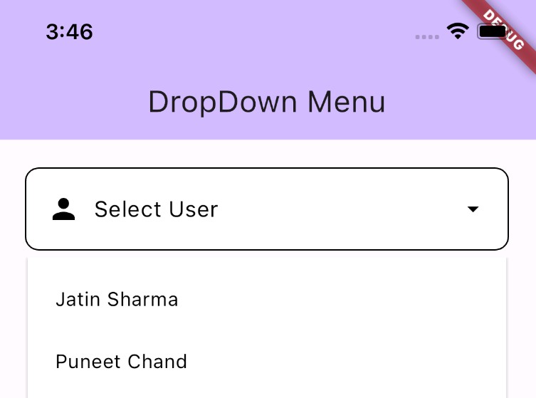
Create elegant and customizable dropdowns effortlessly with the Flex DropDown package. This Flutter package enables you to easily implement dropdowns with custom styling, animations, and data sources to match your app’s needs.
20230824_120955.mp4
Getting Started
If you’re interested in the background story behind this package’s development, you can read our article on Medium: Creating Custom Dropdowns with OverlayPortal in Flutter.
To get started with the Flex DropDown package, ensure you have Flutter installed and a basic understanding of how Flutter packages work. You can follow the instructions below to integrate the package into your project:
- Add the following line to your
pubspec.yamlfile:
dependencies:
  flex_dropdown: ^0.1.0
- Run the following command to fetch the package:
flutter pub get
- Import the package in your Dart code:
import 'package:flex_dropdown/flex_dropdown.dart';
Usage
Here’s a simple example showcasing the usage of the Flex DropDown package:
  final OverlayPortalController _controller = OverlayPortalController();

  @override
  Widget build(BuildContext context) {
    return RawFlexDropDown(
      controller: _controller,
      buttonBuilder: (context, onTap) {
        return ButtonWidget(
          width: 500,
          onTap: onTap,
        );
      },
      menuBuilder: (context, width) {
        return Padding(
          padding: const EdgeInsets.only(top: 4),
          child: MenuWidget(
            width: width,
            onItemTap: () {
              _controller.hide();
            },
          ),
        );
      },
    );
  }
For a complete example, you can explore the code in the example folder of the repository.
Additional information
If you encounter any issues, have suggestions, or want to contribute to the package, feel free to open an issue or submit a pull request on the GitHub repository.
We value community feedback and aim to provide timely responses to any queries or concerns you may have.
