flutter_tags
With flutter tags you can create selectable or input tags that automatically adapt to the screen width
Create beautiful tags quickly and easily.
Installing
Add this to your package's pubspec.yaml file:
dependencies:
  flutter_tags: "^0.4.9+1"
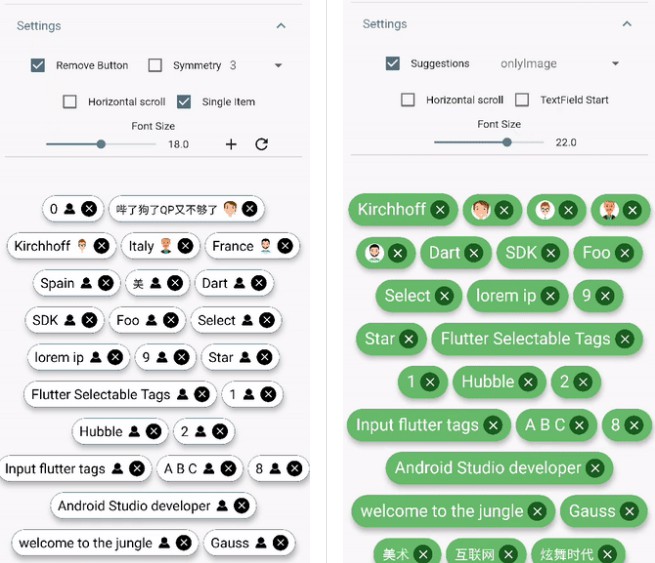
DEMO

|

|
Simple usage
import 'package:flutter_tags/flutter_tags.dart';
.
.
.
List _items;
double _fontSize = 14;

@override
void initState(){
    super.initState();
    // if you store data on a local database (sqflite), then you could do something like this
    Model().getItems().then((items){
            _items = items;
        });
}

@override
Widget build(BuildContext context) {
    return Tags(
      key:_tagStateKey,
      textField: TagsTextField(
        textStyle: TextStyle(fontSize: _fontSize),
        constraintSuggestion: true, suggestions: [],
        //width: double.infinity, padding: EdgeInsets.symmetric(horizontal: 10),
        onSubmitted: (String str) {
          // Add item to the data source.
          setState(() {
              // required
            _items.add(str);
          });
        },
      ),
      itemCount: _items.length, // required
      itemBuilder: (int index){
            final item = _items[index];

            return ItemTags(
                  // Each ItemTags must contain a Key. Keys allow Flutter to
                  // uniquely identify widgets.
                  key: Key(index.toString()),
                  index: index, // required
                  title: item.title,
                  active: item.active,
                  customData: item.customData,
                  textStyle: TextStyle( fontSize: _fontSize, ),
                  combine: ItemTagsCombine.withTextBefore,
                  image: ItemTagsImage(
                    image: AssetImage("img.jpg") // OR NetworkImage("https://...image.png")
                  ), // OR null,
                  icon: ItemTagsIcon(
                    icon: Icons.add,
                  ), // OR null,
                  removeButton: ItemTagsRemoveButton(
                    onRemoved: (){
                        // Remove the item from the data source.
                        setState(() {
                            // required
                            _items.removeAt(index);
                        });
                        //required
                        return true;
                    },
                  ), // OR null,
                  onPressed: (item) => print(item),
                  onLongPressed: (item) => print(item),
            );

      },
    );
}

final GlobalKey<TagsState> _tagStateKey = GlobalKey<TagsState>();
// Allows you to get a list of all the ItemTags
_getAllItem(){
    List<Item> lst = _tagStateKey.currentState?.getAllItem;
    if(lst!=null)
        lst.where((a) => a.active==true).forEach( ( a) => print(a.title));
}
Wrapped widget example
You are free to wrap ItemTags () inside another widget
Tags(
      itemCount: items.length,
      itemBuilder: (int index){
          return Tooltip(
          message: item.title,
          child:ItemTags(
            title:item.title,
          )
          );
      },
    );
Tags() parameters
| PropName | Description | default value |
|---|---|---|
columns |
Possibility to set number of columns when necessary | null |
itemCount |
Tag number to display | required |
symmetry |
Ability to view and scroll tags horizontally | false |
horizontalScroll |
Offset drawer width | 0.4 |
heightHorizontalScroll |
height for HorizontalScroll to set to display tags correctly | 60 |
spacing |
Horizontal space between the tags | 6 |
runSpacing |
Vertical space between the tags | 14 |
alignment |
Horizontal WrapAlignment | WrapAlignment.center |
runAlignment |
Vertical WrapAlignment | WrapAlignment.center |
direction |
Direction of the ItemTags | Axis.horizontal |
verticalDirection |
Iterate Item from the lower to the upper direction or vice versa | VerticalDirection.down |
textDirection |
Text direction of the ItemTags | TextDirection.ltr |
itemBuilder |
tag generator | |
textField |
add textField | TagsTextFiled() |
ItemTags() parameters
index- requiredtitle- requiredtextScaleFactor- custom textScaleFactoractive- bool value (default true)pressEnabled- active onPress tag ( default true)customData- Possibility to add any custom value in customData field, you can retrieve this later. A good example: store an id from Firestore document.textStyle- textStyle()alignment- MainAxisAlignment ( default MainAxisAlignment.center)combine- * ability to combine text, icons, images in different ways ( default ItemTagsCombine.imageOrIconOrText)*icon- ItemTagsIcon()image- ItemTagsImage()removeButton- ItemTagsRemoveButton()borderRadius- BorderRadiusborder- custom border-sidepadding- default EdgeInsets.symmetric(horizontal: 7, vertical: 5)elevation- default 5singleItem- default falsetextOverflow- default TextOverflow.fadetextColor- default Colors.blacktextActiveColor- default Colors.whitecolor- default Colors.whiteactiveColor- default Colors.blueGreyhighlightColor-splashColor-colorShowDuplicate- default Colors.redonPressed- callbackonLongPressed- callbackonRemoved- callback