flutter_inner_drawer
Inner Drawer is an easy way to create an internal side section (left/right) where you can insert a list menu or other.
Installing
Add this to your package's pubspec.yaml file:
dependencies:
  flutter_inner_drawer: "^0.2.2"
New Version 0.1.5 -> 0.2.0
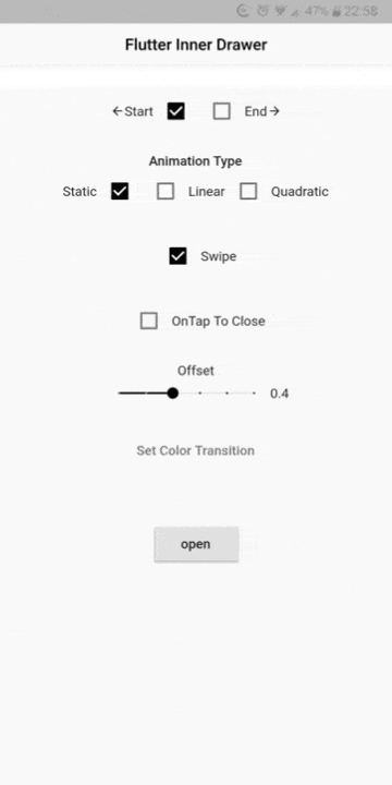
Animation type
- static
- Linear - Linear animation from version 0.2.0 has a different behavior
- quadratic (Linear of 0.1.5 version)
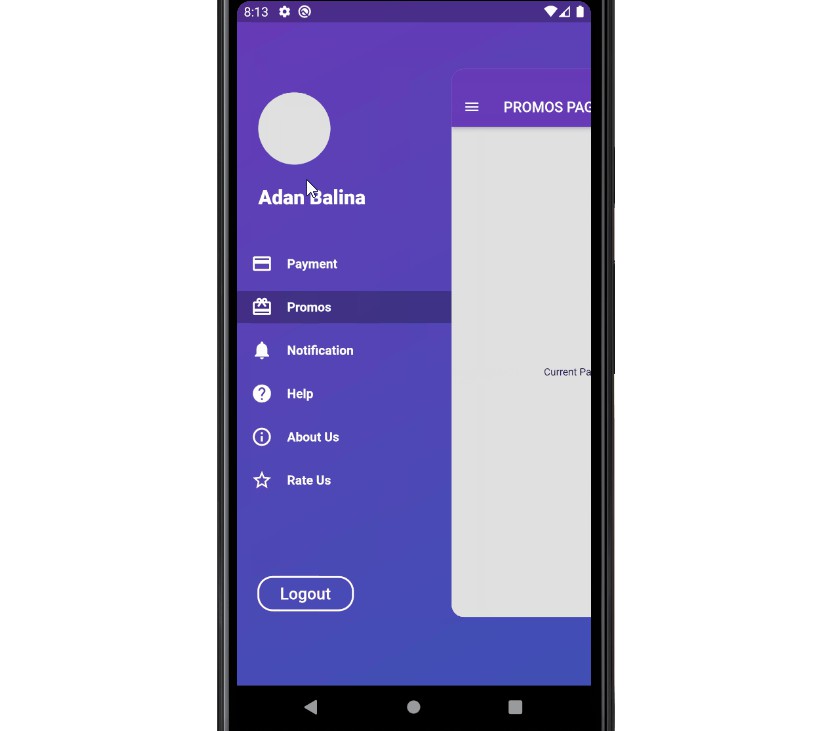
DEMO

Simple usage
import 'package:flutter_inner_drawer/inner_drawer.dart';
.
.
.

    final GlobalKey<InnerDrawerState> _innerDrawerKey = GlobalKey<InnerDrawerState>();


    @override
    Widget build(BuildContext context)
    {
        return InnerDrawer(
            key: _innerDrawerKey,
            position: InnerDrawerPosition.start, // required
            onTapClose: true, // default false
            swipe: true, // default true
            offset: 0.6, // default 0.4
            colorTransition: Color.red, // default Color.black54
            animationType: InnerDrawerAnimation.linear, // default static
            innerDrawerCallback: (a) => print(a), // return bool
            child: Material(
                child: SafeArea(
                    child: Container(...)
                )
            ),
            //  A Scaffold is generally used but you are free to use other widgets
            // Note: use "automaticallyImplyLeading: false" if you do not personalize "leading" of Bar
            scaffold: Scaffold(
                appBar: AppBar(
                    automaticallyImplyLeading: false
                )
                .
                .
            )
            or
            CupertinoPageScaffold(
                navigationBar: CupertinoNavigationBar(
                    automaticallyImplyLeading: false
                ),
                .
                .
            ),
        )
    }

    void _open()
    {
       _innerDrawerKey.currentState.open();
    }

    void _close()
    {
       _innerDrawerKey.currentState.close();
    }
All parameters
- child - Inner Widget (required)
- scaffold - A Scaffold is generally used but you are free to use other widgets (required)
- position - This controls the direction in which the user should swipe to open and close the InnerDrawer (required)
- offset - Offset drawer width (default 0.4)
- onTapClose - bool (default false)
- swipe - bool (default true)
- boxShadow - BoxShadow of scaffold opened
- colorTransition - default Colors.black54
- animationType - static / linear / quadratic (default static)
- innerDrawerCallback - Optional callback that is called when a InnerDrawer is opened or closed
Issues
If you encounter problems, open an issue. Pull request are also welcome.