Easy Pie Chart Package
The Easy Pie Chart package provides a versatile pie chart widget for Flutter applications. It offers various customization options to create interactive and visually appealing pie charts.
Features
-
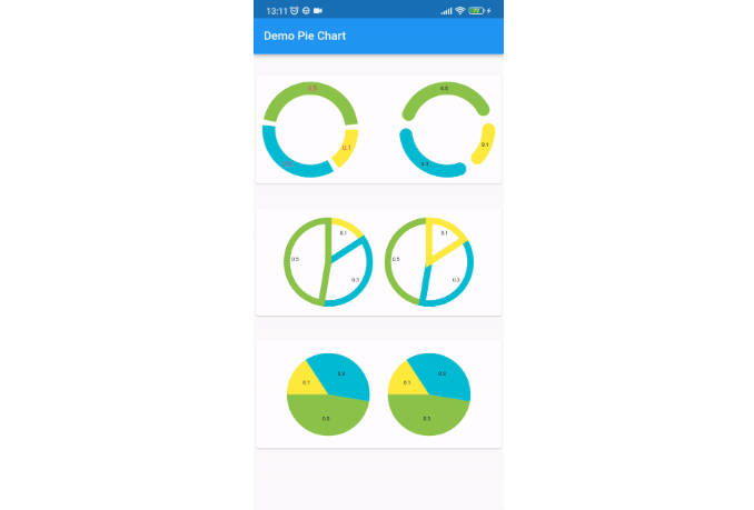
Three Pie Chart Variants:
- Crust: Only border, no fill.
- TriCrust: Borders around each pie slice.
- Fill: Filled pie slices.
-
Interactive Pie Slices:
- Each pie slice is interactive and responds to user taps.
-
Customization Options:
- Adjustable gap between pie slices.
- Control over the border edge style (rounded, squared, etc.).
- Start angle of the pie chart can be customized.
- Text or widget display options inside the pie chart.
- Animations: Clockwise and anti-clockwise animations with adjustable duration.
Getting started
To use this package, add the following line to your pubspec.yaml file:
dependencies:
  easy_pie_chart: ^version
Then, import the package in your Dart file:
import 'package:easy_pie_chart/easy_pie_chart.dart';
Usage
Here’s a simple example of creating a Easy pie chart:
PieChart(
  children: [
    PieData(value: 30, color: Colors.red),
    PieData(value: 50, color: Colors.blue),
  ],
)

For more examples, check out the /example folder in this repository.
Properties
| Name | Description | Default Value | Data Type | Required |
|---|---|---|---|---|
| children | List of PieData objects representing each pie slice. | – | List | Yes |
| showValue | Determines whether the value is shown on each pie slice. | true | bool | No |
| start | Starting angle of the pie chart in degrees. | -90 | double | No |
| gap | Gap between pie chart slices. | 0.0 | double | No |
| borderWidth | Width of the border for crust and triCrust pie types. | 30.0 | double | No |
| borderEdge | Edge shape of the border for crust pie type. | StrokeCap.round | StrokeCap | No |
| shouldAnimate | Determines if the pie chart animates clockwise during build. | true | bool | No |
| animateDuration | Duration of the animation. | 1500ms | Duration? | No |
| animateFromEnd | If true, animation starts anti-clockwise. | false | bool | No |
| centerText | Text to be displayed at the center of the pie chart. | null | String? | No |
| style | TextStyle for centerText. | null | TextStyle? | No |
| centerStyle | TextStyle for the value displayed on each pie slice. | null | TextStyle? | No |
| pieType | Enum defining the pie chart type (crust, triCrust, fill). | PieType.crust | PieType | No |
| onTap | Function triggered when a pie slice is tapped. | null | void Function(int)? | No |
| size | Size of the pie chart. | 200.0 | double | No |
Contribution and Issues
Contributions and bug reports are welcome! Feel free to create pull requests and issues on the GitHub repository.
License
This package is available under the MIT License.
