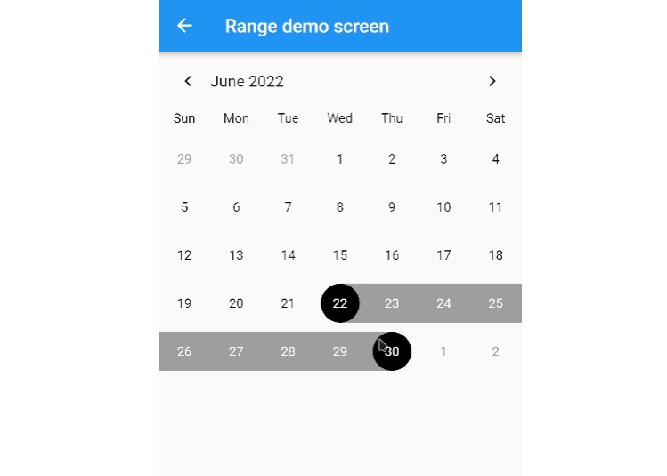
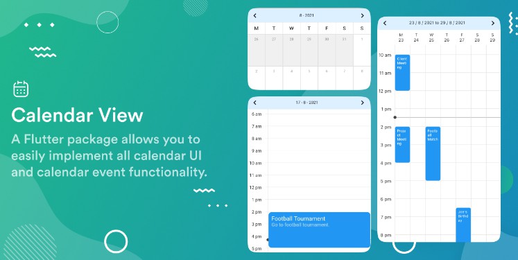
WeeklyCalendar
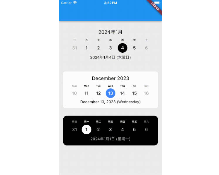
A very simple weekly calendar widget for Flutter.
Features
- Simple calendar widget
- Locale support
- Customizable color scheme
Usage
Make sure to check out examples for more details.
Installation
To use this widget, add the following line to pubspec.yaml:
dependencies:
  weekly_calendar: ^0.1.2
Basic setup
import 'package:weekly_calendar/weekly_calendar.dart';

class MyApp extends StatelessWidget {
  const MyApp({super.key});

  @override
  Widget build(BuildContext context) {
    return MaterialApp(
      home: Scaffold(
        appBar: AppBar(),
        body: Center(
          child: WeeklyCalendar(),
        ),
      ),
    );
  }
}
Calendar Style
By using the CalendarStyle, you can customize WeeklyCalendar with your preferred color patterns.
class CalendarStyle {

  /// The locale of the calendar.
  ///
  final String locale;

  /// The padding of the calendar.
  ///
  final EdgeInsets padding;

  /// The margin of the calendar.
  ///
  final EdgeInsets margin;

  /// The decoration of the calendar.
  ///
  final BoxDecoration decoration;

  /// The alignment of the header date text.
  ///
  final Alignment headerDateTextAlign;

  /// The color of the header date text.
  ///
  final Color headerDateTextColor;

  /// Whether to show the header date text.
  ///
  final bool isShowHeaderDateText;

  /// The alignment of the footer date text.
  ///
  final Alignment footerDateTextAlign;

  /// The color of the footer date text.
  ///
  final Color footerDateTextColor;

  /// Whether to show the footer date text.
  ///
  final bool isShowFooterDateText;

  /// The color of the selected circle in DayCell.
  ///
  final Color selectedCircleColor;

  /// The color of the selected circle at today in DayCell.
  ///
  final Color todaySelectedCircleColor;

  /// The color of the day text in DayCell.
  ///
  final Color dayTextColor;

  /// The color of the day text at today in DayCell.
  ///
  final Color todayDayTextColor;

  /// The color of the selected day text in DayCell.
  ///
  final Color selectedDayTextColor;

  /// The color of the weekend day text in DayCell.
  ///
  final Color weekendDayTextColor;

  /// The color of the text in DayOfWeekCell.
  ///
  final Color dayOfWeekTextColor;

  /// The color of the weekend text in DayOfWeekCell.
  ///
  final Color weekendDayOfWeekTextColor;
}
When using CalendarStyle, set it as follows:
WeeklyCalendar(
    style: CalendarStyle(
        locale: "en",
        padding: EdgeInsets.all(10),
        decoration: BoxDecoration(
            color: Colors.black,
            borderRadius: BorderRadius.all(Radius.circular(14)),
        ),
        headerDateTextAlign: Alignment.centerLeft,
        headerDateTextColor: Colors.white,
        footerDateTextColor: Colors.grey,
        isShowFooterDateText: true,
    ),
)
Events
You can retreive the selected date through the callback function onChangedSelectedDate, when you select a specific date on WeeklyCalendar.
onChangedSelectedDate: (DateTime date) {
    debugPrint("onChangedSelectedDate: $date");
}
You can control whether to automatically select the date when changing the displayed week page by swiping, using the isAutoSelect parameter.
isAutoSelect: bool,
You retreive the day for Wednesday and the page state PageState (previous or next) when chainging the week page by swiping.
onChangedPage: (DateTime date, PageState state) {
    debugPrint("onChangedPage: $date ${state.name}");
}
