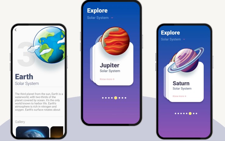
Design System Mobile for Flutter
Design System Mobile in Flutter (yes, it could be that easy…).
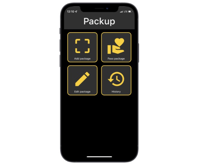
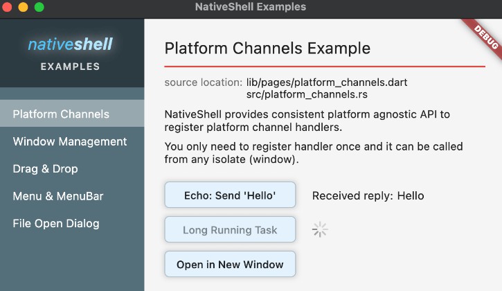
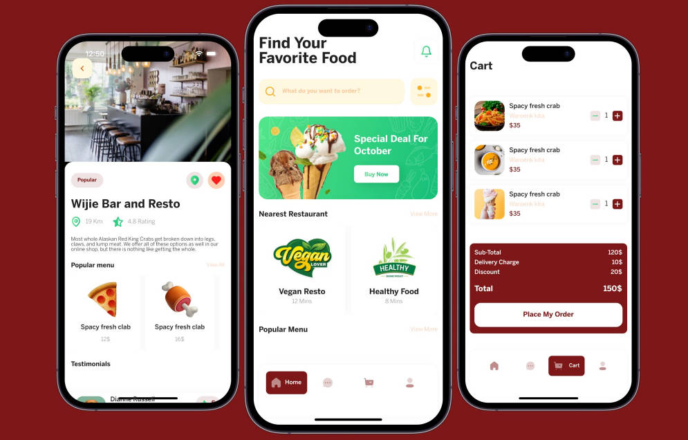
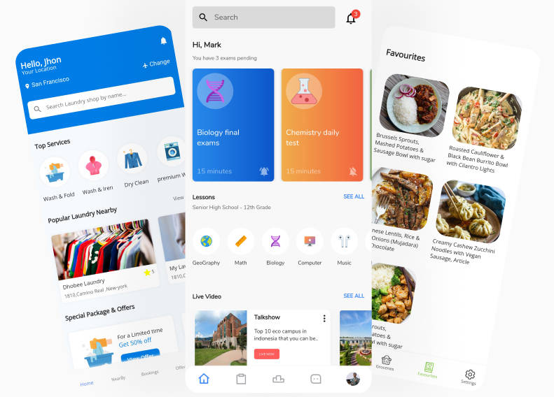
This framework contains SBB (Swiss Federal Railways) UI elements for Flutter Apps. It allows an easy integration of SBB theming to your app (or a custom color theming of your choice). All elements are optimized for dynamic TextSizes, VoiceOver, light & dark mode as well as for different SizeClasses.
Note: This plugin is still under development and some APIs might change. Feedback and Pull Requests are most welcome!
Usage
To use this plugin, add design_system_flutter as a dependency in your pubspec.yaml file. As this is a private plugin, you must add it as a Git dependency:
dependencies:
  design_system_flutter:
    git:
      url: https://github.com/SchweizerischeBundesbahnen/design_system_flutter.git
Getting Started
Dart/Flutter Integration
From your Dart code, you need to import the plugin and instantiate it:
import 'package:design_system_flutter/design_system_flutter.dart';
After that simply use the provided fonts, styles, colors, widgets…
SBB internal documentation
A the moment, the following documents are only available to persons internal to SBB:
- SBB Design System Mobile documentation (new version since 2021)
- AppBakery libraries
- Figma
Getting help
If you need help, you can reach out to us by e-mail: [email protected]
Getting involved
Generally speaking, we are welcoming contributions improving existing UI elements or fixing certain bugs. We will also consider contributions introducing new design elements, but might reject them, if they do not reflect our vision of SBB Design System.
General instructions on how to contribute can be found under Contributing.
Authors
- Tran Hoang
- Raab Ulrich
- Mosberger Dominik
- Schmucki Dominik
- Müller Patrice
License
Code released under the MIT.
