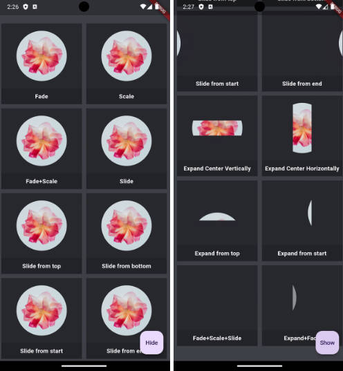
animated_loading_border
Key Definition
- A package that gives us a modern way to show animated border as a placeholder while loading our widget with easy customization and ready to use.
Preview
Basic Usage
Import it to your project file
import 'package:animated_loading_border/animated_loading_border.dart';
And add it in its most basic form like it:
AnimatedLoadingBorder(
  child: Container(),
  controller: (animationController) {
     // Here we get animationController
  },
);
Required parameters of AnimatedLoadingBorder
| Parameter | Description |
|---|---|
| Widget child | The child contained by the AnimatedLoadingBorder |
Optional parameters of AnimatedLoadingBorder
| Parameter | Default | Description |
|---|---|---|
| ValueChanged? controller | — | Callback that gives the AnimationController of the AnimatedLoadingBorder |
| Duration duration | Duration(seconds: 4) | Defines the animation duration |
| double cornerRadius | 0.0 | Defines the corner radius of the border |
| double borderWidth | 1 | Defines the width of the border |
| Color borderColor | Colors.black | Defines the color of the border |
| Color trailingBorderColor | Colors.black | Defines the color for the trailing part of the border |
| EdgeInsets padding | EdgeInsets.zero | Used to add child widget padding |
| bool startWithRandomPosition | true | Used to set starting position of SweepGradient |
| bool isTrailingTransparent | true | Used to set starting color of SweepGradient |
Guideline for contributors
- Guideline to report an issue/feature request
LICENSE!
animated_loading_border is MIT-licensed.


