Slider Button
This package provides an easy implementation of a Slider Button to cancel current transaction or screen. Highly customizable iphone alike looking widget.
How to use
Type 1
This is a Circle type widget.
You just need to define the border radius to swap between rectangle and circle type widget.

import 'package:slider_button/slider_button.dart';
Center(child: SliderButton(
      action: () {
        ///Do something here
        Navigator.of(context).pop();
      },
       label: Text(
          "Slide to cancel Event",
          style: TextStyle(
              color: Color(0xff4a4a4a), fontWeight: FontWeight.w500, fontSize: 17),
        ),
      icon: Text(
        "x",
        style: TextStyle(
          color: Colors.white,
          fontWeight: FontWeight.w400,
          fontSize: 44,
        ),
      ),


    ));
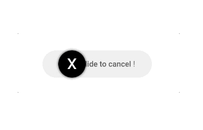
Type 2
This is a Rectangle type widget.

import 'package:slider_button/slider_button.dart';
SliderButton(
      action: () {
        ///Do something here OnSlide
      },

      ///Put label over here
      label: Text(
        "Slide to cancel !",
        style: TextStyle(
            color: Color(0xff4a4a4a),
            fontWeight: FontWeight.w500,
            fontSize: 17),
      ),
      icon: Center(
          child: Icon(
        Icons.power_settings_new,
        color: Colors.white,
        size: 40.0,
        semanticLabel: 'Text to announce in accessibility modes',
      )),

      ///Change All the color and size from here.
      width: 230,
      radius: 10,
      buttonColor: Color(0xffd60000),
      backgroundColor: Color(0xff534bae),
      highlightedColor: Colors.white,
      baseColor: Colors.red,
    );