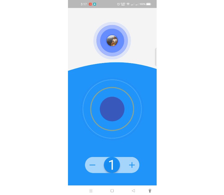
selectable_circle
Selectable Circle where colors can be customized and a child widget can be defined.
How to use
SelectableCircleText(
    width: 80.0,
    onSelected: () {
    setState(() {
        _isSelected = !_isSelected;
    });
    },
    child: Icon(Icons.star),
);
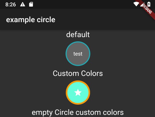
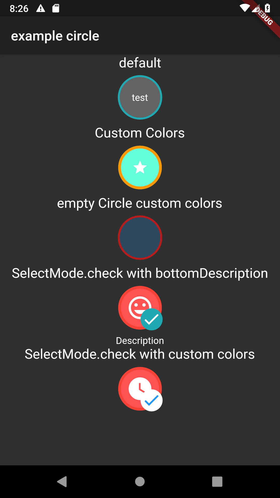
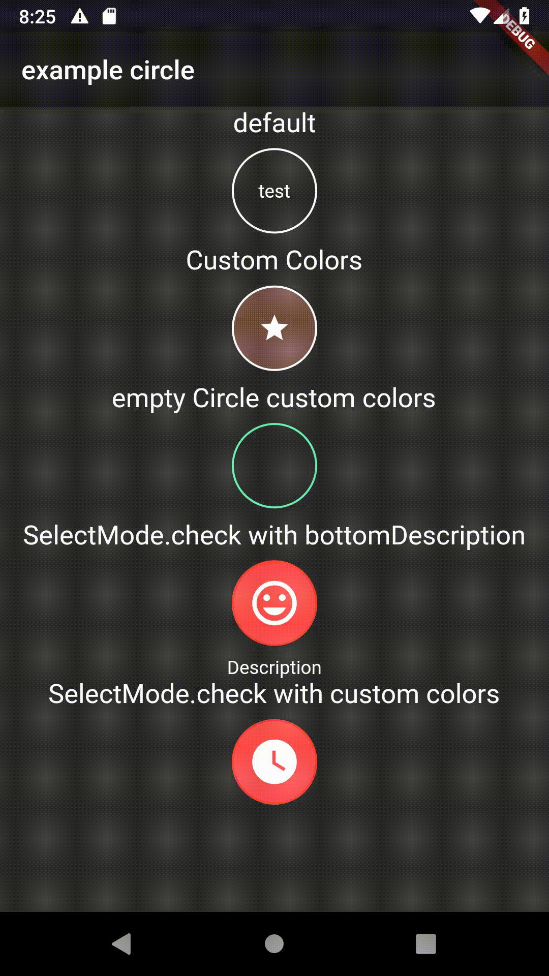
Screenshot
Parameters
    /// the width and height of the CircleWidget
final double width;

/// is called when the circle is tapped
final VoidCallback onSelected;

/// child displayed on top of the circle
final Widget child;

/// widget should be displayed as selected
final bool isSelected;

/// Color of the circle
final Color color;

/// borderColor of the circle
final Color borderColor;

/// Color of the circle when selected
final Color selectedColor;

/// Color of the border when selected
final Color selectedBorderColor;

/// widget that is displayed below the Circle for descriptions
final Widget bottomDescription;

/// changes the select animation
///
/// Possible Values:
/// simple: no animation, only selectedColor is used
/// animatedCircle: Animation is used (default)
/// check: Check Icon Animation is used
final SelectMode selectMode;