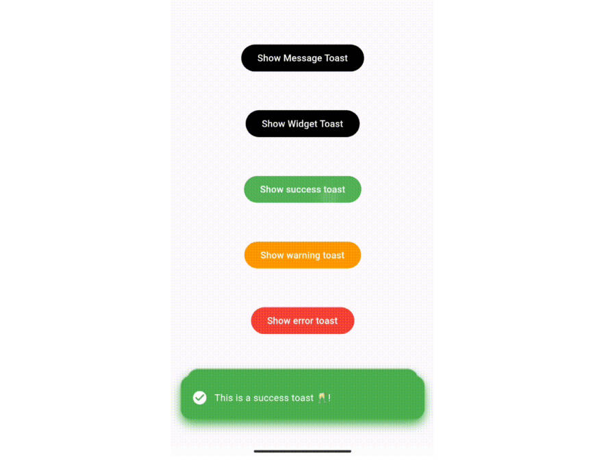
Flutter Material Dialogs
A Flutter library aims to help you create animated, simple, and stylish Material Dialogs in your app.
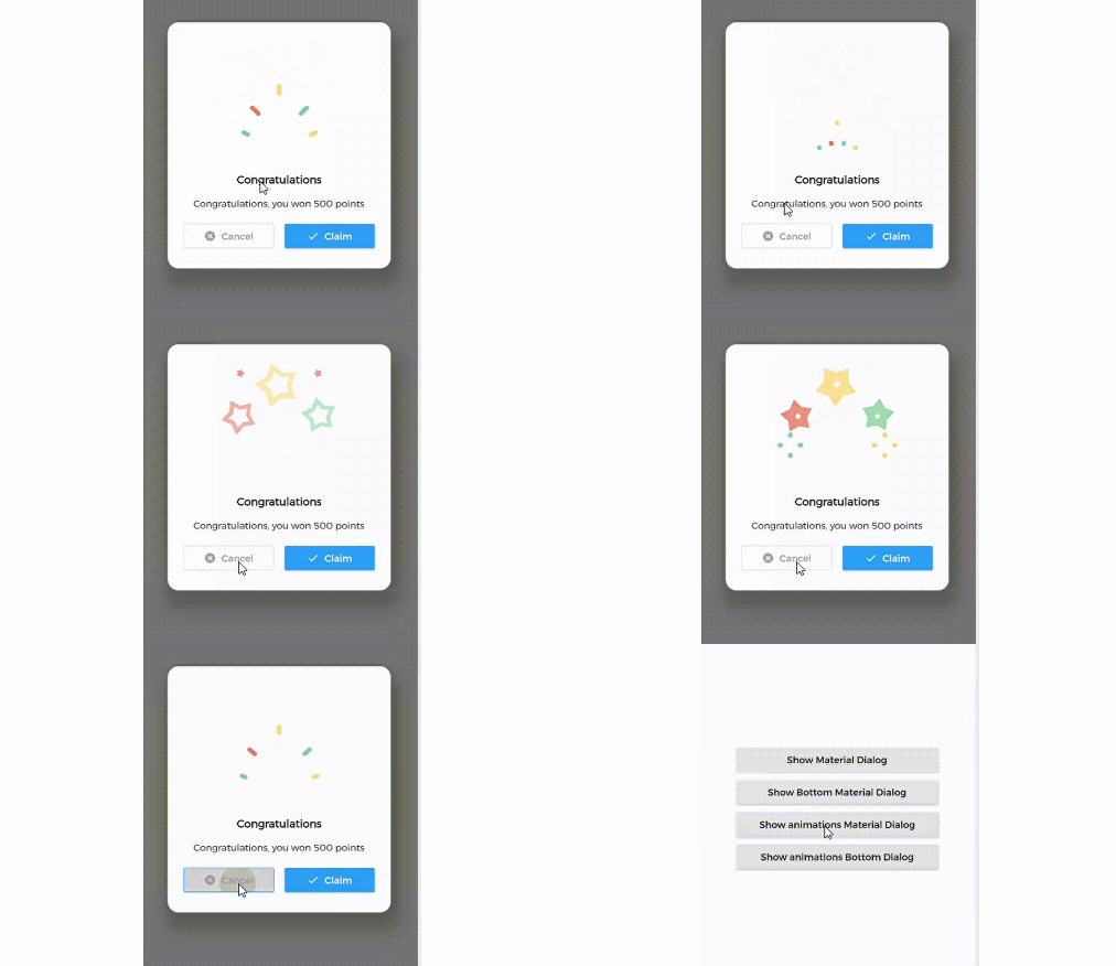
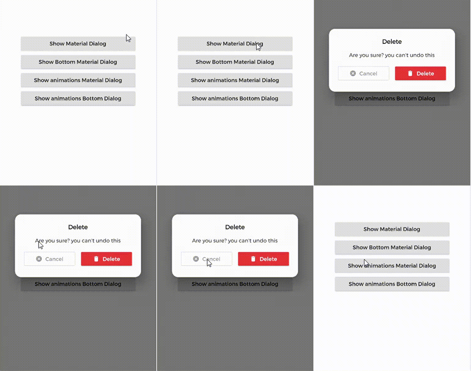
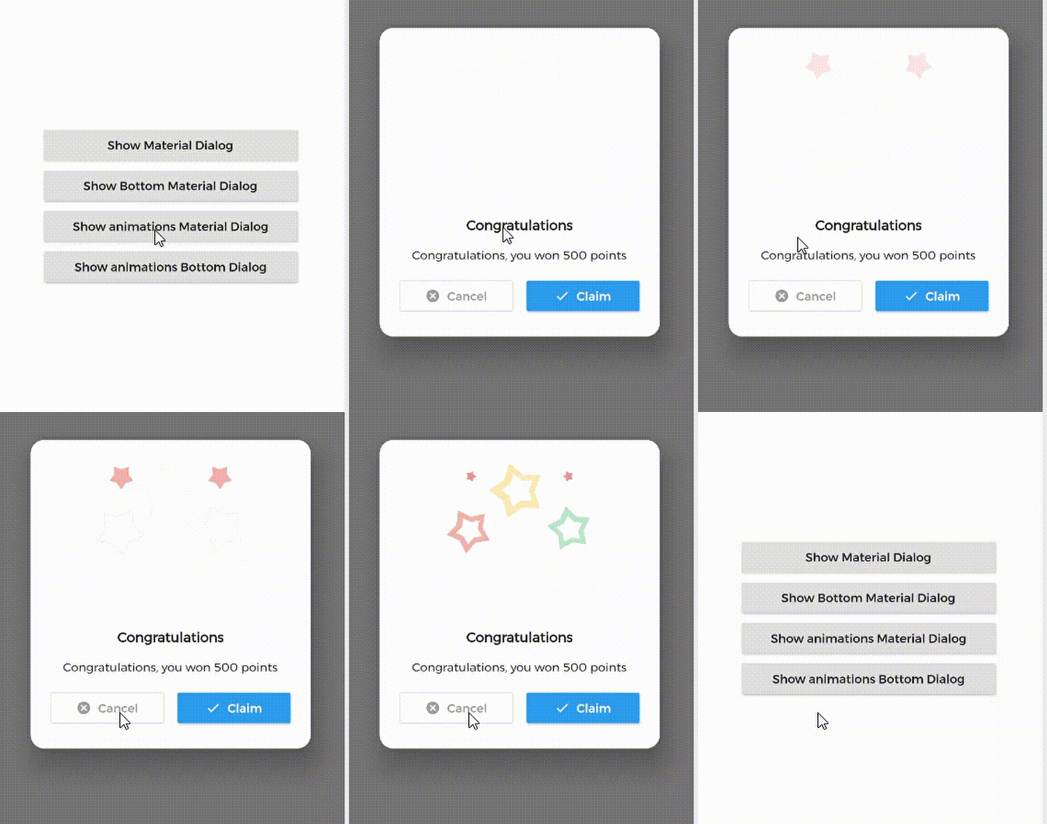
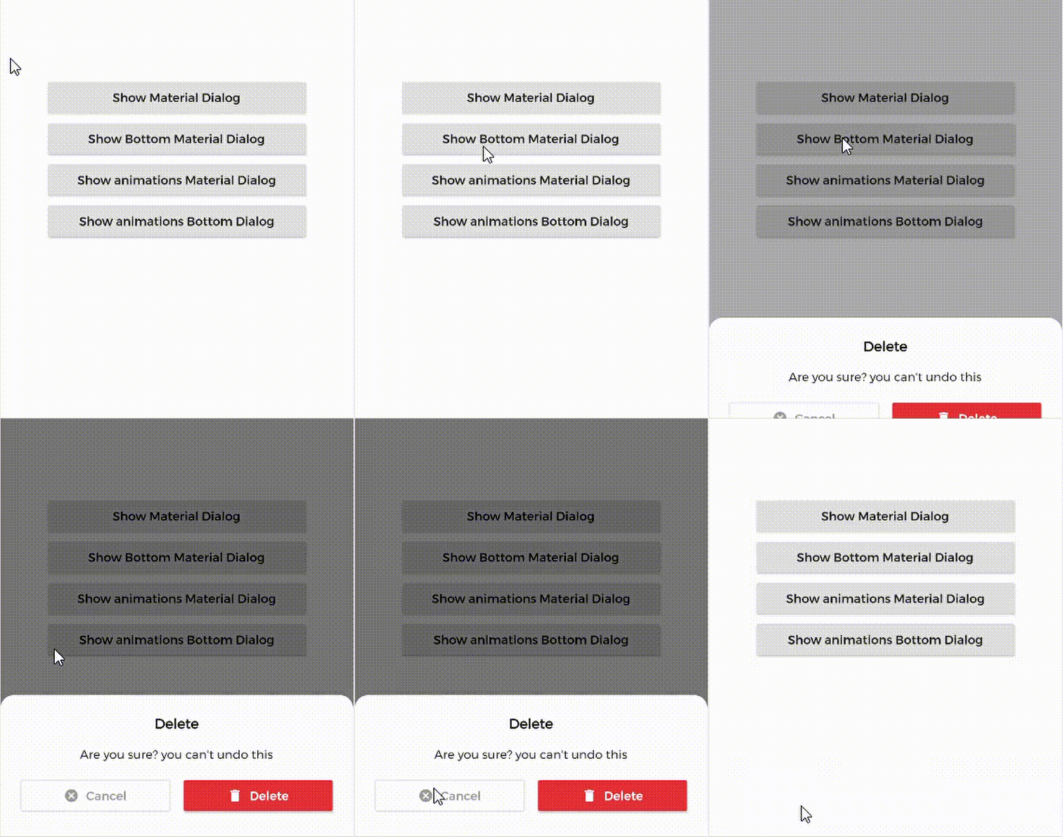
| 1. Material Dialog | 2. Animations Material Dialog | 3. Bottom Material Dialog | 4. Animations Bottom Dialog |
|---|---|---|---|
 |
 |
 |
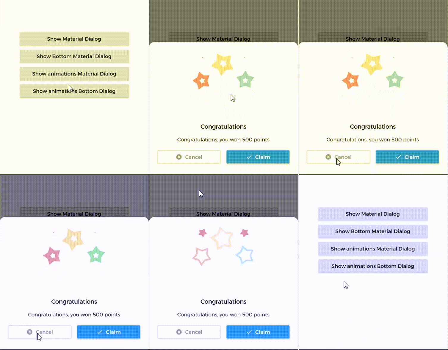 |
MaterialDialog This Plugin will be useful to create simple, animated, and beautiful dialogs in your next Flutter app.
This library implements Airbnb's Lottie library to render After Effects animation in app.
Types of Dialog
MaterialDialog library provides two types of dialog i.e.
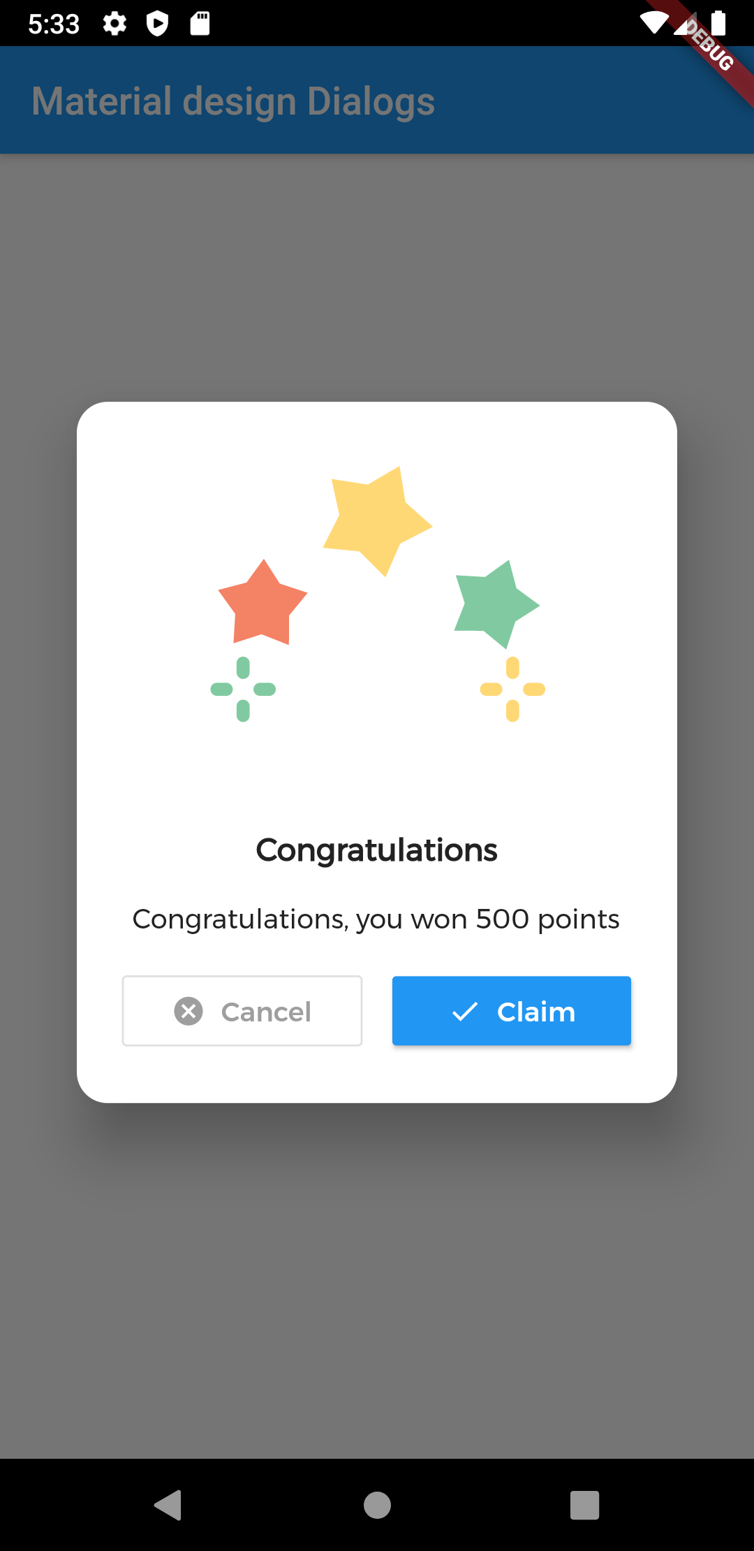
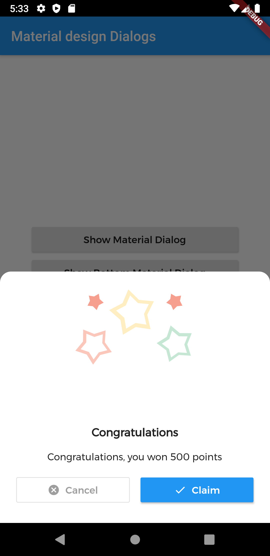
| 1. Material Dialog | 2. Bottom Sheet Material Dialog |
|---|---|
| A normal material dialog which can have one or two buttons. | A Bottom Sheet material dialog which can have one or two buttons, is showed from bottom of device. |
 |
 |
Implementation
Implementation of Material Dialog library is so easy. You can check /example directory for demo. Let's have look talk in details about it.
install
i. pubspec
In pubspec.yaml
dependencies:
  material_dialogs: _latest_version
Now in your Dart code, you can use:
import 'package:material_dialogs/material_dialogs.dart';
Details see pub.dev.
Create Dialog
As there are two types of dialogs in library. Material Dialogs are instantiated as follows.
i. Material Dialog
Dialogs class will be used to create your dialog, below is an example to show your dialog in the app.
Dialogs.materialDialog(
          msg: 'Are you sure ? you can\'t undo this',
          title: "Delete",
          color: Colors.white,
          context: context,
          actions: [
            IconsOutlineButton(
              onPressed: () {},
              text: 'Cancel',
              iconData: Icons.cancel_outlined,
              textStyle: TextStyle(color: Colors.grey),
              iconColor: Colors.grey,
            ),
            IconsButton(
              onPressed: () {},
              text: 'Delete',
              iconData: Icons.delete,
              color: Colors.red,
              textStyle: TextStyle(color: Colors.white),
              iconColor: Colors.white,
            ),
          ])

IconsOutlineButton and IconsButton are both buttons widgets provided by the plugin to make things easier for you read more, you can use any other buttons if you want.
ii. Bottom Sheet Material Dialog
Dialogs class will be used to create your dialog, use bottomMaterialDialog. Below is an example to show your dialog in the app.
Dialogs.bottomMaterialDialog(
          msg: 'Are you sure? you can\'t undo this action',
          title: 'Delete',
          context: context,
          actions: [
            IconsOutlineButton(
              onPressed: () {},
              text: 'Cancel',
              iconData: Icons.cancel_outlined,
              textStyle: TextStyle(color: Colors.grey),
              iconColor: Colors.grey,
            ),
            IconsButton(
              onPressed: () {},
              text: 'Delete',
              iconData: Icons.delete,
              color: Colors.red,
              textStyle: TextStyle(color: Colors.white),
              iconColor: Colors.white,
            ),
          ]),

Show Animations
Animations in this library are implemented using Lottie animation library. You can get free animations files here.
*.json file downloaded from LottieFiles should be placed in flutter project.
For example, here cong_example.json animation file is used in the assets folder to show congratulations animation in the example app.
In code, set animations: 'path to your animation file' arg in Widget to set Animation to the dialog.
Dialogs.materialDialog(
          color: Colors.white,
          msg: 'Congratulations, you won 500 points',
          title: 'Congratulations',
          animations: 'assets/cong_example.json',
          context: context,
          actions: [
            IconsButton(
              onPressed: () {},
              text: 'Claim',
              iconData: Icons.done,
              color: Colors.blue,
              textStyle: TextStyle(color: Colors.white),
              iconColor: Colors.white,
            ),
          ]),
Icons buttons
The plugin provide you some out of the box customized buttons to help you creating your dialog.
IconsOutlineButton
This widget helps you create an outline button easily
    IconsOutlineButton(
      onPressed: () {},
      text: 'Cancel',
      iconData: Icons.cancel_outlined,
      textStyle: TextStyle(color: Colors.grey),
      iconColor: Colors.grey,
    ),
IconsButton
This widget helps you create a material button with icons in few lines of code
    IconsButton(
      onPressed: () {},
      text: 'Delete',
      iconData: Icons.delete,
      color: Colors.red,
      textStyle: TextStyle(color: Colors.white),
      iconColor: Colors.white,
    ),
Limitations
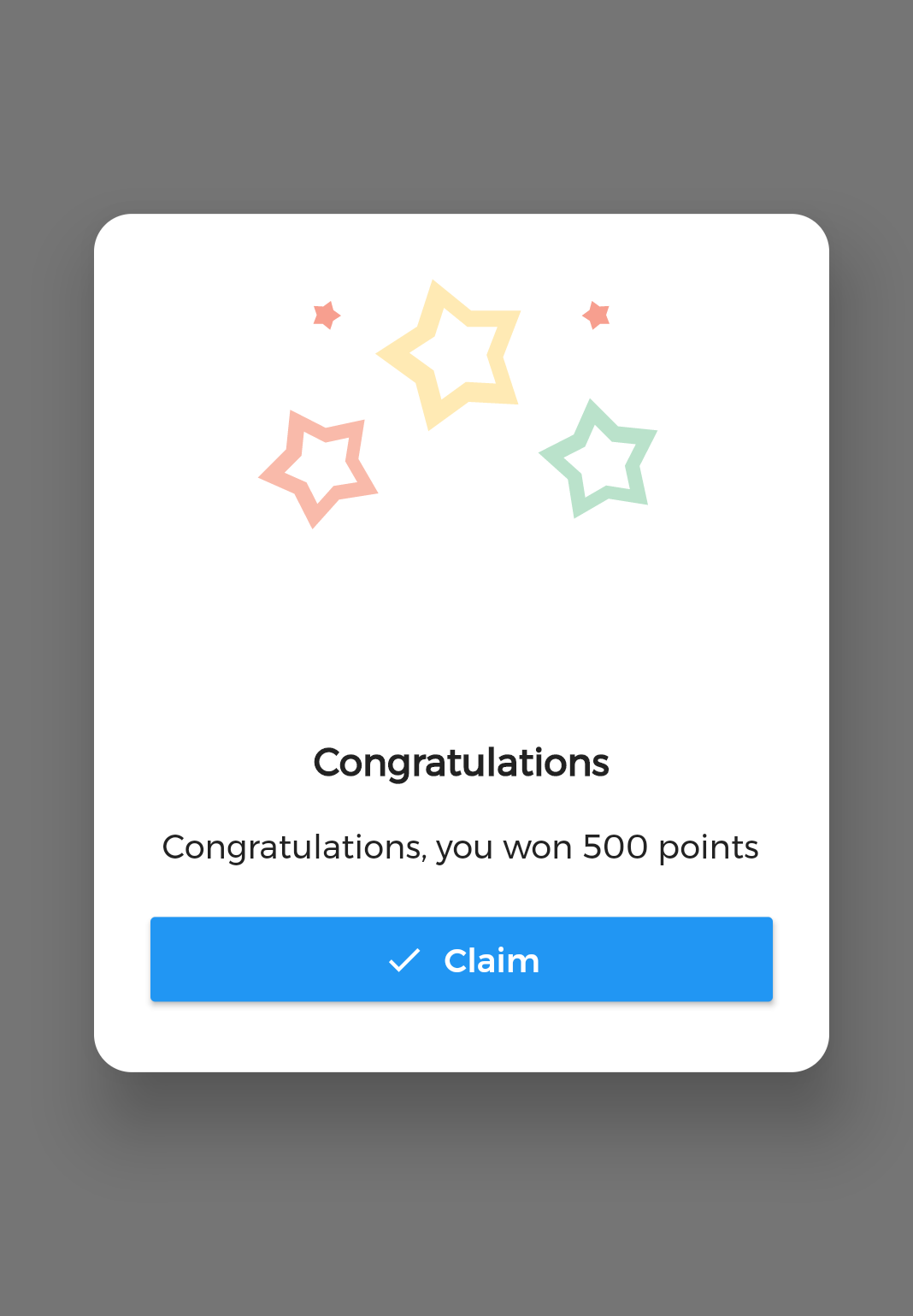
it's better to make your animation to have the same background color as your dialog's background color, please use lottie editor to remove the background layer of your animation or make it same as your dialog background color before using it in the plugin.
