flutter_slidable
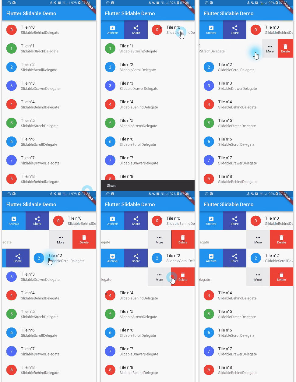
A Flutter implementation of slidable list item with directional slide actions that can be dismissed.
Features
- Accepts primary (left/top) and secondary (right/bottom) widget lists as slide actions.
- Can be dismissed.
- 4 built-in layouts.
- 2 built-in slide action widgets.
- 1 built-in dismiss animation.
- You can easily create you custom layouts and animations.
- You can use a builder to create your slide actions if you want special effects during animation.
- Close when a slide action has been tapped (overridable).
- Close when the nearest
Scrollablestarts to scroll (overridable). - Option to disable the slide effect easily.
Getting started
In the pubspec.yaml of your flutter project, add the following dependency:
dependencies:
  ...
  flutter_slidable: "^0.4.7"
In your library add the following import:
import 'package:flutter_slidable/flutter_slidable.dart';
For help getting started with Flutter, view the online documentation.
Constructors
You can create a Slidable in two different ways:
- By calling the
Slidableconstructor and passing a list of slide actions. - By calling the
Slidable.builderconstructor and passing slide action builders, if you want special effects during the animation.
A Slidable needs multiple things:
- Slide actions (see below for details). They can be any widget. For convenience, this package has 2 built-in side action widgets.
- A delegate. This is what controls the layout and the animation of the slide menu.
- An extent ratio between a slide action extent and the item extent.
- A child.
The actions contains the slide actions that appear when the child has been dragged down or to the right.
The secondaryActions contains the slide actions that appear when the child has been dragged up or to the left.
A direction parameter lets you choose if you want actions to appear when you slide horizontally (default) or vertically.
new Slidable(
  delegate: new SlidableDrawerDelegate(),
  actionExtentRatio: 0.25,
  child: new Container(
    color: Colors.white,
    child: new ListTile(
      leading: new CircleAvatar(
        backgroundColor: Colors.indigoAccent,
        child: new Text('$3'),
        foregroundColor: Colors.white,
      ),
      title: new Text('Tile n°$3'),
      subtitle: new Text('SlidableDrawerDelegate'),
    ),
  ),
  actions: <Widget>[
    new IconSlideAction(
      caption: 'Archive',
      color: Colors.blue,
      icon: Icons.archive,
      onTap: () => _showSnackBar('Archive'),
    ),
    new IconSlideAction(
      caption: 'Share',
      color: Colors.indigo,
      icon: Icons.share,
      onTap: () => _showSnackBar('Share'),
    ),
  ],
  secondaryActions: <Widget>[
    new IconSlideAction(
      caption: 'More',
      color: Colors.black45,
      icon: Icons.more_horiz,
      onTap: () => _showSnackBar('More'),
    ),
    new IconSlideAction(
      caption: 'Delete',
      color: Colors.red,
      icon: Icons.delete,
      onTap: () => _showSnackBar('Delete'),
    ),
  ],
);
Built-in slide actions
This package comes with 2 kinds of slide actions:
SlideAction, which is the most flexible. You can choose a background color, or any decoration, and it takes any widget as a child.IconSlideAction, which requires an icon. It can have a background color and a caption below the icon.
Built-in delegates
This package comes with 4 kinds of delegates:
SlidableBehindDelegate
The slide actions stay behind the item while it's sliding:

SlidableScrollDelegate
The slide actions follow the item while it's sliding:

SlidableDrawerDelegate
The slide actions animate like drawers while the item is sliding:

SlidableStrechDelegate
The slide actions stretch while the item is sliding:

FAQ
How to prevent my slide action to close after it has been tapped?
By default, SlideAction and IconSlideAction close on tap.
To prevent this, you can pass in false to the closeOnTap constructor parameter.
How to prevent my Slidable to close after my list has scrolled?
By default, a Slidable closes when the nearest Scrollable widget starts to scroll.
To prevent this, you can pass in false to the closeOnScroll constructor parameter.
How can I dismiss my Slidable?
In order to make your Slidable dismissible, you have to set the slideToDismissDelegate parameter of the Slidable constructor.
You can set any class that inherits SlideToDismissDelegate. For now there is only one built-in: SlideToDismissDrawerDelegate.
The actionType passed to the onDismissed callback let you know which action has been dismissed.
When a Slidable is dismissible, the key parameter must not be null.
Example:
slideToDismissDelegate: new SlideToDismissDrawerDelegate(
  onDismissed: (actionType) {
    _showSnackBar(
        context,
        actionType == SlideActionType.primary
            ? 'Dismiss Archive'
            : 'Dimiss Delete');
    setState(() {
      items.removeAt(index);
    });
  },
),
How can I prevent to dismiss one side but not the other?
If you only want one side to be dismissible, you can set the associated threshold to 1.0 or more.
For example, if you don't want the first primary action to be dismissed, you will set the following thresholds on the slideToDismissDelegate:
dismissThresholds: <SlideActionType, double>{
  SlideActionType.primary: 1.0
},
How to let the user cancel a dismissal?
You can let the user confirm the dismissal by setting the onWillDismiss callback on the slideToDismissDelegate.
Example:
slideToDismissDelegate: new SlideToDismissDrawerDelegate(
  onWillDismiss: (actionType) {
          return showDialog<bool>(
            context: context,
            builder: (context) {
              return new AlertDialog(
                title: new Text('Delete'),
                content: new Text('Item will be deleted'),
                actions: <Widget>[
                  new FlatButton(
                    child: new Text('Cancel'),
                    onPressed: () => Navigator.of(context).pop(false),
                  ),
                  new FlatButton(
                    child: new Text('Ok'),
                    onPressed: () => Navigator.of(context).pop(true),
                  ),
                ],
              );
            },
          );
        },
        ...
        ),
How to let keep only one Slidable open?
You have to set the controller parameter of the Slidable constructors to a SlidableController instance:
final SlidableController slidableController = new SlidableController();
...
new Slidable(
      key: new Key(item.title),
      controller: slidableController,
      ...
      );
