Fluid Slider for Flutter
Inspired by a dribbble by Virgil Pana.
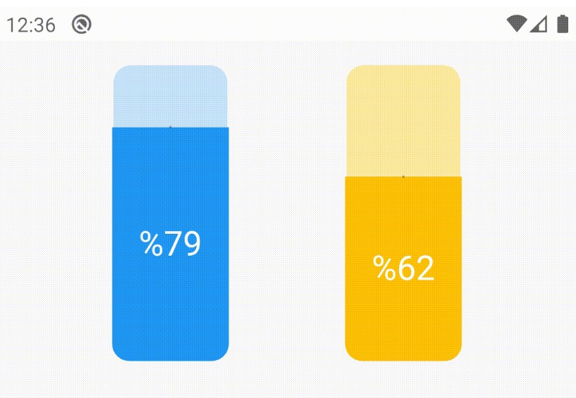
A fluid design slider that works just like the Slider material widget.
Used to select from a range of values.
Installation
Just add the package to your dependencies in the pubspec.yaml file:
dependencies:
  flutter_fluid_slider: ^1.0.2
Basic Usage
Place the FluidSlider in your widget tree.
FluidSlider(
  value: _value,
  onChanged: (double newValue) {
    setState(() {
      _value = newValue;
    });
  },
  min: 0.0,
  max: 100.0,
),
Properties
-
value: [Required] The currently selected value for this slider. The slider’s thumb is drawn at a position that corresponds to this value. -
min: The minimum value the user can select. Defaults to0.0. Must be less than or equal tomax. -
max: The maximum value the user can select. Defaults to1.0. Must be less than or equal tomin. -
start: The widget to be displayed as the min label. For eg: an Icon can be displayed. If not provided theminvalue is displayed as text. -
end: The widget to be displayed as the max label. For eg: an Icon can be displayed. If not provided themaxvalue is displayed as text. -
onChanged: [Required] Called during a drag when the user is selecting a new value for the sliderby dragging.
-
The slider passes the new value to the callback but does not actually change state until the parent widget rebuilds the slider with the new value.
-
If null, the slider will be displayed as disabled.
-
-
onChangeStart: Called when the user starts selecting a new value for the slider. The value passed will be the lastvaluethat the slider had before the change began. -
onChangeEnd: Called when the user is done selecting a new value for the slider. -
labelsTextStyle: The styling of the min and max text that gets displayed on the slider. If not provided the ancestorTheme‘saccentTextThemetext style will be applied. -
valueTextStyle: The styling of the current value text that gets displayed on the slider. If not provided the ancestorTheme‘stextTheme.titletext style with bold will be applied . -
sliderColor: The color of the slider. If not provided the ancestorTheme‘sprimaryColorwill be applied. -
thumbColor: The color of the thumb. If not provided theColors.whitewill be applied. -
showDecimalValue: Whether to display the first decimal value of the slider value. Defaults tofalse. -
mapValueToString: called with value for the String to be rendered in the slider’s thumb. E.g. display roman integers as follows:FluidSlider( value:_val, min:1.0, max:5.0, onChanged:(){}, mapValueToString: (double value){ List<String> romanNumerals=['I', 'II', 'III', 'IV', 'V']; return _romanNumerals[value.toInt() - 1]; } )
See example. If null the value is converted to String based on [showDecimalValue].
Credits:
- Ramotion – implementation for ios and android
- Virgil Pana – creating the original concept


