just_the_tooltip
A nice, small package for when you need a tooltip.
Getting Started
Insert this into your yaml:
just_the_tooltip: <latest_version>
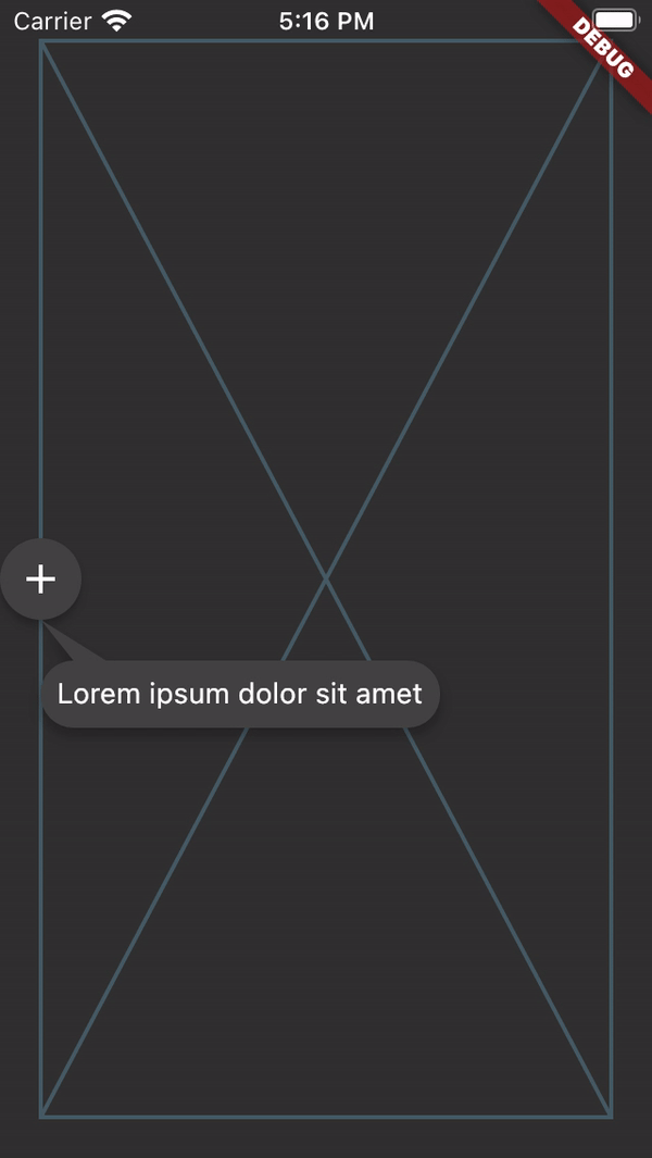
just_the_tooltip gives you more flexibility over the Flutter standard Tooltip by allowing you to set arbitrary content. It also expands upon their single axis layout algorithm to fit both vertically and horizontally. The tooltip can be positioned along any axis and will fall back to the opposite side if overflowed.

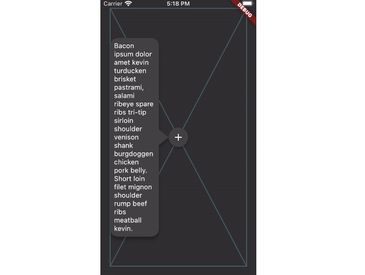
JustTheTooltip(
  child: Material(
    color: Colors.grey.shade800,
    shape: const CircleBorder(),
    elevation: 4.0,
    child: const Padding(
      padding: EdgeInsets.all(8.0),
      child: Icon(
        Icons.add,
        color: Colors.white,
      ),
    ),
  ),
  content: const Padding(
    padding: EdgeInsets.all(8.0),
    child: Text(
      'Bacon ipsum dolor amet kevin turducken brisket pastrami, salami ribeye spare ribs tri-tip sirloin shoulder venison shank burgdoggen chicken pork belly. Short loin filet mignon shoulder rump beef ribs meatball kevin.',
    ),
  ),
)
The child widget will be wrapped with a GestureDetector or MouseRegion that is responsible for showing and hiding the content. You can further define how a Tooltip will show by defining the isModal property. A modal will only open through clicking on the child and close by clicking on the background area (referred to as the skrim here). A non-modal (the default) is a more traditional tooltip opens and closes on hovers.
Note, phone emulators do not implement mouse controls. To test hover states, use a browser.
The fallback used when no mouse region is present but isModal is false is to only open when long pressed.
If you'd like to create a controller to manage the state of the tooltip, you can do so by defining an instance of a JustTheController and pass it through to constructor.
final tooltipController = JustTheController();

child: JustTheTooltip(
  controller: tooltipController,
  // ...
)

void showTooltip() {
  if (controller.isHidden) {
    controller.showTooltip();
  }
}
ListViews
The tooltip should also work in lists and follow the target through scrolling. For even more consideration of the available space in ListViews, a ScrollController may be passed to the just_the_tooltip to give the layout algorithm a hint as to how much space is before and after the scroll axis. This allows tooltips that would otherwise overflow to use up space offscreen in one of the scroll directions.
For some use cases where the tooltip must be a part the widget tree rather than an overlay there is a JustTheTooltip.entry:
Scaffold(
  appBar: AppBar(title: const Text('It goes under me')),
  body: JustTheTooltipArea(
    builder: (context, tooltip, scrim) {
      return Stack(
        fit: StackFit.passthrough,
        children: [
          ListView.builder(
            itemCount: 30,
            itemBuilder: (context, index) {
              if (index == 15) {
                return JustTheTooltip.entry(
                  tailLength: 10.0,
                  preferredDirection: AxisDirection.down,
                  isModal: true,
                  margin: const EdgeInsets.all(20.0),
                  child: const Material(
                    color: Colors.blue,
                    shape: CircleBorder(),
                    elevation: 4.0,
                    child: Padding(
                      padding: EdgeInsets.all(8.0),
                      child: Icon(
                        Icons.touch_app,
                        color: Colors.white,
                      ),
                    ),
                  ),
                  content: Column(
                    mainAxisSize: MainAxisSize.min,
                    children: [
                      Container(
                        height: 120,
                        color: Colors.blue,
                        width: double.infinity,
                      ),
                      const SizedBox(height: 8),
                      const Text(
                        'Quia ducimus eius magni voluptatibus ut veniam ducimus. Ullam ab qui voluptatibus quos est in. Maiores eos ab magni tempora praesentium libero. Voluptate architecto rerum vel sapiente ducimus aut cumque quibusdam. Consequatur illo et quos vel cupiditate quis dolores at.',
                      ),
                    ],
                  ),
                );
              }

              return ListTile(title: Text('Item $index'));
            },
          ),
          if (scrim != null) scrim,
          if (tooltip != null) tooltip,
        ],
      );
    },
  ),
);
This will give you the positioned tooltip and scrim (an empty gesture detector that catches tap events and closes the tooltip) for you to enter into the tree however you like. By doing this, you can make tooltips that are visually "under" other parts of the UI such as the appbar in the above example.
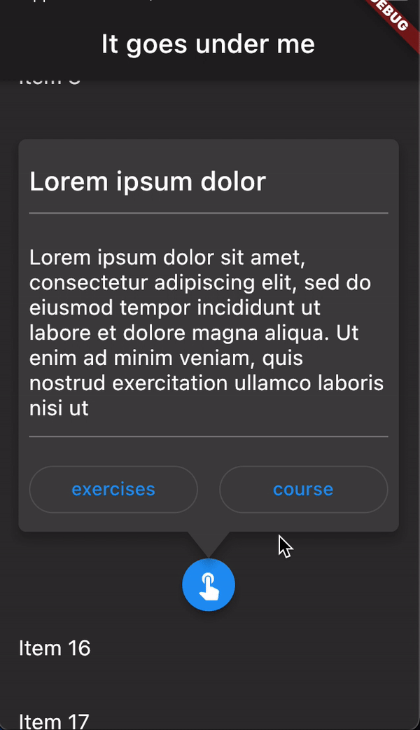
Notice the use of JustTheTooltip.entry. This factory ensures the area above is in charge of the widgets and returns them via the builder of that widget.
Issues and PRs welcome. API subject to change.