DayNightTimePicker
A day night time picker for Flutter. Beautiful day and night animation with Sun and Moon assets.
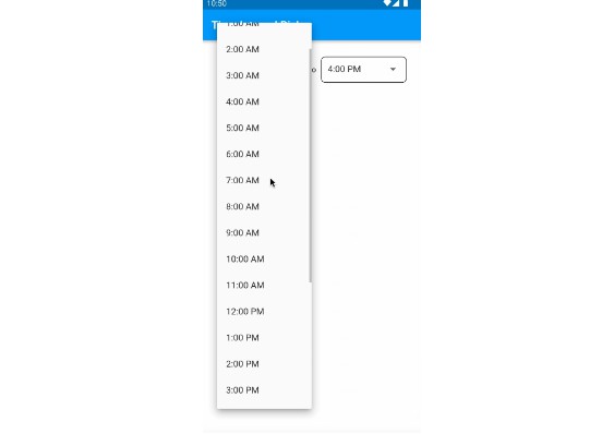
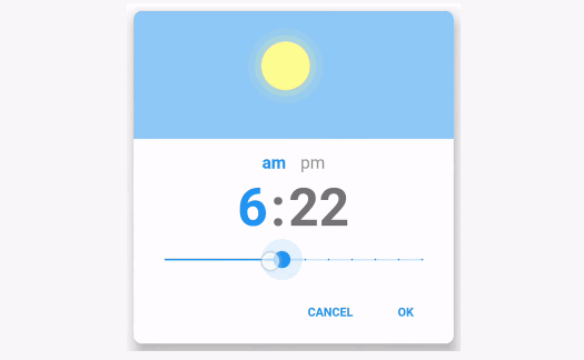
Default style:
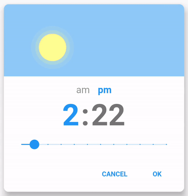
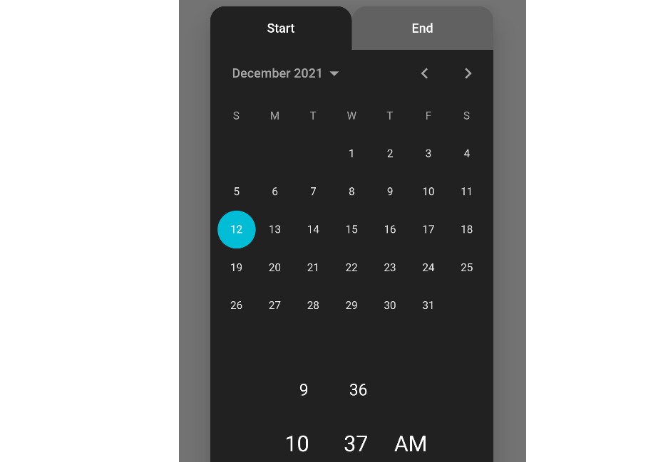
IOS style:
View it on pub.dev
Installation
Add to pubspec.yaml.
dependencies:
  day_night_time_picker:
Usage
To use plugin, just import package
import 'package:day_night_time_picker/day_night_time_picker.dart';
Example
FlatButton(
    onPressed: () {
        Navigator.of(context).push(
            showPicker(
                context: context,
                value: _time,
                onChange: onTimeChanged,
            ),
        );
    },
    child: Text(
        "Open time picker",
        style: TextStyle(color: Colors.white),
    ),
),
Props
| Name | Description | Default |
|---|---|---|
| value | Required Display value. It takes in [TimeOfDay]. |
|
| onChange | Required Return the new time the user picked as [TimeOfDay]. |
|
| onChangeDateTime | Optional Return the new time the user picked as [DateTime]. |
|
| is24HrFormat | Show the time in TimePicker in 24 hour format. | false |
| accentColor | Accent color of the TimePicker. | Theme.of(context).accentColor |
| unselectedColor | Color applied unselected options (am/pm, hour/minute). | Colors.grey |
| cancelText | Text displayed for the Cancel button. | cancel |
| okText | Text displayed for the Ok button. | ok |
| sunAsset | Image asset used for the Sun. | Asset provided |
| moonAsset | Image asset used for the Moon. | Asset provided |
| blurredBackground | Whether to blur the background of the [Modal]. | false |
| barrierColor | Color of the background of the [Modal]. | Colors.black45 |
| borderRadius | Border radius of the [Container] in [double]. | 10.0 |
| elevation | Elevation of the [Modal] in [double]. | 12.0 |
| barrierDismissible | Whether clicking outside should dismiss the [Modal]. | true |
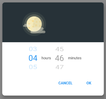
| iosStylePicker | Whether to display a IOS style picker (Not exactly the same). | false |
| hourLabel | The label to be displayed for hour picker. Only for iosStylePicker. |
'hours' |
| minuteLabel | The label to be displayed for minute picker. Only for iosStylePicker. |
'minutes' |
| minuteInterval | Steps interval while changing minute. Accepts MinuteInterval enum. |
MinuteInterval.ONE |
| disableMinute | Disables the minute picker. | false |
| disableHour | Disables the hour picker. | false |
| minHour | Selectable minimum hour. | Defaults to 1[12hr] or 0[24hr] |
| maxHour | Selectable maximum hour. | Defaults to 12[12hr] or 23[24hr] |
| minMinute | Selectable minimum minute. | 0 |
| maxMinute | Selectable maximum minute. | 59 |
| displayHeader | Whether to display the sun moon animation. | true |
| isOnValueChangeMode | Weather to hide okText, cancelText and return value on every onValueChange. Only for Inline widget | false |
| themeData | ThemeData to use for the widget. | Theme.of(context) |