Radix Colors
A gorgeous, accessible color system An open-source color system for designing beautiful, accessible websites and apps. A dart library for Radix Colors
View the Flutter web demo
Installation
Add the Radix Colors package to pubspec.yaml
dependencies:
  radix_colors: ^1.0.3
Import the package in your dart file
import 'package:radix_colors/radix_colors.dart';
Usage
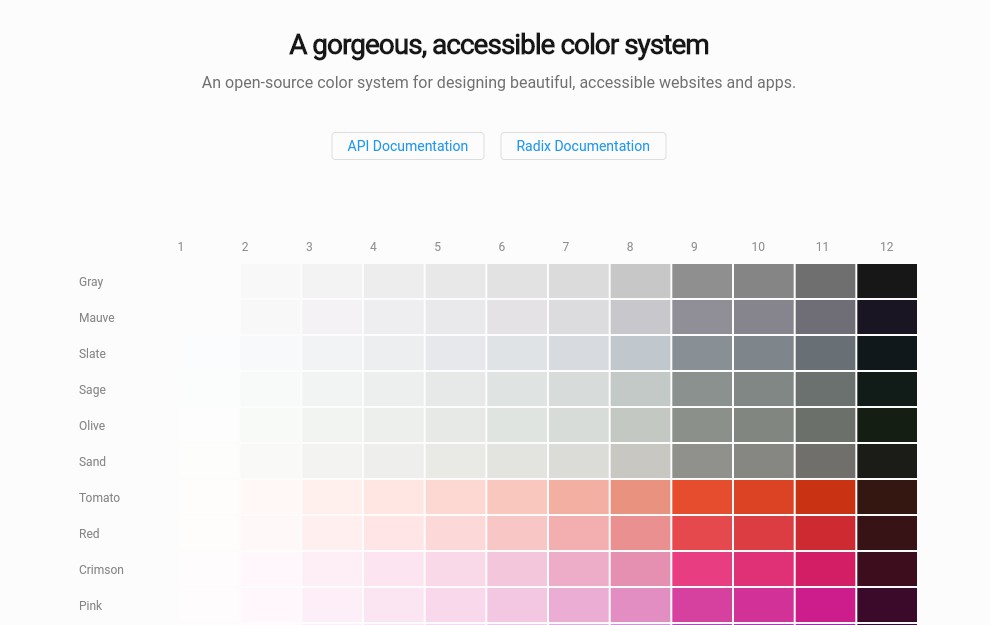
Radix Colors provides 15 color scales, designed for white foreground text at step 9.
Light color variant
RadixColors.amber;
Dark color variant
RadixColors.dark.amber;
Dynamic color for auto light/dark theme
RadixColorsDynamic(context).amber;
12 Colors steps/shades
RadixColors.amber.step1;
RadixColors.amber.step2;
RadixColors.amber.step3;
RadixColors.amber.step4;
RadixColors.amber.step5;
RadixColors.amber.step6;
RadixColors.amber.step7;
RadixColors.amber.step8;
RadixColors.amber.step9;
RadixColors.amber.step10;
RadixColors.amber.step11;
RadixColors.amber.step12;
There are 12 steps in each scale. Each step was designed for at least one specific use case.
| Step | Use case |
|---|---|
| 1 | App background |
| 2 | Subtle background |
| 3 | UI element background |
| 4 | Hovered UI element background |
| 5 | Active Selected UI element background |
| 6 | Subtle borders and separators |
| 7 | UI element border and focus rings |
| 8 | Hovered UI element border |
| 9 | Solid backgrounds |
| 10 | Hovered solid backgrounds |
| 11 | Low-contrast text |
| 12 | High-contrast text |
Steps 1 and 2 are designed for app backgrounds and subtle component backgrounds. You can use them interchangeably, depending on the vibe you’re going for.
Appropriate applications include:
- Main app background
- Striped table background
- Code block background
- Card background
- Sidebar background
- Canvas area background
Steps 3, 4, and 5 are designed for UI component backgrounds.
- Step
3is for normal states. - Step
4is for hover states. - Step
5is for pressed or selected states.
Even if your component has a transparent background in its default state, you should skip Step 3 and use Step 4 for its hover state.
For call-to-action components that you want to draw particular attention to, you can bump each color one step higher to steps 4, 5, and 6.
For complex components where you need many subtle colors to communicate different meanings, you can get creative and do something like:
- Step
3for hovered backgrounds. - Step
4for selected / pressed backgrounds. - Step
5for “unread” backgrounds. - Step
6for hovered “unread” backgrounds.
Steps 6, 7, and 8 are designed for borders.
- Step
6is designed for subtle borders on components which are not interactive. For example sidebars, headers, cards, alerts, and separators. - Step
7is designed for borders on interactive components, but can also be used for focus rings. - Step
8is designed for borders on interactive components in their hover state.
Steps 9 and 10 are designed for solid backgrounds.
Step 9 has the highest chroma of all steps in the scale. In other words, it’s the purest step, the step mixed with the least amount of white or black. Because 9 is the purest step, it has a wide range of applications:
- Website/App backgrounds
- Website section backgrounds
- Header backgrounds
- Component backgrounds
- Graphics/Logos
- Overlays
- Coloured shadows
- Accent borders
Step 10 is designed for component hover states, where step 9 is the component’s normal state background.
Most step 9 colors are designed for white foreground text. RadixColors.sky, RadixColors.mint,
RadixColors.lime, RadixColors.yellow, and RadixColors.amber are designed for black foreground text and steps
9 and 10.
Steps 11 and 12 are designed for text.
- Step
11is designed for low-contrast text. - Step
12is designed for high-contrast text.
A major part of this documentation was lifted from the Radix Colors website.
Found an issue or have a suggestion?
Contact
Reach me on Twitter @lesliearkorful