progressive_time_picker
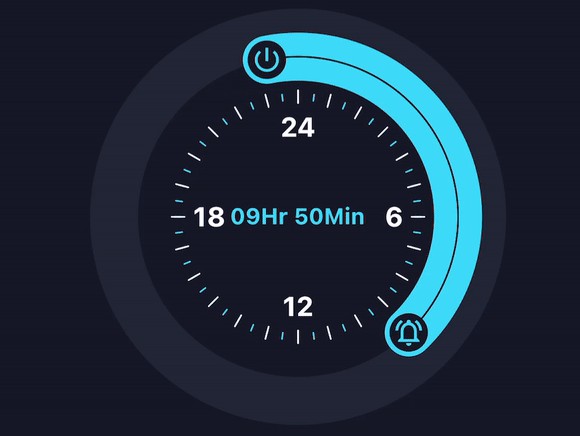
A Customizable Progressive Time Picker for Flutter. This plugin allow us to customize time picker based on our requirements for selecting a specific range from time picker and it’s supports multiple platforms.
Key Features
- supports selection of both picker handler.
- easy customization for decorating a time picker.
- gives feature to show clock numbers in both 12 or 24 hours format and also supports customization for it.
Preview
Basic Usage
Import it to your project file
import 'package:progressive_time_picker/progressive_time_picker.dart';
And add it in its most basic form like it:
print(
‘onSelectionChange => init : ${a.h}:${a.m}, end : ${b.h}:${b.m}’),
onSelectionEnd: (a, b) =>
print(
‘onSelectionEnd => init : ${a.h}:${a.m}, end : ${b.h}:${b.m}’),
);
“>
‘onSelectionChange => init : ${a.h}:${a.m}, end : ${b.h}:${b.m}’),
onSelectionEnd: (a, b) =>
print(
‘onSelectionEnd => init : ${a.h}:${a.m}, end : ${b.h}:${b.m}’),
);
“>
  TimePicker(
    initTime: PickedTime(h: 0, m: 0),
    endTime: PickedTime(h: 8, m: 0),
    onSelectionChange: (a, b) =>
        print(
            'onSelectionChange => init : ${a.h}:${a.m}, end : ${b.h}:${b.m}'),
    onSelectionEnd: (a, b) =>
        print(
            'onSelectionEnd => init : ${a.h}:${a.m}, end : ${b.h}:${b.m}'),
  );
Required parameters of TimePicker
| Parameter | Description |
|---|---|
| PickedTime initTime | the init PickedTime value in the selection |
| PickedTime endTime | the end PickedTime value in the selection |
| onSelectionChange | callback function when init and end PickedTime change |
| onSelectionEnd | callback function when init and end PickedTime finish |
Optional parameters of TimePicker
| Parameter | Default | Description |
|---|---|---|
| double height | 220 | height of the canvas |
| double width | 220 | width of the canvas |
| int primarySectors | 0 | the number of primary sectors to be painted |
| int secondarySectors | 0 | the number of secondary sectors to be painted |
| Widget child | Container | widget that would be mounted inside the circle |
| TimePickerDecoration decoration | – | used to decorate our TimePicker widget |
Required parameters of TimePickerDecoration
| Parameter | Description |
|---|---|
| TimePickerSweepDecoration sweepDecoration | used to decorate our sweep part or a part between our init and end point with various options |
| TimePickerHandlerDecoration initHandlerDecoration | used to decorate our init or end handler of time picker |
| TimePickerHandlerDecoration endHandlerDecoration | used to decorate our init or end handler of time picker |
Optional parameters of TimePickerDecoration
| Parameter | Default | Description |
|---|---|---|
| Color baseColor | cyanAccent | defines the background color of the picker |
| double pickerBaseCirclePadding | 0.0 | to add extra padding for picker base or outer circle |
| TimePickerSectorDecoration primarySectorsDecoration | – | used to decorate the primary sectors of out time picker |
| TimePickerSectorDecoration secondarySectorsDecoration | – | used to decorate the secondary of out time picker |
| TimePickerClockNumberDecoration clockNumberDecoration | – | Provides decoration options which will get applied to the internal clock’s numbers when enable |
Guideline for contributors
- Contribution towards our repository is always welcome, we request contributors to create a pull request for development.
Guideline to report an issue/feature request
It would be great for us if the reporter can share the below things to understand the root cause of the issue.
- Library version
- Code snippet
- Logs if applicable
- Device specification like (Manufacturer, OS version, etc)
- Screenshot/video with steps to reproduce the issue
- Library used
LICENSE!
progressive_time_picker is MIT-licensed.
Let us know!
We’d be really happy if you send us links to your projects where you use our component. Just send an email to [email protected] And do let us know if you have any questions or suggestion regarding our work.


