1. About
TextDivider provides a customizable Flutter widget that makes it easy to display text in the middle of a Divider.
Using TextDivider, you can easily display the following objects that you often see in websites and mobile apps. In addition, TextDivider has flexible customization options that allow you to change the style to suit your taste.
- Wellknown text divider
Also TextDivider supports vertical as well as horizontal direction.
To see exactly what kind of output you can get by using TextDivider, see this GitHub Pages made with Flutter and TextDivider.
1.1. Introduction
1.1.1. Install Library
With Dart:
dart pub add text_divider
With Flutter:
flutter pub add text_divider
1.1.2. Import It
import 'package:text_divider/text_divider.dart';
1.1.3. Use TextDivider
import 'package:text_divider/text_divider.dart';
class ExampleTextDivider extends StatelessWidget {
const ExampleTextDivider({Key? key}) : super(key: key);
@override
Widget build(BuildContext context) => Scaffold(
body: Padding(
padding: const EdgeInsets.all(20),
child: Center(
child: Column(
mainAxisAlignment: MainAxisAlignment.center,
children: [
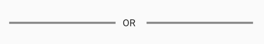
// Outputs a horizontal Divider with the text placed in the center.
TextDivider.horizontal(text: const Text('Horizontal Test')),
// Outputs a vertical Divider with the text placed in the center.
TextDivider.vertical(text: const Text('Vertical Test')),
],
),
),
),
);
}
1.2. Details
1.2.1. Customization Options
| Name | Type | Required | Initial Value | Remarks |
|---|---|---|---|---|
| text | Text | ✅ | – | This is a Text widget included in a commonly used material package. The text data set in this Text widget will be output to the center of the Divider. |
| direction | Direction | ❌ | Direction.horizontal | This option specifies the direction of the Divider to be output. |
| size | double? | ❌ | 16.0 | This option indicates the height if the Divider direction is horizontal, and the width if the Divider direction is vertical. |
| thickness | double? | ❌ | 0.0 | The thickness of the line drawn within the divider. |
| indent | double? | ❌ | 0.0 | The amount of empty space to the leading edge of the divider. |
| endIndent | double? | ❌ | 0.0 | The amount of empty space to the trailing edge of the divider. |
| color | Color? | ❌ | DividerThemeData.color OR ThemeData.dividerColor | The color to use when painting the line. |
1.2.2. Horizontal Constructor
It is possible to specify the direction of the Divider with the argument of the default constructor, but a simpler way is to use the horizontal constructor. However, keep in mind that you cannot specify const in the caller of the TextDivider if you use this horizontal constructor.
1.2.3. Vertical Constructor
Also you can use the vertical constructor for vertical direction. However, keep in mind that you cannot specify const in the caller of the TextDivider if you use this vertical constructor.
1.3. License
Copyright (c) 2022, Kato Shinya. All rights reserved.
Use of this source code is governed by a
BSD-style license that can be found in the LICENSE file.
1.4. More Information
TextDivider was designed and implemented by Kato Shinya.