stylish_dialog
A collection of stylish animated dialogs like Normal, Progress, Success, Info, Warning, and Error for flutter.
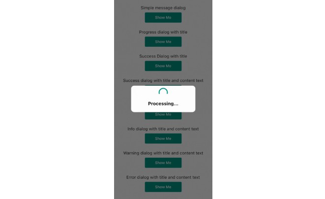
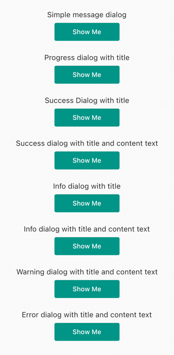
Showcase
⭐ Installing
dependencies:
    stylish_dialog: ^0.0.6
⚡ Import
import 'package:stylish_dialog/stylish_dialog.dart';
? How To Use
context:
alertType:
titleText:
contentText:
addView:
confirmText:
cancelText:
confirmPressEvent:
cancelPressEvent:
dismissOnTouchOutside:
Properties
context → BuildContext

alertType → int

titleText → String

addView → Widget

confirmText → String

confirmText → String

cancelText → String

confirmPressEvent → void Function ()

cancelPressEvent → void Function ()

dismissOnTouchOutside → bool

rootNavigator → bool
Alert Type
StylishDialog.NORMAL
StylishDialog.PROGRESS
StylishDialog.SUCCESS
StylishDialog.INFO
StylishDialog.WARNING
StylishDialog.ERROR
Press Event
confirmPressEvent: (){

}

cancelPressEvent: (){

}
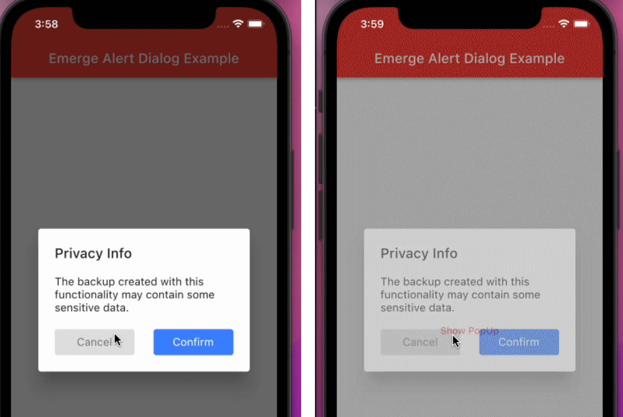
Bind Dialog/Change Alert Type
dialog.changeAlertType(
    alertType: /*Alert Type*/,
    ...
);
Example
StylishDialog dialog = StylishDialog(
        context: context,
        alertType: StylishDialog.NORMAL,
        titleText: 'This is title',
        contentText: 'This is content text',
    );

//show stylish dialog
dialog.show();

//dismiss stylish dialog
dialog.dismiss();

//dialog.dismiss(/*rootNavigator: bool  default true */);
Simple Dialog
Simple Stylish Dialog with title and content text
StylishDialog(
    context: context,
    alertType: StylishDialog.NORMAL,
    titleText: 'This is title',
    contentText: 'This is content text',
).show();
Normal Dialog with Custom Widget
Normal dialog with custom widget
Note: addView: is only supported with StylishDialog.NORMAL alertType
StylishDialog(
    context: context,
    alertType: StylishDialog.NORMAL,
    titleText: 'Name',
    contentText: 'Please enter your name',
    confirmText: 'Submit',
    confirmPressEvent: () {
        print(controller.text);
    },
    addView: TextField(
        controller: controller,
        ),
).show();
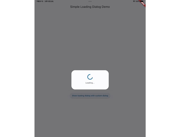
Progress Dialog
Progress dialog without title and content text
StylishDialog(
    context: context,
    alertType: StylishDialog.PROGRESS,
    titleText: 'This is title',
    contentText: 'This is content text',
).show();
Progress dialog with only title
StylishDialog(
    context: context,
    alertType: StylishDialog.PROGRESS,
    titleText: 'This is title',
    contentText: 'This is content text',
).show();
Progress dialog with title and content text
StylishDialog(
    context: context,
    alertType: StylishDialog.PROGRESS,
    titleText: 'This is title',
    contentText: 'This is content text',
).show();
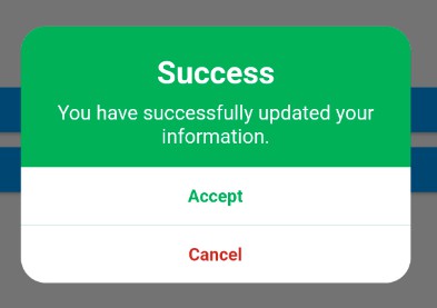
Success Dialog
Success dialog without title and content text
StylishDialog(
    context: context,
    alertType: StylishDialog.SUCCESS,
).show();
Success dialog with only title
StylishDialog(
    context: context,
    alertType: StylishDialog.SUCCESS,
    titleText: 'Wow',
).show();
Success Dialog with title and content text
StylishDialog(
    context: context,
    alertType: StylishDialog.SUCCESS,
    titleText: 'Wow',
    contentText: 'Task completed',
).show();
Info Dialog
Info Dialog without title and content text
StylishDialog(
    context: context,
    alertType: StylishDialog.INFO,
).show();
Info Dialog with only title
StylishDialog(
    context: context,
    alertType: StylishDialog.INFO,
    titleText: 'You know',
).show();
Info Dialog with title and content text
StylishDialog(
    context: context,
    alertType: StylishDialog.INFO,
    titleText: 'You know',
    contentText: 'This is an amazing dialog',
).show();
Warning Dialog
Warning Dialog without title and content text
StylishDialog(
    context: context,
    alertType: StylishDialog.WARNING,
).show();
Warning Dialog with only title
StylishDialog(
    context: context,
    alertType: StylishDialog.WARNING,
    titleText: 'Wait',
).show();
Warning Dialog with title and content text
StylishDialog(
    context: context,
    alertType: StylishDialog.WARNING,
    titleText: 'Wait',
    contentText: 'Are you sure you want to delete',
).show();
Error Dialog
Error Dialog without title and content text
StylishDialog(
    context: context,
    alertType: StylishDialog.ERROR,
).show();
Error Dialog with only title
StylishDialog(
    context: context,
    alertType: StylishDialog.ERROR,
    titleText: 'Oops',
).show();
Error Dialog with title and content text
StylishDialog(
    context: context,
    alertType: StylishDialog.ERROR,
    titleText: 'Oops',
    contentText: 'Task Failed',
).show();
Success Dialog
Success Dialog with click
StylishDialog(
    context: context,
    alertType: StylishDialog.SUCCESS,
    titleText: 'Wow',
    contentText: 'You did it',
    confirmText: 'Dismiss',
    confirmPressEvent: () {
        //Dismiss stylish dialog
        Navigator.of(context).pop();
    },
).show();
Different Ways to bind
Progress dialog bind with Success dialog
StylishDialog dialog = StylishDialog(
    context: context,
    alertType: StylishDialog.PROGRESS,
    titleText: 'Processing...',
    dismissOnTouchOutside: false,
);
dialog.show();

Future.delayed(Duration(seconds: 3), () {
    dialog.changeAlertType(
    alertType: StylishDialog.SUCCESS,
        titleText: 'Congrats!',
        contentText: 'Task completed successfuly',
        confirmPressEvent: () {
            dialog.dismiss();
        },
    confirmText: 'Dismiss',
    );
});