Unoffcial Flutter implementation of the progress bar defined in GitHub Primer Design System
Installation
Add this package to your pubspec.yaml.
dependencies:
  primer_progress_bar: ^0.2.0
Alternatively, you can use flutter command like:
flutter pub add primer_progress_bar
Getting Started
Define segments to be displayed in the progress bar using Segment:
List<Segment> segments = [
  Segment(value: 80, color: Colors.purple, label: Text("Done")),
  Segment(value: 14, color: Colors.deepOrange, label: Text("In progress")),
  Segment(value: 6, color: Colors.green, label: Text("Open")),
];
Then, in your build method:
Widget build(BuildContext context) {
  final progressBar = PrimerProgressBar(segments: segments);
  return Scaffold(
    body: Center(
      child: Padding(
        padding: EdgeInsets.all(20),
        child: progressBar,
      ),
    ),
  );
}
Finally you will get a nice progress bar ?
Usage
Components
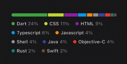
The Primer‘s progress bar consists of 3 components: the segmented bar, the legend, and the legend items. The progress bar can display multiple colored segments in a horizontal bar, and the legend is placed below the bar with the aligned descriptions of each segment.
You can define a segment using Segment:
Segment(color: Colors.lightBlue, value: 24,
        label: Text("Dart"), valueLabel: Text("24%"));
The value describes the amount of space the segment occupies in the entier bar (see Proportion of segments section), and the label and valueLabel are the texts used in the legend to explain what the segment means.
The PrimerProgressBar integrates these 3 components and provides a simple interface to create a chart like the one above, so it should fit to general usecases. However, since each component is modulated, it is easy to use them individually for your own purposes. See SegmentedBar, SegmentedBarLegend, LegendItem for more details usage of each component.
Proportions of segment sizes
The proportion of each segment size to the bar length is determined by dividing the maxTotalValue according to the values of the segments. For example, if you want to display the percentage of each programming language used in a project, the value could be the percentage for a language and the maxTotalValue is 100.
PrimerProgressBar(segments: segments, maxTotalValue: 100);
Then, the size of a segment with a value of 24, for example, should be the 24% of the bar length.
If maxTotalValue is not specified, it is implicitly set to the sum of the values of the segments, resulting in the segments always filling the entire bar.
Limit legend lines
By default, the legend tries to align all the items while growing in vertical direction. This is fine if the legend has a relatively small number of items to display, but if you have a large number of segments, you will end up with a verbose legend.
For these cases, the legend provides a way to limit the number of lines in which the items are aligned. The following example limits the number of lines in the legend to 2.
PrimerProgressBar(
  segments: segments,
  // Limits the number of the lines in the legend to 2.
  legendStyle: const SegmentedBarLegendStyle(maxLines: 2),
  // A builder of a legend item that represent the overflowed items.
  // `truncatedItemCount` is the number of items that is overflowed.
  ellipsisBuilder: (truncatedItemCount) {
    final value = segments
        .skip(segments.length - truncatedItemCount)
        .fold(0, (accValue, segment) => accValue + segment.value);
    return LegendItem(
      segment: Segment(
        value: value,
        color: Colors.grey,
        label: const Text("Other"),
        valueLabel: Text("$value%"),
      ),
    );
  },
);
If the legend failed to align some items within the given line limit, the overflowing items are not shown and instead an item that is created by ellipsisBuilder (called an ellipsis) is displayed as the last item in the legend.
Styling
The appearace of the 3 components are configurable with SegmentedBarStyle, SegmentedBarLegendStyle, LegendItemStyle, respectively. The documentation will provide detailed descriptions of each class and its properties, while our focus here is on briefly explaining the terminology used in the documentation.
Segmented bar
- Gap : A space between adjacent segments.
- Background : The color of the bar itself.
Legend item
- Handle : A small shape filled with the segment’s color and placed at the start of the item.
- Label : A text explaining what the segment means.
- Value label : A formatted
valueof the segment.
TODO
- Add tests
- Support mouse hovering
- Refactor with Dart3
Contributing
Contributions are what make the open source community such an amazing place to learn, inspire, and create. Any contributions you make are greatly appreciated.
If you have a suggestion that would make this better, please fork the repo and create a pull request. You can also simply open an issue with the tag “enhancement”. Don’t forget to give the project a star! Thanks again!
- Fork the Project
- Create your Feature Branch (
git checkout -b feature/AmazingFeature) - Commit your Changes (
git commit -m 'Add some AmazingFeature') - Push to the Branch (
git push origin feature/AmazingFeature) - Open a Pull Request
