Flutter Duration Button
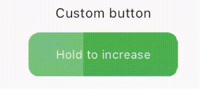
Duration Button is auto-clicked button likes Netflix’s Skip Intro button.
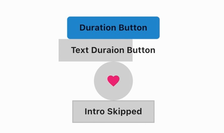
It provides normal duration button called DurationButton, icon based button called IconDurationButton, text based button called TextDurationButton and outlined button called TextDurationButton.
Getting started
Depend on it.
$ flutter pub add duration_button
or
Add below line to your personal package’s pubspec.yaml.
dependencies:
  duration_button: ^1.0.0
And run flutter pub get to install.
Import it.
import 'package:duration_button/duration_button.dart';
Use widget.
DurationButton(/* Props here.. */)
IconDurationButton(/* Props here.. */)
OutlinedDurationButton(/* Props here.. */)
TextDurationButton(/* Props here.. */)
Props
| Props | Types | Default | Description |
|---|---|---|---|
| duration | Duration |
required | The Duration value of the button. |
| width | double? |
null |
The width value of the button. |
| height | double? |
null |
The height value of the button. |
| child | Widget? |
null |
The child widget of the button. |
| coverChild | bool? |
false |
The bool value if cover covers child widget. |
| borderRadius | BorderRadius |
null |
The border radius of the button. |
| onPressed | VoidCallback |
required | The callback function that will be called when button is clicked. and if onCompleteis null, then onPressed will be called when completed. |
| onComplete | VoidCallback? |
null |
The callback function that will be called when the button is completly covered. |
| coverColor | Color? |
Colors.black.withOpacity(0.2) |
the color value of the button. |
| backgroundColor | Color? |
Theme Primary Color | the color value of the button. |
| hoverColor | Color? |
null |
the color value of the hover effect. |
| splashColor | Color? |
null |
the color value of the splash effect. |
| splashFactory | InteractiveInkFeatureFactory? |
null |
The splashFactory value of the button. |
| border | Border? |
null |
The border value of the button |
You can find other widget’s Props from Documentation.
Example
DurationButton
DurationButton(
  duration: const Duration(seconds: 3),
  onPressed: () {},
  backgroundColor: Colors.yellow,
  splashFactory: NoSplash.splashFactory,
  onComplete: () => ScaffoldMessenger.of(context).showSnackBar(SnackBar(content: Text("onCompleteCalled!"))),
  child: const Text("Duration Button"),
),
IconDurationButton
IconDurationButton(
  Icons.favorite,
  size: 30,
  iconColor: Colors.pink,
  onPressed: () {},
  duration: const Duration(seconds: 2),
),
TextDurationButton
TextDurationButton(
  width: 150,
  height: 50
  duration: const Duration(seconds: 7),
  text: const Text('Text Duraion Button'),
  onPressed: () {},
),
OutlinedDurationButton
// String _skipIntro = 'Skip Intro';

OutlinedDurationButton(
  child: Text(_skipIntro),
  onPressed: () {},
  onComplete: () => setState(() => _skipIntro = 'Intro Skipped'),
  duration: const Duration(seconds: 3),
),
License
MIT License

Copyright (c) 2022 Kim Seung Hwan

Permission is hereby granted, free of charge, to any person obtaining a copy
of this software and associated documentation files (the "Software"), to deal
in the Software without restriction, including without limitation the rights
to use, copy, modify, merge, publish, distribute, sublicense, and/or sell
copies of the Software, and to permit persons to whom the Software is
furnished to do so, subject to the following conditions:

The above copyright notice and this permission notice shall be included in all
copies or substantial portions of the Software.

THE SOFTWARE IS PROVIDED "AS IS", WITHOUT WARRANTY OF ANY KIND, EXPRESS OR
IMPLIED, INCLUDING BUT NOT LIMITED TO THE WARRANTIES OF MERCHANTABILITY,
FITNESS FOR A PARTICULAR PURPOSE AND NONINFRINGEMENT. IN NO EVENT SHALL THE
AUTHORS OR COPYRIGHT HOLDERS BE LIABLE FOR ANY CLAIM, DAMAGES OR OTHER
LIABILITY, WHETHER IN AN ACTION OF CONTRACT, TORT OR OTHERWISE, ARISING FROM,
OUT OF OR IN CONNECTION WITH THE SOFTWARE OR THE USE OR OTHER DEALINGS IN THE
SOFTWARE.
