Flutter fluency optimization component "Keframe"
Optimize for lag caused by builds, such as page switches or rapid scrolling of complex lists, through frame-splitting rendering.
The following is Example(you can download it directly) running in VIVO X23 (Snapdragon 660). Comparison of collected data indicators before and after optimization of 200 frames under the same operation (The demo is at the end of the article)
| Before optimization | after optimization |
|---|---|
Monitoring tools from: fps_monitor
- Fluency: FPS greater than 55, which means less than 18ms per frame
- Good: FPS between 30-55, i.e. 18ms-33ms per frame
- Slight lag: FPS between 15-30, i.e. 33ms-67ms per frame
- Caton: FPS less than 15, which means a frame time greater than 66.7ms
After using frame splitting optimization, the number of lag decreased from an average of 33.3 frames to only one in 200 frames, and the slight lag decreased from 188ms to 90ms. The phenomenon of lag is greatly reduced, the proportion of fluid frames is significantly increased, and the overall performance is smoother. Below are the details.
| Before optimization | after optimization | |
|---|---|---|
| The average number of frames appears a lag | 33.3 | 200 |
| The average number of frames with a slight lag | 8.6 | 66.7 |
| Most time consuming | 188.0ms | 90.0ms |
| The average time | 27.0ms | 19.4ms |
| Fluency frame ratio | 40% | 64.5% |
Page switching fluency improved:
When opening a page or Tab switch, the system will render the entire page and complete the page switch with animation. For complex pages, there will also be a frame lag.
With the framing component, the page build is disassembled frame by frame and viewed through the performance tool in DevTools. During switching, the peak value of a frame is reduced from 112.5ms to 30.2ms, and the overall switching process is more smooth.
How to use
Project depend on:
Add a dependency on keframe to pubspec.yaml
dependencies:
  keframe: version
Components distinguish only the normal and null-safe versions
The normal version uses : 1.0.2
The null-safe version uses :2.0.2
Quick learning
As shown in the figure below :
Suppose the page now consists of four parts A, B, C and D, each of which takes 10ms and is built as 40ms at page time.
Use the frameseparateWidget component to nest each section. A simple placeholder is rendered on the first frame of the page, and A, B, C, and D are rendered on the next four frames.
For the list, nested FrameSeparateWidget in each item and nested ListView in SizeCacheWidget.
Constructor Description:
FrameSeparateWidget :A frame-splitting component that renders nested widgets in a single frame.
| type | name | required | describe |
|---|---|---|---|
| Key | key | no | |
| int | index | no | frame component id, using SizeCacheWidget scenario will pass, and to maintain the index in the SizeCacheWidget corresponding Size information |
| Widget | child | yes | the actual need to render the widget |
| Widget | placeHolder | no | placeholder widget, try to set up a simple placeholder, not the default is the Container () |
SizeCacheWidget:Cache size information for **actual widgets nested by framing components in child nodes **.
| type | name | required | describe |
|---|---|---|---|
| Key | key | no | |
| Widget | child | yes | if include framing component in the child nodes, the cache is the actual widget size |
| int | estimateCount | no | estimates the number of child nodes on the screen, can enhance the response speed of the fast scroll |
Example explanation:
Caton's pages are often rendered by multiple complex widgets at the same time. By nested FrameSeparateWidget for complex widgets. When rendering, the Framing Component renders multiple palceHolder simultaneously in the first frame, and then renders complex sub-items in successive frames to improve page fluency.
For example:
ListView.builder(
              itemCount: childCount,
              itemBuilder: (c, i) => CellWidget(
                color: i % 2 == 0 ? Colors.red : Colors.blue,
                index: i,
              ),
            )
The height of cellWidget is 60, and three components of TextField are nested inside (the overall construction time is about 9ms).
Optimization simply involves nested framing components for each item and setting placeHolder for each item (placeHolder should be as simple as possible and should look like the actual item).
In the ListView case, nested SizeCacheWidget is recommended, and the pre-load cacheExtent is recommended to be larger, such as 500 (the default is 250), to improve the slow sliding experience.
For example:
SizeCacheWidget(
              child: ListView.builder(
                cacheExtent: 500,
                itemCount: childCount,
                itemBuilder: (c, i) => FrameSeparateWidget(
                  index: i,
                  placeHolder: Container(
                    color: i % 2 == 0 ? Colors.red : Colors.blue,
                    height: 60,
                  ),
                  child: CellWidget(
                    color: i % 2 == 0 ? Colors.red : Colors.blue,
                    index: i,
                  ),
                ),
              ),
            ),
Here are a few scenarios:
1. The actual item size in the list is known
If the actual item height is known (each item height is 60), just set the placeholder to match the actual item height. See frame optimization 1 in Example.
FrameSeparateWidget(
                index: i,
                placeHolder: Container(
                  color: i % 2 == 0 ? Colors.red : Colors.blue,
                  height: 60,// Keep the same height as the actual item
                ),
                child: CellWidget(
                  color: i % 2 == 0 ? Colors.red : Colors.blue,
                  index: i,
                ),
              )
2. The actual item height in the list is unknown
In the real world, lists are often presented based on data, and there is no way to predict the size of an item at first.
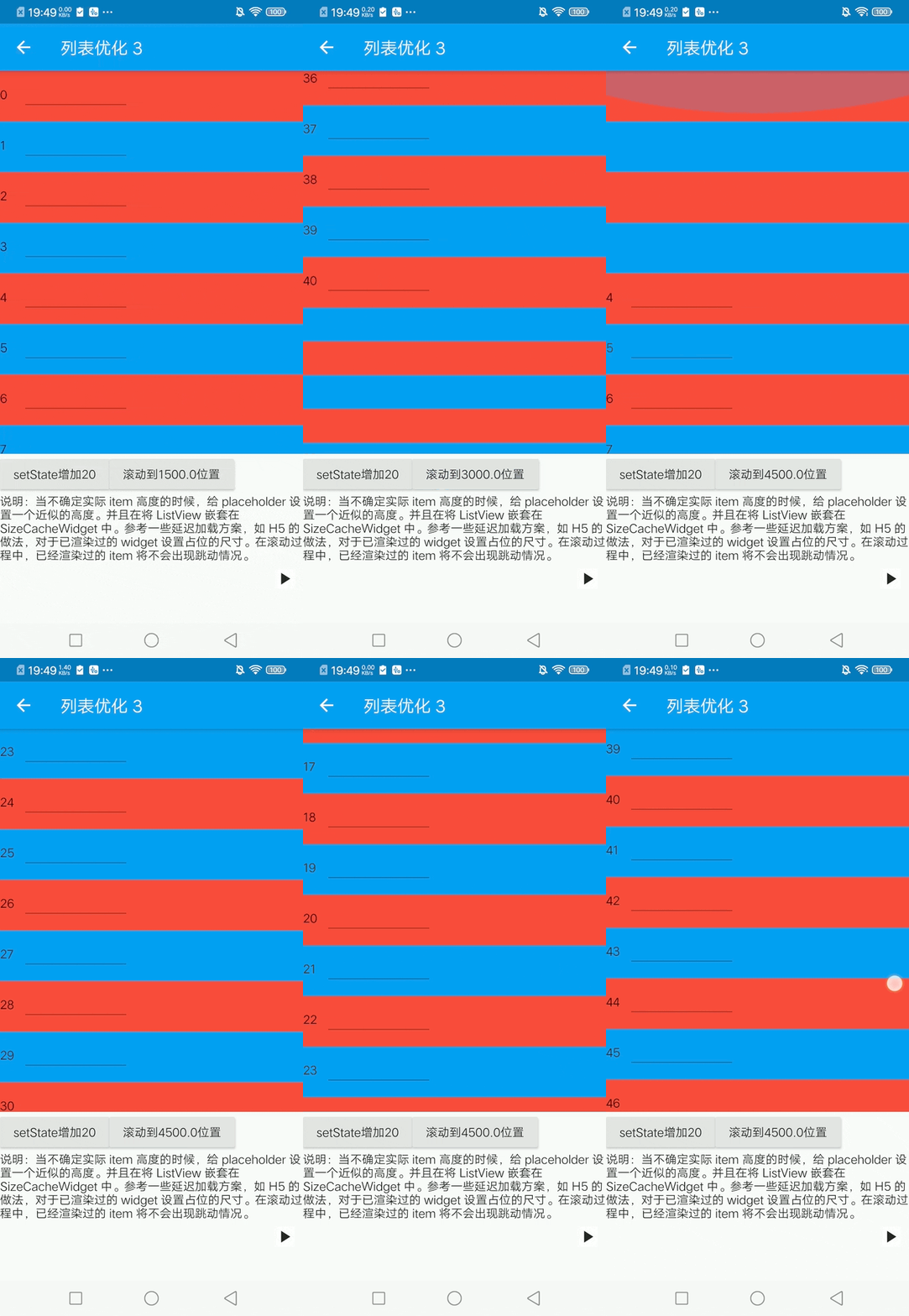
For example, in example frame optimization 2, placeHolder (height 40) is not the same size as the actual item (height 60).
Because each item is rendered in a different frame, list jitter occurs.
You can set some approximate height for the placeholder. And nested the ListView in the SizeCacheWidget.
For widgets that have been rendered, the palceHolder size is forced and the cacheExtent is increased. This way, the rendered item will not jump as it slides back and forth.
For example, framing optimization 3 in example
SizeCacheWidget(
              child: ListView.builder(
                cacheExtent: 500,
                itemCount: childCount,
                itemBuilder: (c, i) => FrameSeparateWidget(
                  index: i,
                  placeHolder: Container(
                    color: i % 2 == 0 ? Colors.red : Colors.blue,
                    height: 40,
                  ),
                  child: CellWidget(
                    color: i % 2 == 0 ? Colors.red : Colors.blue,
                    index: i,
                  ),
                ),
              ),
            ),
The actual effect is as follows:

3. Estimate the number of items in a screen
If you can roughly estimate the maximum number of actual items that can be displayed on a screen, say 10. Set the SizeCacheWidge estimateCount property to 10*2. Fast scrolling scene builds are more responsive and more memory stable.
For example, framing optimization 4 in example
...
SizeCacheWidget(
              estimateCount: 20,
              child: ListView.builder(
...
In addition, you can also nest animations such as transparency/displacement on items to optimize the visual effect.
The actual effect is as follows:
 |
|---|
4. Non-list scenarios
For non-list scenarios, there are generally no fluency issues, but there can still be a lag on first entry.
Similarly, complex modules can be rendered in different frames to avoid first-time entry delays.
For example, we will nest the framing component for the bottom action area in the optimization example:
FrameSeparateWidget(
    child: operateBar(),
    index: -1,
)
The cost of framing
Of course, the framing scheme is not perfect. In my opinion, there are two main costs:
-
Extra build cost: The build cost of the entire build process changed from "N * widget cost" to "N * (widget + placeholder) cost + The system scheduling N frame cost". As you can see, the additional overhead is mainly due to the complexity of the placeholder. If the placeholders were simple Containers, the overall build time would probably increase by 10-20% after testing.This extra overhead is negligible for today's mobile devices.
-
Visual change: As demonstrated above, the component will render the item in frames, and the page will visually occupy the space to become the actual widget.
But in fact, because the list exists in the cache area (it is recommended to increase the cacheExtent), the user does not feel it in the high-end machine or normal sliding situation.
On lower devices, a quick swipe can feel the transition, but it's better than a heavy stumble.
If you have any questions, please feel free to contact me. If this inspires you, dont forget start ✨✨✨✨ Thanks
Before and after optimization demo
| Before optimization | after optimization |
|---|---|
 |


