gauge_indicator
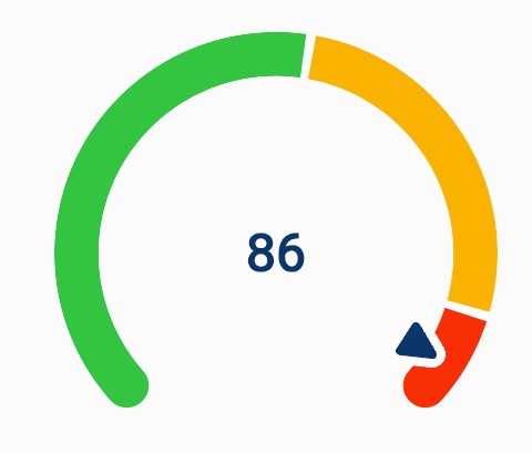
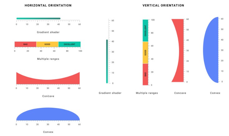
An animated, highly customizable, opensource, Flutter gauge widget.
Usage
It is as simple as defining a RadialGauge or an AnimatedRadialGauge widget in your widget tree.
Code
/// Build method of your widget.
@override
Widget build(BuildContext context) {
  // Create animated radial gauge.
  // All arguments changes will be automatically animated.
  return AnimatedRadialGauge(
    /// The animation duration.
    duration: const Duration(milliseconds: 500),
    /// Gauge value.
    value: gaugeValue,
    /// Provide the [min] and [max] value for the [value] argument.
    min: 0,
    max: 100,
    /// Optionally, you can configure your gauge, providing additional
    /// styles and transformers.
    axis: GaugeAxis(
      /// Render the gauge as a 260-degree arc.
      degrees: 260,
      /// Display the green value progress.
      transformer: const GaugeAxisTransformer.progress(color: Colors.red),
      /// Set the background color and axis thickness.
      style: const GaugeAxisStyle(
        thickness: 20,
        background: Color(0xFFD9DEEB),
      ),
      /// Define the pointer that will indicate the progress.
      pointer: RoundedTrianglePointer(
        size: 20,
        backgroundColor: Colors.black,
        borderRadius: 2,
        border: const GaugePointerBorder(
          color: Colors.white,
          width: 2,
        ),
      ),
    ),
    /// You can also, define the value label style.
    style: const GaugeStyle(
      labelStyle: TextStyle(
        color: Colors.black,
        fontSize: 46,
        fontWeight: FontWeight.bold,
      ),
    ),
  );
}
