Portfolio app by Adam Dybcio
Well, this is a simple application that serves me as such a small portfolio. It might not look great from the code point of view, but it’s actually a patchwork of some of my ideas that were supposed to be implemented into the application, but not all of them fit. Of course, you can give me ideas what to add or remove from the application, it would be nice to develop it in the future. But now let’s move on to the description of the application…
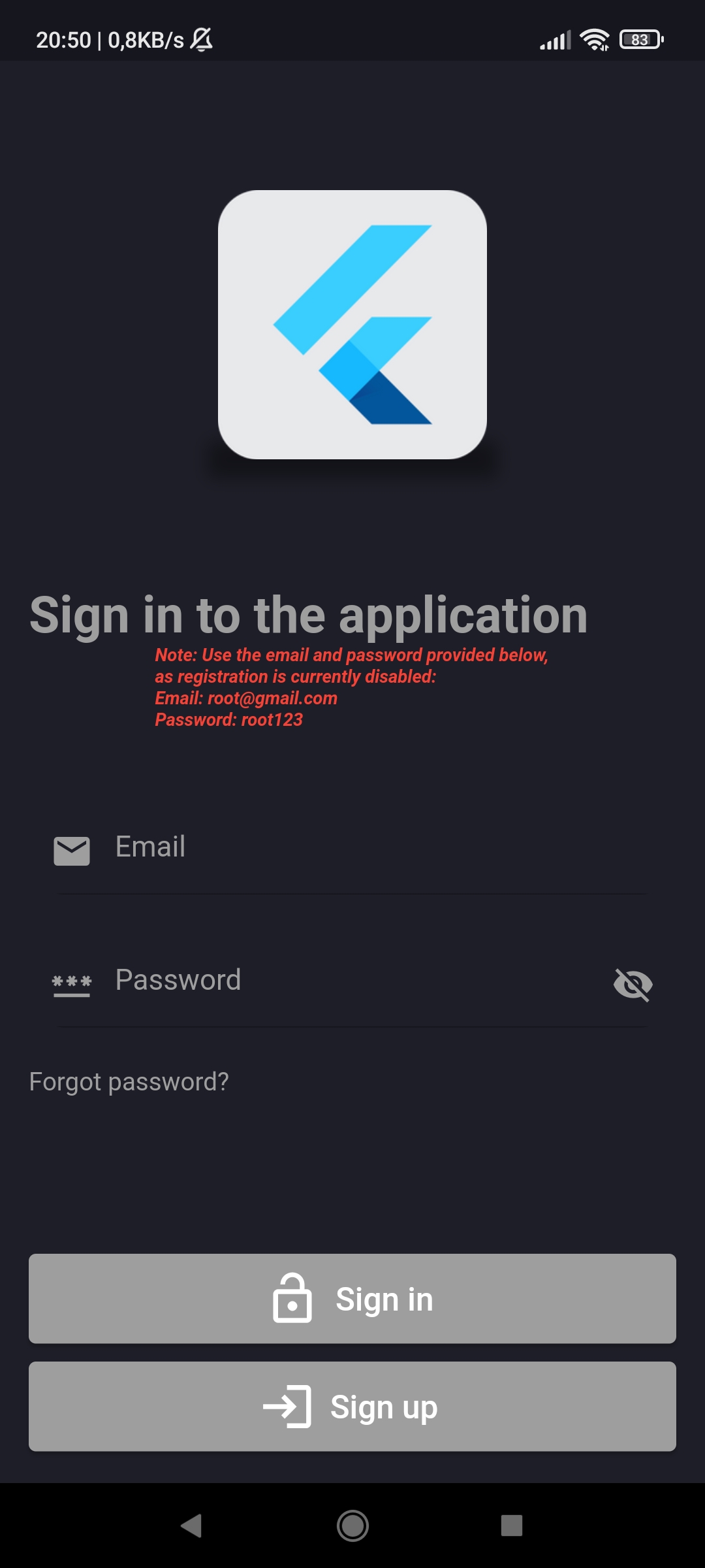
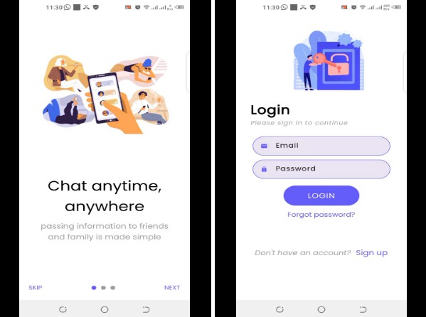
- The application is called “PortfolioAD”. It has a Flutter icon on the screen (I could have created my own but I had no idea what it would look like). After launching the application, the Splash Screen is displayed, also with the Flutter icon, and after a while it takes the user to the login screen:
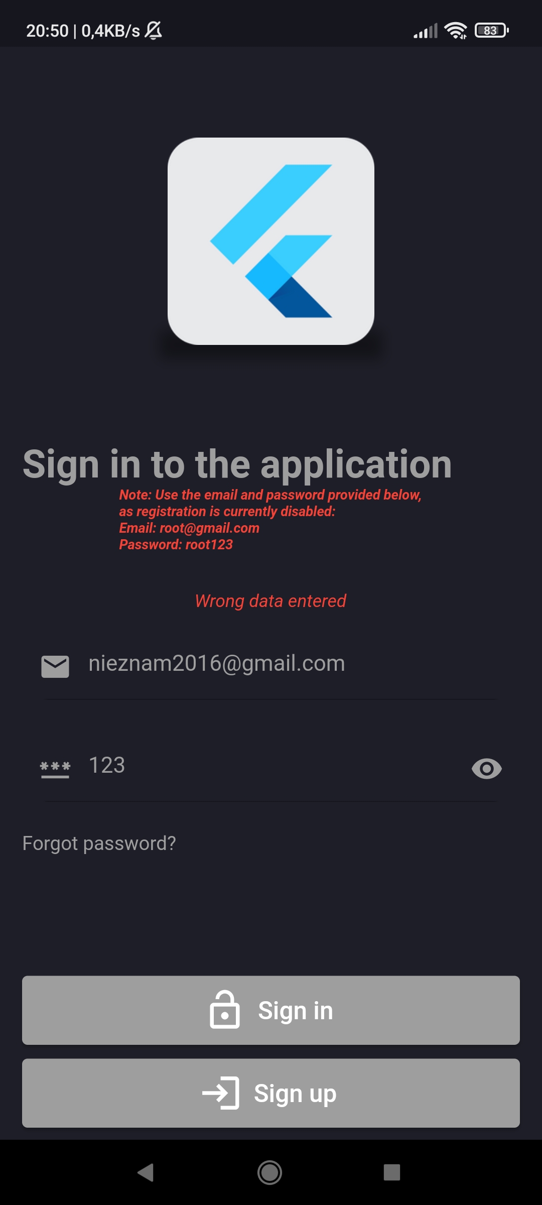
- As you can see, currently you can only log in with the given data, because I turned off the possibility of registration (it is fully operational, but more on that later). If the user enters wrong data, he will be presented with an error. I also added the ability to reveal and hide the password. “Forgot password?” I haven’t added it yet, but maybe I will add it in the near future. Below are screenshots with an example of incorrect login details and password disclosure:
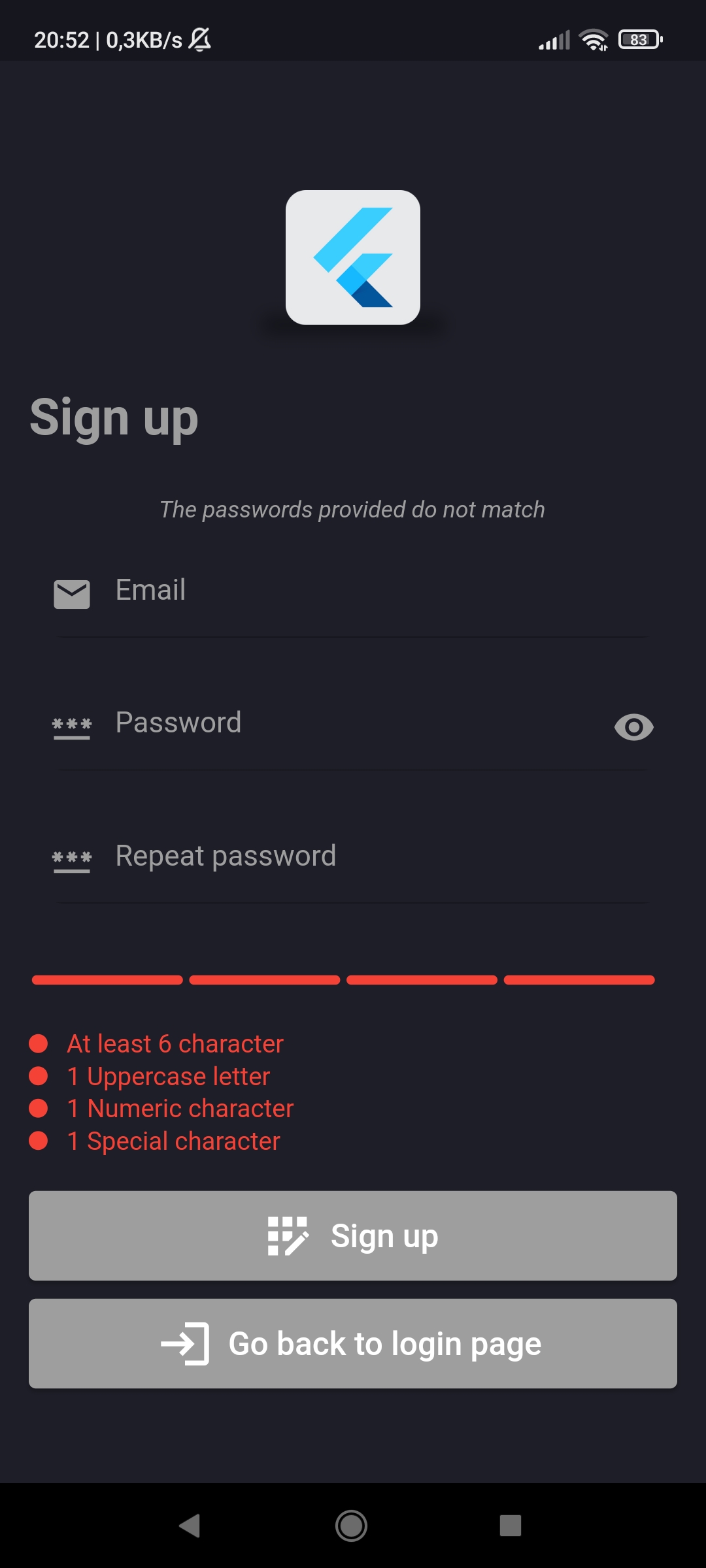
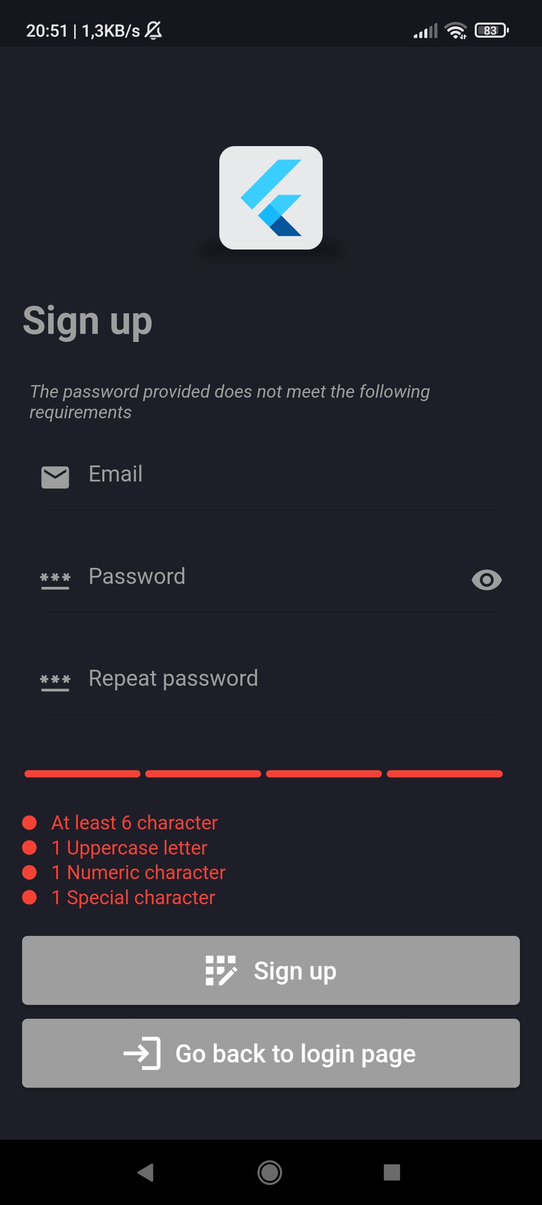
- The user can also go to the registration page which looks like this:
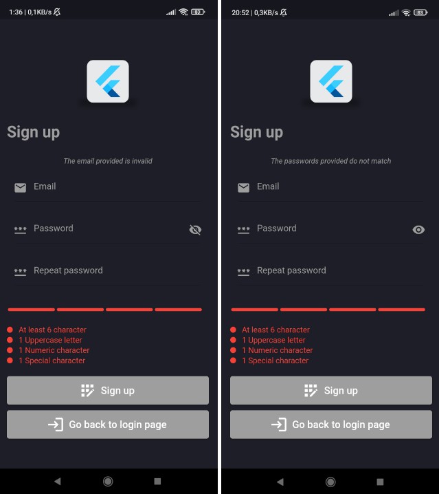
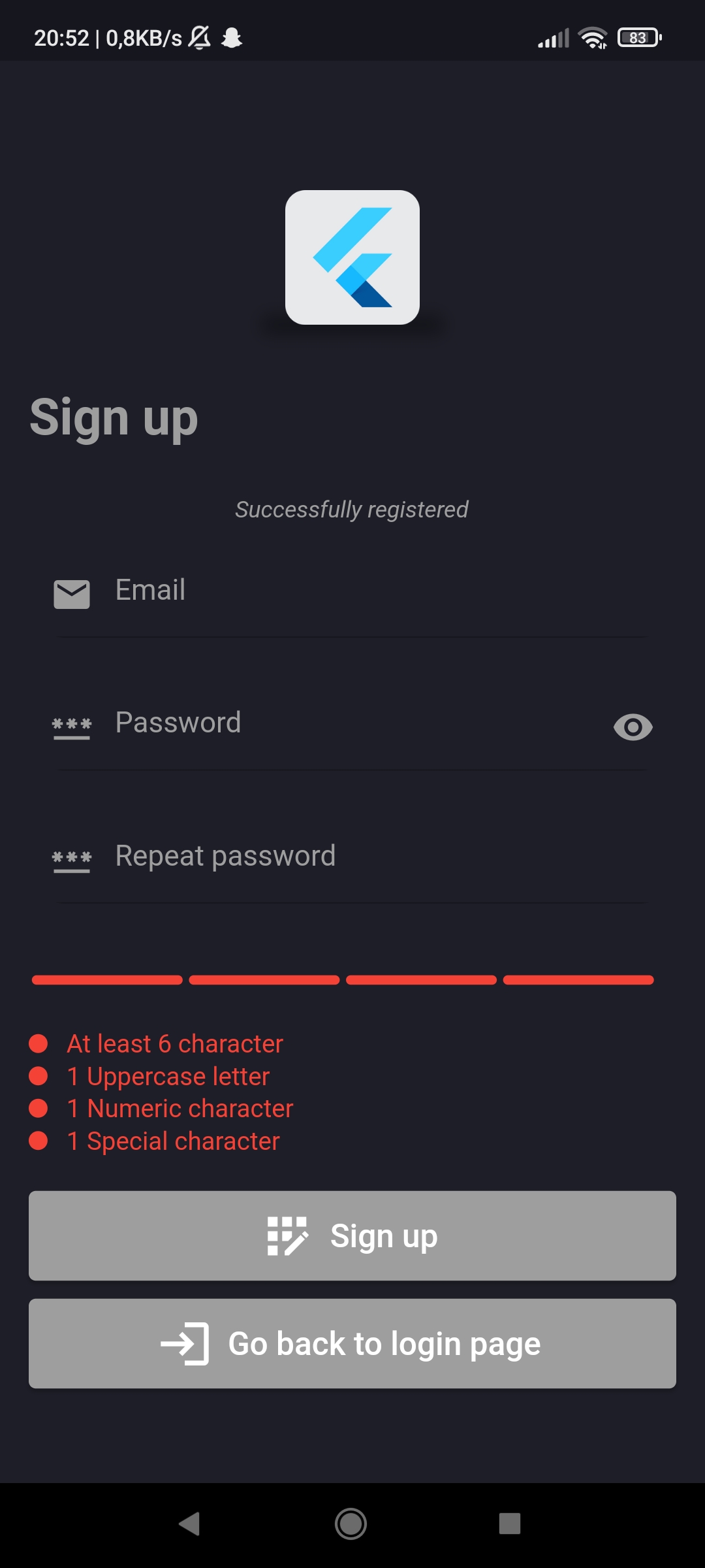
- As you can see, there is a note about disabled registration. I turned it off because if a user wants to register using an email that is already in use, they don’t get a message that the email is busy. Despite the fact that in the case of a busy email it is impossible to create a second account, due to the lack of feedback for the user, I had to disable the registration option. It will be rolled back in the near future after the patch. Nevertheless, feedback to the user after filling in the fields and pressing the “Sign up” button is displayed. For the registration to be successful, the user must provide a valid email, a password that meets the requirements listed below, and a repeated password that is identical to the password provided above. Otherwise, after pressing the button, the user gets feedback on what mistake he made while filling in the fields. Here are some examples:
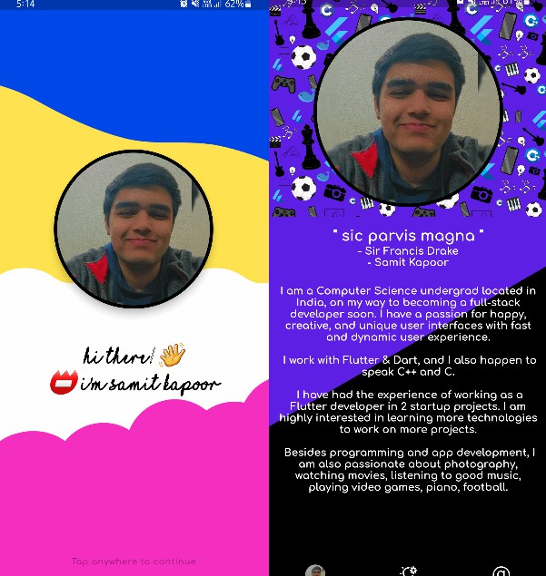
- When the user logs in successfully, he will be taken to the home page. It is important that if the logged in user turns off the application and turns it on again after some time, he will still be logged in until he logs out himself. The home page is my small portfolio, my photo, information about me, programming skills, language skills, hobbies and contact. Subtitles such as “Junior Flutter Developer” and progress bars in programming and language skills are animated. Here’s what the whole page looks like (without showing these simple animations):
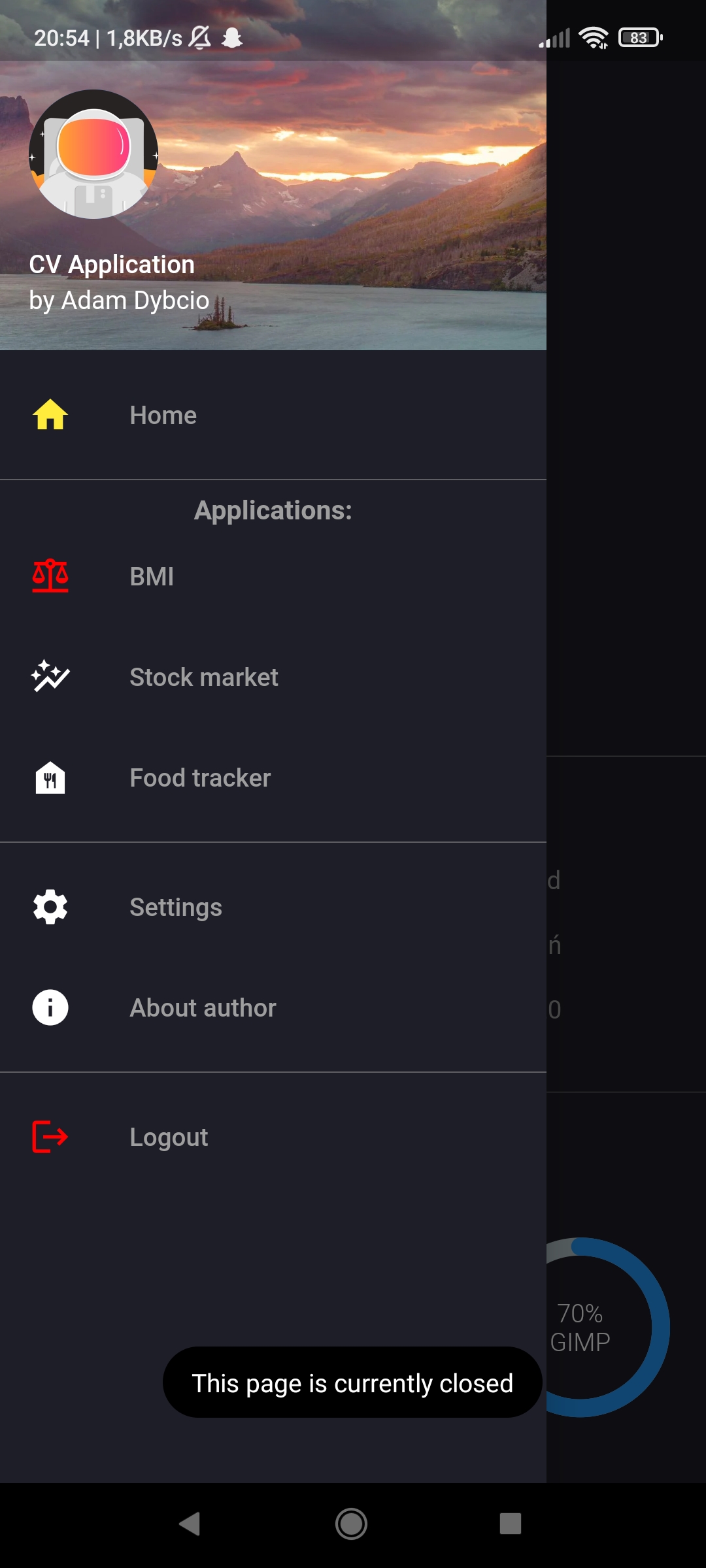
- There’s also a navigation bar that slides out from the side when you swipe or press a button, and it looks like this:
- Currently, nothing else is there (there used to be a BMI website but I will be changing and improving it in the near future as well, so it’s turned off). The icons of disabled pages are red (not counting the logout button) and the icons of pages under construction are gray. After pressing the appropriate icon, a toast is displayed with feedback:
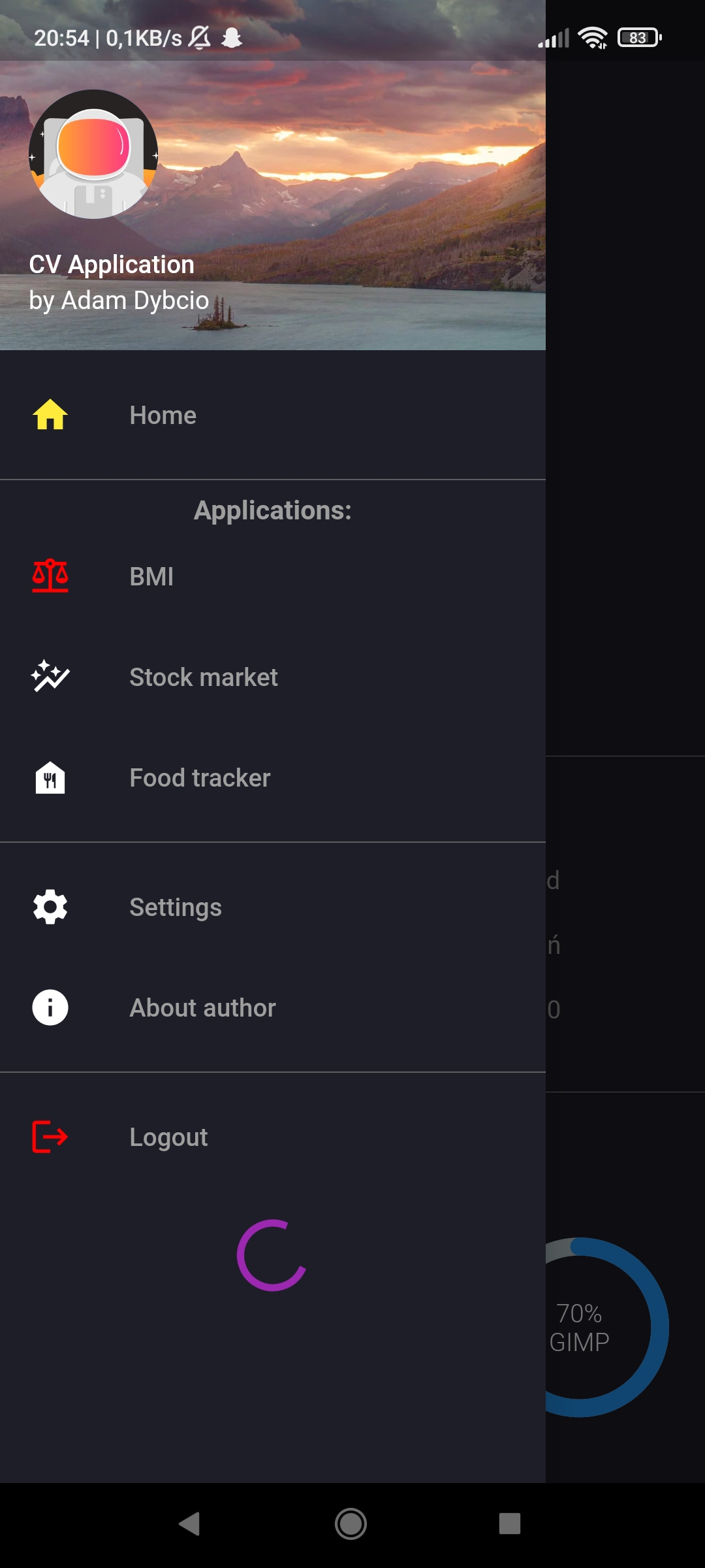
- And the last function at the moment – the logout button. After pressing, a circular progress bar is displayed, and then the user is logged out and transferred to the login page (although these circular progress bars also appear during login and registration):
And that’s it, at least for the moment. If you have any idea what I could improve in the application, what to change, write to me.
