Essential_Widgets
This package is a compilation of widgets maybe useful for some cases when the standard Flutter widgets fall short or we need a widget with a more specific function.
Usage Examples
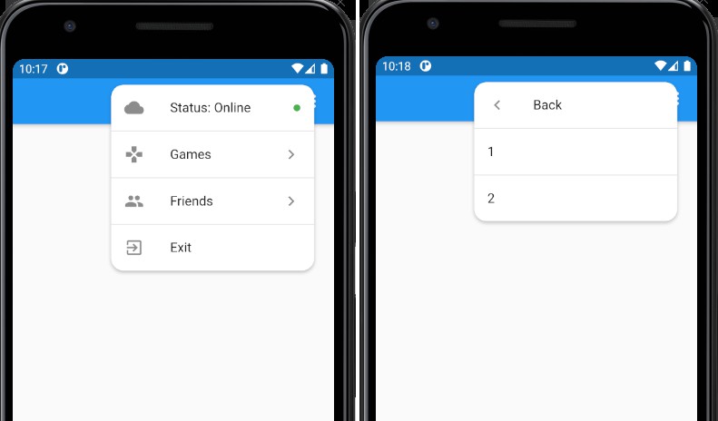
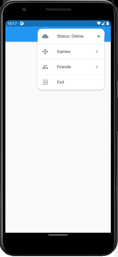
Floating Drawer
import 'package:essential_widgets/widgets/floatingDrawer.dart';
import 'package:flutter/material.dart';

class FloatingDrawerPage extends StatelessWidget {
  final List items = [
    DrawerTile(
      child: Text("Status: Online"),
      leading: Icon(Icons.cloud),
      trailing: Icon(
        Icons.brightness_1,
        color: Colors.green,
        size: 10,
      ),
    ),
    DrawerTile(
      child: Text("Games"),
      leading: Icon(Icons.gamepad),
      trailing: Icon(Icons.chevron_right),
      children: List.generate(2, (i) => DrawerTile(child: Text("${i + 1}"))),
    ),
    DrawerTile(
      child: Text("Friends"),
      leading: Icon(Icons.people),
      trailing: Icon(Icons.chevron_right),
      children: List.generate(5, (i) => DrawerTile(child: Text("${i + 1}"))),
    ),
    DrawerTile(
      child: Text("Exit"),
      leading: Icon(Icons.exit_to_app),
    ),
  ];

  @override
  Widget build(BuildContext context) {
    return Scaffold(
      appBar: AppBar(
        actions: [
          PopupMenuButton<String>(
            color: Colors.transparent,
            elevation: 0,
            itemBuilder: (context) => [
              PopupMenuItem(
                child: Container(
                  width: 300,
                  child: FloatingDrawer(
                    separator: Container(
                      width: double.infinity,
                      height: 1,
                      color: Colors.black12,
                    ),
                    color: Colors.white,
                    borderRadius: BorderRadius.circular(15),
                    tiles: [...items],
                  ),
                ),
              )
            ],
          )
        ],
      ),
    );
  }
}
Params
| Name | Type | Description |
|---|---|---|
| tiles (Required) | List | Defines the rows in the drawer |
| color | Color | Defines the background color |
| separator | Widget | Defines the tiles divider |
| borderRadius | BorderRadiusGeometry | Defines the border radius for the drawer |

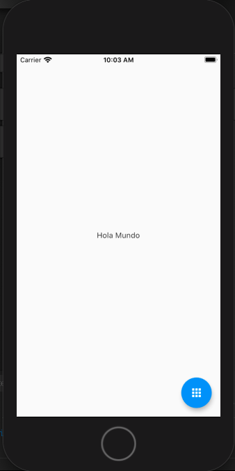
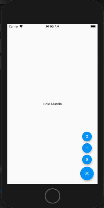
Multi Fab
import 'package:essential_widgets/widgets/multiFab.dart';
import 'package:flutter/material.dart';

class MultiFabPage extends StatelessWidget {
  @override
  Widget build(BuildContext context) {
    return Scaffold(
        body: Center(
          child: Text('Hola Mundo'),
        ),
        floatingActionButton: MultiFab(
          children: [
            ...List.generate(
                3,
                (i) => MultiFabItem(
                      onPressed: () {},
                      child: Text("$i"),
                    ))
          ],
        ));
  }
}
Params
| Name | Type | Description |
|---|---|---|
| unfoldedIcon | Widget | Defines the icon to show when the fab is open |
| foldedIcon | Widget | Defines the icon to show when the fab is closed |
| customIcon | Widget | Defines the icon to show in the fab overwriting the folded and unfolded icons |
| children (Required) | List | Defines the widgets to show when the fab is open |
| shape | ShapeBorder | Defines the shape of the fab |
| animationDuration | Duration | Defines the duration of unfold animation |
| tooltip | String | Defines the string tooltip |
| color | Color | Defines the fab background color |
| onTap | Function | Defines a custom action when the fab is tapped |
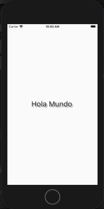
Shadowed
import 'package:essential_widgets/widgets/shadowed.dart';
import 'package:flutter/material.dart';

class ShadowedPage extends StatelessWidget {
  @override
  Widget build(BuildContext context) {
    return Scaffold(
      body: Center(
        child: Shadowed(
          child: Text(
            'Hola Mundo',
            style: TextStyle(fontSize: 30),
          ),
          blurLevel: 1.5,
          distance: 3,
          shadowColor: Colors.black45,
        ),
      ),
    );
  }
}
Params
| Name | Type | Description |
|---|---|---|
| child (Required) | Widget | Defines the widget to shade |
| blurLevel | double | Defines the level of blur in the shadow |
| distance | double | Defines the distance between the child and the shadow |
| shadowColor | Color | Defines the color of the shadow |
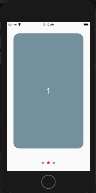
Slideshow
import 'package:essential_widgets/widgets/slideshow.dart';
import 'package:flutter/material.dart';

class SlideshowPage extends StatelessWidget {
  @override
  Widget build(BuildContext context) {
    return Scaffold(
      body: Center(
        child: Slideshow(
          slides: [
            ...List.generate(
              3,
              (i) => Container(
                alignment: Alignment.center,
                child: Text(
                  "$i",
                  style: TextStyle(fontSize: 35, color: Colors.white),
                ),
                decoration: BoxDecoration(
                    color: Colors.blueGrey[400],
                    borderRadius: BorderRadius.circular(25)),
              ),
            )
          ],
        ),
      ),
    );
  }
}
Params
| Name | Type | Description |
|---|---|---|
| Slides (Required) | List | Defines the widgets to show |
| dotsOnTop | bool | Define if the dots are showed on the top or in the bottom |
| primaryColor | Color | Defines the color of the dot for the selected slide |
| secondaryColor | Color | Defines the color of the dots when aren't selected |
| dotsSpace | double | Defines the space between dots |
| shape | BoxShape | Defines the shape of the dots |
| dotsSize | double | Defines the size of the dot fot the selected slide |
| secondaryDotsSize | double | Defines the size of the dots when aren't selected |
| slidesPadding | double | Defines the space between the slides |
| scrollDirection | Axis | Defines the scroll direction for the slideshow |
| showDots | bool | Define if the dots may showed or not |
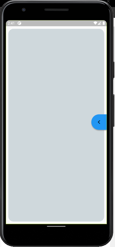
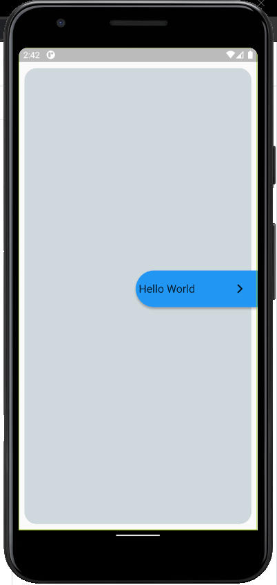
Deployable
import 'package:essential_widgets/widgets/deployable.dart';
import 'package:flutter/material.dart';

class DeployablePage extends StatelessWidget {
  @override
  Widget build(BuildContext context) {
    return Scaffold(
      body: Container(
        alignment: Alignment.centerRight,
        child: Stack(
          alignment: Alignment.centerRight,
          children: [
            SafeArea(
              child: Container(
                margin: EdgeInsets.all(10),
                padding: EdgeInsets.all(10),
                height: double.infinity,
                width: double.infinity,
                decoration: BoxDecoration(
                  borderRadius: BorderRadius.circular(20),
                  color: Colors.blueGrey[100],
                ),
              ),
            ),
            Deployable(
              child: Text(
                "Hello World",
                style: TextStyle(fontSize: 18),
              ),
            ),
          ],
        ),
      ),
    );
  }
}
Deployable
| Name | Type | Description |
|---|---|---|
| cutInLeft | bool | Defines the cut direction of the container |
| color | Color | Defines the background color |
| iconColor | Color | Defines the color of the deployable icon |
| child (Required) | Widget | Defines the widget to deploy |
| alignment | Alignment | Defines the alignment direction of the child container when is deployed |
Blurred
import 'package:essential_widgets/widgets/blurred.dart';
import 'package:flutter/material.dart';

class BlurredPage extends StatelessWidget {
  @override
  Widget build(BuildContext context) {
    return Scaffold(
      body: Center(
        child: Blurred(
          width: 200,
          height: 200,
          opacity: .1,
          blur: 8,
          accentColor: Colors.blueGrey,
          boxDecoration: BoxDecoration(borderRadius: BorderRadius.circular(20)),
          child: FlutterLogo(size: 100),
        ),
      ),
    );
  }
}
Blurred
| Name | Type | Description |
|---|---|---|
| width | Double | Defines the width of the container |
| height | Double | Defines the height of the container |
| opacity | Double | Defines the opacity of the accent color |
| blur | Double | Defines the amount of blur in the widget |
| child (Required) | widget | Defines the widget to be blurred |
| accentColor | Color | Defines the a color layer for the blur |
| boxDecoration | BoxDecoration | Defines the box decoration for the blurred container |
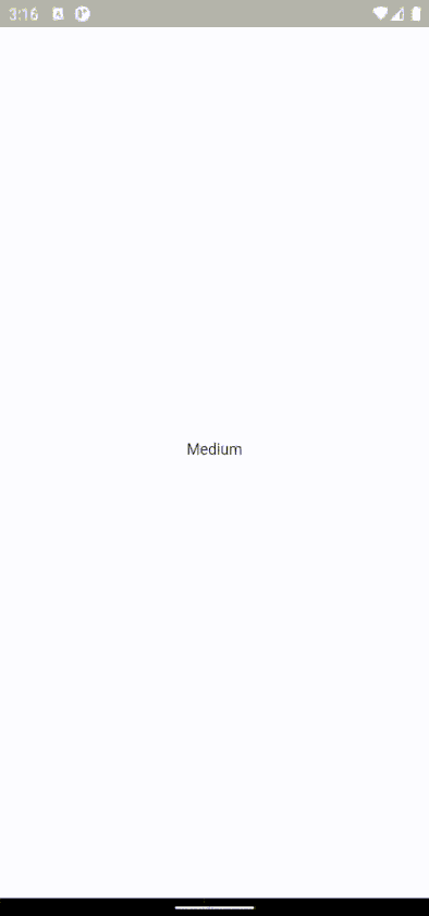
Responsive
- Factors defines the values that determine the widget to use, by default are 200px and 800px respectively.
factors[0] -> sm
factors[1] -> md
import 'package:essential_widgets/widgets/responsive.dart';
import 'package:flutter/material.dart';

class ResponsivePage extends StatelessWidget {
  @override
  Widget build(BuildContext context) {
    return Scaffold(
      body: Center(
        child: Responsive(
          sm: Text("Small"),
          md: Text("Medium"),
          lg: Text("Large"),
          factors: [220, 768],
        ),
      ),
    );
  }
}
Params
| Name | Type | Description |
|---|---|---|
| sm | Widget | Defines the widget to show in small screens |
| md | Widget | Defines the widget to show in medium size screens |
| lg (Required) | Widget | Defines the widget to show in large (default) screens |
| factors | List | Defines the sizes for each breakpoint (sm,md) |